10 Best App Icons to Take Inspiration From
Imagine being served gourmet food on a paper plate. That’s exactly how it feels when a great app is masked by a poorly designed icon. Your app icon serves as more than simply a visual marker in the fiercely competitive digital world of today; it’s also your first impression, and the unsung hero of your product. The best app icons prove that within the confines of one square, you can draw attention, convey a message, and stimulate interest.
In this post, we’ll break down the best app icons in the digital world, why they work, and how you can apply app icon best practices to your designs. From simple design to deep meaning, we hope these great app icons inspire your imagination.

Table of contents
What Makes a Best App Icon?
It takes more than just aesthetics to create an app icon that is both memorable and useful. Finding the ideal balance between form and function is the goal.
The following are important best practices for app icon design:
1. Simplicity
A great app icon is simple and clean. It stays away from unnecessary details and concentrates on clearly communicating the main idea. For the icon to be usable on a variety of devices, it must be simple enough to maintain recognition even at reduced sizes.
2. Scalability
The appearance of your app icon should remain consistent across a range of screen sizes and resolutions. Regardless of whether it’s seen on a desktop interface, tablet, smartphone, or wearable, a scalable design ensures that it always looks crisp and consistent.
3. Uniqueness
With thousands of apps vying for users’ attention, your icon must be distinctive. Using distinctive shapes, striking contrasts, or unforgettable symbols, a unique icon is instantly identifiable and connected to your brand identity.
4. No Clutter
Users may become overwhelmed or confused by cluttered icons. The goal of your app is communicated more successfully, and a stronger visual impression is made in a single second with a focused and simple design.
5. Strong Color Palette
Color decides the way people perceive your app. A proper color selection that balances your brand personality and high contrast will make your icon stand out, be noticed, and appear fantastic on various backgrounds and themes.
You might also like: 15 Inspiring Websites with Minimalistic Color Schemes
10 Best App Icons That Nail the Design Game
1. Google
One of the best examples of flexible design is the Google app icon. It adapts dynamically to various device formats while keeping its distinguishable shape. The company’s straightforward use of its characteristic colors in a crisp ‘G’ shape ensures brand consistency across all platforms. This understated yet unique style enhances Google’s visual identity and makes the app icon readily recognizable.
Design Lesson: Stick to your brand colors, keep it minimal, and ensure it adapts well across devices.
You might also like: 11 Cute Readable Fonts From Google Typefaces
2. Instagram
The Instagram app icon has changed over time, yet it has always managed to remain striking and eye-catching. While the pink, purple, and orange gradient used now is lively and contemporary, the white camera outline still offers a nod to its photographic roots. The platform’s inventiveness is reflected in the icon’s eye-catching contrast and straightforward design language.
Design Lesson: Leverage bold color and strong iconography to grab attention.
You might also like: 10 Famous Photographers Worth Following on Instagram
3. Amazon
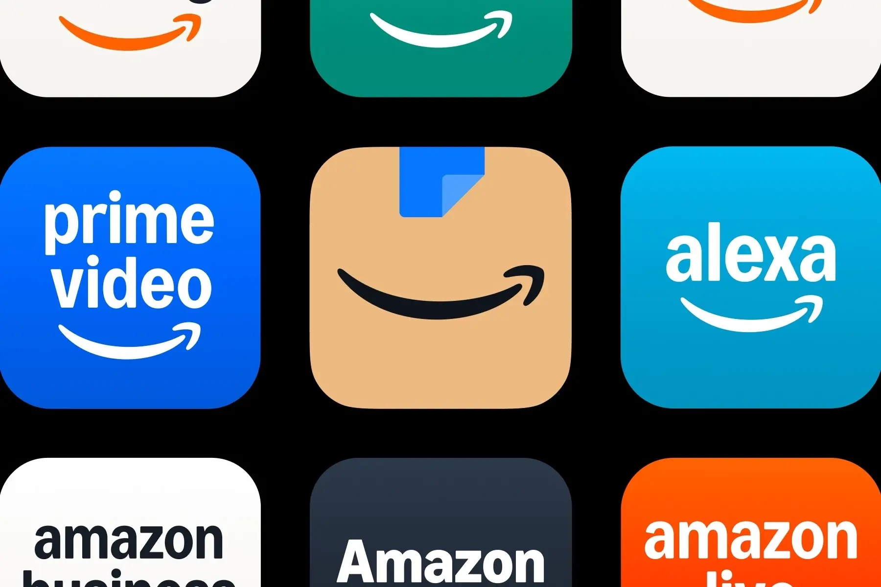
The Amazon app icon uses a clever visual metaphor. The smile icon is also an arrow from A to Z, symbolizing the huge range of products. Brown box and blue tape imagery represent packaging and shipping, which are core elements of the brand service. The design is simple, immediately recognizable, and directly associated with the brand experience.
Design Lesson: Add subtle meaning without cluttering the design.
4. TripAdvisor
TripAdvisor’s owl icon is packed with meaning. The owl symbolizes wisdom, which aligns with the app’s goal of helping users make informed decisions through reviews and insights. Its symmetrical, high-contrast eyes draw immediate attention and are easy to recognize even at smaller sizes. Overall, the design is both visually balanced and functionally effective.
Design Lesson: Use strong symbolic imagery that resonates with your app’s purpose.
5. PhonePe

PhonePe’s app icon is a strong statement of its Indian and fintech identity. With the Devanagari letter “(पे),” it is possible to reconcile cultural significance with global recognizability, allowing for recognition in a competitive digital payments arena. The use of purple, a fintech innovation, provides a unique twist, and the simple, minimalist design ensures instant familiarity.
Design Lesson: Cultural specificity can enhance memorability.
6. Tinder
Tinder’s flame icon conveys the feel of a “spark” or instant attraction. The circular shape is clean and contemporary, something that is apt for younger generations. The red and orange colors are often related to passion and energy, something that is deeply rooted in the app’s functionality. It’s a striking, recognizable icon that conveys emotion and experience.
Design Lesson: Consider emotional resonance in iconography and color.
7. RedBus
The RedBus symbol is straightforward but powerful. It’s a simple bus silhouette that conveys the app’s primary function, which is to book bus tickets. Its simple design eliminates distractions and facilitates quick interpretation of the icon. Additionally, the use of red gives the design vitality.
Design Lesson: Sometimes, being literal and simple is the best way to communicate.
8. Pinterest
Pinterest’s icon transforms the letter “P” into a visual pun, a pin. The clever design element supports the app’s fundamental operation of pinning and saving ideas. The clean typography and striking red-and-white color palette make it stand out without looking cheap. It’s immediately recognizable and deceptively clever.
Design Lesson: Play with typography in a symbolic way to reinforce the app function.
You might also like: The Pinterest New Logo is Much Bolder Than Ever
9. PicsArt
The app icon for PicsArt features a vibrant and imaginative color scheme. The app’s artistic vibe is reflected in the eye-catching gradient of blue, pink, and purple. The app icon has a youthful, lively spirit that appeals to its target of social media users and creatives because of its sleek, contemporary design.
Design Lesson: Don’t be afraid to embrace a playful, colorful look if it aligns with your audience.
10. Evernote
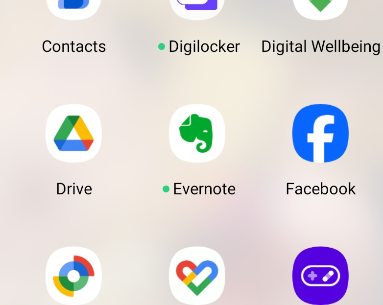
Evernote employs an elephant as a symbol of memory and retention, essential characteristics of the app’s note-taking ability. Green gives a feeling of serenity and productivity, and the minimalism of the lines in the icon keeps it accessible and professional. The combination of symbolism and minimalism keeps it relevant and accessible.
Design Lesson: Use universally understood symbols to communicate your app’s core value.
FAQs About the Best App Icons
Q1: How do I choose a color palette for my app icon?
Stick to 2-3 primary colors that reflect your brand tone and stand out on any background. Test it in both light and dark modes.
Q2: How often should I update my app icon?
Only when you rebrand or optimize for new design trends. Seasonal updates can work for festive promotions, but your core icon should remain familiar.
Q3: What should the size of the app icon be?
Design your icon at a high resolution (1024x1024px) and then scale down as needed. Follow platform-specific guidelines (iOS, Android).
Final Thoughts
Designing a standout app icon isn’t just about beauty; it’s about strategic storytelling in its most compact form. It’s where design meets function and where the user experience begins, often before the app is even opened. You’ve seen how the most iconic brands, from Instagram to Evernote, have mastered this tiny canvas to create something truly memorable. But here’s the thing: the magic doesn’t lie in just mimicking what works, it lies in making your app’s soul into something that is uniquely yours.
When designing your own icon, think of it not just as a decorative element but as a decision-making moment for the user. Ask yourself: What does this icon say about the experience I’m offering? Does it reflect the tone, culture, or promise of my product? Will it stand out in a grid full of other icons, and more importantly, will it be remembered?
The most effective icons look simple but carry carefully considered design choices. They might employ only one letter, one symbol, or one notion, but each decision, down to the color scheme and shape, is intentional. They work at any size, on any screen, and still succeed in creating emotion, trust, or curiosity.
As design aesthetics evolve, it’s worth occasionally revisiting your icon, not to reinvent it entirely, but to refine and modernize. Small changes in depth, contrast, or edge treatment can help your icon stay visually current while keeping the identity your users trust.
So, whether you’re building an icon for a productivity tool, a dating app, or a travel platform, remember that this is your first impression and your long-term visual signature. Take risks where they matter. Be bold, but be meaningful. Because in today’s crowded app landscape, users aren’t just downloading functionality; they’re choosing design, identity, and emotion in one quick glance.
Let your icon speak volumes, quietly, clearly, and confidently
Also Read: Why Fussy App Design Affect Your Brand’s Credibility and Usage
These app icons prove that simplicity and clear symbolism win—whether it’s Instagram’s gradient outline, Headspace’s serene orange dot, or Duolingo’s quirky owl. In just one square, you get instant recognition and personality.
Thanks for sharing
so great. thanks this post
I’ve spent hours in Melon Sandbox, and it never gets old. It’s incredibly addictive.
This article perfectly shows how thoughtful app icon design—simplicity, color, and symbolism—can make a brand memorable. Really inspiring insights!
Great insights on app icon design! It’s fascinating how a well-crafted icon can truly elevate an app’s appeal.
This is a comprehensive fan-made guide website for Path of Exile 3.27 “Keepers of the Flame” expansion. The site provides in-depth analysis, strategy guides, and complete walkthroughs for all new game mechanics, systems, and features introduced in PoE 3.27.
Step into the arena of Scrandle , where linguistic mastery becomes your ultimate weapon in a battle of wits that demands vocabulary dominance.
Witness a symphony of strategic genius and balletic athleticism unfold in Football Bros play online, where every calculated play becomes a testament to the beautiful game’s intellect.
Nano Banana Pro is a professional AI image generation platform powered by Google DeepMind’s advanced Nano Banana AI technology. The platform offers two distinct models: Nano Banana (2 credits per image) for cost-effective generation and Nano Banana Pro (24 credits per image) for premium quality with enhanced features including sharper 2K imagery, intelligent 4K scaling, improved text rendering, and enhanced character consistency.
Hollow Knight blends sharp combat with immersive exploration. Master the Nail, harness Soul for spells and healing, and unlock fluid movement abilities that turn every fight and discovery into a rewarding challenge.
This article is a goldmine for app developers. Every time I work on an icon, I find it really challenging. Great to learn from these examples!
The simplicity principle really stands out here. Google’s clean ‘G’ proves that sometimes less is more when it comes to memorable design.
Great insights on app icon design! Simplicity really is key. Love how Instagram’s gradient makes it instantly recognizable. Hope I can design icons like these too.
I agree that simplicity is key; the Google and Pinterest icons are great examples of this. They’re instantly recognizable, even at a small size, which is so important on mobile devices. Thanks for pointing out how crucial scalability is for app icons!
I agree that simplicity is key, and the Google icon is a perfect example of that. Is there a recommended number of colors to use, or is it more about the overall harmony?
I learned that an app’s icon is crucial for its success—it’s like the first impression that can make or break the user’s experience.