30 Cool Lettermark Logos For Design Inspiration
Logos are for companies what family crests are for… well, families. A logo is supposed to be a neat little package that contains the company’s philosophy, ethics, and history. It is supposed to inspire trust in clients or potential clients, and most importantly, it has to be recognizable. People have to be able to remember it and pick it out in the crowd, making it one of the most important elements of brand identity. When making lettermark logos there are many things that you have to take into account. It is an interesting blend of tradition and trends, seeing as typography has been a trend for a while now, and people love clever letter designs or the use of letters in design.
Today we will be looking at some really cool lettermark logos so that you can get a bit of design inspiration.
1. Fosscon
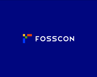
Fosscon is a conference directed at people interested in open-source software and development. The really cool thing about this logo is that, besides the fact that the font used is really appropriate for a business technology-oriented conference, the pixelated “F” is, in fact, an arrow pointing forward, when the mark is turned around.
2. Geoffrey Good
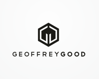
This logo is created in collaboration with the person who commissioned it, Geoffrey Good, who is a jewelery designer from New York, and also a professor at the Fashion Institute of Technology from the State University of New York. The lettering is real professional looking and appealing, and the connected initials (the double G’s) that form a cube are also used as a maker’s mark on the jewels themselves.
Check Out: Beats Logo Meaning, History & Significance
3. Phoenix
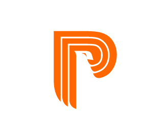
Plain and simple, this is a very cool-looking made for a company called Phoenix Precast Products. What makes it really well thought-out is the three lines that for the “P”, each line being a “P” itself and standing for Phoenix Precast Products. The logo is also a Phoenix in negative space.
4. Studio Pieter Boels
Pieter Boels is a designer from Belgium, and he created this lovely, minimalistic lettermark logo, using his own initials, of course.
Check Out: F1 Logo Meaning: Hidden Details, History & More
5. O, Loveland
O, Loveland is an American folk group that are currently based in Waco, Texas. This is the lovely lettermark logo they had made for themselves, and it looks absolutely great.
6. ny43
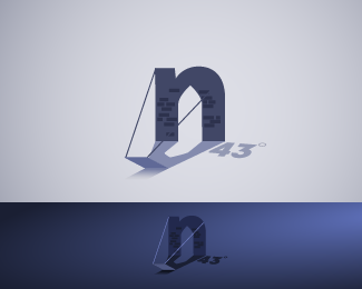
A great logo for a New York-based design firm. It incorporates an essential N.Y. element, the Brooklyn Bridge, and uses the “43” in the company’s name as a part of the greater theme of geometry and architecture in this logo.
Check Out: The Evolution of Amazon: Amazon Logo History (1995-2024)
7. Home Evolutions
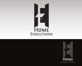
An elegant and simple negative space concept, that reflects the H and the E in an architectural kind of way.
8. NM
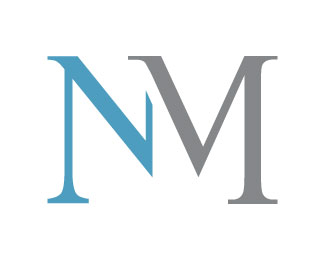
Made by the designers for himself as part of a personal identity and branding project to market himself and his works.
Check Out: LG Logo Meaning: A Deep Dive Into The Symbolism & History
9. M & M Connections
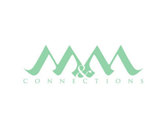
M & M Connections is a furniture design company, and as such needed a simple, discreet logo, that expressed elegance.
10. Medialo
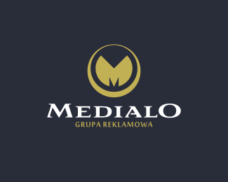
As an advertising agency, Medialo went for a logo that insinuates seriousness, experience and stability. The logo has great lettering, a lovely choice of colors, and gorgeously sleek lines incorporated into the design.
Check Out: 10 Cool Logos With Secret Meanings
11. Saint Eclair
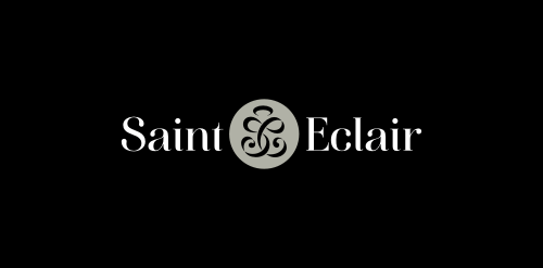
If you open the dictionary to elegance, you will see this logo printed as the definition.
12. Quick ‘n’ Easy
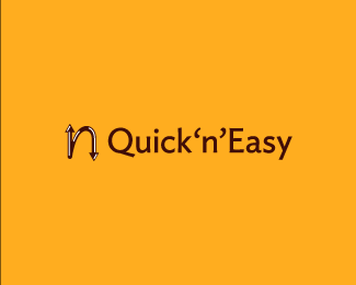
Combining interstate highway signs and the “n” from the company’s name, we get a fantastic little logo for this GPS mobile app. It is especially important you make great logos for apps because users often choose what apps they will download based on the logo itself.
Check Out: Toyota Logo Meaning: History & Significance
13. Waft
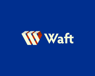
Waft is an online radio streaming app that went for a retro feel in their logo. It has a certain socialist-realism air to it.
14. Growth
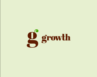
This logo isn’t made for any company in particular, just the designer playing around with a concept, and a very solid concept, at that.
Check Out: Baskin Robbins Logo Meaning: Significance & Hidden Details
15. H5
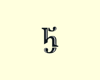
This logo is a work in progress for H5, a prolific design studio specializing in motion graphics. Although it is a work in progress, it’s already looking really cool.
16. EI Sales & Marketing Group
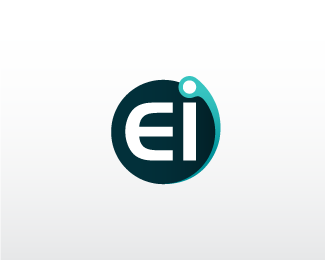
A tad bland, perhaps, but it is simple and it is serviceable.
Check Out: Top 18 Logos with Hidden Meaning
17. NZ Golf
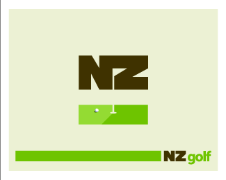
New Zealand is becoming quite a tourist paradise. With its lovely weather, excellently suited for both beach-going, mountain climbing, and upper-middle class favorite, golf. NZ Gold offers all the services required for a good golfing experience, we guess, and their logo is friendly, yet professional.
Check Out: Coca Cola Logo Meaning: Hidden Details, Famous Slogans & More
18. Madura Madani
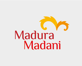
Great use of the “M” as the main letter of the company, creating a great community logo.
Check Out: 1900 Logos Giga Bundle
19. NFS
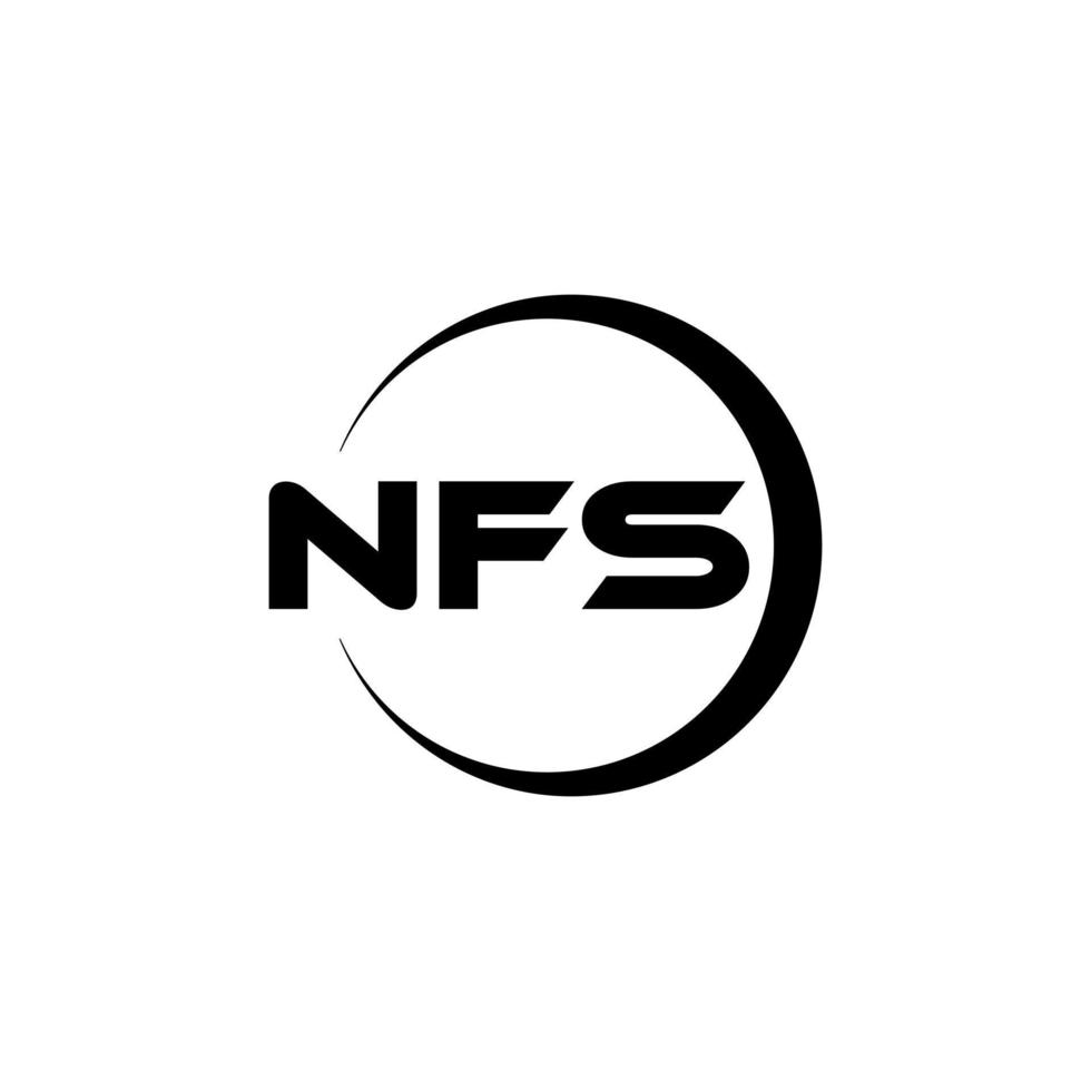
It probably does not stand for “Need for Speed”, it does, however, look nonetheless cool.
20. At Home
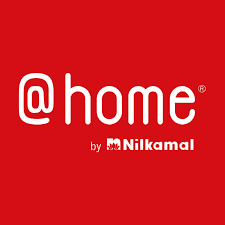
An interior design agency, like any design agency, needs to have an above-standard logo, so as to show that the agency (and the people working for it) is indeed a creative agency. Here we have a truly good looking logo, that made great use of the company’s name and activity.
Check Out: 1300 Best Logos Bundle
21. Luxable
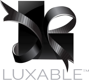
If you are going to have “Lux” in your company name, then the logo better have something to do with gold and/or decadence. Again an excellent example of lettermark logos.
22. Arrow Inc.
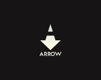
This is an unused logo, and it’s hard to say why the company that commissioned the logo didn’t use it after all. It’s smart, good looking, and it has a solid concept behind. What it also his is stand-out quality, which is very important in logos.
Check Out: Logo Creation Kit – 850+ Creative Elements
23. Excellent Hosting Lettermark Logos
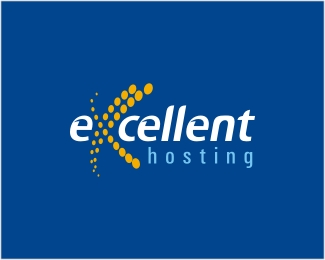
It’s always nice to see logos made up out of the company’s letters. Ideally, they should have used all three E’s, instead of just two of them, but the end result really is a neat little logo.
24. New Skool
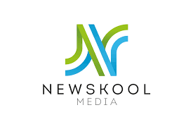
Simple and elegant logo with the initials in highlight. Another great example of lettermark logos.
Check Out: Behind the Adidas Logo: Symbolism of Three Stripes
25. Angela Aaron DDS., LLC.
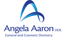
Dentists are expensive, and they need to look expensive to further justify the high price of their services. Here we have a really classy dentist’s practice logo.
26. Amaxa Bank
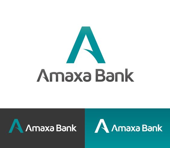
Banks are another expensive service, and just as dentists, banks need to look the part, with an emphasis on seriousness and stability. Amaxa’s logo looks pretty luxurious.
Check Out: Pixalogo – The Best Logo Design Bundle
27. W Studio
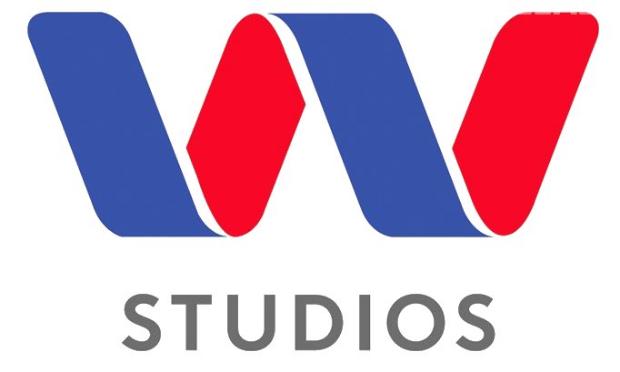
This one’s pretty self-explanatory: elegant, clear, easy to read, and stand out. Another great example of lettermark logo.
28. Devonport Flowers Lettermark Logos
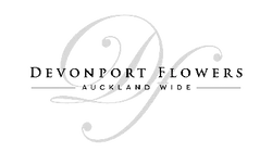
Same as before, only even better.
Check Out: 11 Cool Wine Bottle Label Designs
29. Angi
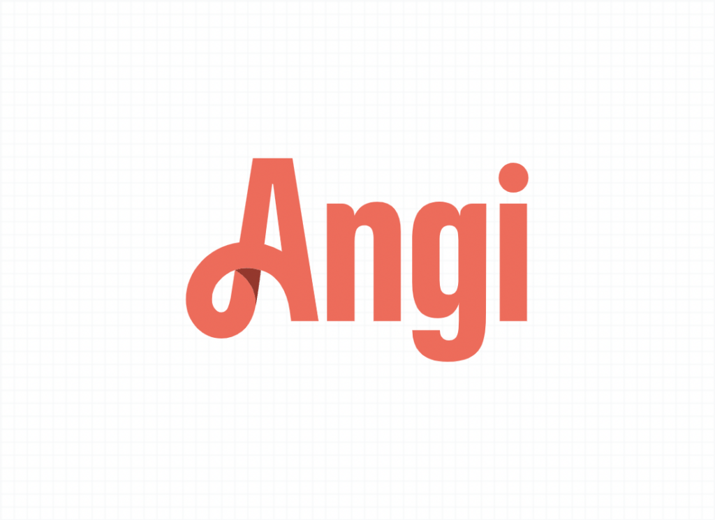
Yet another simple yet aesthetic example of lettermark logos.
30. New York City
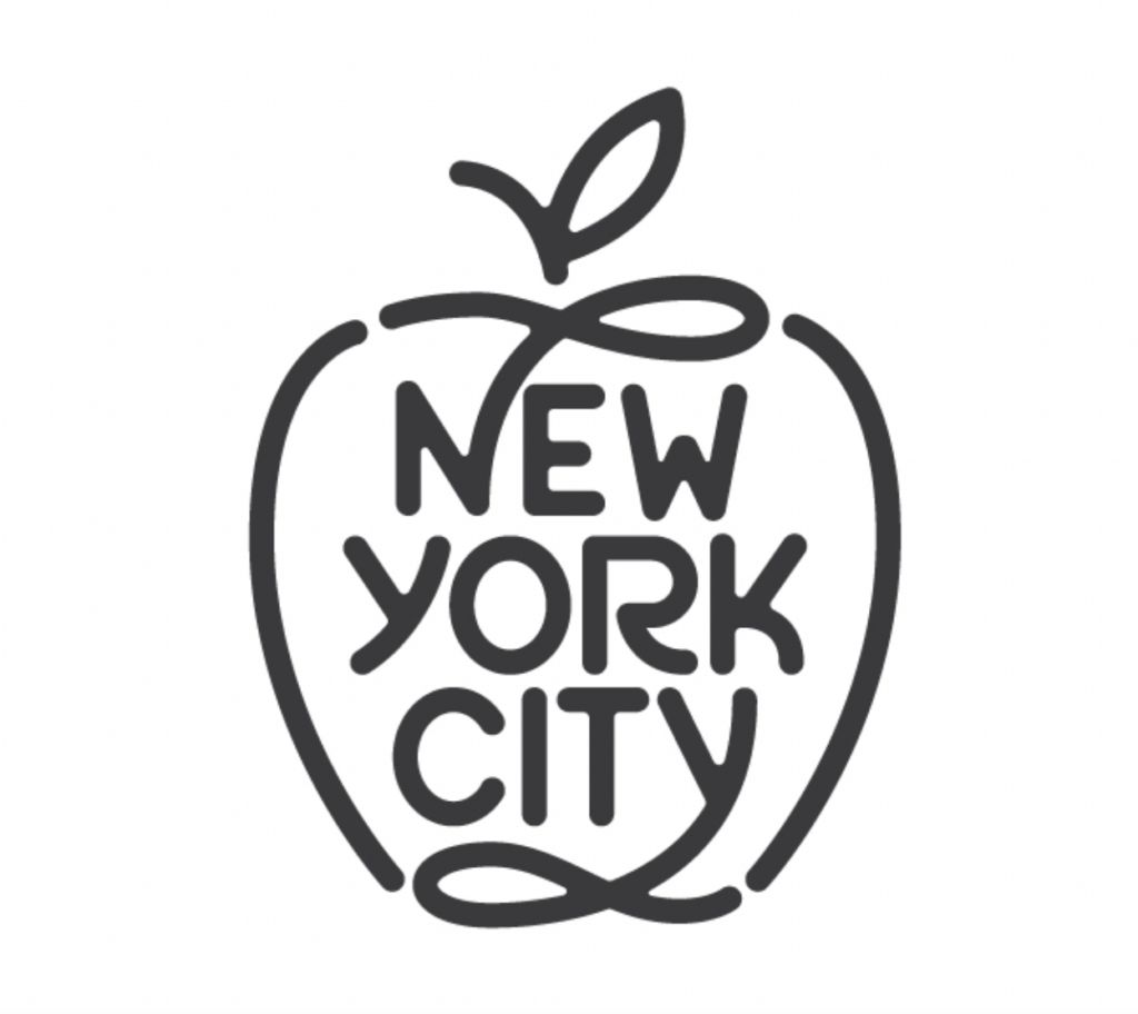
This is one of the best lettermark logos you’ll come across. It is simple but complicated at the same time.
That concludes our list of 30 amazing lettermark logos. We hope you found this list useful, and that it will help you in your current or future projects. Don’t forget to leave us your thoughts on our list, or share any logos you like, in the comment section below.
Like this post? Check out more amazing design inspiration content here.

Leave a Reply