Top 15 Interactive Infographics for Your Inspiration
“The smug complacency of technology adverts disguises a pretty mixed picture, with too many people not connected, too many passive users of technologies designed for interactive, and far too much talk about empowerment but far too little action to make it happen.” – Geoff Mulgan
As a designer, it is probably safe to assume that you are pretty keen on infographics. Truth be told, it is hard not to be. Infographics are the most aesthetically pleasing way of transmitting information, and they are also one of the most efficient. They make both you (the information transmitter) and others (the information receivers) focus strictly on what is essential, and make memorization easier, by using images.
Infographics opened up a whole new way of communicating and presenting information, and as technology advanced, infographics advanced with it. In today’s article, we will be showing you a few totally awesome interactive infographics, in our on-going quest to bring you the best design inspiration out there.
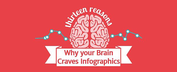
1. Why Your Brain Craves Infographics
We will kick-off our list with an infographic that explains why we love them so much. What it is, essentially, is a single-page website filled to the brim with cool information, presented along relevant and funny images.
It looks absolutely gorgeous, and it runs really smoothly, making sure that once you are done with it, you will be considering giving it another go.
One really cool feature is the timer at the bottom of the page. Once you are ready to move on to another website (or infographic), feel free to check it out, and see how much time you spent on it. We would also encourage you to do that right after you finished reading it the first time, to see just how much you have just found out in a really short period of time.
2. How Search Works: From algorithm to answers

We have already shown you a few infographics about how Google Search works, but none of them were interactive like this one.
Done with lovely animations and stunning flat design, Google’s own How Search Works is a big and insightful infographic into the workings of the most popular search engine there is. We get to see a little bit about how Ranking works, and also a rather lengthy and detailed presentation about how successfully spam is being fought.
This infographic also has a nifty little timer at the bottom of the page, this time counting down seconds spent on the page, and searches done while you were browsing it.
3. The Complete History of Social Media
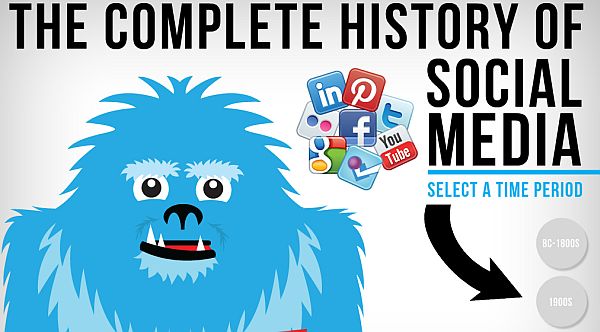
Perhaps not the most insightful infographic on our list, it still servers as a terrific example of how to use Flash properly.
Although the animations are nowhere near as impressive as our previous two entries’, Avalaunch Media’s The Complete History of Social Media runs nice and smooth, and it does have a few cool facts about what social media was prior to the rise of social networks.
4. Universcale

Now here is and infographic you could probably spend an hour or two on.
Technology is a marvelous thing, and it has allowed us to get a better idea of our place in the Universe. Electron microscopes and astronomical telescopes have helped us glimpse through the veil of what we once perceived to be reality, and revealed to us the immensity of both the small and the large. It truly is humbling to see all of the different objects we now know exist in the Universe, and compare sizes.
5. Evolution of the Cloud
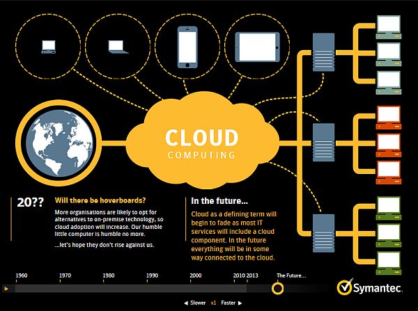
A great example of how to do a seamless slideshow-style infographic, Symantec’s Evolution of the Cloud (a fantastic name for an indie band) gives a brief rundown of the history of Cloud technology, and a prediction about what is to come.
Boasting lovely flat design, colored so as to match the company’s own color scheme, and an adjustable speed-scroll bar, this is a real how-to if you are going to make an informative and advertising-oriented infographic.
6. HTML5 & CSS3 Readiness
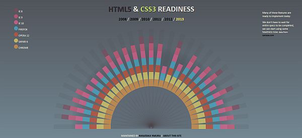
This is a fairly straight forward infographic, documenting, as its name suggests, HTML5 and CSS3 readiness for web browsers from 2008, up to 2013.
One really cool thing about it is that you can click on one of the features, if you are not as HTML5 and CSS3 ready as the browsers, and see what that feature is, and how it works.
7. How Many Households Are Like Yours?
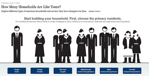
Brought to you by the prestigious New York Times, this is a customizable infographic that shows how many households in the United States are like yours, or the imaginary person’s data you input.
You can find out all sorts of interesting statistics, like average household income, and when those particular household conditions were more likely to occur. For example, did you know that a married couple with two children is more common than one with only one child? Or that such households were more likely to occur during the 60’s?
8. Women’s Political Rights Around the World
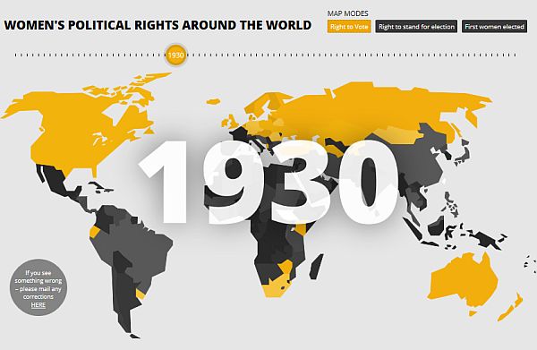
This is another information graphic done by a publication, but they just do them so well, and have such interesting facts in them.
This is a very intuitive and easy to follow infographic, with a horizontal scroll bar on top, which changes the year. As the year changes, countries are highlighted with yellow, blue or red, depending on whether you are looking to see right to vote, right to stand for election, or first woman elected or appointed.
9. You vs. John Paulson
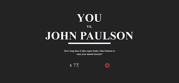
If you are so satisfied, it hurts, or you are feeling the need to get some righteous socialist rage going, then check out this infographic. Just put in your yearly wage, and see how it takes more time for the page to load the results, than it takes John Paulson to earn your wage.
This is a great example of how to make a fun infographic, from ease of use, to subject matter. Just remember to add all the little fun facts, otherwise it isn’t so much an infographic, as it is a torture device.
10. The Evolution of the Web
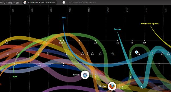
We can all agree that we love the internet. We love it because, essentially, we are the ones who make it. Whether you are a content creator or a developer, the internet bares your footprint.
This infographic aims to show you all the different ways that internet technologies interact in creating this very experience that you are having now. It does this by using brilliantly colored lines that flow and intertwine throughout the graph.
There’s also a Growth of the Internet graph that’s way more easy to follow, but just doesn’t look as pretty.
11. The Evolution of Western Dance Music
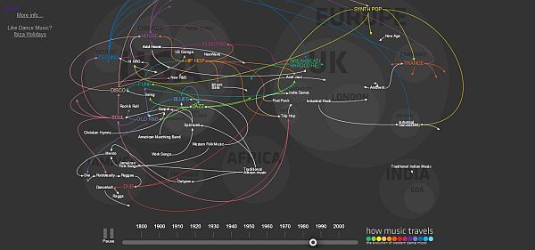
As far as advetisement goes, this is absolutely brilliant. A real stroke of genius.
Working kind of like a video, this infographic shows how music evolved into all the different genres we have today, and how they are connected. All this is done so Thomson can advertise their tourism services. Nice one, fellows!
12. Fish Tales
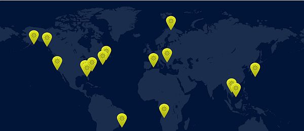
Aimed at fisherman, Fish Tales shows some of the best fishing spots in the world, selected by size and weight of the record fish caught there. It comes with, of course, fishing tales about how the fish was caught, and fun facts about the species.
13. Evolution of Social Collaboration
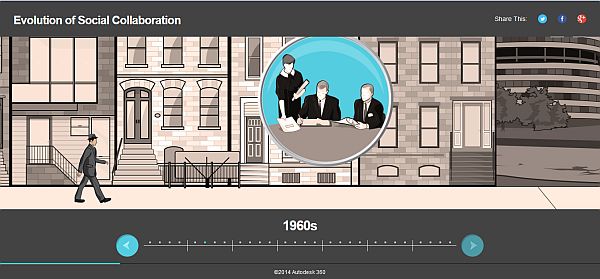
We have a lot of “Evolution of…” entries on our list, but we don’t pick them by name, we pick them by quality.
Using a fedora-wearing individual as our avatar, we get to walk from 50’s, all the way to the present, and see how social collaboration has changed the way we look at design.
14. Inception Explained
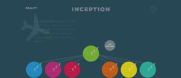
Christopher Nolan’s mind-blowing exploration into how dreams and the psyche are connected left plenty of people confused. So confused, in fact, that it warranted the creation of an infographic.
Built like a one-page website, Inception Explained takes us step-by-step through the movie’s action, explaining along the way why something that is happening, is happening.
15. Bond -License to Drive-
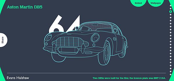
Hitting that sweet spot between Bond enthusiasts and car enthusiasts, Evans Halshaw’s infographic showcases some of his favorite cars from the James Bond series, since 1962.
From all the iconic DBS’, to odd-one-out’s like the Renault 11 and the Citroen 2CV, all of the cars are wonderfully drawn, capturing the old-school Bond vibe of the 60’s and 70’s.
That concludes our list of awesome interactive infographics. We hope you enjoyed reading them, as much as we enjoyed collecting them. Don’t forget to share your thoughts, or any other infographics you think we should know about, in the comment section below.
This article fits as to why we like infographics. http://www.forbes.com/sites/stevemeyer/2014/06/12/persuasion-fascinating-study-shows-how-to-open-a-closed-mind/
Hi there! What tool do you use for your infographics? I recommend Genial.ly
It’s great, free and online. I’ve been using it for a while now and my infographics never looked better. Besides, you can also use it to create slide presentations, charts, postcards, microsites…Whatever you need. Take a look a it and try it! :)
Thank you for the feedback, Cara! We’ll be sure to try it.