Design Resources: Split A/B Testing in a Nutshell

Design Resources: Split A/B Testing in a Nutshell

A/B testing, split testing, randomized controlled experiments, online controlled experiments – what do all these word combinations tell you? UX designers are surely aware that all of the enumerated terms have the same meaning; nevertheless, let’s clear up the matter for the rest of the readers. Actually, the explanation is rather simple: split testing is a specialized method of marketing research, which uses random experiments offering a limited choice of two A and B options. In web development, marketing and user experience design, the test is mainly aimed on highlighting the amendments that should be inserted into web pages (banners, advertisements, newsletters and so on) to augment the traffic, click-through or conversion rates.

ab-testing-image

Image source

As a rule, both compared variants are even, except for the small detail, which might have a crucial impact on user’s behavior (or doesn’t influence it at all).

Unfortunately, due to the scanty number of options, A/B testing can’t be considered a universal panacea. However, it can turn out to be really helpful for sales funnel and elements (text, layout, images, and colors) improvement.

Let’s try to identify the perfect applicants for A/B testing:

1)      Catching headlines (words and their order can make big difference, as you know);

2)      Irresistible call-to-actions (text and color of buttons and links);

3)      Selling points (which one of your unique ones attract the visitors);

4)      Placement of trust raising blocks and labels (customers’ testimonials, famous company logos, eminent partners);

5)      Images (photos have the power to stir different emotions in users and impart a website original emotional tint);

6)      Backgrounds (color, pattern, texture or image – what is best for your website);

7)      Landing pages (is its proposition tempting enough to make the user do what you ask);

8)      Sign up/Log in, data input forms (the number and design of their fields can dramatically impact website abandonment rates);

9)      Product pages (it goes without saying that proper product presentation makes the customers buy).

Urban Outfitters and their great minimalistic product page:

Urban Outfitters

Image source

Undoubtedly, our list of test objects is not complete because we just form a general idea of the concept. Each project is unique, so the decision what to test flows out of the particular goal of your research. In other words, you should define elements that are crucial for your traffic and start with them. Usually, they are the biggest elements onsite (images, backgrounds, banners, etc).

Having finished with the “guinea pigs”, let’s talk about the major issues of A/B testing.

1)      Notwithstanding the fact that the technique works well with elements testing, it can be hardly called versatile for holistic design.

2)      You get the data which of two headlines is best, for instance. But you still don’t have the answer why, which is important if you want to dig deeper into customers’ psychology.

3)      Split testing usually lasts for a few weeks, which shows you immediate slice data rather than substantial long-term research results.

4)      When you introduce something new into design and test the feature with this method, the results may be not too accurate to rely on as the users simply like to investigate innovations they’ve never seen before. So, the effect is likely to be temporary.

5)      The A/B testing is oriented on local community, while the situation may be quite different at a larger scale.

6)      Another problem is that the method offers only two alternatives to choose from, both of which may be not so good at all.

Due to the drawbacks, available in each analytical method, it’s better to involve a bunch of them during serious research, but what is difficult to argue is that the results of A/B testing method are based on users’ subconscious behavior, which is really important for your conversion and simply interesting to know. Everything mentioned above gives us the ground to state that A/B testing is good for optimization of small details, however, we know, that there is nothing secondary in web design. By the way, lots of small and medium-sized business companies like Amazon.com, BBC, eBay, Google, Walmart, LogMeIn, Microsoft, Netflix, Playdom (Disney Interactive), Vegas.com, Zynga apply this experimentation method to take their marketing decisions that subsequently increase their profits.

Don’t you think that it’s time to make a small digression and get to know some fun facts about the most interested and unexpected results people were surprised to learn from A/B tests they have carried out? So, here they follow:

1)      Website developer’s basic assertions may be turned upside down after the survey.

2)      A subtle change can bring tangible results.

3)      There is no common solution for winning website layout pattern, everything depends on the content.

4)      An awesome logo placed onto the landing page doesn’t affect conversions that much.

5)      A time-limited promotion incredibly raises the conversion.

6)      Low prices are not so crucial for conversion, in some cases price upward leaps resulted in better sales.

7)      Long texts don’t necessarily reduce user’s interest in your services if they are informative, of course. We know that the statement contradicts trendy minimalistic approach, but this is the reason why the argument is in this list.

Dropbox

dropbox.com

Image source

8)      Men and women give different responses to one and the same copy.

9)      Visitors like to see close-ups of middle aged people on landing pages.

10)  The results on weekends and weekdays are different.

11)  Design techniques working well for others may not work for you.

12)  Animated transition effects can be important.

13)  A/B testing may reveal browser or OS bugs haven’t been noticed before.

14)  Exploring key offline behavior is not less important than understanding online experience.

15)  Changing a button name can double the conversion.

Monetate

monetate

Image source

16)  Giveaways don’t necessarily lead to the highest click through.

17)  A smaller rectangular button with sharp corners performs better than the rounded one.

18)  The word “help” in advertisement text drops click through rates.

19)  Sometimes it is better to give a specific product to consumers rather than options to choose from.

20)  Putting a customer service phone number in addition to the “Buy Now” button increases online conversions.

21)  Many things that seem intuitive and obvious to developers fail when exposed to a test.

22)  Price filter sliders do not work.

23)  Blue button beats out the orange one.

monetate1

Image source

24)  Even small changes in pricing information display can make an impact.

monetate2

Image source

25)  Lightbox popups are effective notwithstanding the fact that most people don’t like them.

26)  Inserting a video in place of product images can bump the conversion.

27)  Guarantees have strong effect on the users.

monetate3

Image source

28)  Live chat can help your hesitant visitors make a decision.

monetate4

Image source

29)  One click ordering feature, like on Amazon website makes a huge difference.

30)  Huge buttons are simply irresistible.

DIY Themes

DIY Themes

Image source

Tried-and-true A/B testing tools

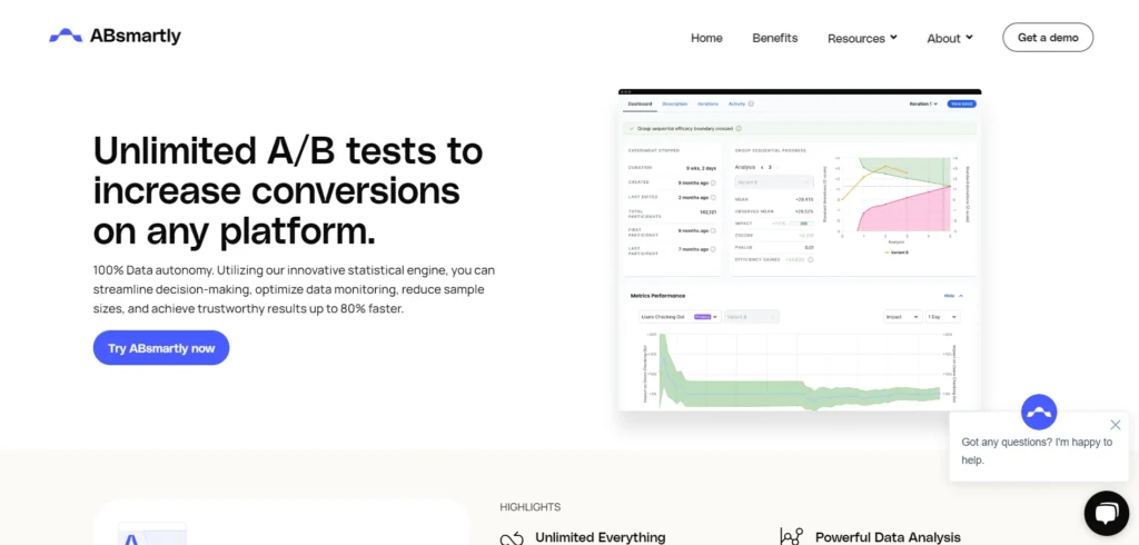
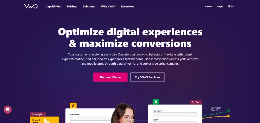
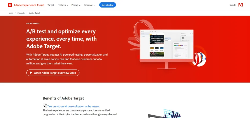
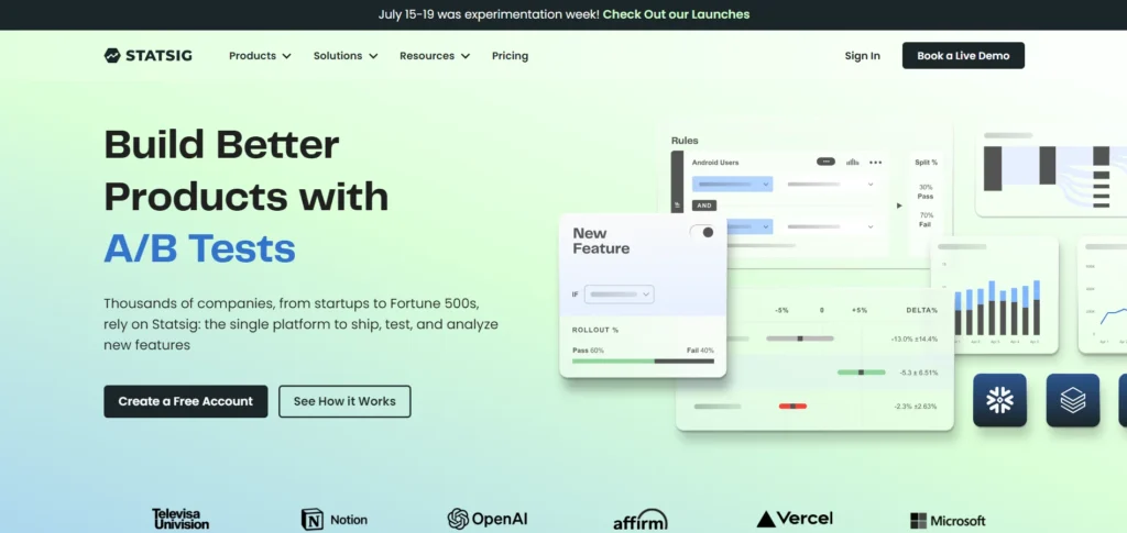
As our story shows, Split testing does work for some particular cases and even gives the results, making analysts’ eyes goggle. Don’t you think this is a good motive to try the A/B testing for your project? So, if after reading our article and viewing some illustrative examples, you’ve decided to conduct a couple of quick tests to optimize your website and start earning more money through better visitor’s online experience, here are some helpful tools, considered useful by the web community. Browse them and make your own conclusions. It’s high time for smart approach to conversion improvement!

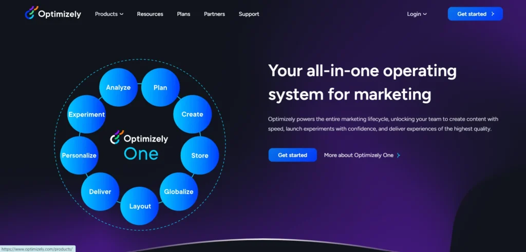
Optimizely.com

Unbounce.com

Mynaweb.com

Growthgiant.com

Zentester.com

Convert.com

Visualwebsiteoptimizer.com

Adobe.com/products/testandtarget.html

Personyze.com

Google.com/analytics/siteopt

To wrap it up:

You can’t but agree that every solid prosperous website involves analytics in order to get timely information on all fluctuations taking place behind the scenes and make right decisions lifting their business to the higher level. Our today’s virtual life is the one of constant development. This entry highlighted main points of A/B testing, knowing which you can take utmost advantage of this simple, quick method, giving rather accurate results if used properly or in combination with more complicated technologies.

This post is provided by Helga Moreno, one of Template Monster’s authors feeling special passion to sharing her thoughts on various topics with the community and highly appreciating the opinion of her colleagues.

Leave a Reply

Your email address will not be published. Required fields are marked *