Explore The Best Olympic Logos: A Legacy of Iconic Design
Olympics logos often serve as one of the most memorable aspects of the world’s largest athletic event, sometimes surpassing sporting activity. Olympic logos may be recognized by everyone, not only athletes or sports enthusiasts. One of the most fascinating aspects of the constant Olympic logo design is that each symbol may be significantly and internationally uniting simultaneously.
While every Olympic Games logo has some variation of the five interlocking rings, each symbol has its own unique spirit. When a new venue hosts the games, they receive creative choices to promote their unique culture and tradition through the designs they pick.

Table of contents
What Makes The Olympic Logos Unique?
Jeffrey Kurtz, Ceros’ creative director, says he is looking for three elements in a logo. “I want to see a connection to the local culture, a sense of sport or activity, and a sense of timeliness.” He added, “My favorite logos are the ones that couldn’t possibly belong to any other country.”
Have a laugh checking out these 10 Graphic Design Memes to Brighten Your Day
Designing The Olympic Logo
The design of the logo represents togetherness, the flags of all participating continents and nations, which is to be the best. Designing a logo for the Olympic Games must be one of the most difficult branding problems possible.
The design should evoke the atmosphere of a sporting event, ideally the Olympic values. However, an Olympic logo serves more than simply as the Games’ brand. It also showcases the host city, which frequently entails balancing parts of the national past while demonstrating a country’s modernity.
Also, check out these 3 Essential Steps Toward Successful Rebranding
Why Are There 5 Rings In The Olympic Logo?
You may question why the Olympic emblem only has five rings, given that it is designed to represent international togetherness. Some people believe that each hue relates to a certain region of the world.
According to the Olympic Committee, each of the five colors in the official logo reflects the flags of all nations. The 5 rings are the most important part of the Olympic logo. The five connected rings, each depicted in equal proportions, are intended to express more than international unity, but also a sense of community and togetherness.
Let’s look at some of the best Olympic logos that have been created throughout.
Best Olympic Logos
Tokyo Olympic Logo 1964
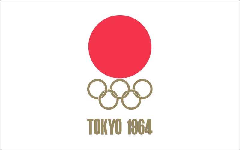
Tokyo introduced one of the first visually appealing Olympic logo designs in 1964. The simplest of all Olympic logos turned out to be one of the most timeless. Designed by Japanese designers Masaru Katsumi and Yusaku Kamekura, it appears simple, but the way the rings join together involves very intricate interleaving, reducing the customary areas where they overlap for a more compact and balanced connected symbol.
The sleek and eye-catching logo makes the minimalist design captivating at the time. The design was professional, engaging, and dynamic.
Mexico 1968 (Summer Olympic Logo)
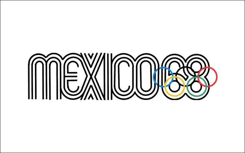
The 1968 Mexico Olympic logo was widely regarded as one of the best Olympic logos of all time, combining cultural identity with modernism. Lance Wyman created the logo, and what it lacks in typography, it makes up for in excitement and individuality. It has an energetic, racing-stripes spirit and effectively combines the Olympic rings.
Expanding the geometry of the five Olympic rings to form the number ’68’, this deceptively simple design incorporates inspirations from both Mexican folk art and 1960s pop art, perfectly integrating Mexico’s tradition and modernity while avoiding stereotypes.
Elevate your logo-making experience with these 6 Tips for Startups to Pick Professional Logo Service
Munich 1972 (One Of The Best Olympic Logos)
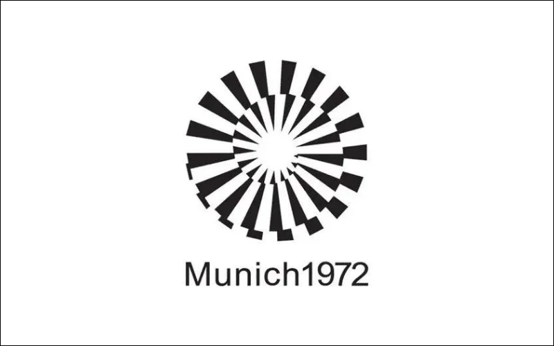
The Munich Olympic emblem’s most troublesome aspect is its difficulty to look at. The interconnecting white and black lines make the circle appear to be in constant motion.
Though the Munich Games will always be remembered as tragic, Otl Aicher’s logo is captivating like it is almost hypnotizing.
While most Olympic logos attempt to integrate aspects of patriotic pride, West Germany’s economy was bold enough to adopt a different approach in 1972. This modernist geometric logo was created deliberately to avoid referring to any single country, emphasizing a notion of global solidarity that became even more poignant following the terrorist murder of 11 Israeli Olympians.
Check out how YouTube Changes Its Logo and App Design
Moscow 1980
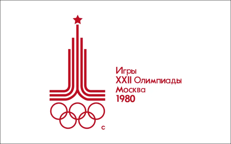
Another great example of a contemporary design is the Moscow Olympic logo for the 1980 event. The design by Soviet artist Vladimir Arsentyev was finally picked as the winner. The primary portion of the symbol is made up of three parallel lines.
Vladimir Arsentyev designed more than just the primary logo; he also prepared 533-page sets of marketing standards for the entire Moscow Olympics. The red is striking, reminiscent of the Soviet Union.
The logo has a wonderfully uncompromising design that combines Soviet and Olympic symbols into a single strong mark, with the red star above the lines indicating the Kremlin.
Also, check out: 10 Vintage Tobacco Ads That Were Ridiculous But Inspirational
Athens Olympic Logo In 2004
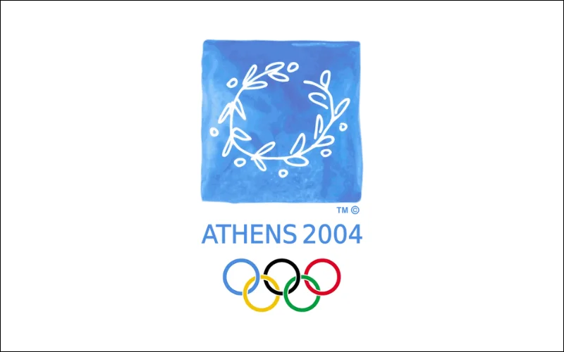
The Athens Olympic logo is an elegant yet simple mark designed to reflect the landscape’s heritage as well as the game’s togetherness. It’s highly Greek, but rather than focusing on an apparent national icon or location, the primary subject matter of an olive wreath, the customary award given to Olympic champions, also represented the Olympic principles of peace and athletic achievement.
Wolff Olins and Greek partners Red Design created the striking design, which stands out due to its hand-painted appearance. It incorporates Greece’s national colors, and the watercolor backdrop represents the waves that surround the country.
Explore how The Pinterest New Logo is Much Bolder Than Ever
Beijing Olympic Logo 2008
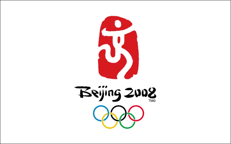
The usage of abstract human images in Olympic logos is not new. However, Beijing appears to have missed the target considerably with this design. The design has a person dancing in the center of a red mark, earning the logo the nickname “Dancing Beijing.”
The figure’s contours resemble a Chinese dragon, and its wide arms represent China’s offer to the world to join in its culture.
Check out the 10 Best Graphic Design Ideas For Modern Businesses
London 2012 (The Modernized Olympic Logo)
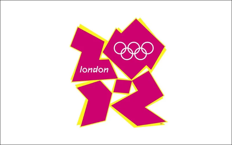
The Olympic logo created for London 2012 is most likely the one that has sparked the most debate in Olympic history. Wolff Olins designed the abstract logo to be playful and edgy, capturing the energy of London as a city.
There are neither vertical nor horizontal lines. Also, there is no indication of a local landmark.
Wolff Olins took a risk, and the outcome is unlike any prior Olympics logo, reflecting London as a city of the present: frantic, vibrant, edgy, and forward-thinking.
Check out: Exploring Retro Futurism– Origin, Characteristics & Art
Rio 2016
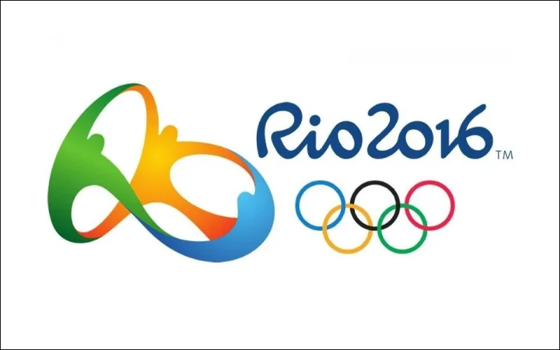
When developing the Rio Olympic logo 2016, the committee aimed to emphasize sentiments of connection and community.
The stretchable 3D logo for the Rio 2016 Olympics seemed fresh and unique. It expressed a wide range of subjects simply, and it felt Brazilian without making overt national references. The design was inspired by Rio’s famed Sugarloaf Peak. The colors of the sun, sea, and forest depicted Rio’s surroundings..
Check out Tinder’s Logo Transformation
Tokyo 2020 (The Second Shot Of Making Olympic Logo)
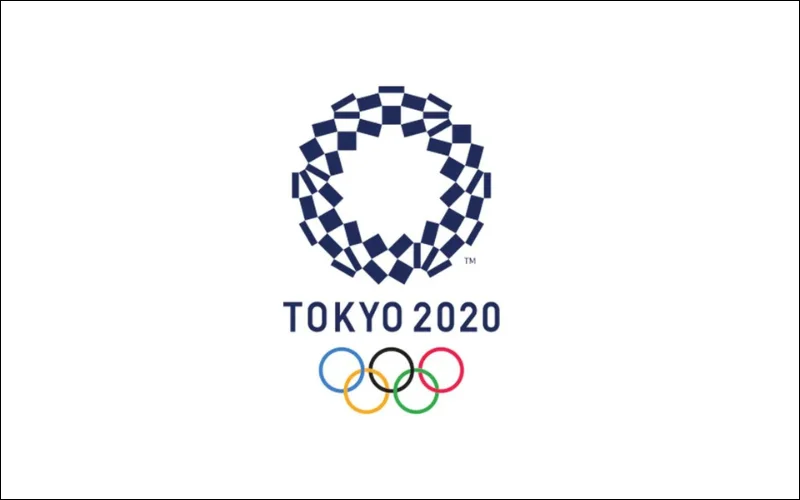
Even though it took two tries, Tokyo succeeded again in 2020. The initial logo for the Tokyo 2020 Games was removed because of plagiarism allegations, however, the event was rescheduled for 2021 due to the Covid-19 outbreak. It was replaced with the work of Asao Tokolo, an artist noted for his complicated mathematical designs.
The design consists of numerous forms of rectangles represented in indigo blue. It is supposed to mimic a design commonly found in kimonos. According to the designer, Asao Tokoro, the logo is intended to depict the oneness of many civilizations and forms of thought. The entire design emphasizes unity, variety, and innovation.
Check out these 19 Best Typewriter Fonts To Transform Your Designs
Paris 2024
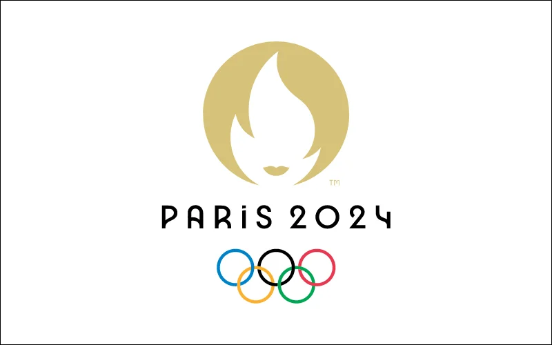
The gold and white hues used in the Paris Olympic logo are intended to communicate richness and elegance. The white form in the center of the circle is meant to represent the flame of the Olympic torch. However, the addition of golden lips makes it resemble a lady.
The design attempts to bring together the gold medal, Olympic flame, and Marianne into a representation of the Olympic legacy with a Parisian flare. However, the design does not perform as well as it could.
Check out: Best Adobe Illustrator Alternatives For Every Need
Closing Thoughts: The Symbolic Power of the Olympics Logo
For decades, Olympic logos created by host towns and countries have served as strong, symbolic images. More than merely expressing emotions of community and inclusiveness, several of these logos have brilliantly showcased the distinct culture of each area hosting the games.
The different Summer Olympic logos created throughout the years have contributed to constantly broadening the reach and effect of the Olympic events, captivating the minds and hearts of vast audiences.
Designing the right logo is not always simple when looking through all the best Olympic logos. If you’re designing a logo that sends the proper message to your target audience you’re on the right track.
Most of the Olympic logos are impressive, except for the London (2012) one. I really don’t understand the design intent of this one. Weird.
Each Olympic logo is designed to reflect the unique culture and heritage of the host city or country. For example, the Beijing 2008 logo incorporated elements of traditional Chinese calligraphy, symbolizing harmony and the connection between past and future.
Hey , The acknowledgment of the challenges in designing an effective logo is a thoughtful touch, reminding us of the importance of conveying the right message.
I love how each Olympic logo tries to mix the five rings with a splash of the host country’s vibe, like the sleek lines in the Tokyo 2020 design. Jeffrey Kurtz’s point about needing a connection to local culture, a sporty feel, and timeliness really hits home – the Munich 1972 badge totally nails that. Seeing the evolution from the classic 1964 Tokyo emblem to the futuristic Paris 2024 version just shows how the games keep reinventing that timeless symbol.
The Mexico 1968 design remains my personal favorite because of how it perfectly blends local art with such a clean, geometric style.