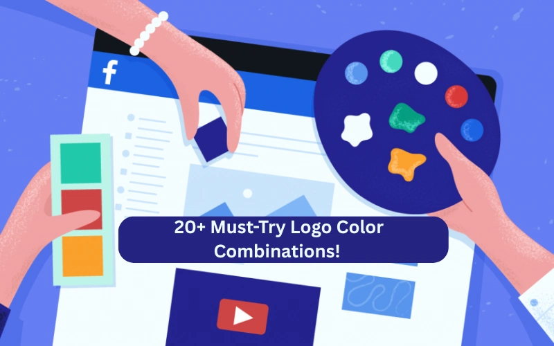
20+ Logo Color Combinations To Skyrocket Your Brand’s Appeal!
Your logo is the visual manifestation of your brand, and the colors you select greatly affect how people perceive your organization. Having the right logo color combinations can tell the story of your brand and evoke emotions, while giving a lasting impression. But when there are so many in the market, how do you select the right palette?
The best logo color combinations, their psychological effects, industry-specific suggestions, and professional advice on how to choose the right colors for your brand identity will all be covered in this guide.
Explore the favorite colors of several industries, learn how to master blending logo color combinations and leverage the science of color psychology in your designs. Start designing a logo that fits your company like a glove today!
Table of contents
- Why Logo Colors Matter?
- Understanding Color Psychology
- Best Logo Color Combinations
- Gold and Black
- White and Blue
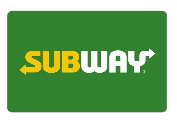
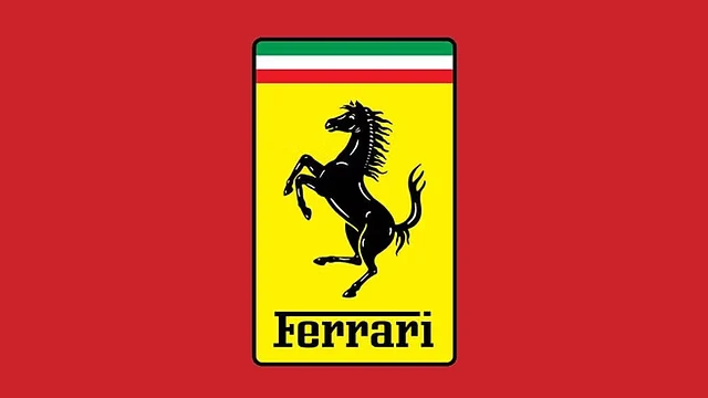
- Yellow and Red
- Brown and Green
- Silver and Purple
- Orange & Navy Blue
- Pink & Gray
- Orange & Red
- Blue & Yellow
- Pink & Purple
- Blue & Pink
- Green & Yellow
- Blue, Purple & Pink
- White, Red & Black
- Blue, Green & Yellow
- White, Orange And Blue
- Purple, White and Green
- Red, Yellow & Green
- Brown, Cream & Gold
- Blue, Red & Yellow
- Green, Yellow and Brown
- Tips for choosing the right logo color combination
- FAQs
- To Wrap Up
Why Logo Colors Matter?
Tints affect behavior and perception. In fact, research shows that people make subconscious judgments within the first ninety seconds of seeing a product. According to The Sociology of Color, as much as 90% of those assessments are made based on color alone. Here’s why so selecting just the right color scheme is important:
- Brand Recognition: Colors contribute to a powerful identity and help people remember your brand. Up to 80% more people can recognize a brand when colors are used consistently.
- Emotional Connection: Customers’ perceptions of and interactions with your brand are influenced by the emotions that different colors evoke.
- Market Positioning: Colors help you stand out from the competition and define your industry. Certain color trends tend to be followed by specific industries.
- Versatility: Your logo will look fantastic on a variety of media, such as websites, social media, business cards, and packaging if you choose the correct color scheme.
Also Check Out: 6 Tips for Startups to Pick Professional Logo Service.
Understanding Color Psychology
Let’s look at what colors mean before we get to color palette schemes:
- Red: It is a color that is frequently used in the food, retail, and entertainment sectors to convey passion, excitement, energy, and urgency.
- Blue: A color that communicates stability, professionalism, security, and trust (widely used in corporate, health care, and financial industries).
- Yellow: Happiness, optimism, friendliness, and warmth (found in fast food, entertainment, and leisure brands).
- Green: expansion, sustainability, nature, and health (often found in organic, eco-friendly, and wellness enterprises).
- Purple: It is the color of creativity, royalty, luxury, and mystery; it’s perfect for high-end brands, technology, and beauty.
- Black: a color associated with exclusivity, luxury, power, and sophistication (used in high-end fashion and technology).
- White: cleanliness, simplicity, and purity (often observed in minimalist and medical designs).
- Orange: conveys playfulness, energy, enthusiasm, and affordability (youthful and creative brands).
- Brown: A color that conveys nature, tradition, authenticity, and reliability (typically seen in organic and rustic brands).
Might also like: Design Logos Like a Pro With These 9 Fundamental Principles.
Best Logo Color Combinations
Gold and Black
This timeless pair emanates affluence and prestige. Gold offers a touch of exclusivity and elegance, while black serves as an eye-catching backdrop. Combined, they signal wealth, premium quality, and high end.
Also Check Out: What is a Profitable Logo?
White and Blue
White provides simplicity and clarity while blue indicates intelligence and trust. This subtle pairing works effectively to build consumer assurance because it helps brands portray an authentic calm authority while eliciting feelings of credibility in purchase states, even when brands are attempting to situate themselves as thought leaders in the category
Check Out: Behind the Adidas Logo: Symbolism of Three Stripes.
Yellow and Red
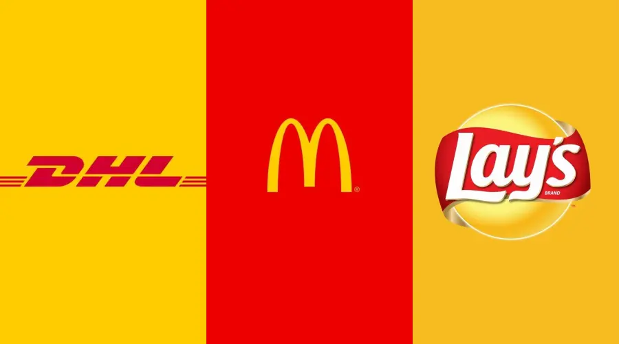
This bold pair provides immediate contrast. Yellow evokes happiness and cheerful feelings, while red creates psychological hunger and urgency. This pairing of colors is effective in steering consumer behavior to attract purchasing attention in an oversaturated product market.
Might also check out: McDonald’s Logo Meaning: Symbol, History & Brand Review.
Brown and Green
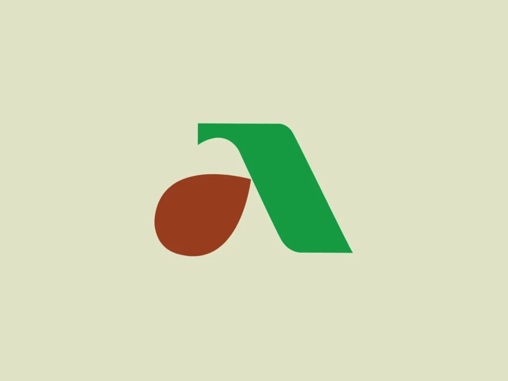
This couple of colors shares reachability, credibility and sustainability. Brown provides a homey anchor and green provided growth and liveliness. This pairing is eco-conscious, approachable, and warm.
Might Also Like To Read: 70+ Logo Templates Ready For Business.
Silver and Purple
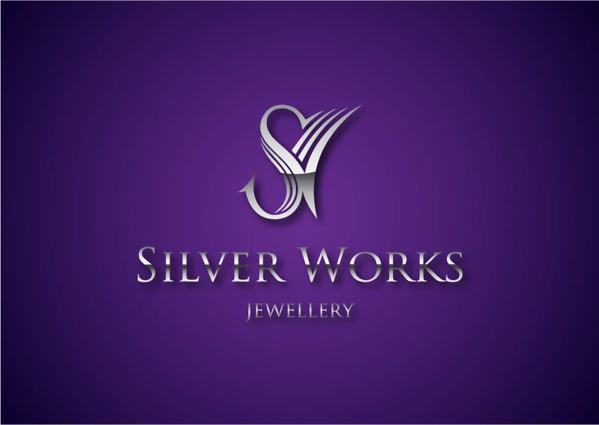
Purple is attractive for its associations of creativity, wealth, and knowledge. Silver also provides modern refinement with its futuristic and sophisticated feeling especially appealing to bold and audacious brands prioritizing creativity.
Also Check Out: The Best Logo Designing Templates You Are Going To Need!
Orange & Navy Blue
This pair is dynamic, balancing feelings of stability combined with feelings of excitement. The navy blue conveys structural stability and trust while the orange layers excitement with welcoming tone. Together they create an engaging experience that remains sophisticated but also feels light-hearted.
Must Also Check Out: 100 Majestic Vector Logo Templates | Commercial License.
Pink & Gray
This smarts pairing includes neutralutilised, balanced gray with soft, affectionate pink. Gray adds grounding and professionalism along with elegance, while Pink adds charm and playfulness. It’s the best of modern coolness and emotional warmth.
Orange & Red
Two of the warmest colors and with one of the highest emotional meaning are orange and red. Both colors are bold, bright, and attention-getting, and this pairing is perfect for brands wanting to energize their audiences and inspire action.
Also Check Out: Mastercard Logo History: How A Simple Design Became Legendary.
Blue & Yellow
The combination of azure-yellow, cheerful, sun-shiny yellow with trustworthy, cool blue creates a brand logo that conveys dependability and positivity. This color scheme is perfect for brands that think outside of the box but carry a warm tone as it balances creativity and consistency
Also Would like to Read: Google Logo Evolution: Design Changes That Shaped The Brand.
Pink & Purple
This dreamy duo combines the sweetness of pink and the creativity of purple. It is appealing to younger audiences and forward-thinking, risk-taking brands as it immediately provokes creativity, empowerment, and a little bit of rebellion.
Also Check Out: Ironov – Dynamic Logo Creator | Lifetime Access.
Blue & Pink
Pink and blue together create a calming, inviting color combination that represents a refreshing blend of soft emotion and calm reasoning. Pink’s playful, uncluttered vibe is grounded by blue’s authority, which makes this combination very easy to adapt across industries
Also Check Out: Baskin Robbins Logo Meaning : Significance & Hidden Details.
Green & Yellow
This combination exudes vitality and freshness. Yellow adds vitality, sunshine, and happiness, while green symbolizes nature and wellbeing. It’s ideal for eco-friendly companies looking to spread optimism.
Might want to read: Top 18 Logos with Hidden Meaning.
Blue, Purple & Pink
This lively and playful trio combines the soothing trust of blue, the imaginative depth of purple, and the emotional warmth of pink. For digital-first brands looking to draw in younger, trend-savvy consumers, it’s visually appealing and perfect.
Also Check Out: 8 Things I wish I knew About Logo Designing.
White, Red & Black

This high-contrast palette is certainly striking and attention-grabbing. White brings balance and clarity, black adds strength and sophistication, while red recalls excitement and urgency. No wonder it’s such a popular choice for brands looking to stand out and make an impact.
Check Out: 1900 Trending Logo Graphic Designs Bundle | Extended License.
Blue, Green & Yellow
This lively, nature-influenced palette takes blue’s stability, yellow’s optimism, and green’s harmony. The result is a fresh yet friendly look that feels energetic as well as centered, making it perfect for creative, people-oriented businesses.
Also Check Out: 1200 Premade Logo Templates Bundle.
White, Orange And Blue

This contemporary and strikingly different trio highlights the fine balance between professionalism and creativity. While white maintains a simple and clean design, orange injects energy and boldness into the concept, whereas blue evokes feelings of trust. This color scheme is greatly used in industries that innovate but are also responsible.
Might also like: Vintage Christmas Logo Badges Bundle.
Purple, White and Green

This striking yet effective color combination blends the whiteness and purity of white, the imaginative inspiration of purple, and the natural allure of greenery. It would suit a modern lifestyle or wellness brand perfectly, as it gives feelings of freshness, creativity, and openness.
Also Would like: Logo Creation Kit: 850+ Logo Elements | Extended License.
Red, Yellow & Green
This daring trio reflects vitality and a sense of multiculturalism. Green brings balance and freshness, yellow adds optimism and happiness, while red contributes passion and action. Together, they create a beautiful, inclusive, and powerful color palette.
Might Also Like To Read : 12 Worst Logo Redesigns That Missed The Mark (and Why).
Brown, Cream & Gold
This earthy, rich blend speaks of tradition and indulgence. A touch of cream mellows the character, while gold brings luxury and refinement and brown adds stability and authenticity.
Check Out: 35 Luxury Brand Logos That Speak The Language Of Sophistication.
Blue, Red & Yellow
Timeless in its vibrancy, balance, and kinetic energy, this trio of primary colors is instantly recognizable. The combination is highly energetic and appealing to everyone due to the fact that blue promotes trust, red creates excitement, and yellow brings positivity.
Might Also Like: 11 Creative Photography Logo Ideas To Try.
Green, Yellow and Brown
This natural and grounded palette represents sustainability infused with a hint of color. Yellow brings energy and friendliness, green is growth, and brown gives depth and trust. This logo color combinations is very earthy and balanced, making it suitable for telling stories in nature.
Also Check Out: Beginners Guide To Business Logo Design.
Tips for choosing the right logo color combination
- Understand Your Brand Identity
- Use Color Psychology
- Limit Your Palette
- Test in Different Contexts
- Analyze Competitors
Check out: 15+ Powerful Reasons Why Are Logos Important (Plus Expert Tips!)
FAQs
To Wrap Up
Selecting the ideal logo color scheme is not just art, but an opportunity for the company to communicate with its clients. The logo color combinations allow your company to enhance its stature, develop trust, and repurpose new or existing ideas with your audience. Whether you’re developing a new logo or redesigning an existing logo—take time to experiment, check for legibility, and create the ultimate selection of colors that demonstrates your voice.
Are you excited about designing with purpose and color assurance? Take a look around, do not hesitate to mix, match, and adjust colors until you arrive at the perfect blend. When you have the proper complimentary colors of your logo, your brand will sing!
Also Read: How A good Logo Will Bring Potential Customers To Your Business.
Einnovention stands out as a versatile IT solutions provider, offering a wide array of services tailored to meet diverse business needs
This page contains information that I find to be helpful, so I have added it to my bookmarks. The excellence of the articles and how they are presented has left me feeling quite satisfied. A tremendous amount of gratitude is extended for the preservation of such wonderful things. Thank you very much for providing me with this website.
Experimenting with logo color combinations taught me how powerful visual identity can be. The right palette instantly communicates emotion and values. I’ve seen how pairing bold contrasts or subtle gradients can elevate a brand’s appeal and memorability. Color isn’t just aesthetic it’s a strategic tool for connection and recognition.
I’ve been stuck on whether to use blue+gray or blue+orange for a client’s tech brand, and the article’s ‘industry-specific color analysis’ cleared things up instantly—turns out cool tones with a saturated accent work better for tech.
Geometry Dash has hundreds of thousands of community-created levels. You can play, rate, share, and even create your own maps with the built-in builder.
It is a must-read for anyone interested in this topic. Thank you for putting this helpful guide together.
This color combination is undeniably perfect! It’s a winning choice that stands out and demands attention!
That’s an interesting perspective. Thanks for sharing.
Excellent write-up! Looking forward to more posts like this.
These 20+ logo color combinations are so inspiring I love how they can help skyrocket a brand’s appeal Perfect for anyone looking to refresh or design a memorable logo
Good information on this website
Very informational content.
Wow. Thanks for sharing these color combination ideas with us!
Thanks for sharing it to us!
Great Article!
Gold and black, what a classic combo! I love how gold adds that touch of class and black brings out the luxury feel. And the bit about yellow and red sparking appetite and urgency? Makes total sense, especially when I’m picking snacks at a grocery store!
Harnessing the right logo color combinations can transform your brand from forgettable to unforgettable, sparking emotional connections and driving consumer engagement like never before.
This is such a helpful breakdown of logo color combos! You’ve really captured how important those choices are for making a brand memorable. I especially love the examples you shared for evoking different feelings. It got me thinking about how even small design elements can make a big impact.
Really insightful breakdown of logo color psychology! The section on complementary color pairings is especially useful — understanding how colors interact is fundamental to brand identity. I work on developer tools and recently redesigned our brand palette for ParseJet (a document parsing API), and articles like this were invaluable during that process. The FedEx and Mastercard examples perfectly illustrate how strategic color choices build instant recognition. Great resource for any designer or brand strategist!
I found the section on complementary versus analogous colors particularly helpful. It’s a great guide for both beginners and experienced designers looking to refine their color palette choices.
The article highlights the importance of psychological aspects in color theory, which is often overlooked. It’s not just about aesthetics, but about making a connection with the viewer. A very comprehensive read!
The mention of gold and black as a combination exuding affluence caught my attention. With gold providing exclusivity and black an elegant backdrop, that’s really intriguing, isn’t it? I’m thinking how these colors might impact a brand’s image on items like packaging or even a shop’s interior decor!
Thank you, i think i have to revise my current logo.
this is a great guide for choosing the right palette to ensure a professional brand identity. i always worry about my designs looking a bit scritchy scratchy if the colors don’t blend perfectly!
Solid piece! Thoughtful analysis and great points throughout. This was definitely worth reading. Looking forward to more from you!
Appreciate the effort in compiling all this information in post.
I find this deep dive into branding psychology incredibly insightful. Thanks!
Loved how this breaks color choices down into psychology + execution: the 60-30-10 rule, high contrast for scalability, and the “still recognizable in black & white” check are the reminders I always need. The combo breakdowns (trust/calm blues, premium black/gold, vibrant but earthy triads) make it super easy to shortlist options instead of guessing. Bookmarking for client mood boards!
This was a surprisingly informative read. I picked up a few things I hadn’t considered before.
This article on logo color combinations is really helpful for understanding how colors affect branding and perception. It clearly explains how different color pairs (like blue & orange or black & gold) create specific moods such as trust, energy, luxury, or creativity.
Great article on logo color combinations! It’s fascinating how color psychology can impact branding. For more creative inspiration, check out FunBoxie.
Love the way you explained this. Very clear and concise.
Informative article! I never realized how much impact colors have on brand perception. Very helpful tips.
Make this special day even more meaningful with heartfelt Bangla birthday captions.
Some useful tips on logos, thank you.
This is an incredibly helpful breakdown of logo color psychology! I love how you explained the balance between warm and cool tones, especially the 60-30-10 rule for keeping designs clean and scalable. It really helps take the guesswork out of branding. For anyone looking to explore more creative design templates
The colour advice was useful. Thanks.
The icons in my game were designed using this method—drawing SVGs via AI. You can find the Cursor Camp Sandbox here.
The point about 90% of brand assessments being based on color alone really puts the pressure on choosing the right palette.