Writing A Resume? Top 10 Resume Fonts For You In 2025!
Hey there, freelancers, internet influencers, and job seekers! Damn serious about your professional life? Wanna hook your desired company or audience at first sight? Not many people care about selecting the right font for their projects. A resume font can turn your life upside down, positively and negatively. Be extra careful; good resume fonts are powerful for triggering mass emotions. The only way to project your professional self is to choose the ideal resume fonts suggested by the resume experts.
Your resume content will only matter once it successfully engages the viewer at first sight. In today’s marketplace, these are the 10 ideal resume fonts based on reliability, perception, and style recommended by a CEO who has read thousands of resumes this year and shares his favorite picks:
Top 10 Resume Fonts:
- 10. Nunito Resume Fonts : Best Font For Resume
- 9. Lato : Great Font For Resume
- 8. Roboto Font
- 7. Calibri Font : Common Font For Resume
- 6. Playfair
- 5. Montserrat: Modern Font For Resume
- 4. DM Sans : Recommended Font For Resume
- 3. Vallery and Chestuh Script Duo
- 2. Open Sans
- 1. Rundeck: Suggested Font For Resume
- Font Psychology: Which font should you choose for your resume?
- Action Replay – Good Resume Fonts
10. Nunito Resume Fonts : Best Font For Resume
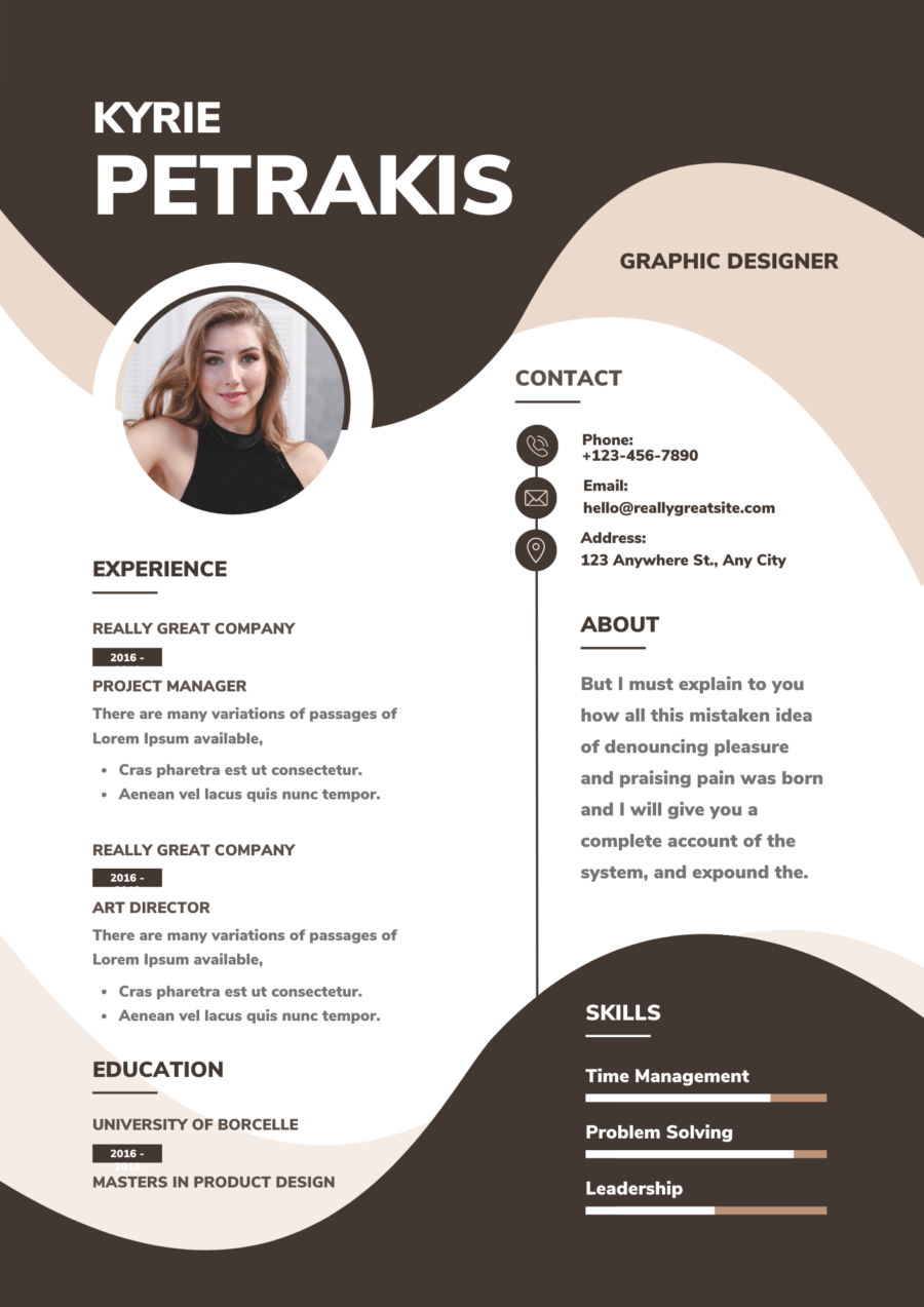
Why choose Nunito for your resume:
Nunito is a geometric font that will make your resume look more organic, even in color, suitable for extended text, and optically perfect.
| Category | Sans-serif typeface |
| Classification | Modern |
| Designer(s) | Vernon Adams |
| Shown here |
Nunito is a free web font on internet browsers, desktop computers, laptops, and mobile devices. |
| Cost | Free Font |
9. Lato : Great Font For Resume
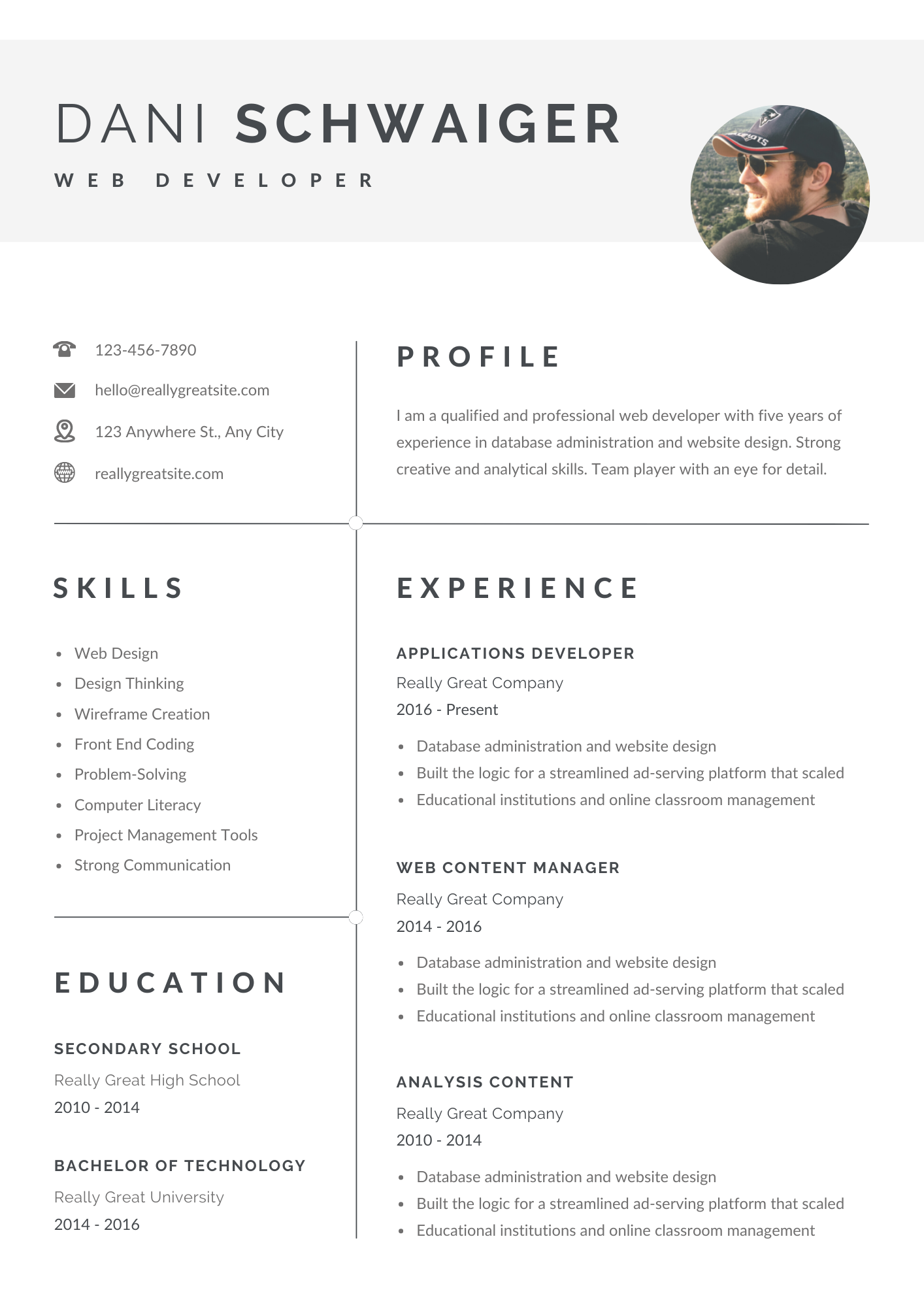
Why choose Lato for your resume: As per a Google survey in 2018, Lato is used on more than 9.6 million websites and is the third most-served font on Google Fonts, with over one billion views per day.
Thus, Lato gives you an advantage in attracting millions of eyes, making it one of the best-fit fonts for your resume.
| Category | Humanist sans-serif typeface |
| Classification | Modern |
| Designer(s) | Łukasz Dziedzic |
| Shown here | Lato has been used in various physical publications, including information signs and election campaign billboards.It is the main font used on iCollege, Georgia State University’s primary learning management system. |
| Cost | Free Font |
8. Roboto Font
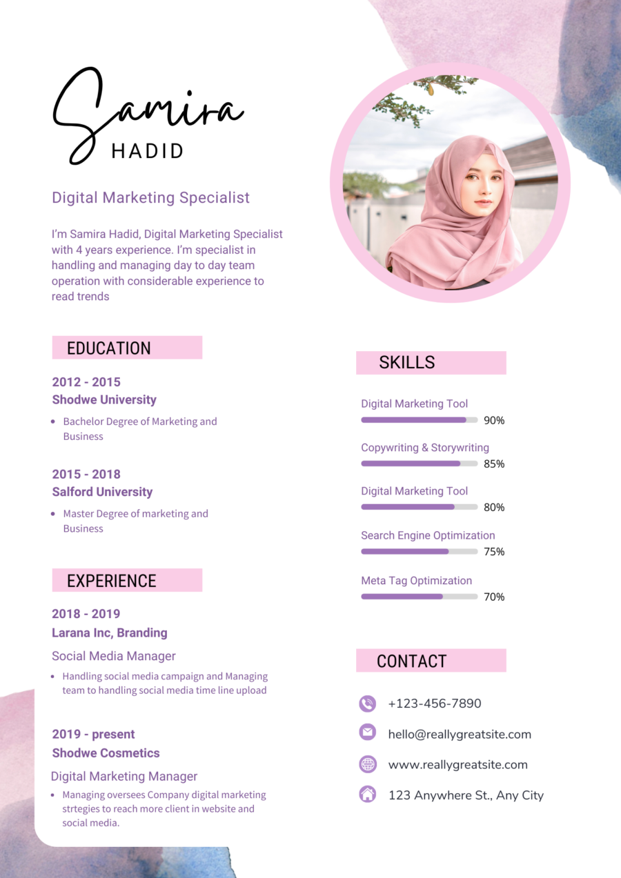
Why choose Roboto for your resume: Unlike other serif and comic sans fonts, Roboto allows letters to take up as much space as needed, thus giving the reader an improved experience. So you can use this font for your resume as well.
| Category | Neo-grotesque sans-serif typeface family |
| Classification | Modern |
| Developed By | Christian Robertson, who had previously designed for his own type foundry Betatype and was responsible for fonts such as Ubuntu-Title and the handwriting font Dear Sarah. |
| Shown here | Roboto is the default font on Android, and since 2013, other Google services such as Google Play, YouTube, Google Maps, and Google Images. Roboto Bold is the default font in Unreal Engine 4 and in Kodi. Roboto Condensed is used to display information on European versions of Nintendo Switch packaging, including physical releases of games. |
| Cost | Free Font |
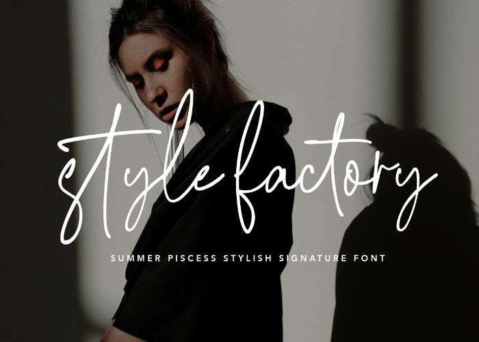
Signatures enhance your identity when included in your resume. Just like Samira, you can add signature fonts to write your name. Pixelo is the top choice for finding such fonts to add to your resume.
You can use the Pieces signature font in your resume. Here is the source link: Stylish Font For Free – Summer Pisces Handwritten Font
7. Calibri Font : Common Font For Resume
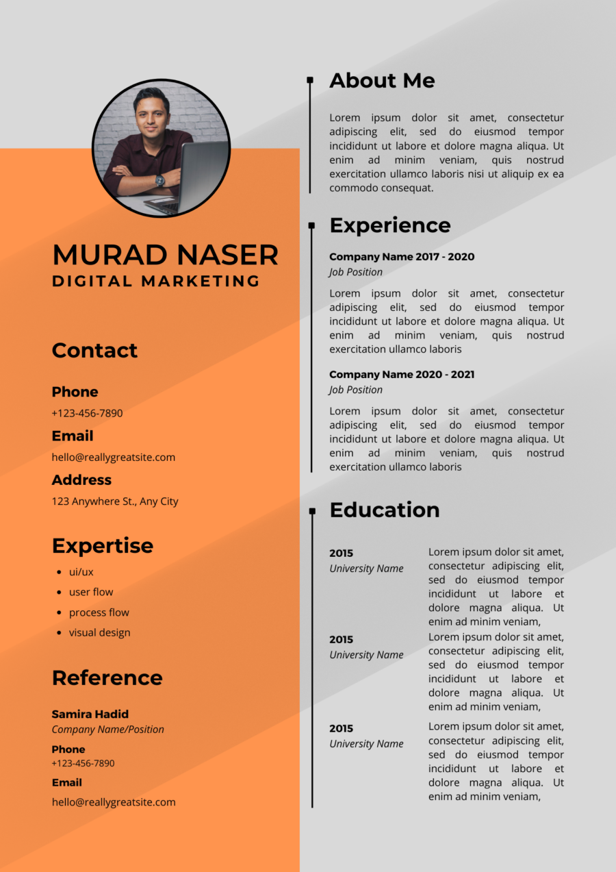
Why choose Calibri for your resume:
Calibri is a default Microsoft font that is highly readable and has a clean typeface for all text sizes. Thus, it is a great choice to give a distinctive look to your resume.
| Category | Geometric sans serif font family |
| Classification | Modern |
| Designer(s) | Lucas de Groot is a Dutch type designer who created Calibri between 2002 and 2004. |
| Shown here | Used as the logo of the Government of Alberta until 2009 and appeared on standard Vehicle registration plates of Alberta until 2019. Defected Records uses the ITC Avant Garde Bold font for its Logos and Posters. |
| Cost | Free Font |
6. Playfair
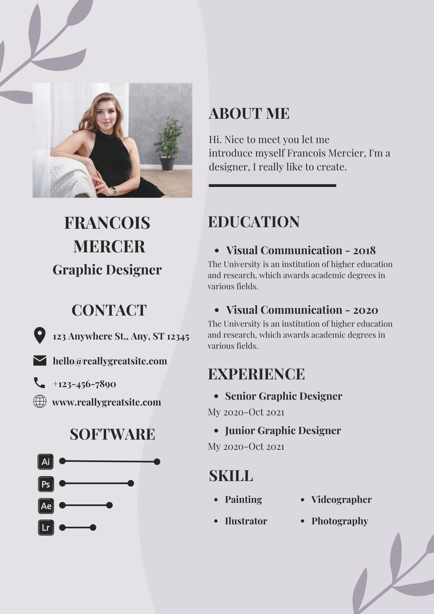
Why choose Playfair for your resume:
Playfair has an elegant and clean typeface. Go with this font if you want to add some flair to your resume while maintaining the same level of professionalism as other San serif fonts.
| Category | Serif Typeface |
| Classification | Modern |
| Designer(s) | Claus Eggers Sørensen |
| Shown here |
In the novel York: The Map of Stars (part three of a trilogy for children) by Laura Ruby, a clue to solving the Morningstarr cipher is encrypted using the Playfair cipher. The Playfair cipher serves as a plot device in a season 2 episode of the 2019 Batwoman (TV series). |
| Cost | Free Font |
5. Montserrat: Modern Font For Resume
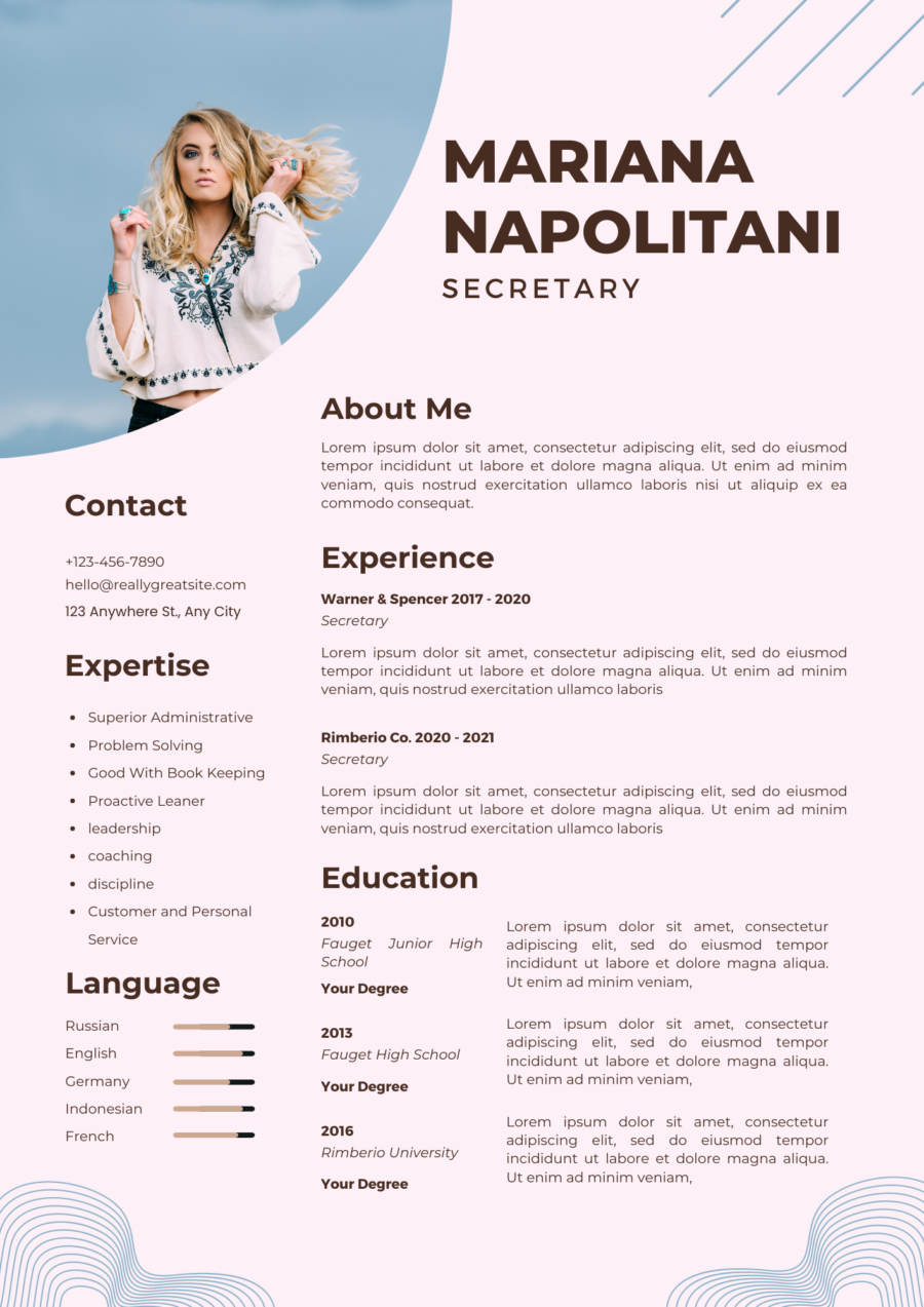
Why choose Montserrat for your resume:
Mainly seen in websites and online media, its high readability and ease of scaling make Montserrat a suitable typeface for printed material, such as brochures, signage, and even books. This makes it a perfect fit for both online and hard-copy resumes.
| Category | Geometric sans-serif typeface |
| Classification | Modern |
| Variations | Montserrat, Classic, extra-bold, semi-bold. |
| Designer(s) | Julieta Ulanovsky, an Argentine graphic designer. |
| Shown here | Since January 2021, it has also served as the Government of Puerto Rico’s official typeface for body text and its agencies’ logos, used alongside Cormorant Garamond for headlines. Montserrat is also popular for mobile apps and games, including Idle Supermarket Tycoon and Snake vs Block. |
| Cost | Free Font |
4. DM Sans : Recommended Font For Resume
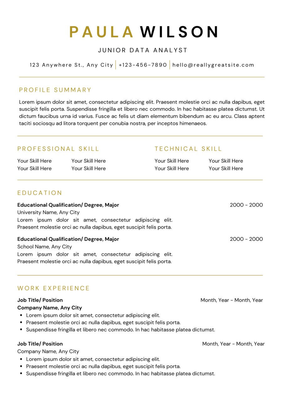
Why choose DM Sans for your resume:
DM Sans is a Google font majorly used for resume text, website template text, brochures, and letters. If you are looking for a minimalistic style resume for your profession then you must choose this font.
| Category | Geometric sans serif |
| Classification | Modern |
| Designer(s) | Colophon Foundry, Jonny Pinhorn |
| Shown here | Google commissioned the DM Sans project from Colophon, an international and award-winning type foundry based in London (UK) and Los Angeles (US), which publishes and distributes high-quality retail and custom typefaces for analog and digital media. |
| Cost | $0Released in 2019 by Colophon and licensed for personal and commercial use. |
3. Vallery and Chestuh Script Duo
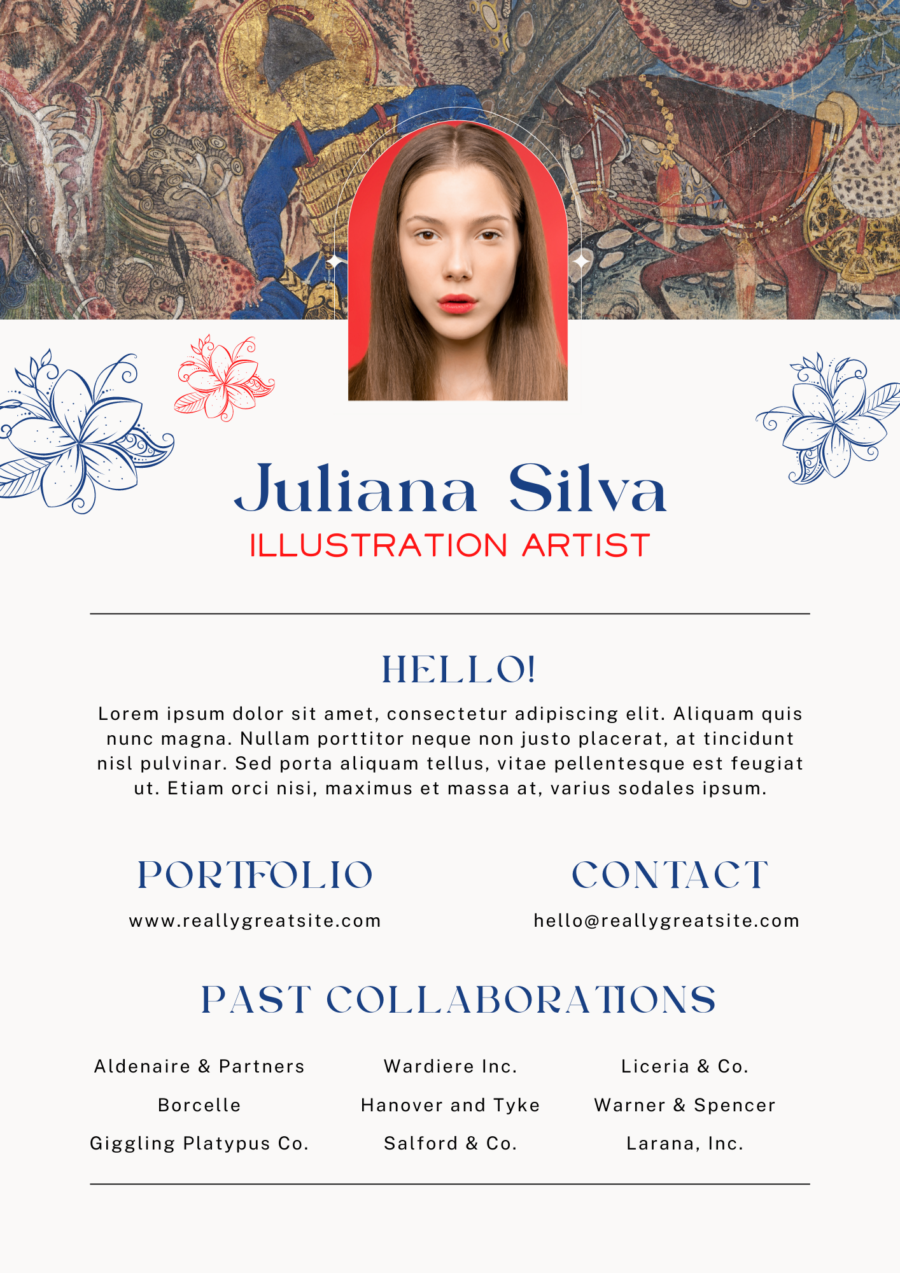
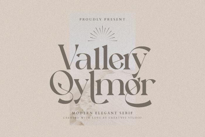
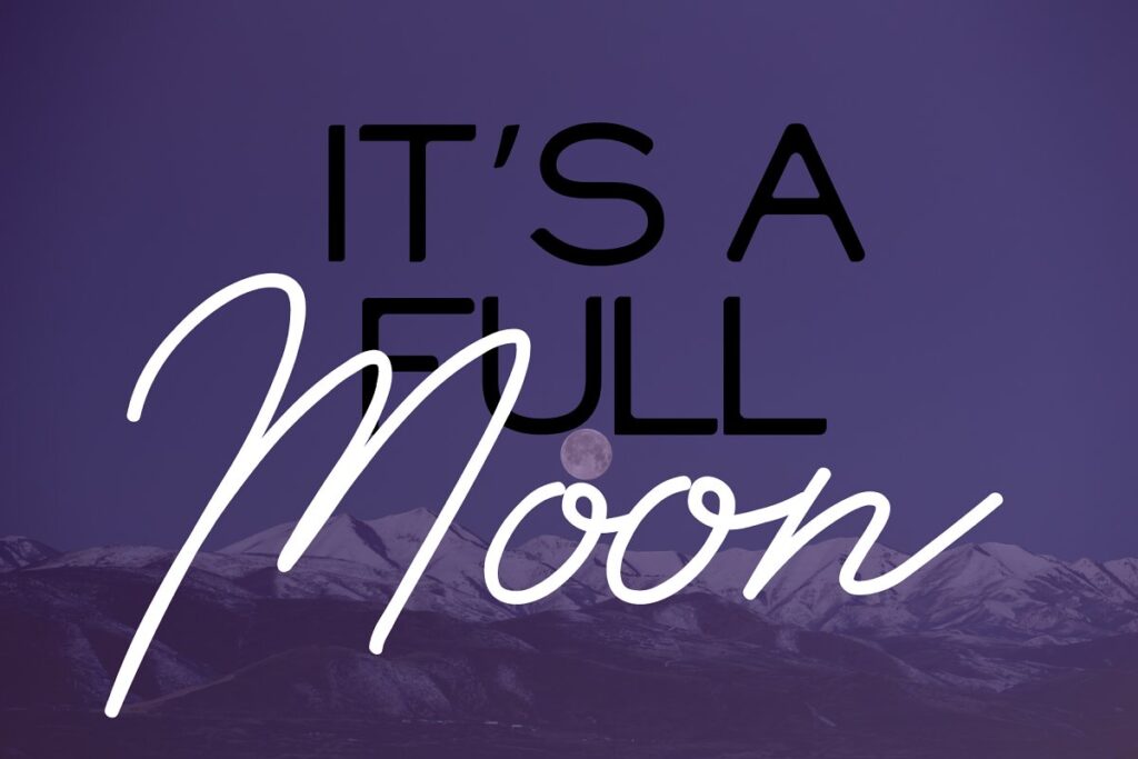
Most sophisticated serif font specially designed for resume titles and headlines. The symmetry and perfect spacing between each letter gives your resume a neat and clean look.
The resume that you see above has the name written in Vallery font, and sub-headlines are in Chestuh font. The descriptive text is in Montserrat font style. This way, you can combine two or three fonts in your resume template.
| Category | |
| Classification | Modern |
| Designer(s) | Creatype Studio (Vallery) and TypoBureau Studio(Chestuh) |
| Shown here | Adobe Garamond Pro (regular style based on Garamond’s work; italic on the work of Robert Granjon) |
| License | Personal use |
| Cost |
2. Open Sans

Open Sans is a popular typeface for its minimalistic style of web design. This font has a friendly appearance with clear-cut, smooth readability in all text sizes, whether used as descriptive text or subheadings.
If your professional requirement is a resume that doesn’t look so fancy and distracting, then this font is perfectly built for you.
| Category | Humanist sans-serif typeface |
| Classification | Modern |
| Designer(s) | Steve Matteson |
| Shown here | Adobe Garamond Pro (regular style based on Garamond’s work; italic on the work of Robert Granjon) |
| Cost | Free Font |
1. Rundeck: Suggested Font For Resume
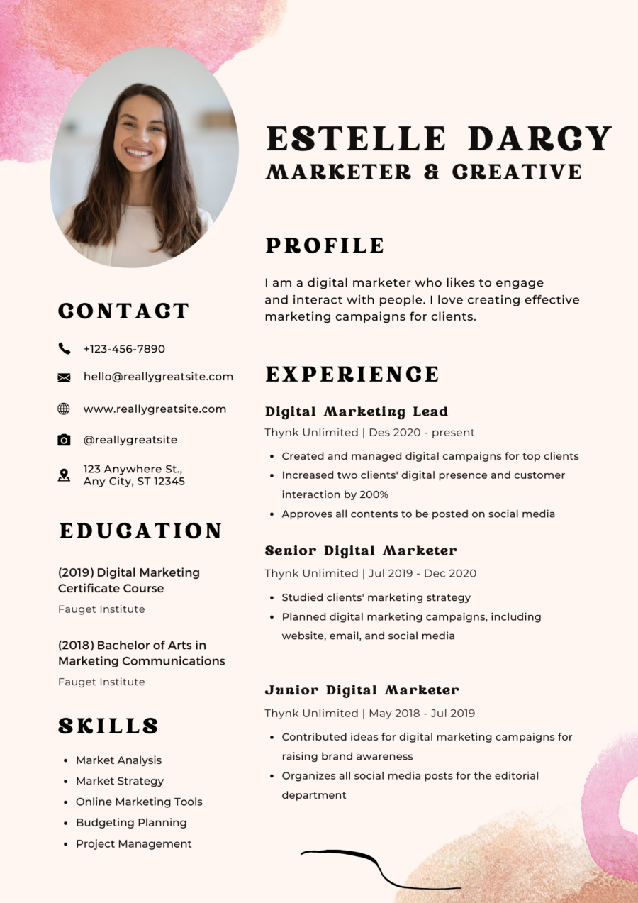
Why choose Rundeck for your resume:
Rundeck is the most preferred vintage font for a resume to create ideally bold and eye-soothing titles and subheadings.
When your name and other headings are highlighted with Rundeck font, it attracts massive attention on the overall page, whether a printed resume or an on-screen document.
| Category | Vintage Serif Display Typeface |
| Classification | Classic |
| Designer(s) | Edignwn Type |
| Usage | Carefully designed for logos, watermarks, book covers, branding, invitations, and resumes. |
| License | Personal and commercial extended use license. |
| Cost |
Font Psychology: Which font should you choose for your resume?
All the top-listed 10 resume fonts have examples of both serif and sans-serif fonts. Psychologists and marketing experts like Nick Kolenda say that sans serif fonts are more readable and approachable for resumes.
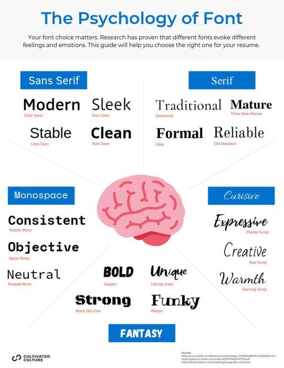
What typically describes a combo of serif and sans-serif fonts when used as resume fonts?
- Clean-looking
- Clarity
- Modern
- Efficient
- Straightforwardness
However, studies from 2012 to 2022 show that serif fonts are seen as more credible and authoritative for branding and advertising. When it comes to writing a resume, you can choose both serif and san serif to bring more clarity and enhance readability.
Action Replay – Good Resume Fonts
Build your resume smartly with your chosen font in Canva. Select any free resume templates and insert your desired font style. It’s as simple as that.
If you want to use freebie fonts like Vallery, Chestuh, and Rundeck for personal use, you can download these fonts easily from Pixelo.
Otherwise, if you want to use these fonts on your resume, you must have a Canva Pro account. If you have a pro account, follow these simple 10-step tutorial: How To Upload Fonts On Canva?
Which font did you choose for your resume? Please tell us in the comment section below. If you have any favorite resume font in your mind, feel free to tell us.
Looking for amazing resume designs? Check out these 20 Designer Resumes To Stand Out
A very worthwhile article
The right font really makes a resume stand out, clean and modern choices go a long way.