World Cup 2014 Fonts by Nike
“It’s the only sport that’s played in every country in the world. It’s played and watched all over the world, it’s the most popular sport in probably 90% of the countries, and then with the World Cup, you have the most viewed tournament of any sport in the world.” – Claudio Reyna
Football fever has gotten to everyone, us included. As Claudio Reyna said in the quote above, football truly is the only sport that everyone watches, and anyone bitten by the soccer bug can tell you why. It is poetry in motion, and every little aspect of the sport plays a role in creating one terrific spectacle, and today, we will be focusing on design in football More specifically, jersey fonts.
The first written evidence of the existence of special football equipment is from 1526, from the Great Wardrobe of King Henry VIII of England, which makes a reference to a pair of football boots. However, it was not until the middle of the 19th century that kits were used to distinguish two teams from one another. It would take another hundred years for numbering to truly catch on, and become the standard.
During the 1970’s teams began creating real brand identity’s for themselves, and the jerseys became an intricate part of it. Shirts with the numbers and names of players became merchandise that supporters could buy, and so design and marketing started to solidify its place in the world of soccer.
In this article, we will be looking at a few excellent examples of fonts, used by Nike in the design of some national teams’ kits. The images are taken from DesignBoom.com, who also took a great interview from Stu McArthur, Nike Football’s design director, which you can read here.
1. Netherlands – Case Crouwel by Nike Football and & Wim Crouwel
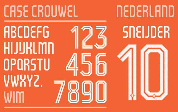
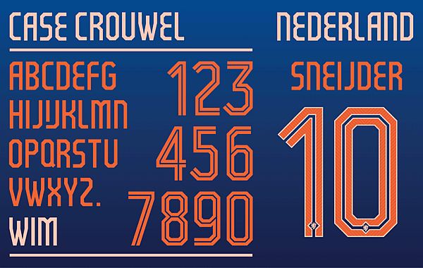
Done by Floor Wesseling, an in-house graphic designer at Nike Football, in collaboration with Wim Crouwel, the font is based on the Gridink typeface, and inspired by Wim’s own Neu Alphabet.
The lines inside the numbers are a callback to the hugely popular styles that were used during the 70’s, and like all the other items on our list, you will notice that the national association’s logo is present at the bottom of the letters. They did this highlight the idea of tradition.
When asked how they came to work with Crouwel, Floor had this to say:
“When we started with the design of the Dutch national team I received a brief where I saw a little image of Wim Crouwel’s ‘neu alphabet’ among the inspiration images. we already knew Wim and asked him if he would be interested to collaborate in making a typeface for the Dutch kits – he happily agreed.”
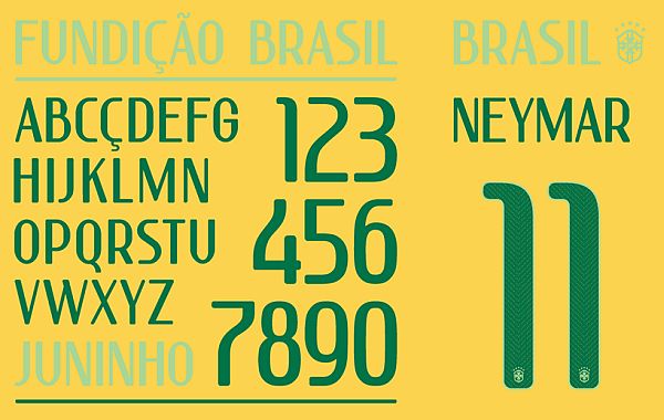
2. Brazil – Fundição Brazil by Nike Football
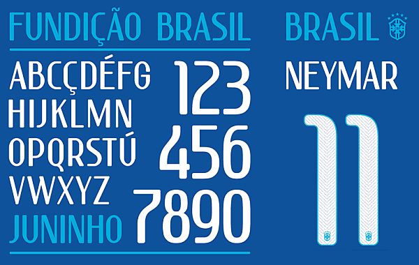
The font Nike did for Brazil’s team is inspired by the classic fonts used in Brazilian hand printed street posters. Like the ones for the Netherlands, additional letters were required to suit the language of the team, so the font really manages to pull off looking traditional and modern in the same time. Also, each letter and number comes with micro pinholes to help the skin breathe better, and the outlines of the numbers are fluorescent so as to be easier to see.
3. France – Stylized ITC Avant Garde by Nike Football
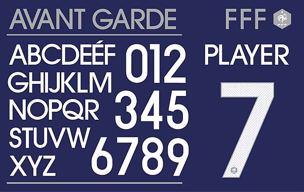
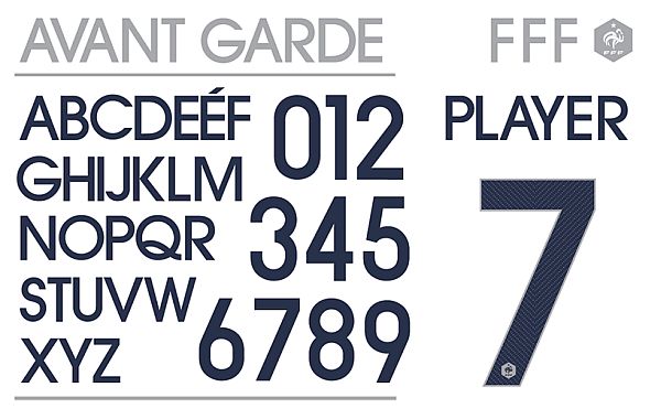
The French kit is different right from the start. Instead of opting for the usual V-neck, the French Federation opted for a collared shirt, which were exclusively used prior to the 1950’s. Nike could have gone all-out vintage, but opted to work on a stylized version of the ITC Avant Garde font, to add that just little drop of modern to the kit. The result is absolutely gorgeous.
4. United States of America – The REX Force by Font Fabric
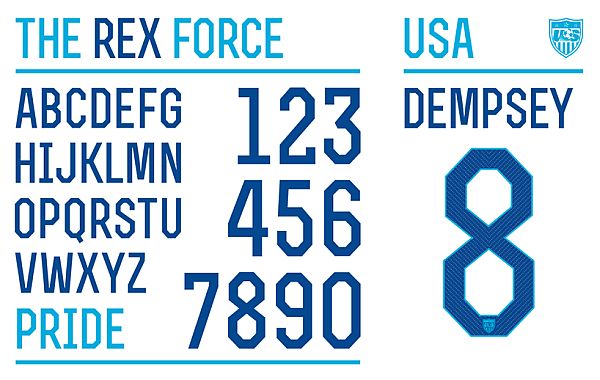
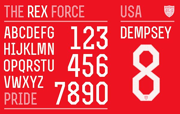
Instead of designing a new font or modifying one, Nike chose to downright use an already existing one for the United States’ national team attire. The reason why we think it is such a cool choice is that it brings to mind the angular font, already in use in other, more popular sports in America, like American Football or Baseball.
Since we are talking about the US, we thought we might also address the word “soccer”, which we have also used quite a lot in this article. Now, although it is most used in the States, the word actually originated in England, and it was also used to refer to what we now know as football. As a matter of fact, it was meant to distinguish the football played under F.A. rules (“soccer” stems from the word “association”) from the football played without standard rules.
5. Portugal – Ronaldo Designed by Nike Football
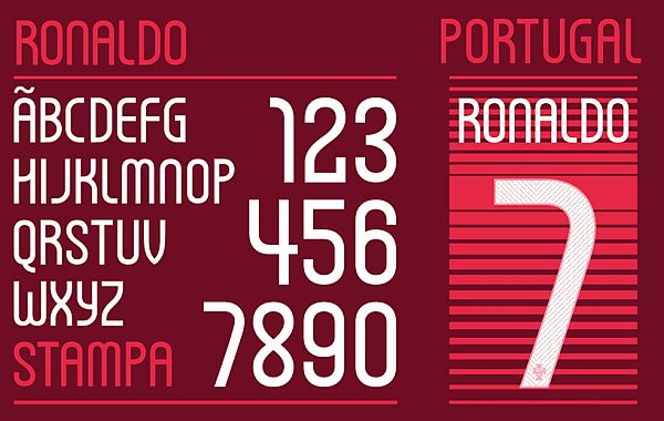
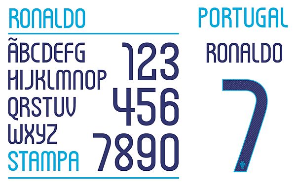
A modern take on Art Deco lettering, the Ronaldo lettering (named, of course, after Portugal’s most famous player) designed by Nike Football is inspired by traditional typefaces used in traditional Portuguese signage. We especially like the numbers used here, as their “roundness” reflect the playful nature of Portuguese football.
6. England – Case Brody Designed by Neville Brody and Nike Football
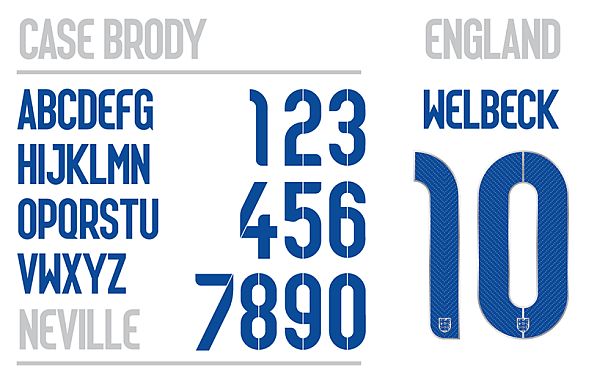
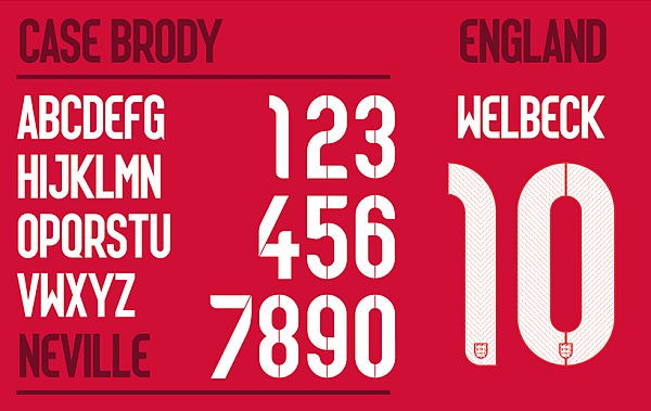
Designed by Neville Brody in collaboration with Nike Football, England’s font reflects the tradition the country has with football. Football was, for all intents and purposes, born in England.
The font also manages to reflect modernity, as England does not want to appear out of touch with what football is today. But no matter what we say about it, we can not really sum it up as good as the designer himself can:
“It has been an extraordinary honor to design the fonts for the England national team. The core inspiration was to focus on the intersection between flair and workmanlike reliability. Small touches emphasize the idea of innovation, invention and surprise, built around a more geometric structure. The industrialized suggestion of a stencil was simultaneously based on a pinstripe motif, combining style with no-frills efficiency.”
That concludes our article on Nike’s totally awesome Word Cup fonts. We hope you enjoyed them, and that they maybe also gave you some design inspiration for your own projects. Don’t forget to tell us what you think about the article, and which fonts you found the coolest, in the comment section below.
Enjoyable lovely article.
Thanks.