Mistakes That Will Make Visitors Lose Interest in Your Blog
This article is strictly based on my experiences as a website and blog visitor and it depicts the situations I have come across and the things that made me lose interest in a blog. Now I’m sure that I’m not the only one which dislikes these things and I wanted to write it down so that maybe the right people will read this and take it as advice.

Working in this field and having to write about design, graphic design, web design I deal with a lot of websites and blogs everyday. I love to interact with people in the design industry, that’s why, when I come across an interesting website I want to come back to it later so I subscribe to it’s RSS; when I love an article or the works of an artist I want to leave a comment and express my thoughts and appreciations and the examples can go on.
So here it goes. These are the mistakes that I recently came across on blogs, which made me lose interest quickly.
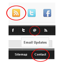
No contact info
Now I don’t accuse the blogs where you click the “Contact us” button and it leads you to an online form. I know from personal experience that you can receive a lot of unwanted emails so if you have a blog which has its share of visitors, this might be a better option.

Nevertheless, the thing that bothers me the most is not finding the “Contact” or “Contact us” button at all! I have collaborated in my work experience with a lot of websites, doing giveaways and other mutual beneficial things, so when I want to contact the owner of a website, the first thing I do is look for a contact option. If there isn’t any, in my opinion, it means that they don’t want to hear from their visitors and that they are missing out on a lot of great opportunities.
No RSS/ No visible RSS icon
Evey week I stumble across a great deal of inspiring and interesting blogs and websites. The situation is like this: I come across an interesting title and I follow it to its website/blog. I enjoy the article and I notice that there are other interesting articles on that blog. I’m having a smile on my face like I’ve hit a small treasure of useful information. I search thoroughly the RSS icon because I want to subscribe to their feed, I want to be updated if new articles come up. My smile fades as I can’t seem to find the RSS icon.

I’m a pretty patient person and I don’t lose my temper that fast. So if I really like a blog, I look everywhere for that RSS. I admit that very few times there wasn’t one, as much as I looked for it. But most of the times it wasn’t visible. It was either hidden between ads, links or other stuff, either too small, either in a different color than orange (I admit that at first I look for an orange icon with the symbol of RSS), either masked into a different icon – hard to be recognized as an RSS.
People, I want to subscribe to your feed, I want to come back to your blog, why don’t you want to make it easier for me?!
No email subscription option
Ok, so you don’t have an RSS, at least you must have an “Email updates” option or “Email news” or whatever you want to call it. I admit that I don’t like to receive blog updates on my email, I hate receiving a lot of emails every day and I want to make my life easier. I prefer to get all the updates from my favorite blogs in my Feed Reader, which I can turn on when I want to read the latest news. But if there is a blog I really like and it doesn’t have an RSS subscription option, I make a compromise and I use the email feed.

I’m taking this chance to hand out some extra advice on this news feed subject. Blog owners, just take in consideration that not all people have Feed Reader or an other tool like this and don’t have the possibility/or they don’t know how to use it. That’s why it’s best that you have, besides your RSS, an email based subscription for those who don’t use RSS.
No Site Search option
I have a lot of inspirational blogs that I follow constantly, they are eye candy for me and some give me very interesting and useful reads constantly. That’s why, when I’m searching for something specific, a topic, more info on something, I turn to my list of helpful and resourceful blogs. When I get there, I’m looking for the Search option of the website, to make my quest easier. It’s very annoying when I don’t find it, or they have a Search option, but not their own! Usually it’s for stock websites. This is a good reason for me to leave that blog or website, because it didn’t live up to my expectations by offering me a chance to search the info I needed.

Eye stressing font/font size/font color
I spend all of my day in front of the computer. I don’t have eye problems (yet), but at the end of the day, when I get home, I don’t want to see the computer, I need to rest my eyes and my back for that matter. Even if I have a pretty good relationship with my monitor, I sometimes run into blogs which have a terribly small font size on their articles, or a hard to read (blurry, annoying font style or color) copy and as much as I want to read that post, if it gives me a head ache, chances are I will most likely leave the page.

Yale University School of Art – this is a wiki website
Now I know that some people are only good at content and not at web design, that they really like purple or other colors and they use it excessively on their text, but you must really empathize with your visitor. Do a Google search, you will find all these wonderful and useful articles with tips about choosing the right fonts for your website, as well as many other tips on general web design which you can put in practice.
Pop Ups
I think you can all agree with me on this one! Pop ups are driving me crazy! I get annoyed when I enter a blog or a website and a big pup up stands before me and the page I want to see. Not to mention that sometimes I can’t ever figure out hot to turn it off because it doesn’t have a turn off button or it’s not in the top right corner where most of them are. I don’t like pop up newsletters (I think that first you have to let me see the content of your blog and JUST THEN I will decide if I want to subscribe or not), big pop up ads which disturb my reading and so on. If you want to place a pop up, make it discrete, place a turn off button and if you see that it reduces significantly the visitors to your blog, let it go!

Too much information
Yes, this bothers me! I don’t like pages that are full of information, many columns of information, lots of banners, online forms, all placed in a chaotic manner on a page. I like simple things. I like a correct use of white spaces and well organized pages. When I’m visiting a blog, I would like to have as few as possible focus points, preferably just one. For example, if I’m reading an article, I don’t want to be distracted by a colorful ad which changes color every 2 seconds.

Followup comments
When I read a great article or an intriguing one, I like to express my opinion and I leave a comment. I like to leave relevant comments to a blog, I always read the whole post and if it triggers something in me, I state what’s on my mind. I would like to know if the person who wrote that article has read my comment and what he thinks of it – he appreciates it, if he agrees or disagrees with my opinion. So that’s why I always check the followup comments box – if there is one! I like to think that people write articles to share some knowledge and to communicate with other people, to establish a relationship with their visitors. So if you place a call to action question at the end of your article, that means you want to engage your readers, right? So why not engage yourself in the discussion, answer your readers, but make sure that they get your replies – have a followup comments check box.

Please note that the image above is not the actual comment box, it’s just a picture I used as example. The real comment box is below the article.
Now these are only a few things which bothered me as a visitor, but I think that they are among the most important ones. It’s your turn now to complete the list. So:
Which are the mistakes that made YOU lose interest in a blog or website?
Simple mistakes but it collapse whole output..well explained.thanks for sharing
I am such a dork.
You will not believe how long I tried to click the image of that comment box up there to try and comment on your blog. I even opened firefox and started to try. Heck I had already started verbally drafting the email I was going to send to you about your comment box not working in Gpogle Chrome.
I feel silly now, but I will say that I am sure that I am not the only one who will encounter this as an challenge, though most wouldn’t admit their defeat by an image publicly. I’m secure enough in my nerdiness/dorkitutde to do so.
However, I will say that this article is FANTASTIC and has very useful information for aspiring bloggers. I agree with all the points you have touched on.
Just update it with one more topic:
Don’t include images of comment boxes in your posts because inevitable there will be one dull-blogger who will go insane attempting to click on it to comment on your blog, and she could be a very valuable reader who wants to make long, usual comments about her shortcomings and your bloggery.
Seriously, great blog and design.
I’ve almost convinced myself to go from discuss to the integrated wordpress comments system. What do you think?
Thanks!
The Nerdy Nurse
Hey Nerdy Nurse, I’m laughing out loud here :)) Thank you for your appreciations and for your tip ;) I will get back to you on your question, as soon as I run it by some competent persons I have here :D
I think if this were a test, my sites would pass. I pretty much agree with all your points. I am lacking a contact link, but there’s enough ways to leave messages through comments.
Thanks for sharing such great article. I think the tips you shared here. will be really effective for our work. Thanks again.
Thanks for sharing such a useful tips. Let me highlight the fact that it did help. Thanks a lot!!!
Thanks a lot for these simple but very helpful tips.
I also clicked the original comment box myself for about 30 seconds, doh!
I think if a business has a blog , then it should mirror the look of the original site, to keep things looking consistent. I’m glad the days of Geocities have long since been abolished…but not forgotten…
Hi, really you give a worthfull information.
Keep Share like this.
visit my blog
Dotnetblog
We were loosing our visitors in our blog. Atfer reading this superb post, I have identified my problem. Thanks for sharing.
How to lose visitors to the blog.
They are blog readers who make a blog interesting, depending on how involved readers that the author will have more or less willing to keep the blog active and updated, with good entries. But we find much online as increasing blog visits but little like losing visitors to the blog so today I'll try a little that theme.
blog advertising fill: one when it comes to view the content and the hype can take too many outputs blog through the links of the ads and the reader eventually gets tired and does not fall over.
trickle of blog: a blog does not enter just to see the index, want to see more, browse categories, read full post, etc, but each page load the browser it takes 15 seconds or more it is normal that page be closed without ever being seen.
forced to register to comment: I hate pages that do this, if I see that are so close and not directly enter anymore, one must think of the convenience of the reader and this is not at all comfortable.
forced to register for access to some common content: this can be misunderstood, what I mean is forcing eg registration To read a full post, see the links in the post, upload images, view comments. It can be useful to have some part is not published, such as discharges or things like that, but not good as restricting as common as I mentioned before, as will understand no one wants to waste time registering to see a link that may not even serves them.
bad page design: this is what makes a website remember and is in the memory of each, provided the design is original and striking the visitor will know that web distinguish from others of the same thematic. You humans are accustomed to associate with quality and design to convey the feeling of quality is important. And here I want to ask some advice: do not use funds in letters of the same color, eg black-letter background blue sky background gray-letter.
pop-up ads on each section of the blog: we all know that if rentabilizamos the web with a pay per impressions and visits our blog has enough pop then the income can signifcar interesting, but… to fill the reader would like to pop Habre whenever a post or browse a category? none, it would be best not to use this system or use it in a few short pages.
I hope these tips to avoid losing visitors greetings.
visit more information http://www.rkinfo.in/blog.html.
What a great article. Thank you very much for it, I have gained some new and valuable knowledge from it. Thanks again.