Stop Relying on This 5 Design Trends
“If you can’t draw as well as someone, or use the software as well, or if you do not have as much money to buy supplies, or if you do not have access to the tools they have, beat them by being more thoughtful. Thoughtfulness is free and burns on time and empathy.”
– Frank Chimero
Trends usually start out as being a good thing, getting highly popular because of their likeability, and because they satisfy the needs of the users. But what happens when trends reach their golden age end? They become obnoxious, that is what happens. We are here to tell you what design trends you should stop relying on. Mainly because you will lose traffic, and partially because we hate them. Enough chit chat, lets get down to the list.
1. Infinite scroll
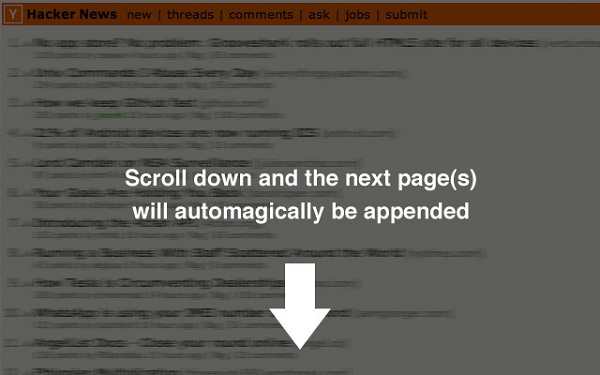
When a website has footer content that highly interests its users, and it also has infinite scrolling it may cause a problem. I don’t want to be made to scroll down through hundreds of pages until I reach what I want to see. This trends is loved by so many people, and yet, so many don’t understand the problem it causes. “A web design technique that prevents the browser scroll bar from scrolling to the bottom of the page, causing the page to grow with additional content instead. “
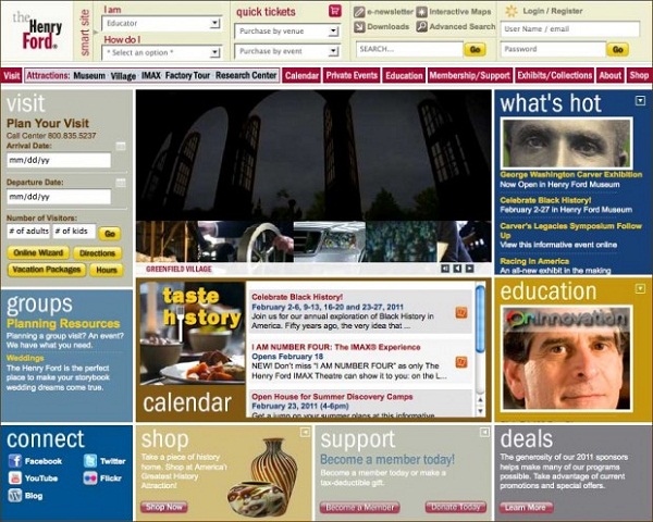
2. Parallax Websites
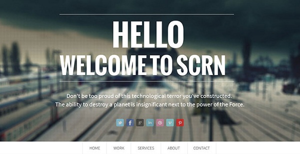
There was a time when Parallax websites were incredibly rare, and web designers truly worked hard for their completion. Don’t get me wrong, web designers, developers work hard now also, but the rarity and beauty of what made a Parallax website has been long forgotten.
It used to mean layers, upon layers, upon marvelous design creating the illusion of depth. Now, most Parallax websites are just former shells of their old selves. Nothing that makes you drop your jaw and be amazed. “ Parallax is a displacement or difference in the apparent position of an object viewed along two different lines of sight, and is measured by the angle or semi-angle of inclination between those two lines. The term is derived from the Greek word παράλλαξις (parallaxis), meaning “alteration”.
Nearby objects have a larger parallax than more distant objects when observed from different positions, so parallax can be used to determine distances. Astronomers use the principle of parallax to measure distances to the closer stars. Here, the term “parallax” is the semi-angle of inclination between two sight-lines to the star, as observed when the Earth is on opposite sides of the sun in its orbit. These distances form the lowest rung of what is called “the cosmic distance ladder”, the first in a succession of methods by which astronomers determine the distances to celestial objects, serving as a basis for other distance measurements in astronomy forming the higher rungs of the ladder.”
3. Floating Elements
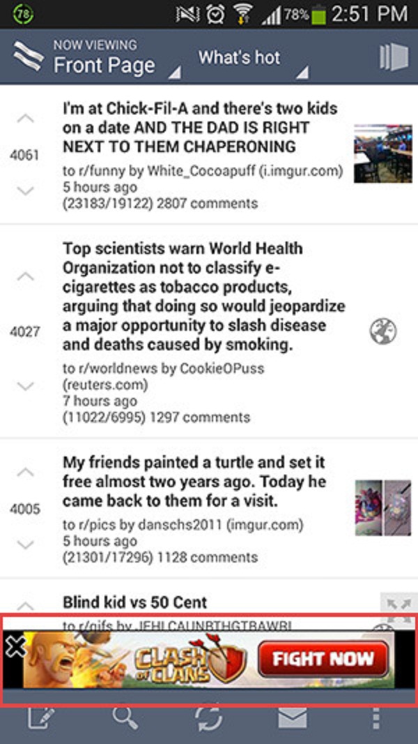
Design wise, it’s horrible. User likeability? Inexistent. Obnoxious and irritating? Double check. Then why are they so popular amongst websites? Well because marketing wise they bring money based on how many clicks it has garnered, and the user traffic it has per month. If floating elements aren’t ads, the are surely trying to get your attention and click them. Nevertheless they are something that needs to disappear from the holy realm of the internet. It is a blasphemy towards the sacred world wide web, and we won’t stand for it anymore!
4. Pop-ups and Splash Pages
I can’t express how much I hate pop-us and splash pages. One minute you are just surfing a website for its content, trying to find some information, then, in a matter of milliseconds, a huge splash page appears that wants to redirect you to buying a new Honda. No Mr. Marketing, I don’t want to own a car, leave me alone, I’m just looking for what bread is best for my diet.
“A splash screen is a graphical control element consisting of window containing an image, a logo and the current version of the software. A splash screen usually appears while a game or program is launching. The term may also be used to describe an introduction page on a website (in which case it’s often referred to as a “splash page”). Splash screens cover the entire screen or web page, or simply a rectangle near the center of the screen or page. The splash screens of operating systems and some applications that expect to be run full-screen usually cover the entire screen.”
5. Sidebars
I get it, sidebars help you navigate a website faster, but stop adding so many sidebars and search bars and bars and bars and bars to your website. It is a trend that needs to disappear. Make just one sidebar, that has a search bar included. “The sidebar is a graphical control element that displays various forms of information to the side of an application or desktop user interface.In a number of predominately-Mac OS X-based desktop applications, drawers, which draw out of the application window rather than expand from the inside like most application sidebars, are used.
Drawers were very common in early versions of Mac OS X. The standard email client, Mail, used drawers for listing mailboxes prior to 10.4 (“Tiger”), when they were replaced by a traditional sidebar. A number of other Apple-created applications and third-party applications have replaced drawers with a sidebar, or re-designed the interface to make a sidebar/drawer unnecessary. Apple’s Human Interface Guidelines now recommend against their use. Formerly drawer-heavy apps, like iCal and Adium, now contain no drawers at all, and instead display an optional sidebar within the main window. “
This was our list of 5 design trends you should stop relying on. If you have anything to add, maybe a tip, a trick, or another trend designers should avoid, please feel free to do so by posting in the comments section below. We would love to hear from you!
The vintage design/flat trend. I cannot get any young designer to come up with something that has not one single type of vintage element. Also the reliance on UI kits as well.
If i wanted monkeys i would have hired them. Its so hard to find innovative designers at present.
Hello Andrew,
It seems that vintage is a trend these days. But we agree on this, designers should be able to develop any creative designs and also innovative :)
No more floating elements. You mean like the “scroll to top” arrow on this site? :)
Haha, yes Carl, I know this blog needs improvement, but I think we’re all here to learn, aren’t we? :)
All of your posts are quite instructional, and your website’s content is very user-friendly.