6 Must-Know Typography Terms For Every Designer
“Google has the functionality of a really complicated Swiss Army knife, but the home page is our way of approaching it closed. It’s simple, it’s elegant, you can slip it in your pocket, but it’s got the great doodad when you need it. A lot of our competitors are like a Swiss Army knife open – and that can be intimidating and occasionally harmful.”
– Marissa Mayer
Every designer should get acquainted with typography terms. Besides making you look more professional amongst your creative peers, it also teaches you some important stuff that will surely come in handy in your projects. If typeface, tracking, kerning, baseline and ascender/descender don’t sound familiar, just scroll down and we will elucidate the mystery.
1. Typeface
Well, our lord and savior wiki describes it as this – “In typography, a typeface (also known as font family) is a set of one or more fonts each composed of glyphs that share common design features. Each font of a typeface has a specific weight, style, condensation, width, slant, italicization, ornamentation, and designer or foundry (and formerly size, in metal fonts).
For example, “ITC Garamond Bold Condensed Italic” is a different font from “ITC Garamond Condensed Italic” and “ITC Garamond Bold Condensed,” but all are fonts within the same typeface, “ITC Garamond.” However, ITC Garamond is a different typeface from “Adobe Garamond” or “Monotype Garamond.” There are thousands of different typefaces in existence, with new ones being developed constantly. The art and craft of designing typefaces is called type design. Designers of typefaces are called type designers and are often employed by type foundries.
In digital typography, type designers are sometimes also called font developers or font designers. Every typeface is a collection of glyphs, each of which represents an individual letter, number, punctuation mark, or other symbol. The same glyph may be used for characters from different scripts, e.g. Roman uppercase A looks the same as Cyrillic uppercase А and Greek uppercase alpha. There are typefaces tailored for special applications, such as map-making or astrology and mathematics.”
2. Tracking
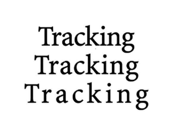
No, we are not going to talk about the greatest tracker of all time Darryl, the zombie killer. Psst, pro tip, go watch “ The Walking Dead” it is amazing. But that’s not the point of this discussion. We are here to talk about tracking as in letter-spacing – increasing or decreasing, to a degree, the space between letters. It should not be confused with kerning, that is something completely different.
“Letter-spacing adjustments are frequently used in news design. The speed with which pages must be built on deadline does not usually leave time to rewrite paragraphs that end in split words or that create orphans or widows. Letter-spacing is increased or decreased by modest (usually unnoticeable) amounts to fix these unattractive situations. “
3. Kerning
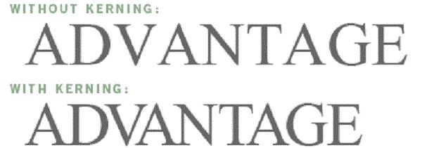
Like I said earlier, it should not be confused with tracking, it is a completely different thing. It is also known as mortising, but usually just kerning. Kerning is the process of – “adjusting the spacing between characters in a proportional font, usually to achieve a visually pleasing result”. Fun fact, the origin of the word is “kern” and it’s from that fancy place we like to call France, though they spell it “carne”.
It means projecting angle. “In digital typography, kerning is usually applied to letter pairs as a number by which the default character spacing should be increased or decreased: a positive value for an increase, a negative value for a decrease. The number is expressed in font units, one unit being a certain fraction of an em (one em is the type size currently used). Different fonts may use different units, but common values are 1000 and 2048 units/em.
Thus, for 1000 units/em, a kerning value of 15 means an increase in character spacing by 0.015 of the current type size (the kerning units for a given font are the same as the units used to express the character widths in that font) Most kerning adjustments are negative, and negative adjustments are generally larger than positive ones. Adjustments for different pairs within a given font can range from a tiny 2 to over 100 (when expressed as 1000 units/em). The adjustments for a given pair vary greatly from one font to another.”
4. Baseline
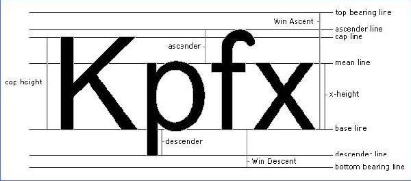
As the legendary Les Claypool puts it – if you desire a baseline, you need passion as your guide. “In European and West Asian typography and penmanship, the baseline is the line upon which most letters “sit” and below which descenders extend. The vertical distance of the base lines of consecutive lines in a paragraph is also known as line height or leading, although the latter can also refer to the baseline distance minus the font size.
North Indian scripts have a characteristic hanging baseline; the letters are aligned to the top of the writing line, marked by an overbar, with diacritics extending above the baseline. East Asian scripts have no baseline; each glyph sits in a square box, with neither ascenders nor descenders. When mixed with scripts with a low baseline, East Asian characters should be set so that the bottom of the character is between the baseline and the descender height. “
5. Ascender/Descender
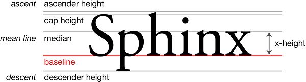
Well, the ascender or descender, in typography, is a part of that minuscule letter, that teeny weeny letter that comes straight from the Latin-derived alphabet, and it expresses the mean line of a font. It makes the font more recognizable, more “warm” if you choose to put it like that.
6. Mean Line
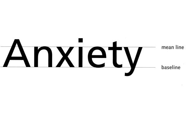
I mentioned it at #5 in our list, and I think I should explain it further, so there shouldn’t be any confusion. The mean line, or midline is half the distance from the baseline to the cap height. “Round glyphs will break (overshoot) the mean line slightly in many typefaces, since this is aesthetically more pleasing; a rounded shape will appear visually smaller than flat-topped (or bottomed) shapes of equal height, due to an optical illusion.”
Hope the mystery is no more, and you, the reader understood what these typography terms are. If you have anything to add, please do so by posting in the comments section below. We would love to hear from you!
Thanks for sharing all the other info you do. Where can I find information like this that’s written so well? I’ll keep an eye on information like that.
Understanding typography terms is crucial for designers. Typeface, tracking, kerning, baseline – each plays a vital role in design precision and aesthetics. It’s like mastering the tools of the trade for creating visually appealing and professional work.
In short, a typeface is the overall font family (like ITC Garamond), while fonts are its specific styles. Designing them is a craft called type design, done by type designers.
I couldn’t agree more with the importance of understanding typography terms as a designer. Typeface, tracking, kerning, and other terms play a crucial role in creating visually appealing designs. It’s fascinating how these seemingly small details can make a significant impact on the overall aesthetics and readability of a project.
This explanation clearly separates typefaces from individual fonts, which is something many people mix up.
Great article! Understanding these typography terms is essential for every designer. It really helps in creating visually appealing designs. Thanks for sharing!
Cowboy Safari takes you to endless savannas where every creature has a unique personality to conquer.
Challenge yourself with daily Solitaire puzzles and climb the leaderboard.
Many people face issues while using online services, but your guide on the portal lto makes everything simple and easy to understand for beginners.
haha, this is so fun!