Responsive Web Design – the Future Is All about Flexibility
One of the most important things to keep in mind when creating a website of any kind is how it works and looks for visitors and users. And generally, many website designers and developers do manage to make their websites user friendly. Many if not all browsers can run almost every available website and quite a few have mobile versions with a different layout for devices such as cell phones.


Still, what if a user does not have a computer with a large enough screen or uses a device such as a tablet or very small netbook computers? What if the website does not offer a mobile version? Many websites today have responsive web design and this fixes quite a few issues that show up for users of sites that do not incorporate this. But what does that mean and what issues can show up without it?


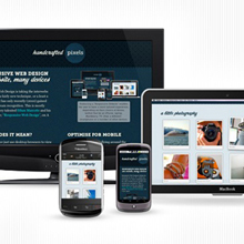
Responsive web design refers to the design of a website that will change depending on the size of a viewing environment for any potential user or visitor. For instance, while a site may completely fit a 1440 x 900 computer monitor perfectly, only a small bit of it may show on an 800 x 600 laptop or netbook screen, obligating the user to do quite a bit of scrolling.

Alternatively, a site may look very nice on a smaller screen but once someone with a very large screen tries to access it, it may seem small and have a great deal of extra space around the edges; this can, unfortunately, make it look poorly designed. Other websites, on the other hand, are too large or wide no matter what resolution the screen is due to poor design choices. These problems can drive away visitors who cannot use or see the website properly and can cause a decrease in customer numbers if that site offers services, goods, or subscriptions.


Amateur web designers may find this sort of web design extremely difficult to master at first, as it typically requires the use of Cascading Style Sheets. CSS is not a terribly difficult thing to learn, however it can be rather daunting when someone is just starting to using it. However, the benefits make it worth the effort. In addition to making responsive web design accessible, CSS itself can be used in many ways to improve web design in general, making it look and feel sleeker and more eye-catching.


With RWD, a website may be built to adapt to the different viewing sizes required via media queries, demanding no extra effort from those viewing it. It may flex, move or shrink to fit a resolution, and even images can be set to follow suit without obstructing other important parts of a website’s design or causing a loss of overall quality. This ensures that no matter what screen or device the user may be viewing it from, the website will always look its best and be easy to navigate.

If you have a website and have begun to consider changing the design to implement this but do not know how to do so yourself, do not worry about the need to teach yourself complicated CSS as quickly as possible.

It is simple and easy to hire a web designer to make these changes for you, and it will definitely be worth all the energy and resources you’ve put into it when the users are able to see what you want them to see without any issue of losing or obscuring the content.
great article :) thank you I've learned more :) hey I've found this responsive prestashop theme check it here http://dapurpixel.com/theme/rumahbatik-responsive.
exclusive tutorials useful everyone.
Mobile internet marketing is the future. – SEO in Philippines.
i love this text. tks for this. eu amei as dicas de design
eu amei esse tezxto obrigada por eletks for this text