Cyberchimps Responsive Theme Review – Alternative to Astra?
When choosing a WordPress theme, the options seem limitless. You can opt for a free theme or upgrade to a paid one to access certain features.
It can be quite challenging to find the perfect theme with so many options available.
However, amidst the vast sea of WordPress themes, there is a popular theme called the Responsive Theme.
Responsive Theme by Cyberchimps stands out as a powerful and feature-rich WordPress theme that simplifies the process of building elegant websites.
What sets it apart is its exceptional speed, minimalistic design, and extensive customization options.
In this review, we’ll take an in-depth look at Cyberchimps Responsive theme. We will walk you through its main functionalities and standout features and help you decide whether it’s the right choice for your WordPress website.
So, let’s get started!
- Responsive WordPress Theme Overview
- Features of Responsive WordPress Theme
- Major Factors That Make Responsive Theme Standout
- Responsive Theme’s Pricing and Support Review
- How to Install Responsive Theme
- Final Thoughts: Is Responsive Theme Worth It?
Build faster Elementor websites with Responsive Addons for Elementor – Get it for free!
Responsive WordPress Theme Overview
Responsive theme is a modern WordPress theme that offers a unique set of features and customization options, giving it an edge over other themes in several aspects.
As the name suggests, the theme is responsive, meaning it’s optimized for viewing on all devices, including smartphones, tablets, and desktop computers.
What sets this theme apart is its adaptability to various niches, making it a perfect solution for your needs.
The theme is translation-ready and search engine optimized, helping you build a WordPress website quickly and providing customers with an excellent user experience.
Features of Responsive WordPress Theme
Here’s why this theme is the perfect solution for your WordPress website:
- Fully Responsive Design: The theme adapts to various screen sizes and platforms, giving users of desktop, tablet, and mobile devices the best possible viewing experience. It’s compatible with popular browsers such as Safari, Chrome, and Opera.
- Highly Customizable: The theme provides a lot of customization options. You can customize the website templates to suit your needs or build your site from scratch.
- Translation Ready: Multilingual support in Responsive theme lets you translate content in multiple languages. The theme is currently available in 45 languages.
- 150+ Readymade Website Templates: Responsive is a multipurpose theme that offers ready-made templates suitable for almost any niche. Whether you’re building a blog or a more complicated eCommerce website, you’ll find a template that suits your needs.
- Theme Customizer Settings: Responsive theme empowers you to take complete control of your website. With its extensive theme settings, you can easily customize your header and footer, adjust colors, set up descriptions, and more.
- Compatible With Page Builders and Plugins: Responsive WordPress theme is fully compatible with the Elementor and Gutenberg page builders, which allows you to customize any layout according to your preferences. It’s also optimized to work with other plugins you want to add to your site.
Major Factors That Make Responsive Theme Standout
Now that you have a clear understanding of what a Responsive theme is and what its benefits are, it’s time to explore the various factors that differentiate Responsive from other themes.
1. Lightweight and Fast
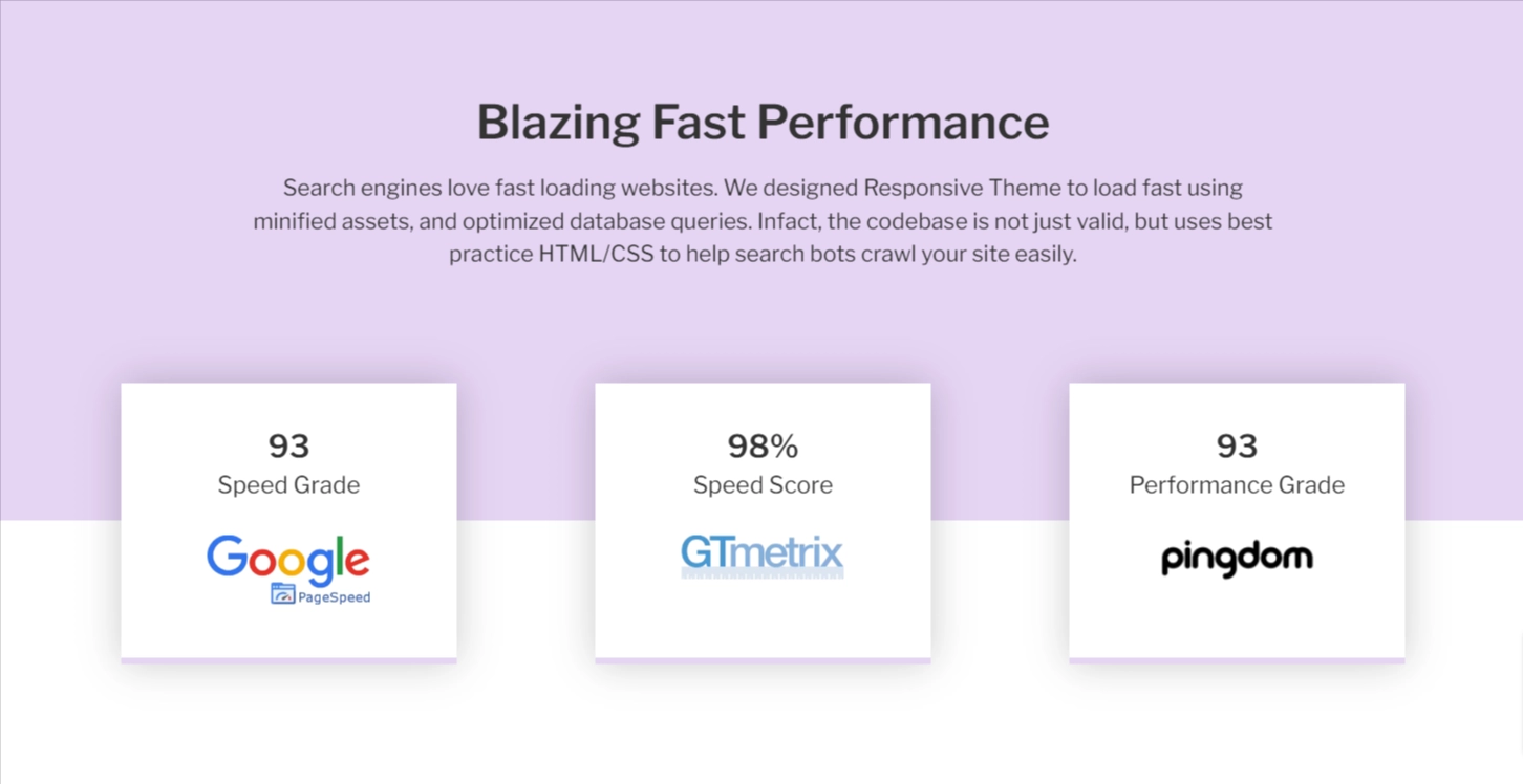
When selecting a theme, page load time is a crucial factor to consider. Responsive theme is lightweight, resulting in faster loading times for your site pages.
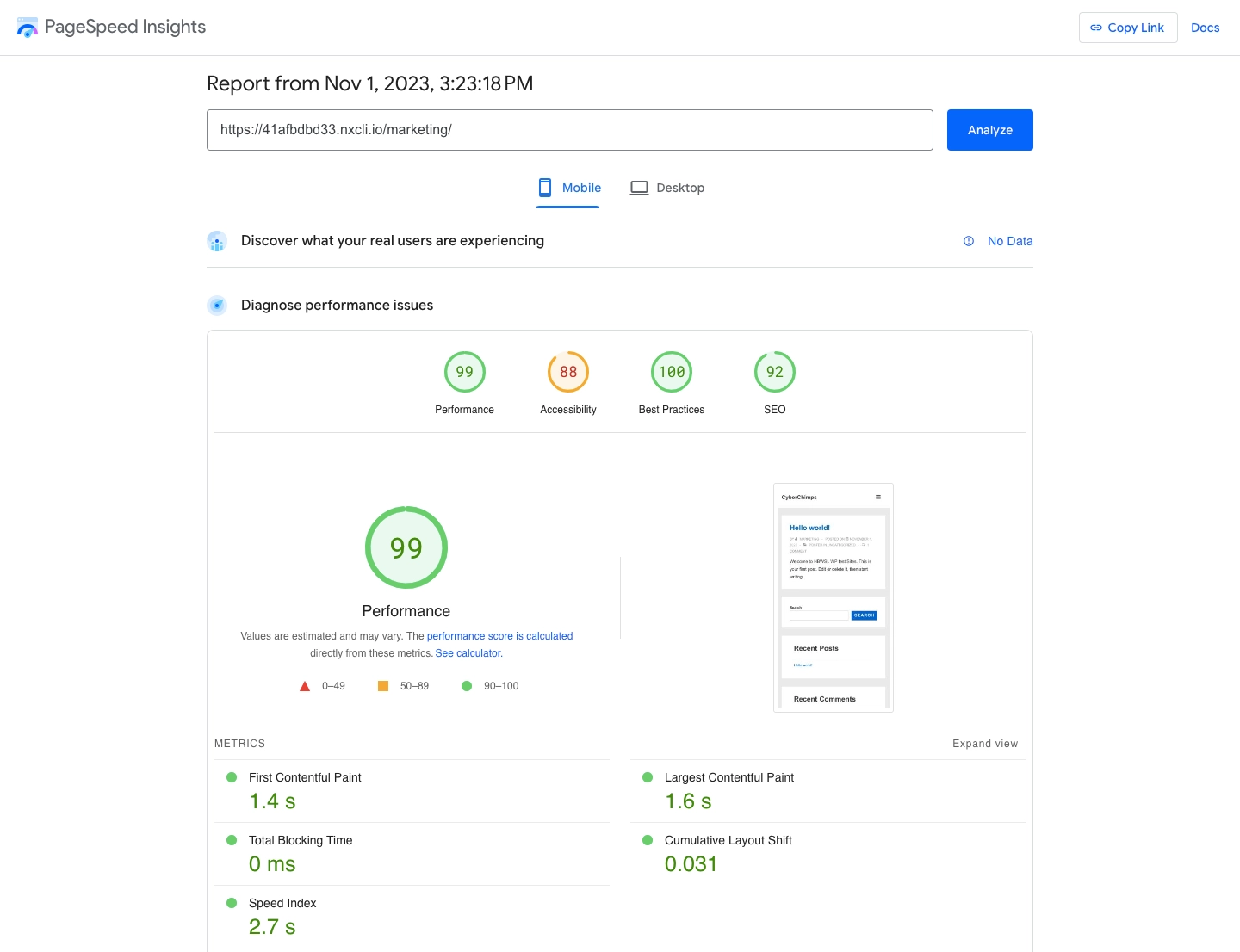
To test the theme’s speed, we created a demo website using Responsive theme.
Now, let’s run a speed test on Google PageSpeed Insights and GT Metrix.
Speed Test Results
Here are the results from Google PageSpeed Insights on mobile:
Here are the results from Google PageSpeed Insights on Desktop:
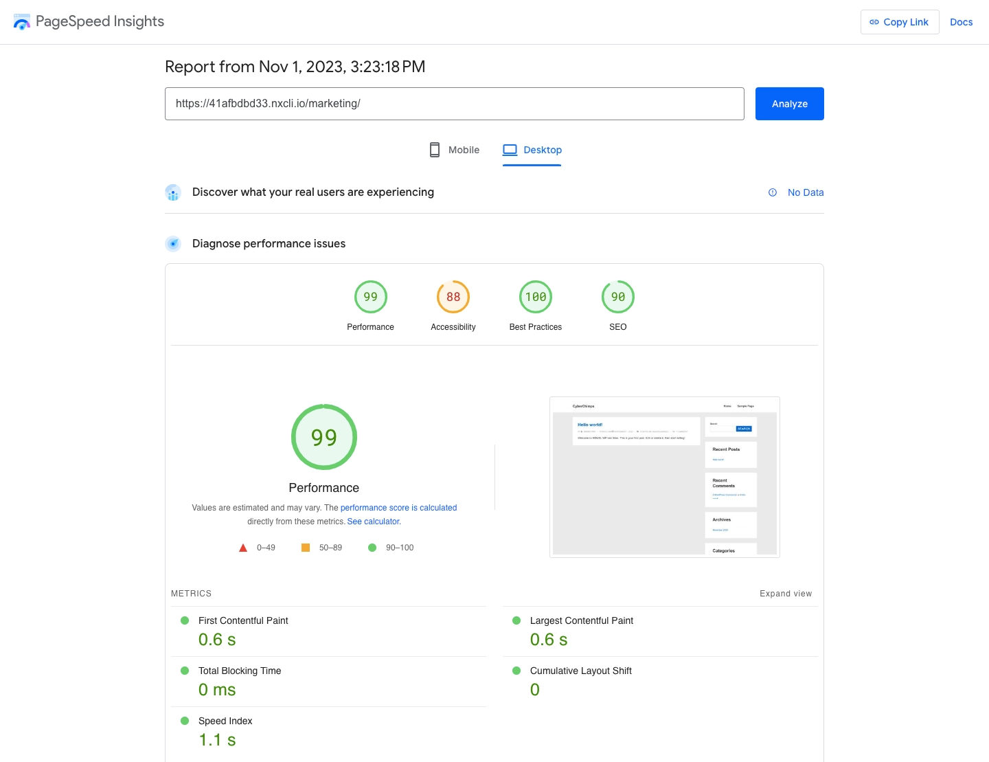
You can see that speed index is approximately 1 second that is a very good score for any website.
Here are the results from GTmetrix:
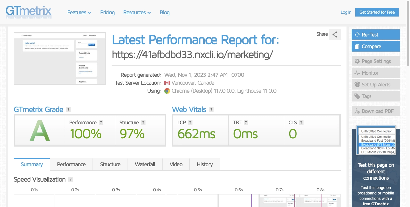
As seen, results show 100% performance, 662ms LCP, 0 ms TBT giving an A grade GTmetrix score for Responsive theme. This shows how fast it loads for users and how well it’s built for performance.
2. User Experience and Interface
Responsive theme prioritizes user experience with a simple UI that works smoothly with Elementor.
You can easily create beautiful websites with an intuitive layout and customizable widgets.
3. Mobile Friendliness
It is crucial for your website’s success to have a theme that optimizes the viewing experience on different devices and screen sizes.
When using the default WordPress customizer to edit your pages, you can easily switch between three different screen sizes: desktop, tablet, and mobile.
This feature allows you to preview how your site appears on different devices.
The WordPress Customizer will show these changes in its live preview, so you can try different sizes to see what looks the best for your WordPress website.
4. WordPress theme Customizer Options in Responsive Theme
When it comes to customizing your site’s appearance, using Responsive theme provides plenty of flexibility.
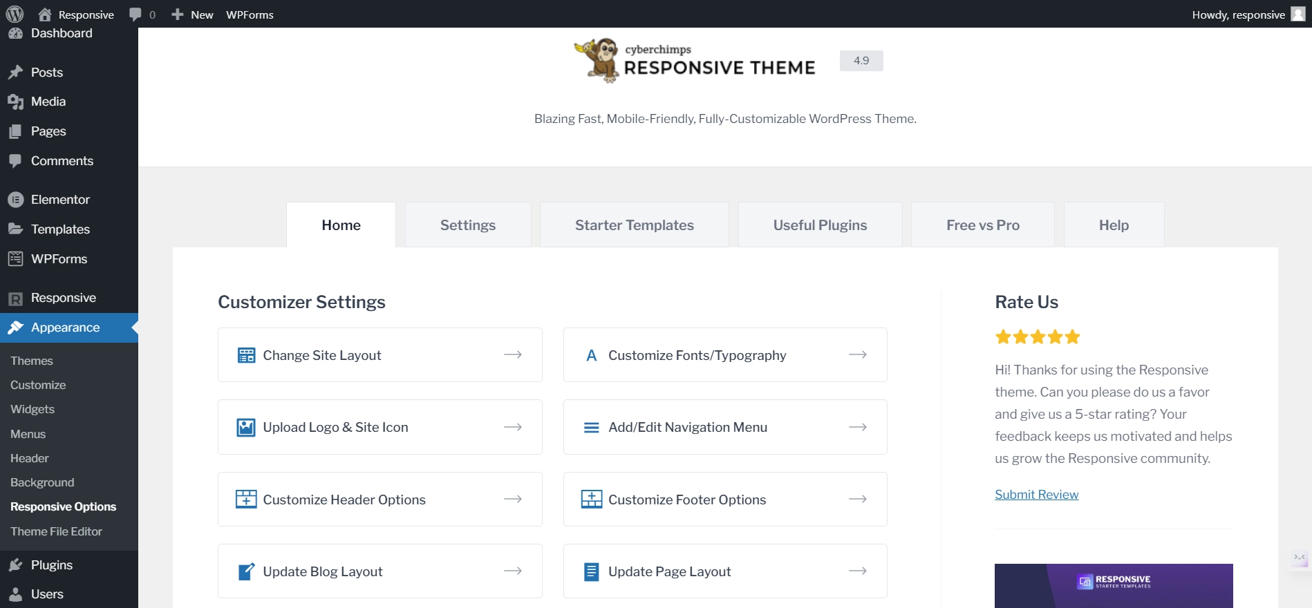
Navigate to Appearance > Responsive Options.
From the Responsive Customizer Settings, you can set your site’s logo, customize your fonts, or tweak the footer and header settings.
Here are eight different sections that you can customize with a free theme:
- Change Site Layout
- Customize fonts/Typography
- Upload Logo & Site Icon
- Add/Edit Navigation menu
- Customize Header Options
- Customize Footer Options
- Update Blog Layout
- Update Page Layout
If you select any of those options, it will take you to the theme customizer, where you can fully control the settings.
Let’s check them out individually.
[Note]: If you want to extend the theme customizer settings, you can upgrade to the premium version at an affordable price.
Change Site Layout
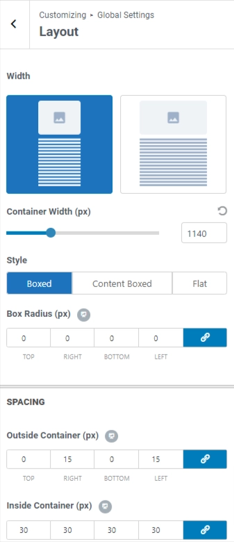
In the Responsive WordPress theme, you can customize the site layout with these options:
Width: Choose between full width or contained width for your website.
Container Width: Set the width of the container.
Style: Select from three layout options:
– Boxed: The default layout with the applied container width.
– Content Boxed: Similar to Boxed but with a white background for content.
– Flat: Removes the white background, displaying content in a single container.
Box Radius (px): Adjust the corner radius for the selected layout style.
Inside Container (px): Set the padding inside the container.
Customize Fonts/Typography
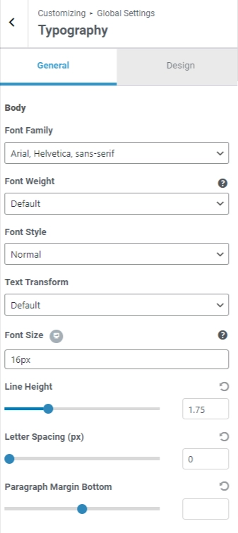
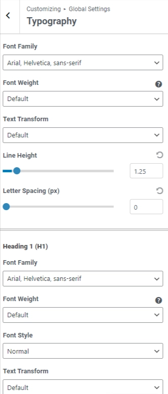
In the typography settings, you can choose the font family, font weight, font style, and size for body text.
You can also alter the font settings for each of the headings from H1 to H6.
Upload Logo & Site Icon
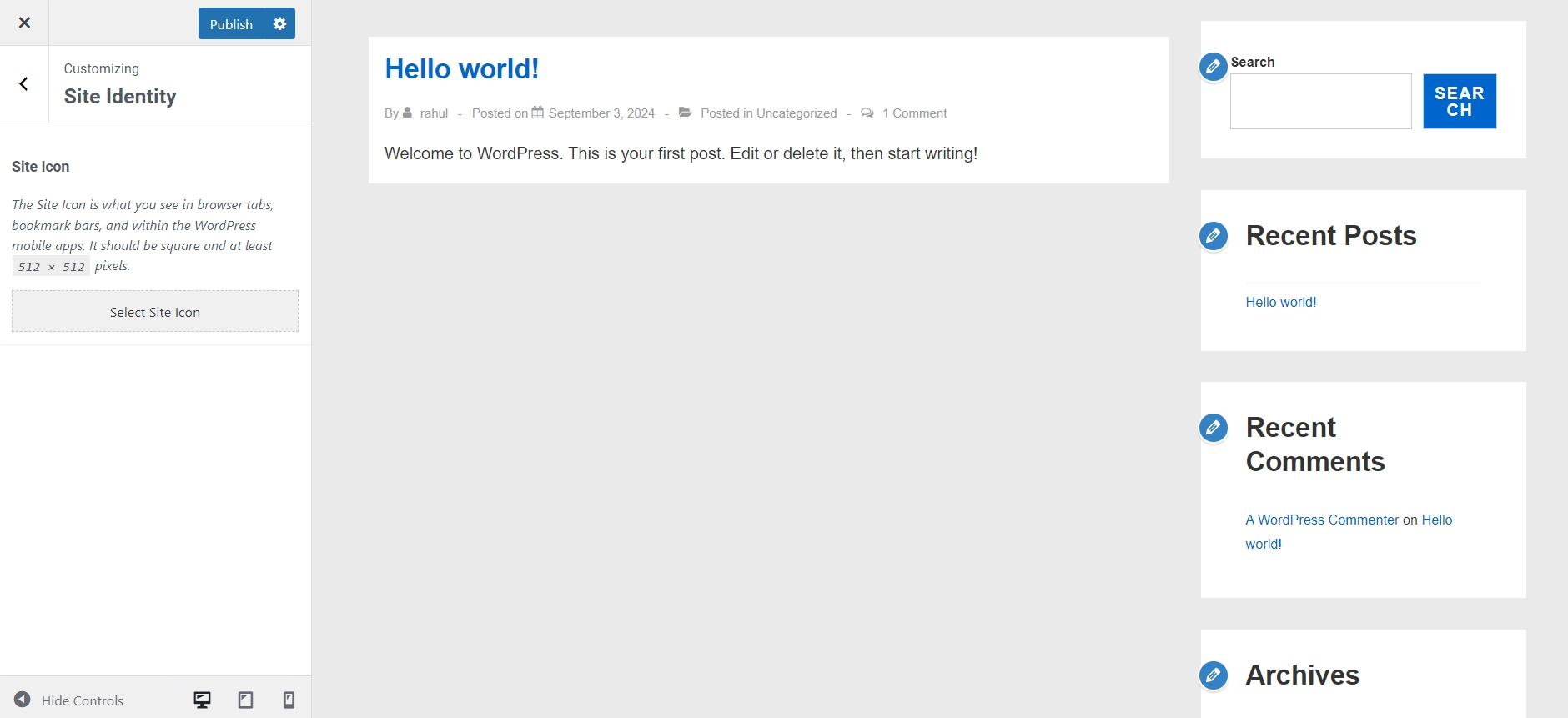
If you want to modify your website’s logo, width, site title, and tagline or enable a retina logo, you can do that under the ‘Upload Logo & Site Icon’ section.
Additionally, you can alter your logo for mobile devices and remove or replace your website’s logo as well.
Responsive Theme offers an easy way to adjust logo size with the Logo Width slider, without the need to write any code.
You can adjust the size in pixels and preview the changes on the right side.
Add/Edit Navigation Menu
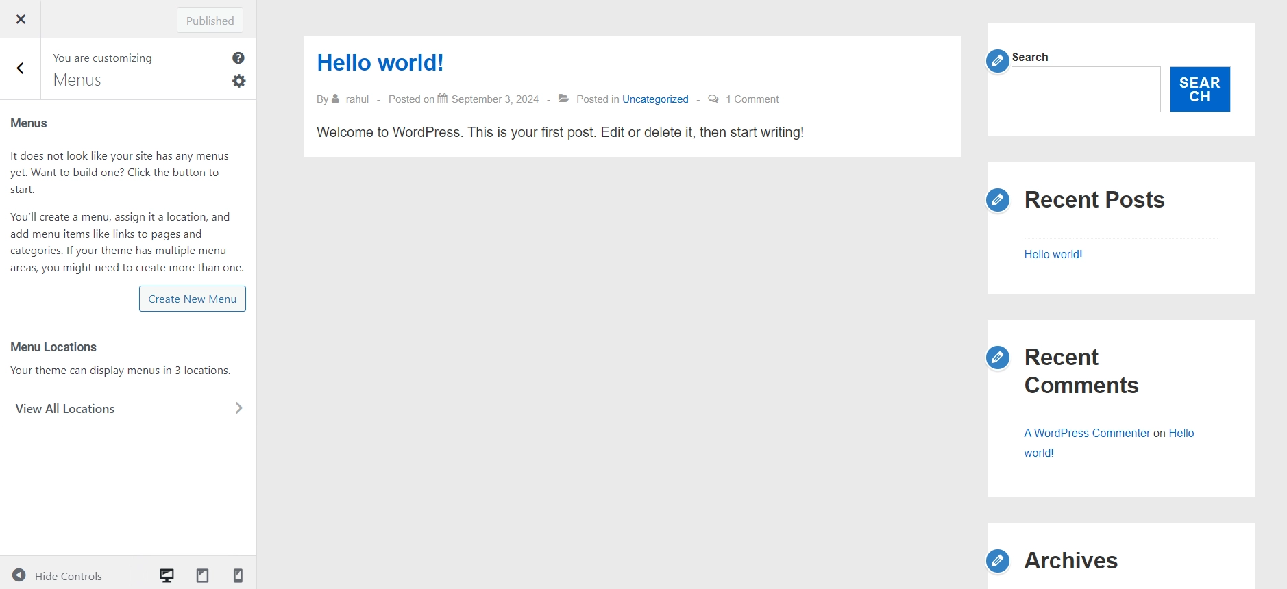
These settings enable you to create and customize menus, manage their items, assign them to different locations, and control the automatic addition of new pages to the menu.
5. Customize Your Navigation Menu
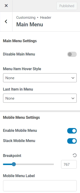
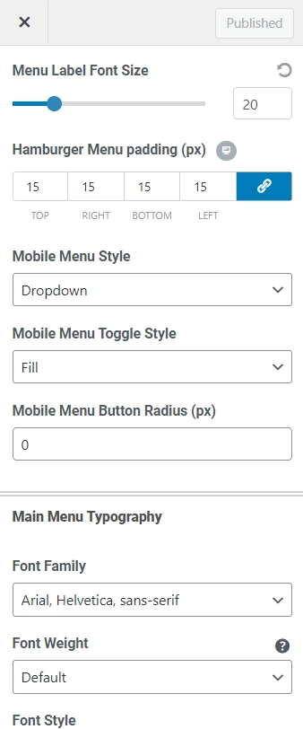
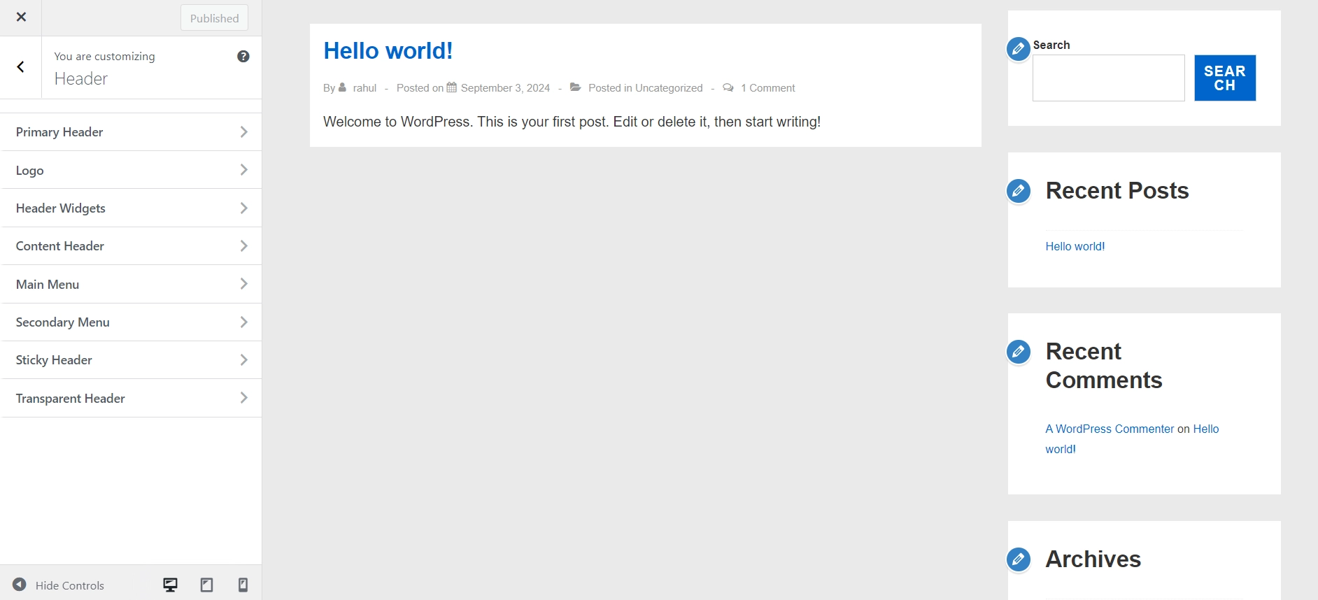
Now to customize your header, navigate to Customize > Header > Main Menu.
Here, you can customize the main menu settings, mobile menu settings, main menu typography, sub menu settings, sub menu colors and main & mobile menu colors.
Additionally, you can enhance the visibility of your website by implementing a Mega menu. But, to access the mega menu, you’ll need to upgrade from free to Responsive Pro.
A Mega Menu is a fly-out menu commonly used for website navigation. This menu format provides a more comprehensive and visually appealing structure for navigation.
It allows you to create expansive, multi-column menus that display a vast array of information, categories, and links in a structured and organized manner. Using a Mega Menu, you can efficiently organize your website’s content and make it easier for users to navigate.
Customize Header Options
The header layout settings panel is an impressive feature of Responsive.
With the pro version, you’ll have a lot more options, but even the free theme lets you customize the header layout and design.
Responsive Pro offers various header options, including a Sticky header, a Shrink logo on scroll, and a Separate logo for mobile.
Customize Footer Options
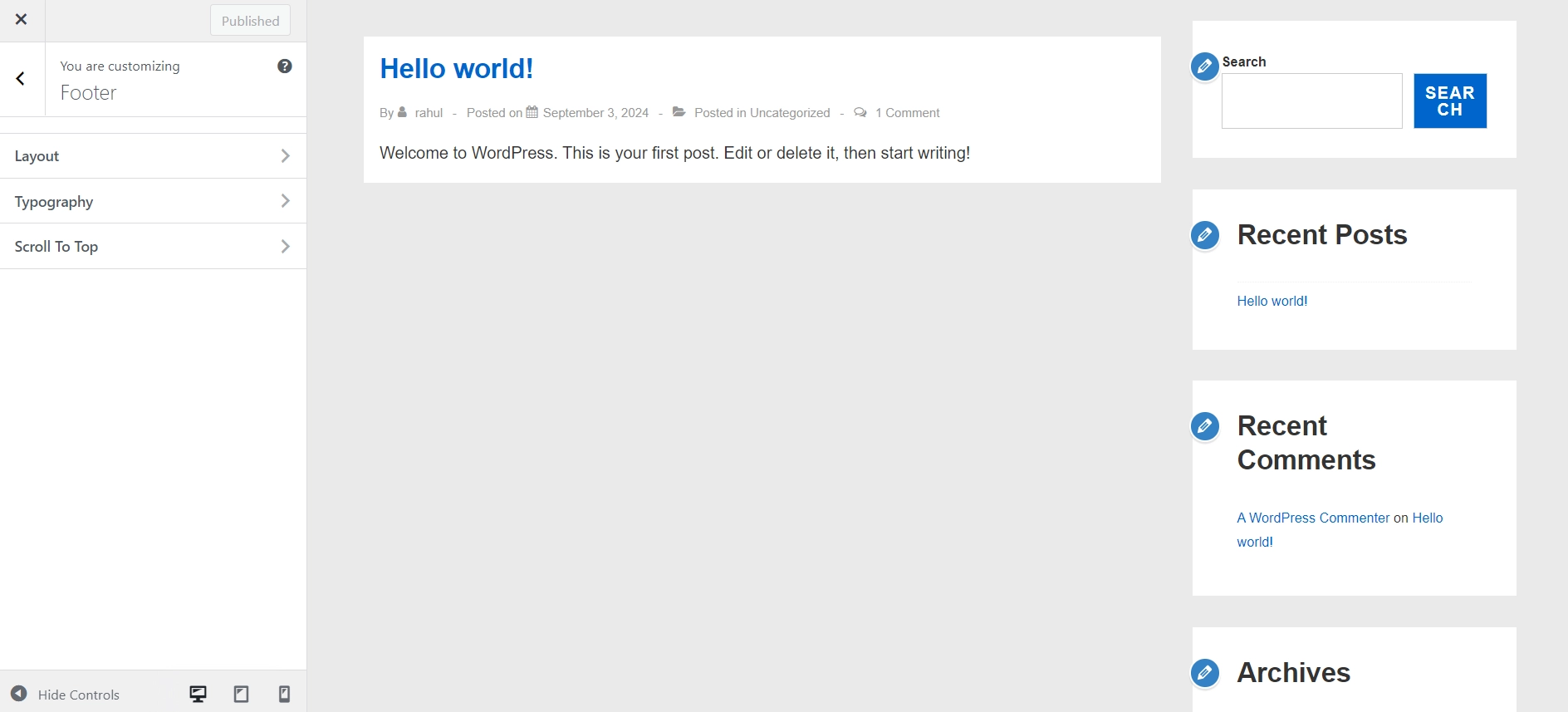
You can customize the footer’s layout, color, typography, and scripts.
You can provide a scroll-to-top option button at the footer as well.
You’ll have control over the elements shown in the footer and the design of those elements.
Update Blog Layout
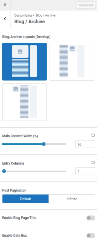
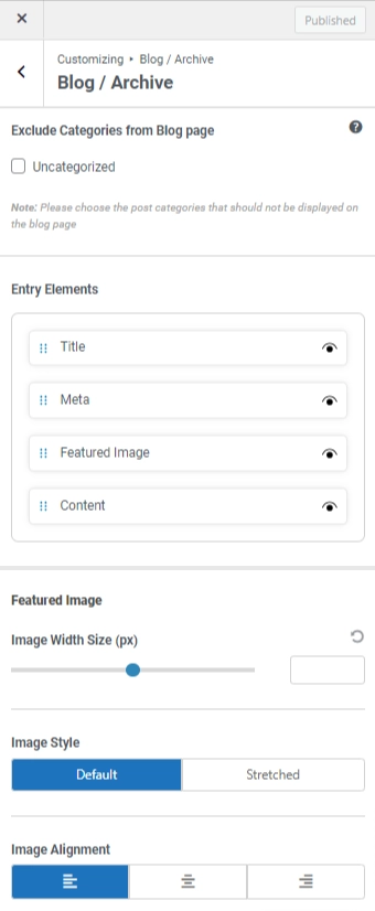
You can control the blog page’s title, content width, column layout, and category exclusions using Responsive theme.
Update Page Layout
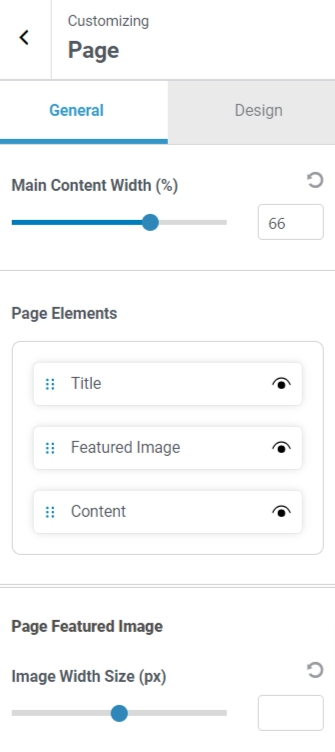
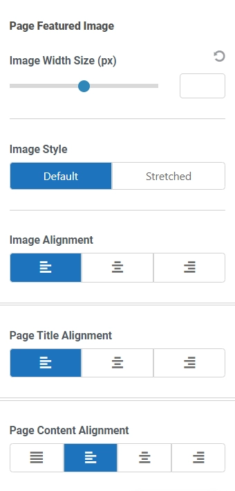
The “Update Page Layout” feature in Responsive WordPress theme allows you to customize the main content width for pages and adjust the order and visibility of elements such as Title, Featured Image, and Content.
6. Related Posts Feature

The related posts section is beneficial for retaining the audience and getting longer web sessions and interaction.
Responsive theme provides a related posts feature, and you don’t need to download any extra plugins. You can also customize the number of posts to display and the number of columns.
7. Responsive Theme’s Compatibility with Page Builders and Plugins
Responsive theme is designed to work seamlessly with third-party WordPress plugins such as Mailchimp, WP Legal Pages, WooCommerce, Yoast, WP Forms, Contact Form 7, LearnDash, LifterLMS, and more.
Responsive Theme works with all the popular page builders, especially Elementor.
8. Responsive Theme’s SEO
Responsive is one of the best themes available for creating an SEO-friendly website.
It’s known for its exceptional speed and lightweight design, with an average load time of under 2 seconds. It’s a crucial factor for Google rankings, as faster website performance means better rankings.
To check that, we conducted a Page Speed Insights test, and here is the result:
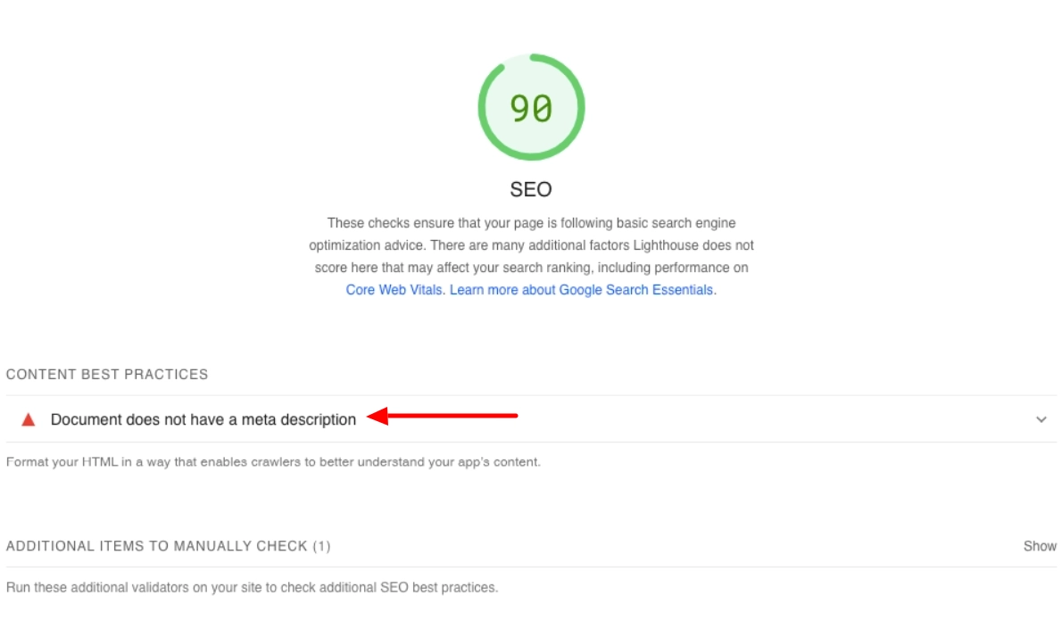
The SEO score is 90, and according to Google, a score of 90 or above is good. This indicates that the page loads quickly and adheres to best practices for search engine optimization. As a result, it can improve the website’s visibility in search results and potentially boost its search engine rankings.
[Note] As this is a demo website created using the Responsive theme, we didn’t include any meta tags.
The next SEO feature that can impact your site is known as Breadcrumb Navigation.
Breadcrumb navigation is essential for improving user experience and optimizing your WordPress site for search engines. It helps users understand their location within the site hierarchy and provides a clear path to the homepage.
Implementing breadcrumb navigation can improve search rankings and reduce bounce rates while assisting visitors.
Now, let’s see how you can easily implement Breadcrumb using Responsive theme.
Go to your WordPress dashboard and navigate to Appearance > Customize > Breadcrumb.
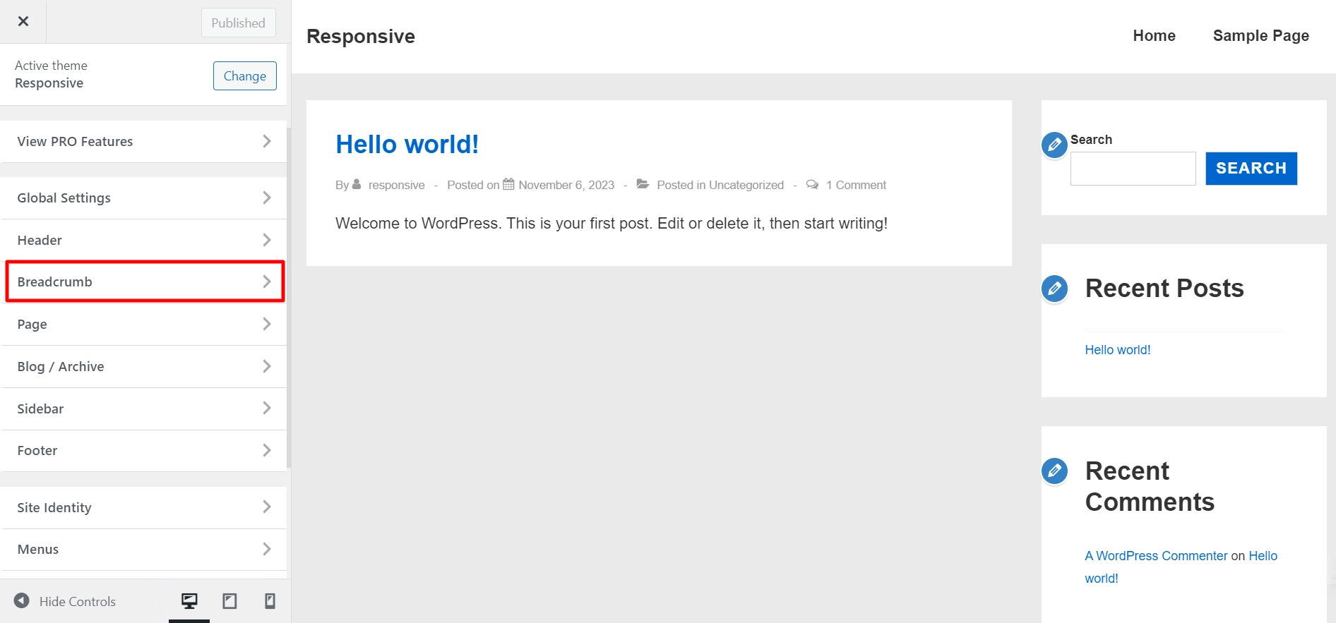
Enable the Enable breadcrumb option.
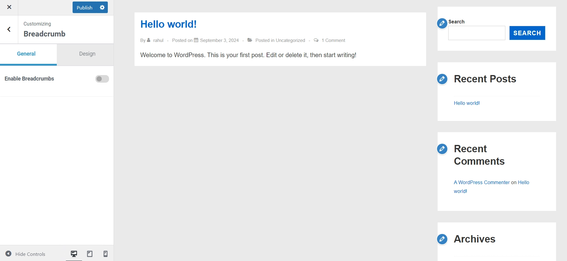
Choose where you want to display the breadcrumbs from the position drop-down menu.
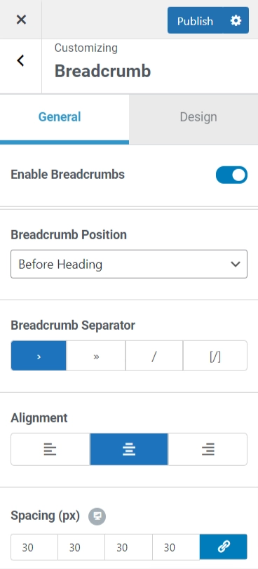
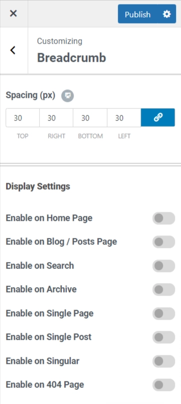
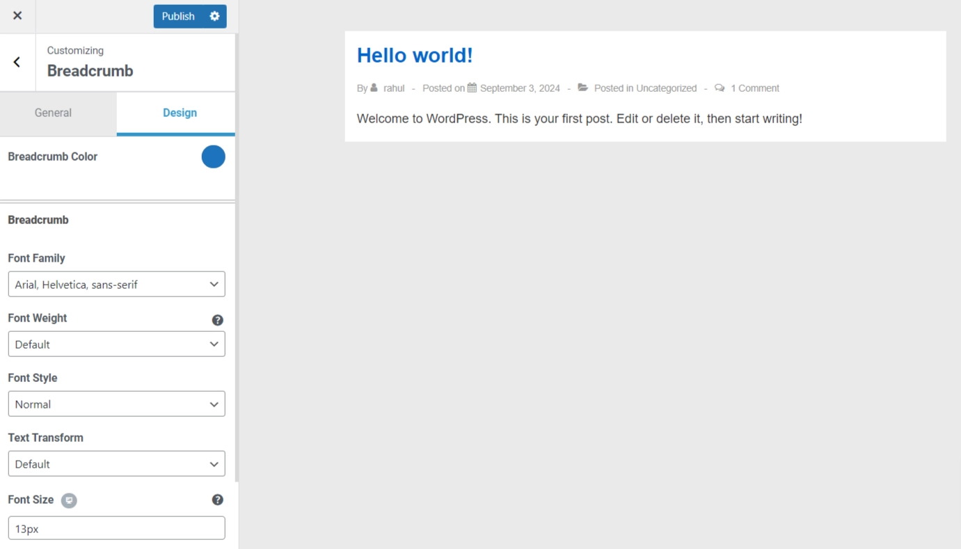
Style your breadcrumbs using various customization options according to how you want them to look.
And when you’re done click the Publish buttons.
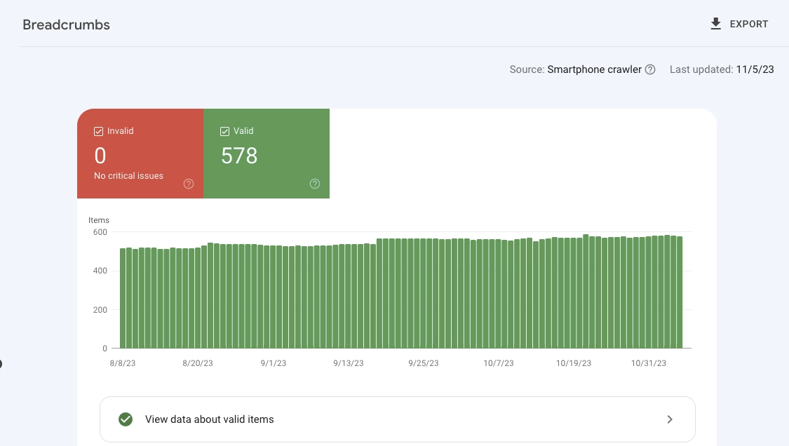
Here is a screenshot from Google Search Console that shows successful pages including breadcrumbs.
Responsive Theme’s Pricing and Support Review
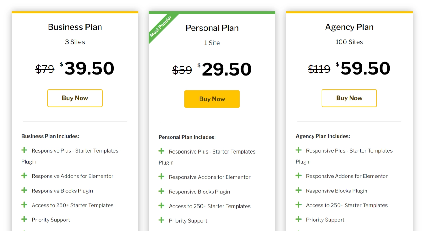
While Responsive theme is completely free, it provides Responsive Pro plugin, which is a plugin that provides additional features and functionalities. It has both annual and lifetime package options with three plans, each that caters to different services.
Responsive Pro Annual Pricing Plan:
Regarding pricing, the theme provides exceptional functionality at a very low price.
What makes it better is it comes with extensive documentation for every product on how to use the theme. It also provides tutorials to guide you through the theme installation, setup, and usage.
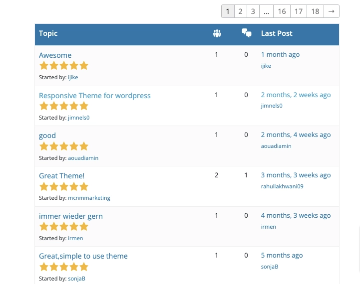
As Responsive theme is available on WordPress.org, the support is handled extensively on the theme’s support forum itself. However, the theme authors also provide support to the free users when a ticket is raised from their website.
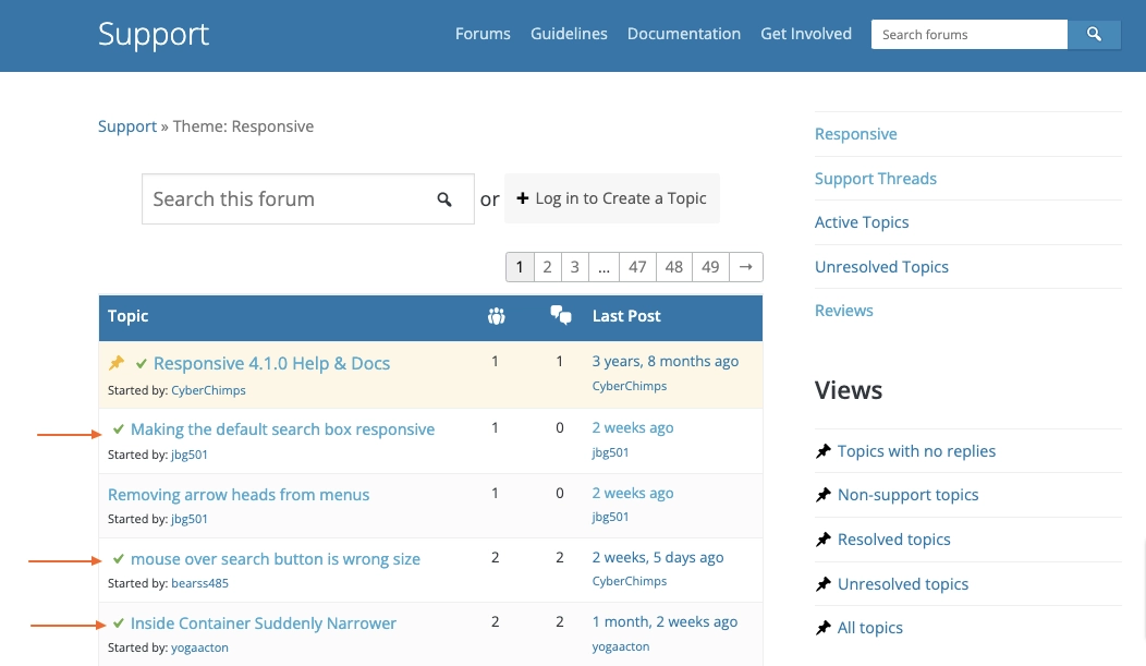
As you can see, the issues are resolved almost immediately and this is one of the reasons why the free Responsive theme boasts over 550+ 5-star reviews on their WordPress page.
Responsive Pro Theme Pricing VS Other Pro Themes Pricing
| Themes | Plans | Annual Pricing | Lifetime Pricing |
| Responsive | Personal Business Agency | $29.50 $39.50 $59.50 | $179 $249 $379 |
| Astra | Astra Pro Essential Bundle Growth Bundle | $47 $137 $187 | $227 $677 $937 |
| KadenceWP | Essential Bundle Full Bundle | $129 $199 | $799 |
| OceanWP | Personal Business Agency | $43 $71 $127 | $178 $285 $509 |
How to Install Responsive Theme
Another area where Responsive shines well is the ease of use and installation.
To get started, all you need to do is install Responsive theme within your default WordPress setup.
Go to the WordPress admin dashboard and follow these steps:
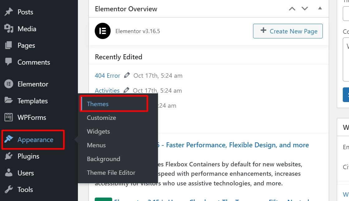
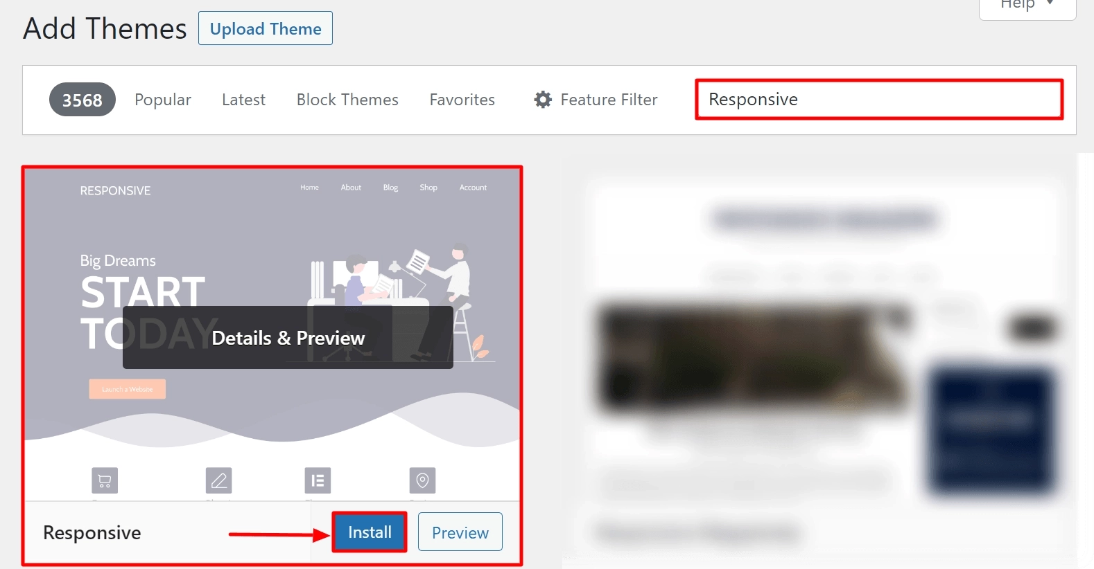
Navigate to Appearance > Themes > Add New.
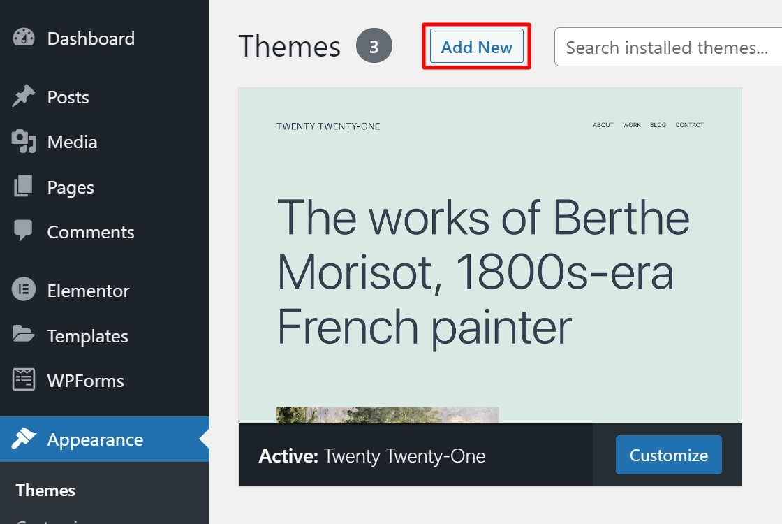
Click on the Add New button.
Search for Responsive and click on the Install button.
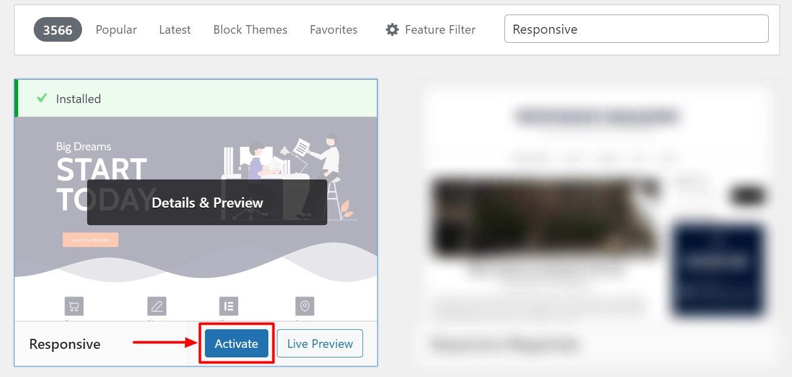
Then, activate the Responsive theme by clicking on the Activate button.
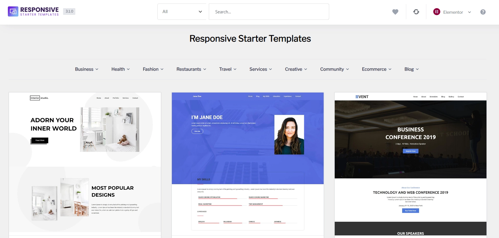
Install the Responsive Starter Templates Plugin
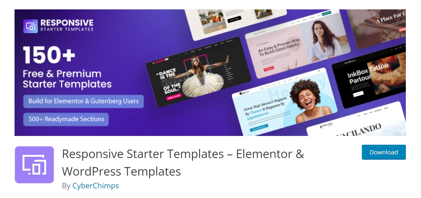
With over 150+ starter templates available for the default block editor and Elementor page builder, it is easy for beginners to create their site design quickly.
From your WordPress dashboard, navigate to Plugins > Add New.
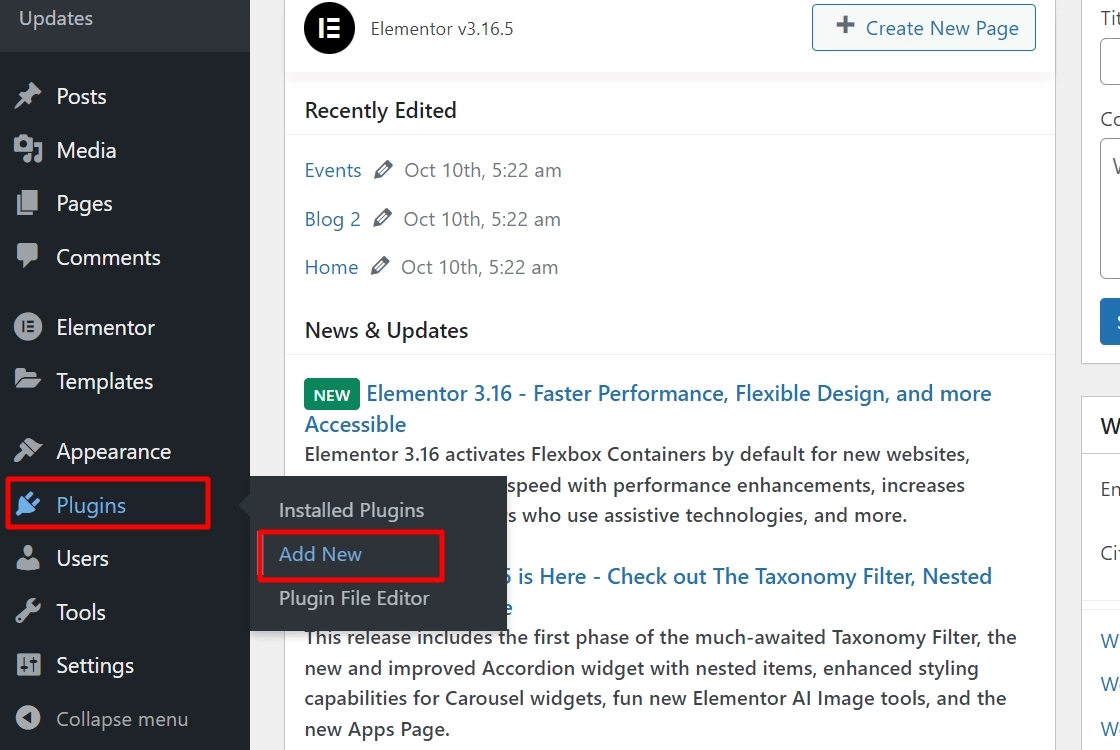
In the search bar option, search for Responsive Plus – Starter Template and click the Install Now button.
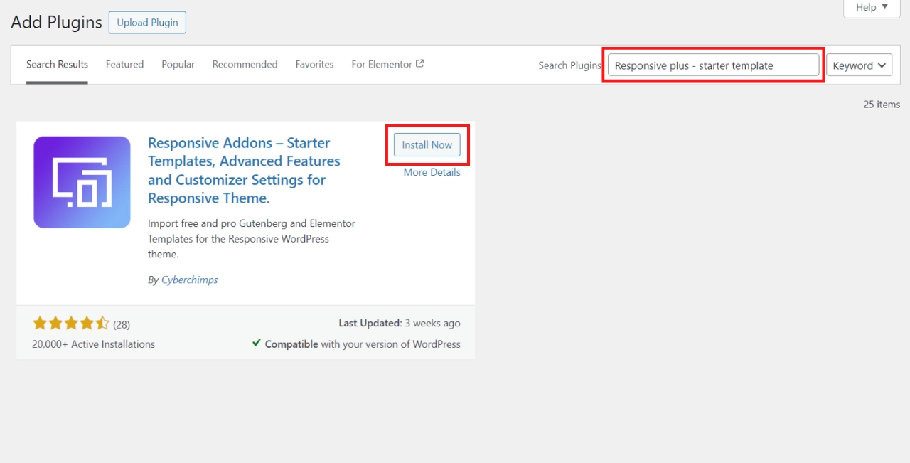
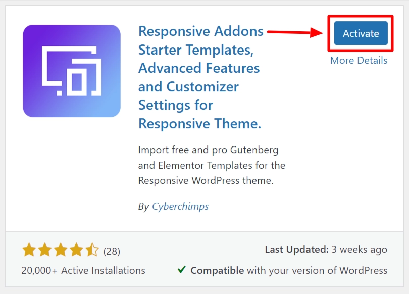
Once you have installed the plugin, click on the Activate button.
You can view all the templates by hovering over Responsive and clicking the Templates button.
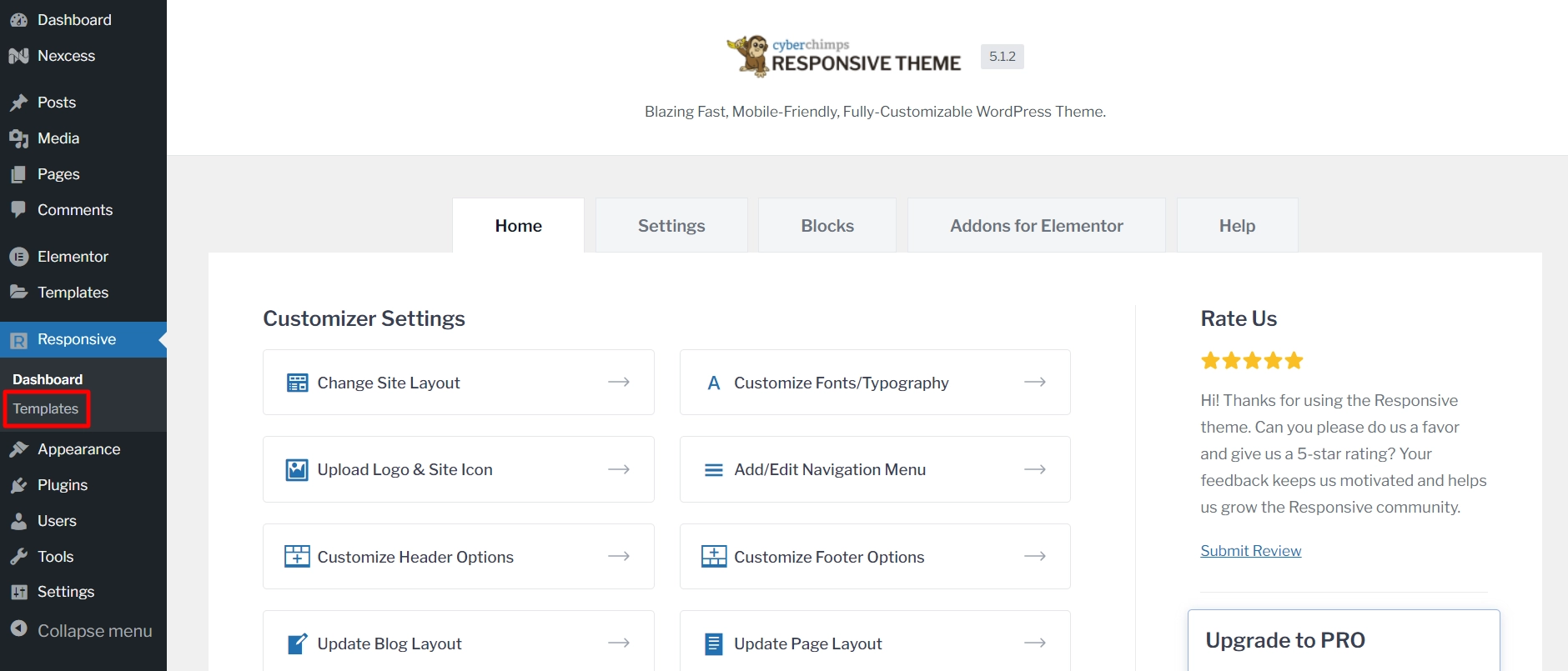
This will open a list of 250+ Responsive Plus – Starter Templates for every niche.
[Note] If you want to access the Pro templates, you will need to buy the Responsive Pro. You can easily purchase it from the Cyberchimps website.
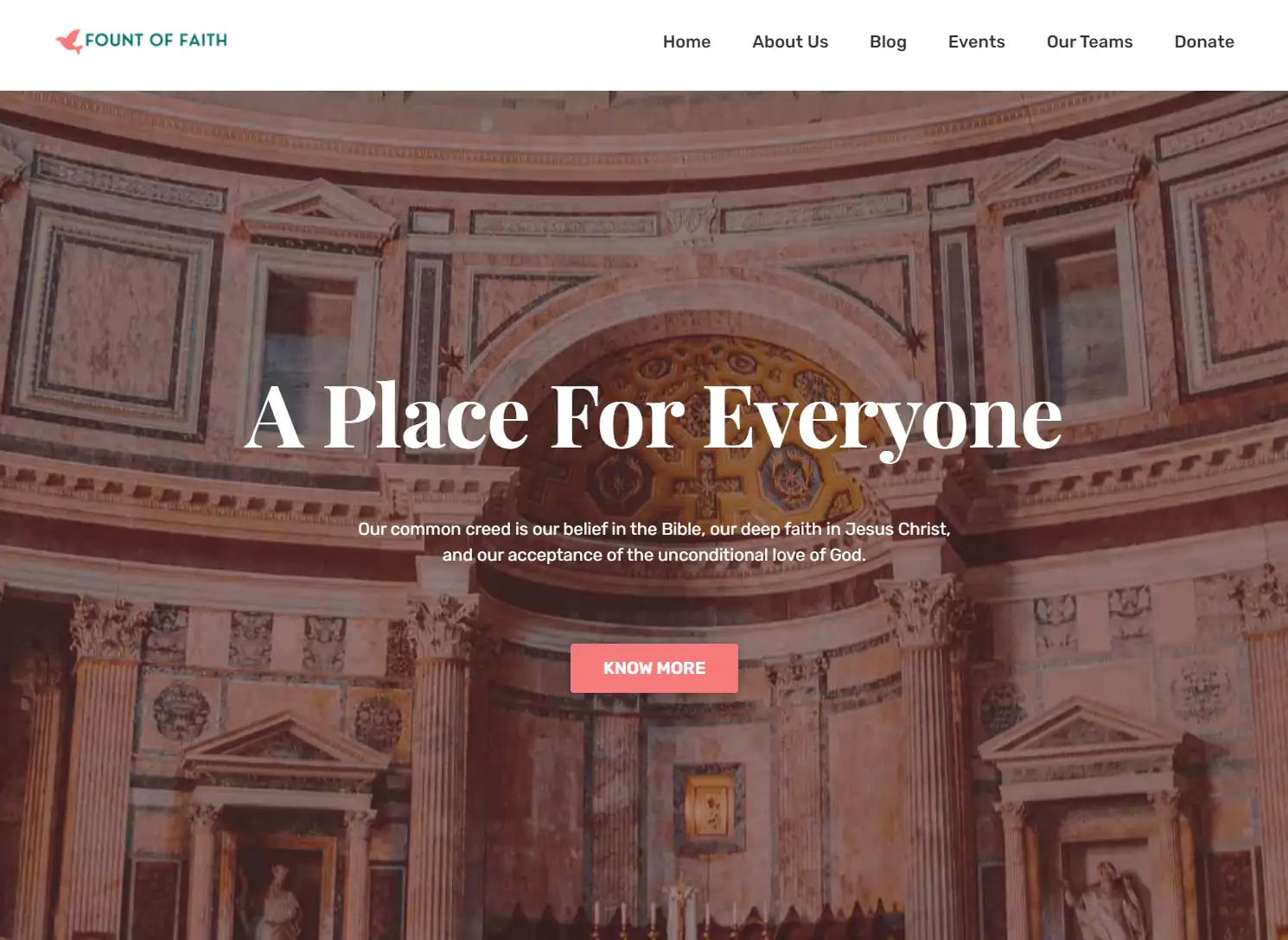
For an illustration purpose, here we’ll show you how to Import a free Church template.
Importing the Free Church Template
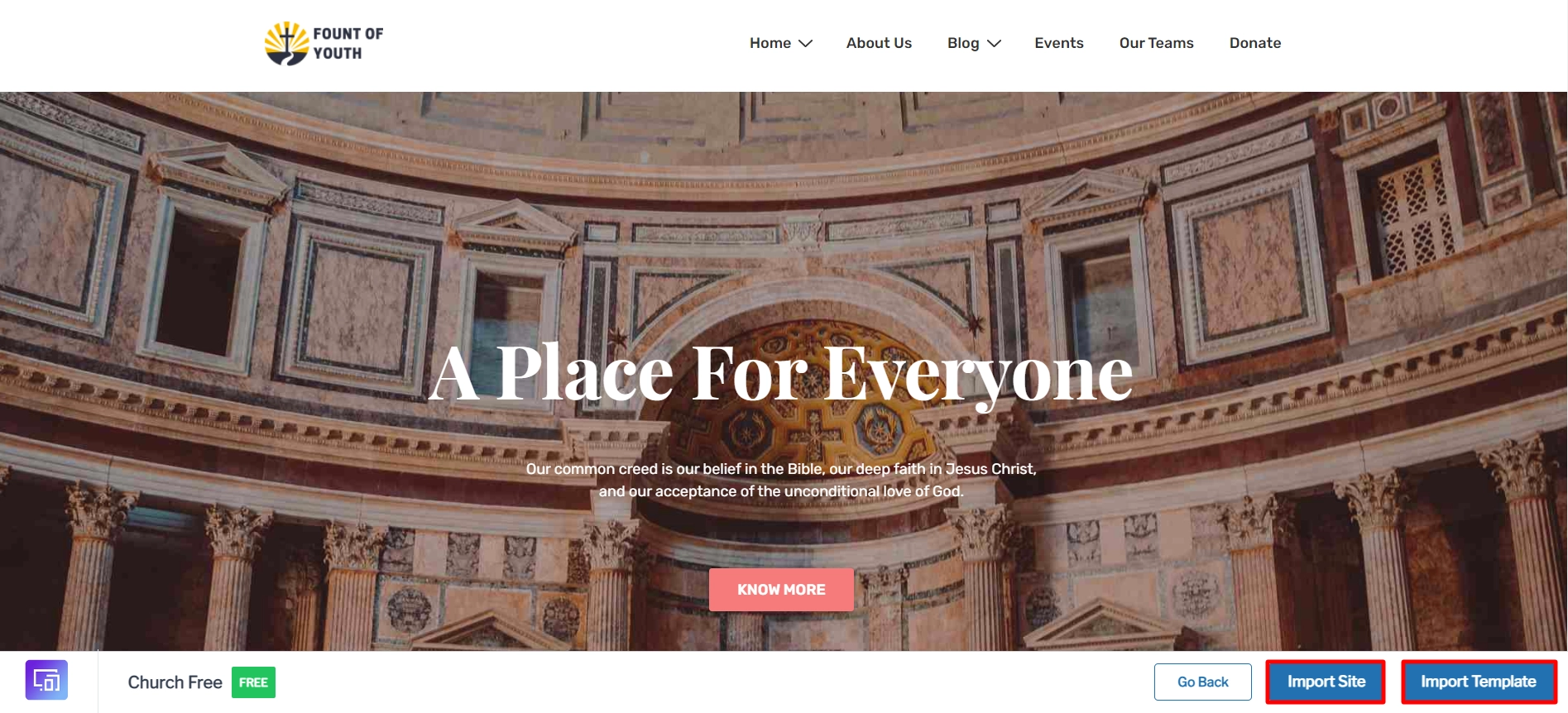
Search for Church in the search bar provided above and select the free Church template.
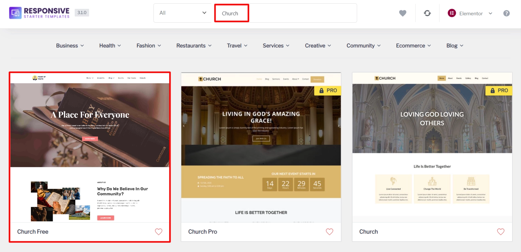
There are two options available: Import Site and Import Template. Import Site imports the entire website, while Import Template imports a single template page. We’ll look at them one by one.
Click on Import Site.
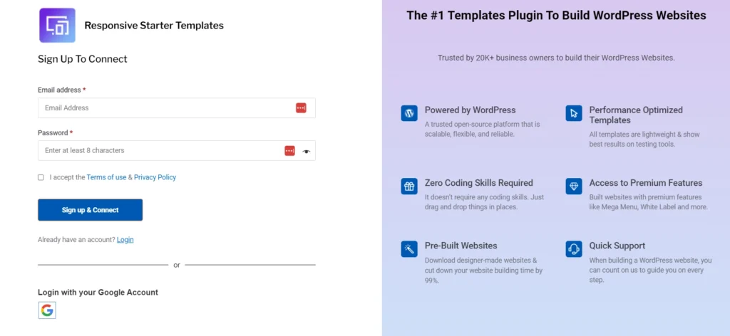
Clicking on Import Site and this will take you to the login page. Now, here enter your details and click on Sign up & Connect.
Now, again go to the template and click on Import Site and then click on Subscribe & Start Importing.
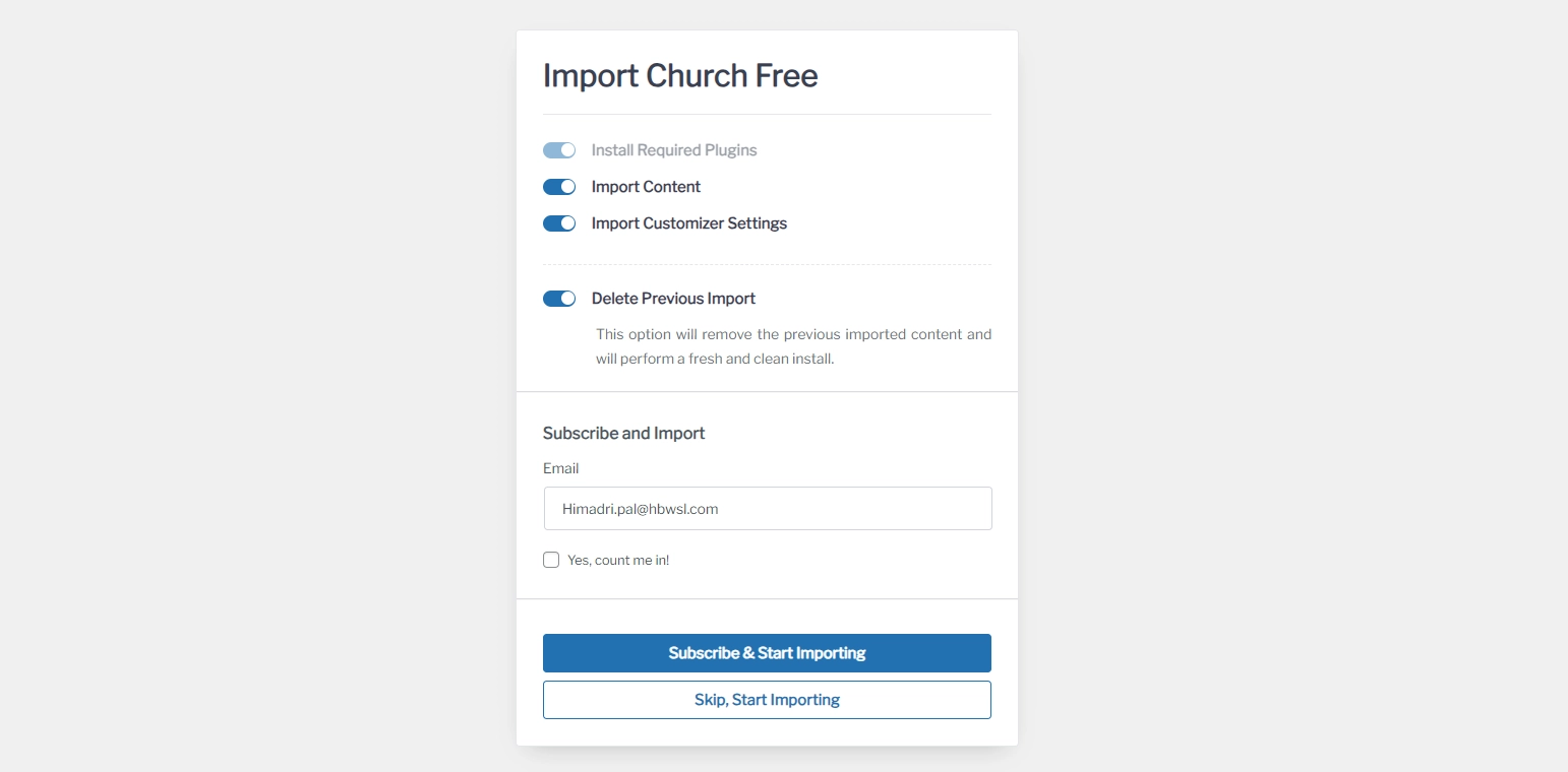
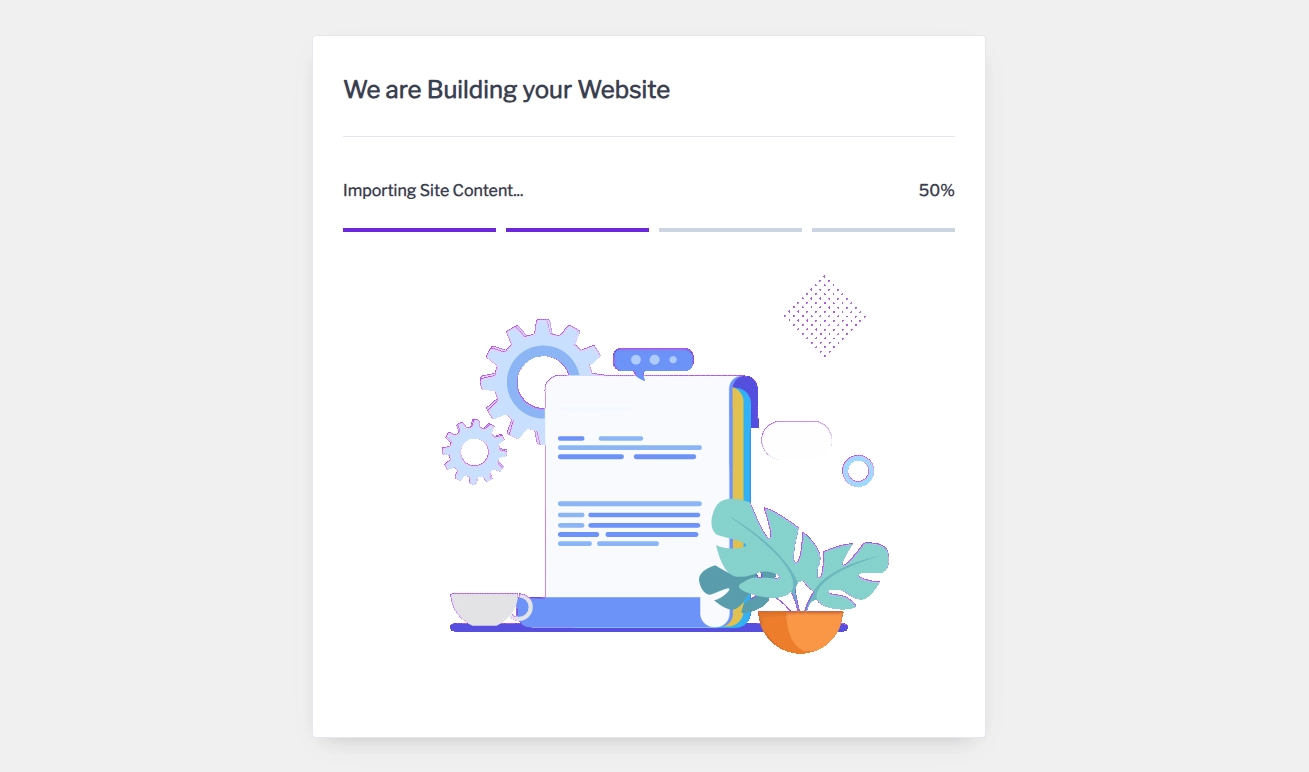
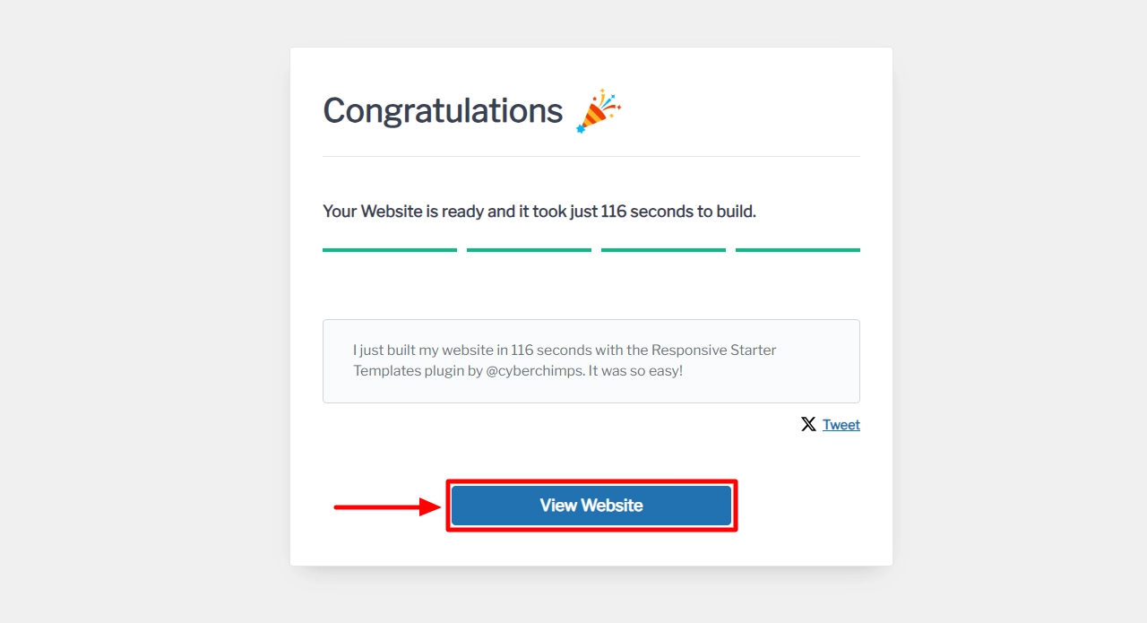
The template importing has been started.
Once it’s done click on View Website.
And you’re done! This is how your website will look like:
Final Thoughts: Is Responsive Theme Worth It?
If you’re in search of a WordPress theme that offers beautiful designs without compromising on your site’s speed, then Responsive theme by CyberChimps is a fantastic choice.
This product ticks off almost every box for everything you require from a multipurpose WordPress theme.
If you want more customization options and reliable support, then the paid subscriptions would be a great fit for you.
We hope this review has assisted you in choosing the perfect theme for your next WordPress project.
When choosing a WordPress theme, the options seem limitless.
You seem to know what you’re dealing with, even though it’s hard to find knowledgeable people on this subject
Thank u for sharing your post. Consider doing a post about Cyber Chimps theme named cyberchimps pro or business pro?
I was very encouraged to find this site. The reason being that this is such an informative post. Thanks for sharing!
I had no idea WordPress had so many great themes. This article has really opened my eyes to more knowledge.
I’m passionate about it and would love to learn more. Would you mind updating your blog with new content when you find out more?
There are many good ideas coming up.
this sounds like a super helpful review!
The Starter Templates are really the hero here, though. Being able to import a full site like that Church template in a few clicks is a lifesaver for anyone who doesn’t want to spend three days wrestling with padding and margins. Plus, the fact that the Pro version starts at such a low price point compared to giants like Astra or Kadence makes it a really strong “indie hacker” choice for building client sites on a budget.