Top 11 Free Fonts For Posters – Elevate Your Designs
Are you on the hunt for the best poster fonts to add to your arsenal? Read ahead to check out the best fonts that will enhance your poster designs effortlessly.
Whether you want bold fonts or something minimal for aesthetic designs, this list will keep you covered. Check out this amazing curated selection of fonts below.
Table of contents
- 1. Mosk Font For Posters
- 2. Enyo Slab Font
- 3. 20 Balistine Fonts Bundle For Posters
- 4. Tea For God Font For Posters
- 5. Gothicha Medieval Sans – Free Poster Font
- 6. Xillian Free Font For Posters
- 7. Nathan Free Poster Font
- 8. Beautiful Child Font For Posters
- 9. Alinkha Bothine Free Poster Font
- 10. Dreaming Font
- 11. Anastasia Font
- Wrapping Up
1. Mosk Font For Posters
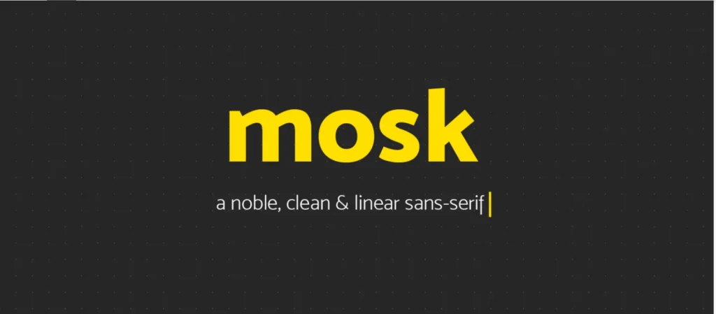
This sans-serif font is a great choice for poster designs. Its clean and simple style makes it perfect for grabbing attention, especially for headings in minimalistic posters.
It will help design stand out without being too flashy, giving it a modern and professional look while staying easy to read.
2. Enyo Slab Font
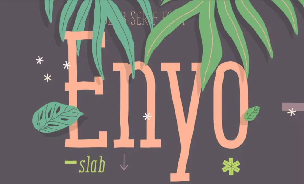
This is another playful font you can use on posters. Its creative style makes it great for posters about events, parties, or anything with a casual, upbeat vibe.
The font stands out and helps make your poster look more friendly and energetic.
3. 20 Balistine Fonts Bundle For Posters
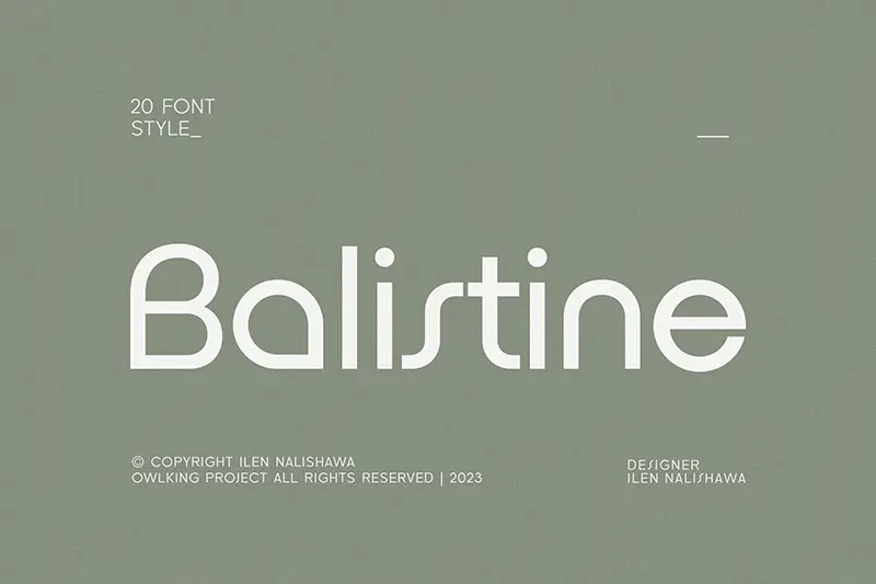
The Balistine free poster fonts bundle is a great choice for posters because it adds a stylish and bold look to your design. Its eye-catching sans-serif style makes it perfect for headlines and important text.
The clean lines help it look sophisticated while still being easy to read, even from far away. Whether you’re making posters for events, advertising, or art shows, Balistine font gives your poster a modern and classic feel.
4. Tea For God Font For Posters
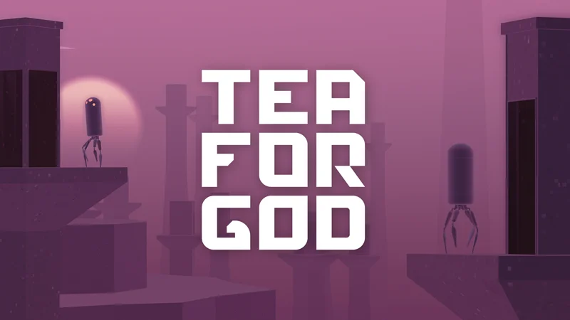
Tea For God adds a charming character that helps your poster stand out. Its fun vibe and clear readability make it a fantastic choice for a variety of poster themes.
This is a must have poster font for every graphic designer.
5. Gothicha Medieval Sans – Free Poster Font
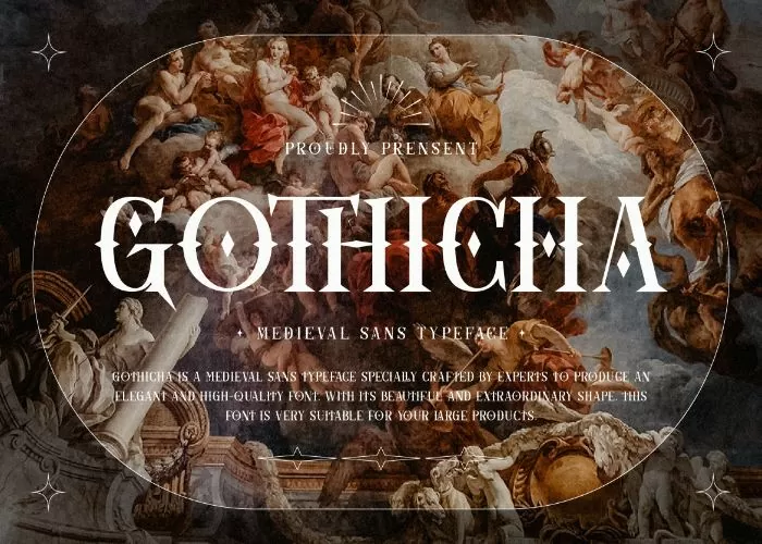
This free font is ideal for various branding projects, including logos, wedding designs, social media posts, advertisements, product packaging, and product designs.
It works well for labels, photography, watermarks, invitations, stationery, and any posters that require a handwritten touch.
6. Xillian Free Font For Posters
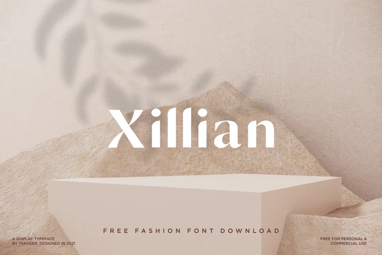
Xillian is an elegant display typeface specifically designed for high-fashion projects. Its stylish and bold design makes it ideal for creating eye-catching titles, magazines, social media posters.
This is another must-have elegant font for graphic designers.
7. Nathan Free Poster Font
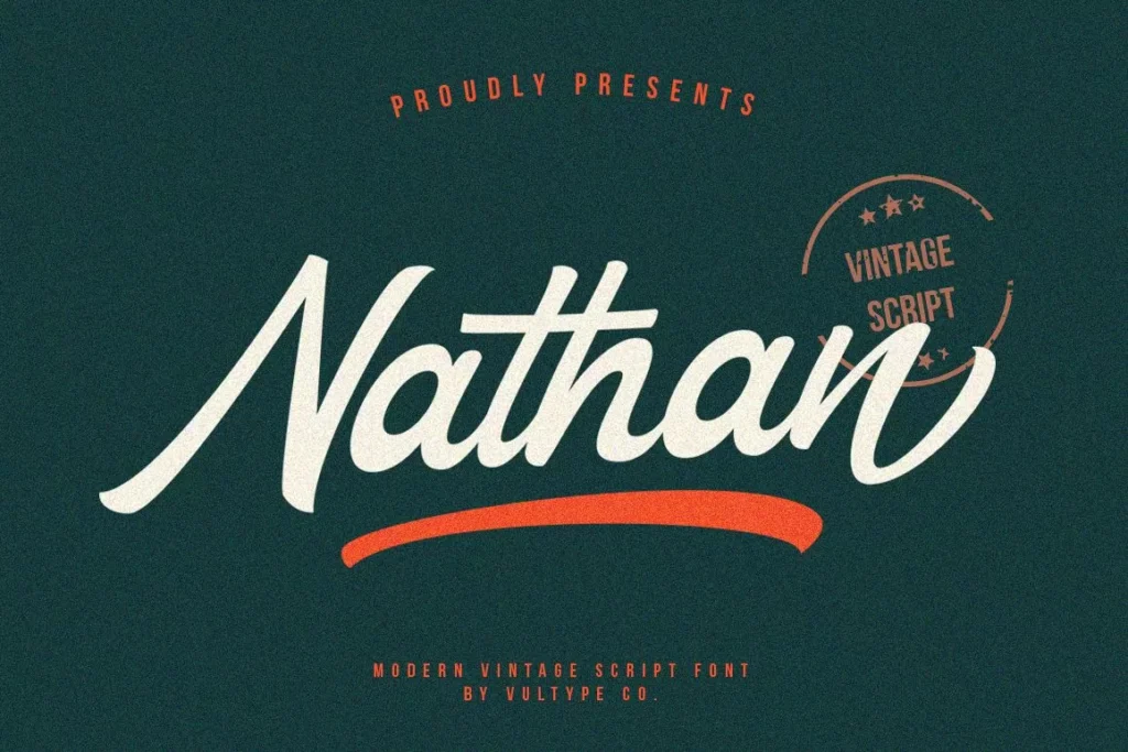
This is a vintage script font that will look great on posters that need a classic look. Its unique style will enhance your poster’s overall look, giving it a sophisticated and inviting feel.
Add this free font to your design toolkit now!
8. Beautiful Child Font For Posters
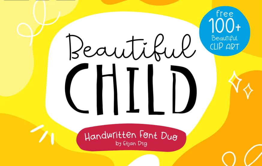
The Beautiful Child font is a great option for poster designs, adding a playful and charming feel to your designs. Its fun letters bring a sense of joy, making it perfect for posters for children’s events, educational materials, or family activities.
The font’s rounded shapes and friendly look catch the eye and create a happy vibe. Download it for free now!
9. Alinkha Bothine Free Poster Font
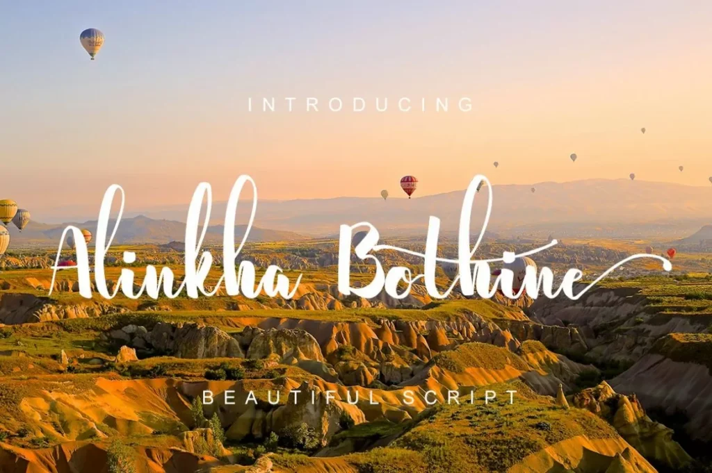
This is one of the best free poster fonts for elegant designs. Alinkha Bothine is a beautiful, free commercial script font that adds a modern touch to any project.
Its stylish script design makes it perfect for a wide variety of uses, enhancing everything from branding to invitations with an elegant touch.
10. Dreaming Font
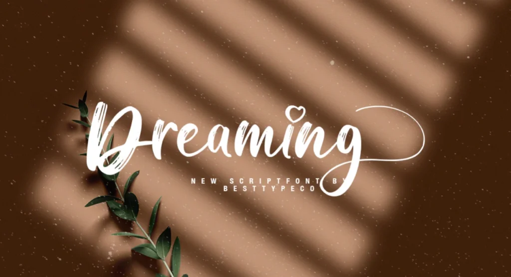
Dreaming is a free textured script font designed by Besttypeco. It offers a unique hand-drawn style. This font includes premium features like common ligatures, multilingual characters, and alternate heart-topped letters.
Dreaming font is perfect for posters that require that aesthetic look. This is another one of the must-have free fonts for posters.
11. Anastasia Font
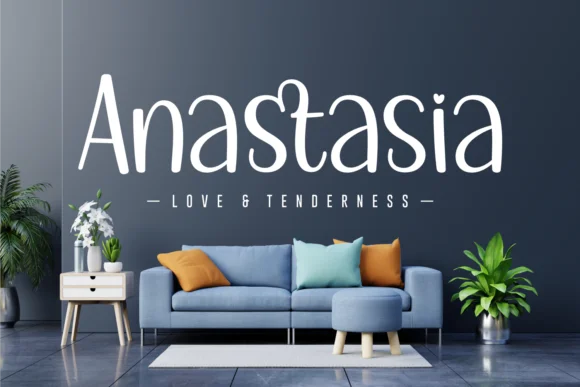
Anastasia is a playful, well-rounded handwritten font that adds charm to any design. Its gentle style brings a joyful and romantic touch to your projects, making it perfect for a wide range of creative ideas.
This is one of the best fonts for posters to elevate your designs and give them a delightful, unique look!
Wrapping Up
We hope these amazing free fonts for posters will help you effortlessly elevate your designs and bring your creative visions to life. Each font in this collection offers unique styles, from bold and modern to playful and vintage, allowing you to find the perfect match for any project.
These fonts are highly versatile, making them ideal for a wide range of themes, whether you’re working on event posters, promotional materials, branding, or artistic displays. With these amazing fonts at your fingertips, you can easily add a professional touch to your designs.
So download these free fonts and add them to your design toolkit now!
Like this post? Check out more amazing graphic design resources and inspiration on our blog.
This is a really helpful list of poster fonts, thanks for sharing; Do you have any exemples using this fonts?
I particularly appreciate how this collection balances different typographic styles – from the clean, professional look of Mosk to the playful Beautiful Child font. The inclusion of both modern sans-serifs and decorative scripts makes this a truly versatile resource. As a designer, I find the Xillian font especially interesting for its high-fashion application potential. It’s also helpful that you’ve included specific use-case suggestions for each font, making it easier for designers to choose the right one for their projects.
Thank you for providing such useful information. I’ve been having trouble coming up with many questions about this topic. I’ll stick with you!
We hope these amazing free fonts for posters will help you effortlessly elevate your designs and bring your creative visions to life.
Amazing font!!!! Whether you want bold fonts or something minimal for aesthetic designs, this list will keep you covered.
Thanks for sharing these fonts, I will try to use them next time I make a beautiful poster.
Great information you provide, it provides some useful playing tips.
These fonts are great, thank you so much for sharing! I’m excited to try them out on my next beautiful poster.
I adore that you informed me about this article since I think it’s amazing.
Thank you for this helpful list! These fonts look so cool and fun. I will try some of them for my next poster design. Very good ideas!
it helps relax and reduce stress
Struggling with complex image edits? Kontext Dev offers free AI-powered local image editing with character consistency and multi-modal input — perfect for artists and developers.
This is awesome! Finding free fonts that actually look good for posters can be tough, so a ‘Top 11’ list is super helpful. I’m excited to check out these must-have poster fonts to elevate my designs. Great resource for graphic designers!
Hey, this sounds super useful! A list of top free fonts specifically for posters is exactly what I need. It’s great to have a curated selection of ‘must-have’ fonts, especially for printable designs. Thanks for putting this together for graphic designers, it’s a real time-saver!
This is a fantastic list! “Top 11 Free Fonts For Posters – Elevate Your Designs” sounds super helpful. I’m always on the lookout for great free fonts, and knowing these are specifically for posters and printables is exactly what I need as a graphic designer. Can’t wait to check them out!
Can’t wait to try out some of these spectacular fonts for my next printable designs!
Love this list of free poster fonts! The title really grabbed me, and the content delivers. It’s awesome to have such spectacular options for printable designs – these are definitely going into my designer toolkit. Thanks for sharing!
I thought your article was interesting. I can’t wait for your post to come out soon. Have luck with the next update. This article is really good and interesting.
This is a great essay, and it’s an honor that you wrote it. I hope you keep publishing things like this matter.
What a fantastic list! These are perfect for my upcoming projects. Thanks for the great recommendations!
Even in curated design lists—like this roundup of standout, free poster fonts from clean sans-serifs to playful scripts Pixel77—there’s undeniable value in simplicity and clarity. Likewise, TextNow APK streamlines connection by enabling direct, peer-to-peer communication without intermediaries.
Excited to see how these recommendations can elevate my work!
thanks for sharing
good share
Can’t wait to check them out!
great
This post is a lifesaver! I’m always on the hunt for great free fonts, and having a curated list specifically for posters is incredibly valuable. It’s awesome to get these ‘must-have’ recommendations to elevate designs without breaking the bank. Thanks for sharing!
The exchange of ideas in this forum is incredibly productive. Companies aiming to maintain high standards in glove manufacturing would do well to consider the feedback and suggestions posted here.
BASEBALL 9 is an exciting, realistic sports game about baseball. Become the manager of a professional baseball team and lead your team to victory, competing in higher-level tournaments.
This is an incredibly useful roundup! The variety, especially the inclusion of vintage scripts like Nathan and elegant fonts like Xillian, ensures every project is covered. I’m curious: which of these free fonts would you recommend for a highly specific, rugged theme, perhaps a unique “cowboy safari” adventure poster? Adding these to my design toolkit immediately.
refer to decorative text generated via Unicode to stand out on social media platforms like Instagram or Twitter
Finding decent free fonts for posters is such a struggle, especially when you need something that stays legible at a distance. I’ve been looking for a solid bold typeface for a gig poster I’m designing this weekend. Hopefully, one of these 11 has that heavy weight I’m looking for!
The modern sans-serif option is perfect for minimal, high-impact designs, while Enyo Slab adds that playful energy ideal for events and casual themes.
Great roundup of poster fonts! Choosing the right typeface can completely transform a poster’s impact. I especially appreciate that you included free options — it’s always helpful for designers working on tight budgets. Bold display fonts are essential for grabbing attention, whether it’s for print or digital media like video thumbnails and social graphics.
I use bold display fonts like these for video thumbnails and title screens. Pairing them with a clean black background really makes the type pop – minimal design can be just as powerful as complex layouts.
I never thought about how a bold slab serif like Bebas Neue can totally change the feel of a poster — after reading this I’m itching to try it on my next event flyer.
Great roundup! Blackletter and serif fonts have such a timeless, mystical quality — perfect for anything with an esoteric or spiritual theme. I’ve been noticing how much visual design matters in the spiritual tool space too. Sites like destiny chart readers really benefit from typography that feels both modern and ancient. Typography sets the energy before a single word is read!
Excited to see how these recommendations can elevate my work!
What a fantastic list! These are perfect for my upcoming projects. Thanks for the great recommendations!
I really enjoyed this roundup of poster fonts! It’s great to see such a diverse selection that caters to different design styles. I particularly loved the inclusion of bold, eye-catching options like “Bebas Neue,” which truly stands out in promotional materials. The tips on pairing fonts effectively were also very helpful—I often struggle with that! For anyone looking to elevate their designs further, I’ve found that considering multimedia elements can enhance the overall impact. At RemoveVideo, we explore related topics like how to incorporate video graphics into your posters, which can really take your work to the next level. Thanks for sharing these resources; I’m excited to experiment with these fonts in my upcoming projects!
Excellent font recommendations for poster design! These choices really make a visual impact.
Great collection! I’ve been designing posters for a few years now and always appreciate when someone puts together a solid list of free options. Helvetica and Impact are classics that belong in every designer’s toolkit, but I really appreciate discovering lesser-known free fonts that can give posters that unique edge. The thing about poster design is that your font choice can make or break the whole piece – it needs to be readable from a distance but still expressive. Thanks for sharing these resources, definitely saving this for future projects!
Finding the right typography for posters is a challenge, but this list is helpful. I love the Mosk font for clean designs and Gothicha for unique projects.
Really solid selection of poster fonts! I especially like Mosk for its clean, minimalist look. As a designer, I often find that picking the right font is only half the battle—once the posters are printed and ready for shipping, managing the logistics becomes the next hurdle. I’ve been using Cubic Feet Calculator to quickly estimate the shipping volume for bulk poster tubes and display stands. It’s a lifesaver for the ‘boring’ side of the design business. Thanks for the typography inspiration!
Typography can truly make or break the visual impact of a poster, so having a reliable list of free options is incredibly helpful for any designer’s workflow. I really appreciate how this selection covers such a wide variety of styles, from bold headers to more subtle, minimal choices. If you find yourself needing a creative break after refining your layouts, the ZooBlocks Game is a great way to reset your brain.
This is a fantastic roundup of poster fonts! I really appreciate the variety you’ve included, from the bold and modern like Balistine to the more whimsical ones like Beautiful Child. It’s super helpful to have these curated options for different design vibes. The Gothicha Medieval Sans also looks perfect for that vintage touch. Great job!
Font choice can completely transform a poster design. Having a curated list of free options saves so much time compared to scrolling through thousands of fonts on Google Fonts.
Great post! Thanks for sharing. Check out LipSyncX for amazing AI lip sync technology!
This is a great list; I particularly like the Enyo Slab font for its playful vibe. I wonder if you have any advice on pairing fonts from this list for a more complex poster design?
I can’t tell you how timely this post was for me. I was running into this exact issue earlier today and was having a hard time finding a clear solution until I landed here. Your step-by-step approach made it so much easier to understand where I was going wrong. Thank you for taking the time to write this out—it was exactly what I needed!
What a fantastic list of free poster fonts! It’s always a challenge to find that perfect balance between bold and minimal for different design aesthetics, so this curated selection is incredibly helpful. I especially appreciate the focus on quality options that elevate designs effortlessly. Thanks for sharing these gems!
Great selection of fonts! As someone building ShipGrowth, a directory for AI tools, I really appreciate high-quality design resources like these. These poster fonts are perfect for creating eye-catching marketing materials for new tech projects. Thanks for sharing!
Typography can completely change the visual impact of a design, so having a solid list of go-to options is incredibly helpful for any project. I appreciate the variety here, especially the mix between bold statement pieces and cleaner, minimal styles. These recommendations will definitely save me some time during the brainstorming phase of my next layout.
Typography can completely change the tone of a design, so having a reliable list of free options is incredibly helpful for quick projects. I particularly appreciate the inclusion of both bold and minimal styles, as it covers a lot of ground for different layout needs. Thanks for putting this collection together; it saved me a lot of time scrolling through endless font libraries.
Thanks for putting this together. Clear, concise and easy to follow. — Olivia kgsg
Great roundup! The variety here is impressive — from Mosk’s clean minimalism to the vintage charm of Nathan, there’s something for every poster style. Alinkha Bothine is a hidden gem for elegant script work. Bookmarking this for my next project.
This is exactly what I’ve been looking for! I’ve been struggling to find the right fonts for my poster projects, and I love that this article covers both bold and minimal options. The curated selection sounds promising – I’m definitely going to check out the Mosk Font and that Balistine Fonts Bundle since I need something versatile for different design styles.
This is a really helpful list of poster fonts, thanks for sharing; Do you have any examples using these fonts?
This is a really helpful list of poster fonts, thanks for sharing; Do you have any examples using these fonts?
This is a really helpful list of poster fonts, thanks for sharing; Do you have any examples using these fonts?
Really enjoyed reading this. Bookmarked for later!
What a fantastic roundup of poster fonts! Typography makes such a huge difference in design, and these free options are perfect for creative projects. Choosing the right font is also crucial when designing party invitations. At Birthday Invitation AI we use carefully selected typography to help people create stunning, personalized invitations that really stand out.
Thanks for putting this together! I’ve been struggling to find the right font for my upcoming poster project and was torn between going bold or keeping things minimal and aesthetic. It’s really helpful to see that your curated list covers both styles instead of just pushing one direction. I’m definitely going to check out the Mosk Font and that Balistine bundle you mentioned since I need something that works for a modern design.
Quality content right here. Appreciate it.
Quality content right here. Appreciate it.
Quality content right here. Appreciate it.
Great roundup of poster fonts! Typography choice can really make or break a poster design. I’ve been working on an AI-powered poster creation tool and font pairing is one of the trickiest parts to get right — these free options are a solid starting point for anyone designing event flyers or promotional materials.
Love how this roundup balances bold display fonts with softer scripts—it’s a ready‑made toolkit for different poster moods.
Thanks so much for putting this together! I’ve been struggling to find the right fonts for my poster projects, and I really appreciate that you included both bold and minimal options. The fact that you curated a selection specifically for posters makes such a difference compared to generic font lists. I’m definitely going to check out the Mosk Font and that Balistine bundle you mentioned – exactly what I was looking for!
I recently designed a poster for my local book club and the Tea For God font really helped it pop! It added that cozy, literary feel we were going for. Thanks for sharing these awesome font options!
Thanks for this detailed write-up! It’s always great to learn from quality content like this.
This is exactly what I’ve been looking for! I’ve been struggling to find the right font for my upcoming poster project, and I love that this list covers both bold and minimal options. The fact that you included a whole bundle like the Balistine Fonts really gives people more bang for their buck. I’m definitely going to check out the Mosk Font and Tea For God Font since those seem like they’d work well for the aesthetic design I’m going for.
Thanks for sharing. It was very helpful for me.
Great roundup! I’ve been struggling to find the right font for my upcoming event posters, and this list is exactly what I needed. I love that you included options for both bold and minimal aesthetic designs since I’m torn between those two directions. The fact that you highlighted specific fonts like Mosk and the Balistine bundle gives me actual options to test out instead of just vague recommendations. Definitely saving this to reference when I start my design project!
I’ve been struggling to find the right font for my upcoming poster project, and this list is exactly what I needed! I really appreciate that you included both bold and minimal options since I’m torn between a striking design and something more understated. The variety in your curated selection—from Mosk Font to the Gothicha Medieval Sans—gives me plenty of directions to explore. Definitely bookmarking this for future reference!
PCB Assembly PCBA box build hardware.
Nail designs maker free online tool. Make your own design.
Great roundup of poster fonts! Typography is such a crucial element in design that people often overlook. One thing I’d add is that font color choice matters just as much as the typeface itself. I’ve been using AI color analysis to find high-contrast color combos that make poster text really pop and stay readable from a distance.
Great roundup of poster fonts! Typography is such a crucial element in design that people often overlook. One thing I’d add is that font color choice matters just as much as the typeface itself. I’ve been using AI color analysis to find high-contrast color combos that make poster text really pop and stay readable from a distance.
I’ve been struggling to find the right fonts for my poster projects, and this list is exactly what I needed! I really appreciate that you included both bold and minimal options since I’m always torn between making a statement or keeping things clean and aesthetic. The variety in your curated selection—from Mosk Font to the Gothicha Medieval Sans—gives me plenty to experiment with for my next few designs.
I’ve been redesigning some marketing materials and was struggling to find the right fonts that would work for both bold headlines and minimal aesthetic designs. This list is exactly what I needed! I’m definitely going to check out the Mosk Font and that Balistine bundle since I love having options for different project styles. Thanks for curating this—it’s so much better than scrolling through endless font websites.
Great roundup! I’ve been struggling to find the right font for a project I’m working on, and I really appreciate how you broke this down into both bold and minimal options. I’m definitely going to check out the Mosk Font and that Balistine bundle since I need something versatile for multiple poster designs. This is exactly the kind of curated list that saves me from endless scrolling through font libraries.
What an excellent roundup of fonts for poster design! Finding the right typeface can make or break a poster, and you’ve included a great mix of free and premium options. The categorization by style makes it super easy to narrow down choices for different projects. I’ve been exploring AI-powered design tools like Kirkify that pair beautifully with great typography choices.
ColorGuesser.app is an addictive web-based game designed for creators. Challenge your visual memory by guessing colors from common nouns or technical HEX/RGB values. Perfect for designers, developers, and anyone looking to sharpen their digital palette skills in a fun, daily ritual.
It’s great that the article highlights fonts suitable for different poster themes; the inclusion of vintage and medieval styles adds another dimension to design possibilities beyond the usual modern and playful options.
It’s great to see fonts suited for different poster themes; the medieval and script options really expand the possibilities beyond typical modern designs.
It’s great that the article highlights fonts suitable for different poster styles, but providing some visual examples of each font in action would really enhance the selection process for designers.
Wow, what a great collection of fonts! I’m always on the lookout for fresh typefaces to use in my poster designs, and this list has given me some awesome new options to try. Thanks for putting together such a helpful resource, I’ll be sure to check these out!
This list of free poster fonts is so helpful! I’m always looking for good options that are also legible from a distance. Xillian looks really chic for fashion projects.
This is a great list of fonts! I’m always on the lookout for new and interesting typefaces to use in my poster designs. I especially liked the inclusion of some of the more unique and less commonly used fonts. Thanks for putting this together!
what about the list of best paid fonts? thx
thank u, i like it!
This list is so helpful! Finding free fonts that aren’t super generic can be a real pain, especially for posters. I’m definitely checking out Mosk and Xillian for my next project.
This is a fantastic list! I’m always looking for quality free fonts, and the examples you’ve provided for posters are really inspiring. I’m excited to try some of these out in my next project.
Thanks for sharing this post about Fonts For Posters | 11 Free Poster Fonts For Designers. I enjoyed the ideas here.
Nice article! Learned something new today.
This curated list is a total lifesaver for anyone tired of scrolling through generic font libraries—the mix of clean modern styles and unique vintage scripts is exactly what I needed to level up my next poster project!
It’s simply amazing!
great!
This is exactly what I’ve been looking for! I’ve been struggling to find the right fonts for my poster projects, and I love that this list covers both bold and minimal options depending on the vibe I’m going for. The variety in this curated selection seems really thoughtful – I’m definitely going to check out the Mosk Font and that Balistine bundle since I usually need multiple options to work with.
This is a fantastic list!Thank you!
Great overview! I love how online platforms have made complex board games so much more accessible to everyone, especially during those times when you can’t get the whole group together in person. The digital interface really helps speed up some of the more tedious rule-checks too. When I’m not in the middle of a marathon session, I often jump into quick browser games like Scritchy Scratchy for a few minutes of casual fun. It’s the perfect palate cleanser between heavy strategy games! Thanks for sharing this list.
This is a fantastic collection of poster fonts! As someone who appreciates clean design, I’m always looking for ways to improve visual impact in my projects. I actually find that choosing the right font is just as important as the content itself—something I’ve been thinking about a lot lately while browsing the sleek layouts and data on the Slay the Spire 2 Wiki. These fonts will definitely come in handy for my next creative endeavor. Thanks for curating such a useful list for designers!
Great overview of font choices for poster design! The point about readability at different sizes is crucial — especially for posters that need to work both from a distance and up close. I work with AI image generation tools and find that typography principles transfer surprisingly well to prompt crafting for text-heavy AI images. I maintain nanoprompts.org which has hundreds of free prompts including typography and design-related examples. Would love to see how these font principles could be applied to AI-generated poster designs. Thanks for this useful guide!
Great overview of typography principles for posters! I work with AI image generation tools and finding the right prompt structure is surprisingly similar to choosing fonts — specific keywords and modifiers make a huge difference in the output, just like good font choices here. I’ve been collecting prompt examples at nanoprompts.org. Thanks for the useful breakdown!
Wow, this is a great list of free fonts! I’m always looking for new fonts for my poster designs. I especially appreciate that you highlighted fonts perfect for printable designs. Definitely saving this for future projects!
Great list! I especially love the bold options for poster designs. I’m planning to use one of these for my children’s reading milestone charts. Do you think these fonts work well for home printing too? Thanks!
Wow, this is a great list of free poster fonts! I’m always looking for new and interesting typefaces to use in my designs. The title totally grabbed my attention, and the content didn’t disappoint. I especially like that you included fonts that are a must-have for graphic designers.
Wow, this is a great list of free fonts! I’m always looking for new typefaces for my poster designs. I especially appreciate that you included some unique and eye-catching options; I’m excited to try out a few of these!
I’ve been stuck on finding a good bold font for event posters, so seeing “Bebas Neue” highlighted here is a huge help. I’ll definitely be checking out the selection at nano-banana2.com for more options like this.
This is a fantastic collection of fonts! I’ve been looking for some clean and bold options for my upcoming poster projects, and these selections are exactly what I needed.
Great roundup of poster fonts! Typography can really make or break a design, and having a solid list of free options like this is so helpful. I always find myself spending too long choosing fonts, so curated lists like these save a lot of time.
Really appreciate the variety in this list — from bold display fonts to more artistic styles. The preview images make it easy to see how each one would work on an actual poster. Bookmarked for future projects!
I appreciate the focus on sans-serif fonts for minimalistic posters; the clean style mentioned for headings is exactly what I need for an upcoming project. It’s helpful to see practical examples that balance professionalism with readability.
This is a great essay!thanks!
I really appreciated the inclusion of the Balistine bundle; bundles can be such a lifesaver when you need a cohesive look across multiple design elements. I’ve found that sometimes individual free fonts can be a bit limiting if you need more than just a headline. Have you found that some of these fonts, while great for headlines, also offer enough versatility for smaller subheadings or body text without losing their impact?
The Mosk Font is a great choice for poster designs with its clean and simple style.
I really appreciated the callout for “Tea For God” and its “charming character” for posters. I’ve always leaned towards more serious fonts, but that description makes me want to try something a bit more playful! Do you find that certain industries or themes respond better to these more whimsical styles, or is it more about the overall design aesthetic?
Your writing style is very captivating and makes the subject matter so much more enjoyable to explore and understand.
Nice!
deepseekv4.click is an unofficial, third-party domain focused on the hype and speculation around a potential future DeepSeek-V4 AI model. It’s not affiliated with the official DeepSeek company, but instead is likely used as a speculative blog or SEO/marketing property, aggregating rumors, ideas, and possible feature discussions about what a next-generation DeepSeek model might include.
deepseekv4.click is an unofficial, third-party domain focused on the hype and speculation around a potential future DeepSeek-V4 AI model. It is not affiliated with the official DeepSeek company. Instead, it likely serves as a speculative blog, SEO/marketing property, or redirect site that aggregates rumors, ideas, and possible feature discussions about what a next-generation DeepSeek model (“DeepSeek-V4”) might include. The site is positioned as a free resource and does not advertise an official product; visitors should treat any claims as informal commentary rather than official announcements.
DeepSeek V4 Hub is a developer-focused AI model comparison and access platform that helps users evaluate cost-effective models like DeepSeek, MiniMax, and Qwen against leading models such as Claude, Gemini, and GPT.
It offers benchmarks, side-by-side comparisons, use-case recommendations, and discounted official API key options so developers can choose the right model for coding, agent workflows, automation, and production use while optimizing both performance and cost.
deepseekv4.click is an unofficial, third-party domain focused on the anticipation around a potential future DeepSeek-V4 AI model. It is not affiliated with the official DeepSeek company.
The site is likely used as a speculative blog or SEO/marketing property that aggregates rumors, ideas, and possible feature discussions about what a next-generation DeepSeek model (“DeepSeek-V4”) might include. It may also act as a redirect or placeholder rather than a formal product page.
Visitors should treat any content as informal commentary, not official announcements or product documentation, and be aware that details about features, capabilities, or releases are speculative unless confirmed on DeepSeek’s official channels.
Font selection can make or break a poster and this roundup covers the spectrum really well – from the bold condensed display faces that command attention from a distance to the more refined options that work for cultural or editorial contexts. The examples showing how each font behaves at large scale are particularly useful since many designers pick fonts without testing them at actual poster dimensions. Bookmarking this for the next print project.
Free DET Score(https://www.detpractice.com/det-score) Calculator, Converter & Predictor. Understand your Duolingo English Test scores, compare with TOEFL & IELTS, and plan your target score.
Great roundup! I’ve been looking for some fresh poster fonts and this list is exactly what I needed. The mix of bold options like Mosk alongside more minimal choices like Tea For God gives designers real flexibility depending on the vibe they’re going for. Definitely bookmarking this to try out that Balistine bundle.
Really helpful collection. I like that this list covers very different poster styles — from clean sans-serifs like Mosk to more decorative and playful options like Dreaming and Beautiful Child. It makes it much easier to pick the right font depending on the mood of the design.
Great article, thanks for sharing this!
I’ve been looking for a clear explanation of this for months — finally found it here. Saved this page immediately.
I really appreciated the breakdown of different poster font styles – the distinction between bold display fonts versus more readable body type is something I always struggle with when designing event flyers. I’ve been using a couple from this list for a local music festival poster and the feedback has been great.
I’m definitely intrigued by the Gothicha Medieval Sans being listed as free—that’s a nice find for anyone on a budget. Also curious about the “Tea For God” font name, sounds whimsical but I wonder if it’s actually readable for poster text.
This is a really helpful and well-curated list for anyone working on poster design. I like how it covers different styles—from clean and minimal sans-serif fonts to more playful and bold options—so there’s something for every kind of project.
I love discovering new fonts, especially for poster designs! The Mosk Font and Enyo Slab Font really caught my eye. Thanks for sharing this great list, girigo. Can’t wait to try out these free poster fonts in my next project.
I really appreciated how you highlighted Mosk Font’s ability to grab attention for headings without being too flashy – that balance is often tough to strike. I’ve definitely found myself overthinking header fonts trying to get that perfect blend of modern and readable. For designers who might be newer to typography, do you find there’s a common pitfall they should avoid when choosing a primary display font, especially for event posters?
I tried something similar a while back and ran into a few issues. Wish I had this resource then — would have saved me a lot of time.
The idea of watching trending shows for free is attractive, but viewers should avoid relying solely on unofficial services. Legal streaming platforms offer more reliability and fewer risks.
The multi-device support makes Visit very flexible. Being able to stream on phones, tablets, or smart TVs allows users to watch their favorite content wherever they feel comfortable.
This post is a lifesaver!Great!!
Great font list. I built a cartoon color matching game recently and realized how similar font pairing is to color palette design – both need visual harmony and contrast. Would love to see a follow-up on font pairing for game UI designs.
DanceAI.Art is a free AI dance video generator that transforms any photo into a smooth, viral-ready dance video in seconds. With 8,000+ trending templates including TikTok challenges and K-pop routines, it requires no animation skills — just upload a photo, pick a motion, and share.
I’m really digging the Enyo Slab font – it definitely has that fun, upbeat feel you mentioned, perfect for a party poster. I’ve been looking for something a little less serious, and I think it could really work. I might give Mosk a try too for something cleaner.
Great collection of poster fonts! The variety here is impressive – from bold display fonts to elegant script styles. Typography plays such a huge role in making designs stand out. Thanks for putting together such a comprehensive and useful resource for designers!
I’ve been struggling to find the right font for an upcoming event poster, and I think the Enyo Slab Font could be perfect! It definitely has that upbeat vibe I’m going for. I just hope it works well with the images I’ve chosen.
I’ve been looking for some good fonts for posters lately, and I’m definitely going to check out Mosk! That clean, simple style sounds perfect for a project I’ve got coming up – hopefully it’ll grab people’s attention like you said. I’m also curious about the Balistine bundle, 20 fonts sounds like a lot of options to play with!
I’m really digging the Enyo Slab font! I hadn’t considered using a slab serif for a party poster, but it actually looks like it could be super fun. I’ll have to try that out for my friend’s birthday next month!
I like the Enyo Slab font!
I’m really digging the Enyo Slab font! PhotoDance.art – Turn Any Photo Into a Dance Video with AI
Great breakdown of poster fonts! I’ve been using Bebas Neue for bold headers and Oswald for subheads—it creates a nice hierarchy without overcomplicating things (Slime RNG game guide). For anyone exploring different design styles, there’s also a Slime RNG game guide that shows how visual variety works in practice, which can spark ideas for poster compositions too.
I was actually looking for a good slab serif for a music poster, so Enyo Slab caught my eye right away. Also, the Gothicha Medieval Sans being free is a nice bonus—might grab that for a quick project.
This is exactly what I’ve been looking for! GREAT!!!
This article sounds fantastic! I’m always on the hunt for great free fonts, especially for posters. A curated list of ‘must-have’ fonts for graphic designers is incredibly valuable. I’m excited to check out these top 11 spectacular options to elevate my designs. Thanks for putting this together!
This is a fantastic roundup of poster fonts!GREAT!!!