Color Theory in Graphic Design – Usage & Tools
Color is one of the most potent tools in graphic design. It shapes emotions, tells stories, and helps create memorable visuals. If you master the basics of color theory in graphic design, you can effortlessly craft eye-catching designs.
Whether you’re a novice or a seasoned designer, understanding the relationships between colors, their meanings, and their impact on viewers is crucial.
We’ll explore the fundamentals of color theory in graphic design and how you can use it to create stunning, practical designs that truly resonate with your audience. Let’s dive in!
Table Of Contents
What Is Color Theory?
Color theory is a framework for understanding how colors work together and the effects they create when combined. It’s essential knowledge for graphic designers because color choices can significantly impact how a design is perceived.
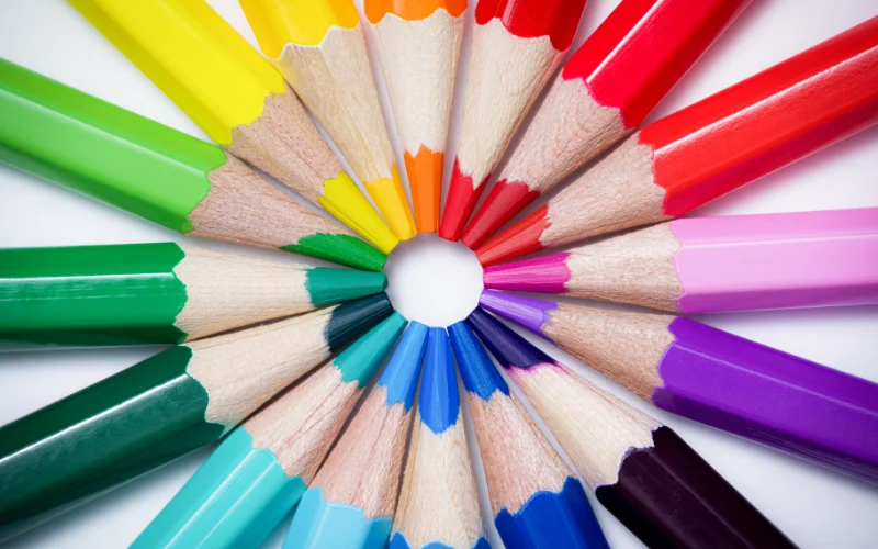
A color wheel is a pinnacle tool in color theory. It organizes colors based on their relationships with one another.
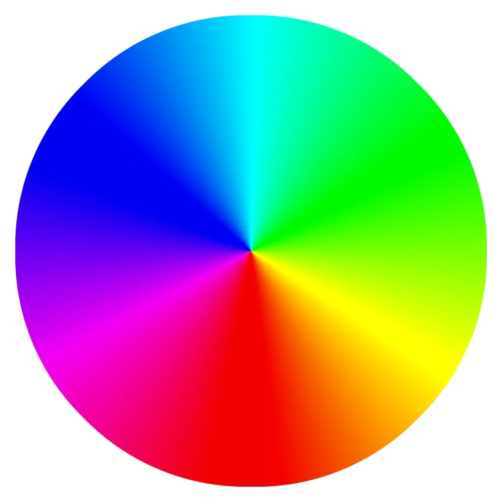
The wheel is divided into three sections: primary, secondary, and tertiary colors. They are the building blocks for creating any color scheme.
- Primary colors in graphic design (red, blue, and yellow) are the foundation. These are pure colors that cannot be created by mixing other colors.
- Secondary colors (green, orange, and purple) are created when two primary colors are mixed.
- Tertiary colors are created by mixing primary and secondary colors, resulting in more nuanced hues like red-orange and blue-green.
Color Harmonies
Color harmonies refer to the combination of visually pleasing colors in a design.
By selecting colors that work well together, graphic designers can create balance, contrast, or unity within their designs.
Here are the most common types:
- Complementary Colors: Colors directly opposite each other (e.g., blue and orange).
- Analogous Colors: Colors next to each other (e.g., yellow, yellow-green, green).
- Triadic Colors: Three evenly spaced colors (e.g., red, blue, yellow).
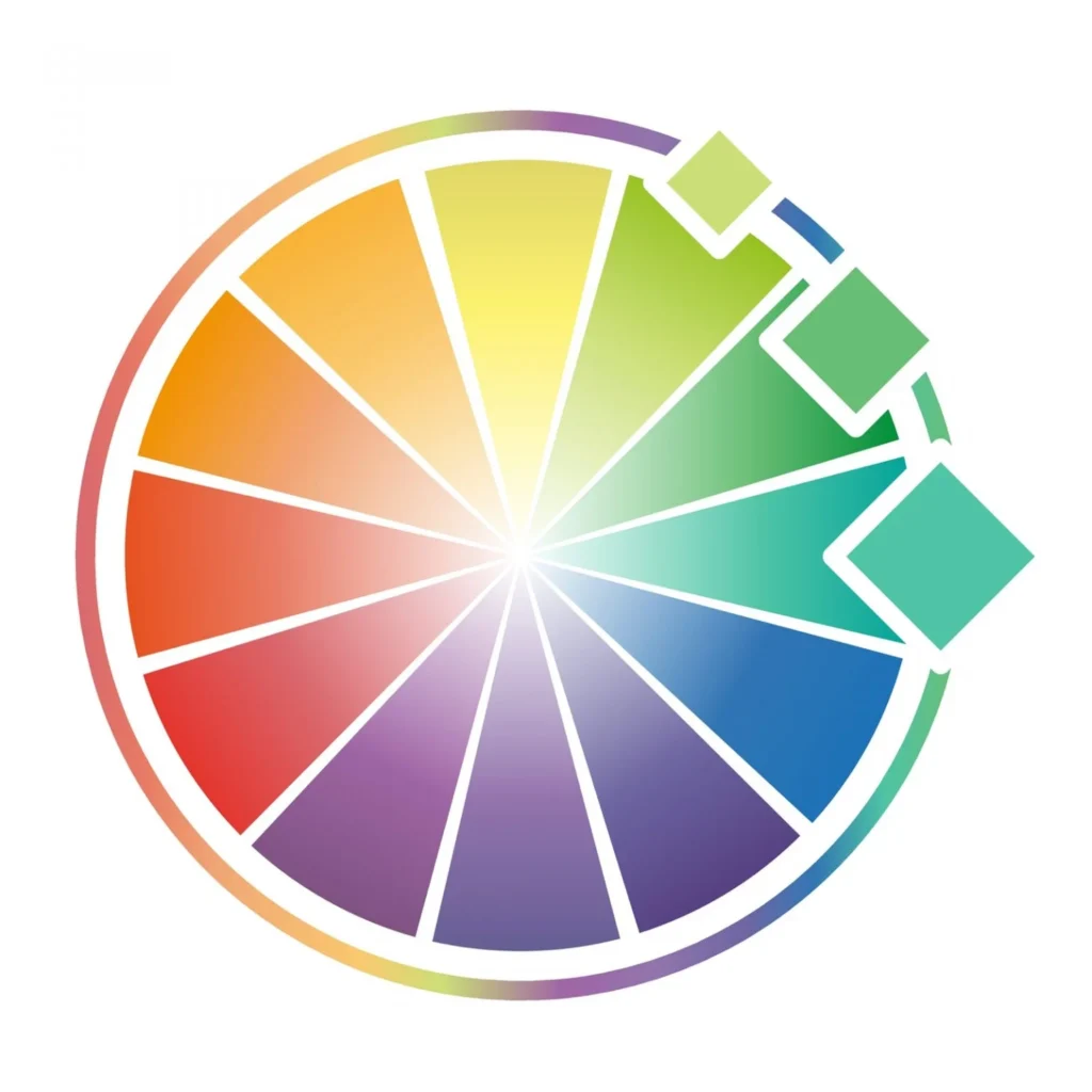
- Split-Complementary Colors: One base color and two adjacent to its complement (e.g., blue, yellow-orange, red-orange).
- Monochromatic Colors: Variations of a single hue (e.g., light blue, navy blue).
Let’s look at them in more detail below.
Complementary Colors
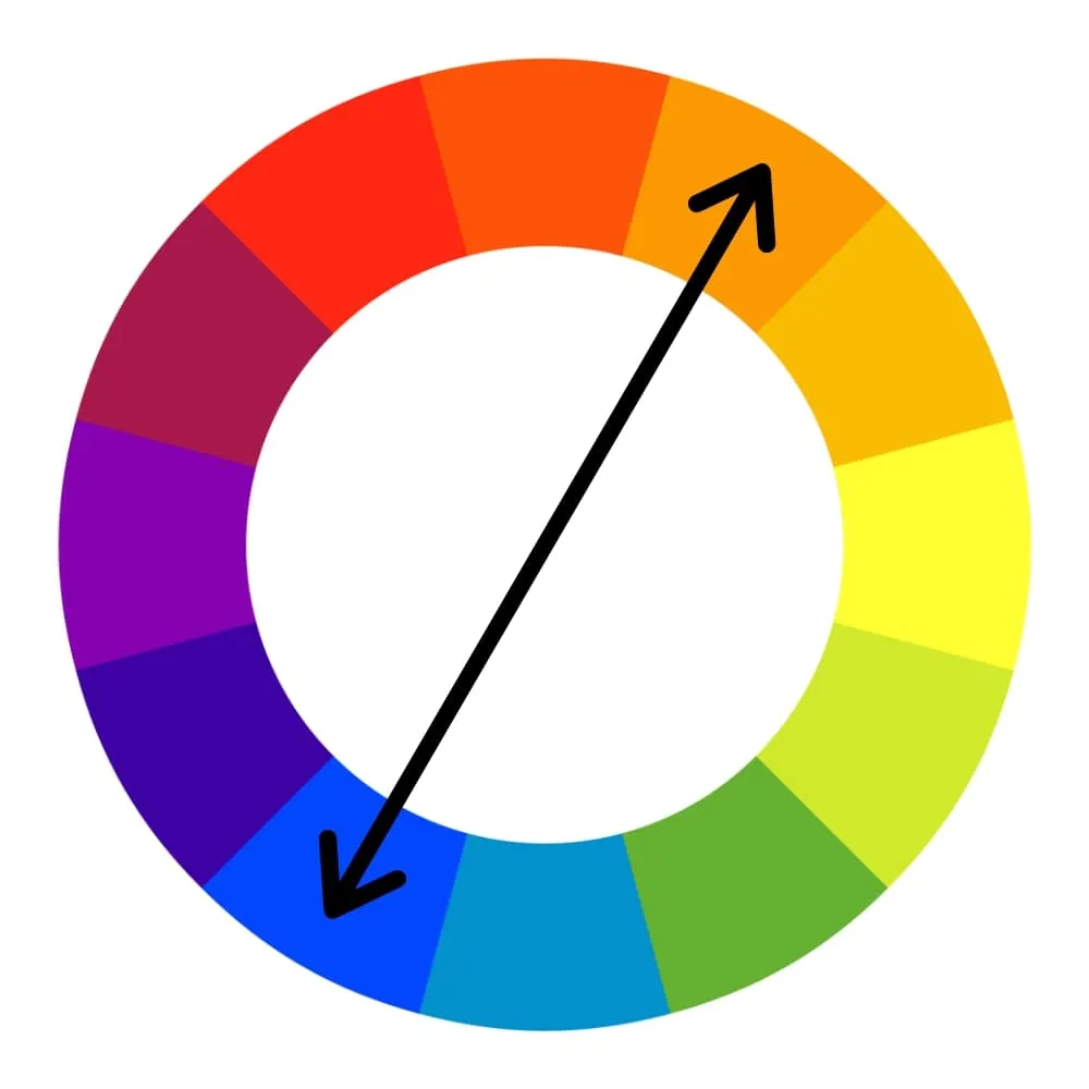
When two colors sit directly across from each other on the color wheel, they are called complementary. Simple examples include blue and orange, red and green, and purple and yellow are popular complementary pairs.
Analogous Colors
Analogous colors sit side by side on the color wheel. They create a natural flow between them and often share a similar hue, creating a cohesive and calming color scheme.
For example, colors like blue, teal, and green are analogous, blending smoothly.
Triadic Colors
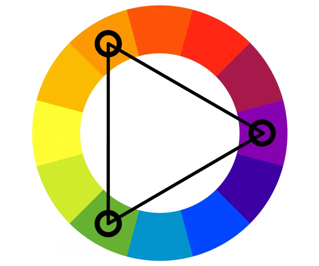
A group of three colors evenly spaced around the color wheel forms a triadic color scheme known for its vibrant and balanced contrast.
Choose three colors 120 degrees apart on the color wheel to create a triadic color scheme.
Split-Complementary Colors
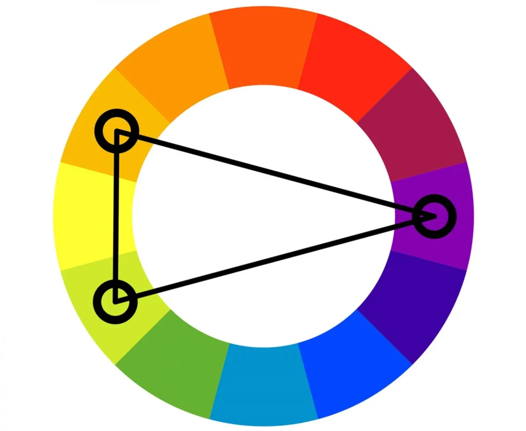
Split complementary colors are a variation of the complementary color scheme. In a split complementary scheme, you start with one base color.
Instead of choosing the color directly opposite on the color wheel (as in a complementary scheme), you select the two colors adjacent to the direct complement.
This results in a color scheme with intense visual contrast, like a complementary scheme, but with more harmony and less tension.
Monochromatic Color Schemes
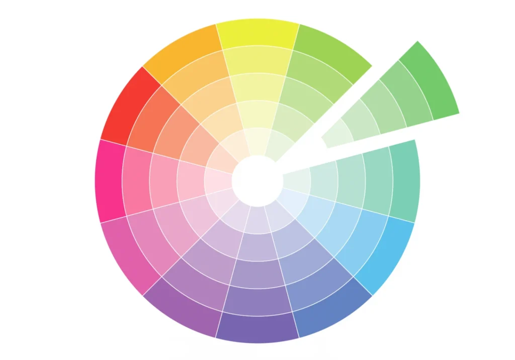
A monochromatic color scheme is based on variations in lightness and saturation of a single color. This scheme uses different shades (darker versions), tints (lighter versions), and tones (less saturated versions) of one base color to create a cohesive and harmonious look.
Does Color Have a Psychological Impact?
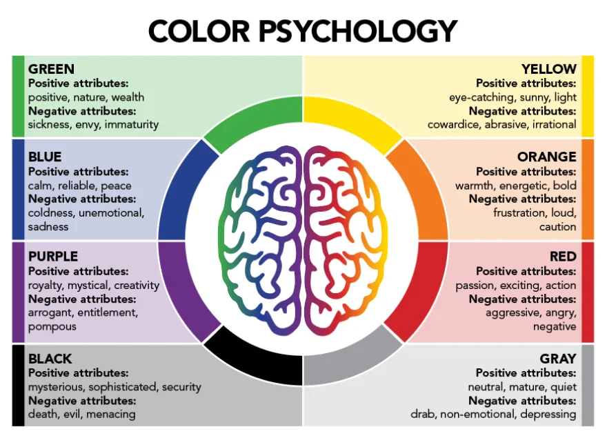
Color plays a massive role in shaping how we feel and respond to things, especially in graphic design. Certain colors evoke specific emotions and perceptions, and brands often use this to their advantage.
For instance, many financial institutions and IT organizations use the color blue in their branding because people frequently associate it with trust and dependability. Conversely, red is popular for sales and promotions because it evokes urgency and enthusiasm.
Knowing how colors affect people psychologically will help you make images that evoke strong feelings in viewers and support your objectives.
Also, check out 3 Ways in Which Colors Affect Your Creativity – Backed by Science.
How to Choose the Right Colors for Your Design
Selecting the right colors for a project can significantly impact its effectiveness. There are a few things to know how to choose colors for graphic design. Let’s dive in:
Balancing Color Saturation and Contrast
Balancing color saturation and contrast is vital for practical design. High saturation makes colors vibrant and attention-grabbing, while lower saturation offers a more subtle, professional tone.
Contrast helps separate elements, ensuring important content stands out clearly.
Importance of Cultural Context in Color Choice
It’s also vital to consider cultural context when choosing colors. For example, while certain Eastern cultures associate white with grief, Western societies associate it with purity.
Awareness of these differences ensures your design resonates with the audience and avoids unintended negative perceptions.
Additional Color Selection Tips From Color Theory For Graphic Designers
- Define the project’s message and emotion.
- Choose colors that fit your audience.
- Align colors with the brand identity.
- Test color combinations for balance.
Also, check out 7 Perfect Text Colors That Can Be Used On Golden Backgrounds.
Tools for Working with Color in Graphic Design
Having the right tools can make working with color more effortless and efficient. These will help you effortlessly implement color theory in graphic design. Here are a few recommended tools that allow graphic designers to maintain consistency and unleash creativity.
Adobe Color
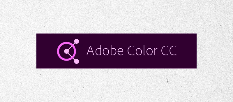
Adobe Color is a versatile color wheel tool for creating color schemes.
Features:
- Explore and create custom color palettes.
- Share and sync colors with Adobe apps.
- Easily extract color schemes from images.
Coolors
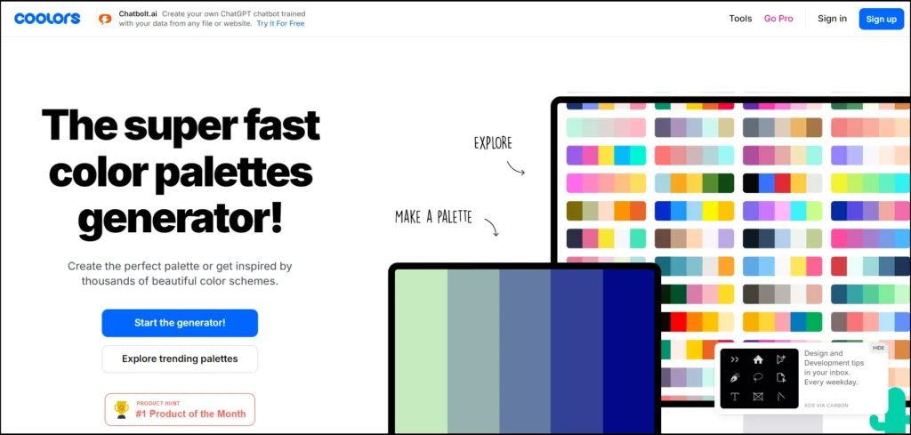
Coolors is a quick, user-friendly color palette generator that helps you combine graphic design and color theory.
Features:
- Generate color schemes with one click.
- Save and export palettes in multiple formats.
- Browse trending color palettes for inspiration.
Canva Color Palette Generator
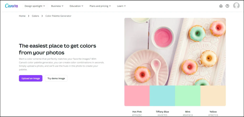
Canva’s tool allows you to create palettes from images or choose pre-made options.
Features:
- Generate color schemes from any image.
- Access a wide range of pre-made palettes.
- Easily integrate palettes into Canva designs.
Also, check out Glossary for Design Beginners: 50+ Color Related Terms
Conclusion – Color Theory In Graphic Design
Colors cannot be overlooked in graphic design. They shape how people feel and respond to visuals. By understanding color theory, designers can create harmony, contrast, and emotional impact in their work.
Whether you use complementary or analogous colors or leverage tools like Adobe Color or Coolors, the right choices make a big difference.
Take the time to experiment, stay mindful of cultural context, and always aim for consistency in your designs. With practice, your color choices will elevate your creative projects.
Frequently Asked Questions – Graphic Design And Color Theory
What is color theory in graphic design?
Color theory in graphic design refers to the principles that guide how colors are combined and interact. Understanding color relationships, harmonies, and the emotional impact of colors helps designers create visually appealing compositions.
What are the seven types of color theories?
The seven types of color theory include monochromatic, complementary, analogous, triadic, split-complementary, tetradic (rectangle), and square color schemes. Each provides different methods for creating harmonious or contrasting color combinations in design.
What are the three principles of color theory?
The three parts or principles of color theory are the color wheel, color harmony, and the context of color use. These principles guide designers in combining colors effectively and understanding their relationships.
What is the color model in graphic design?
The color model in graphic design refers to systems like RGB (Red, Green, Blue) and CMYK (Cyan, Magenta, Yellow, Black), which reproduce colors digitally and in print.
These models ensure consistency in color representation.
Want to brush up more on this topic? Check out Back to Basics – Understanding Color
Like this post? Check out more amazing content for graphic designers on our blog.
Your article is very deep and meaningful! The way you explore the topic comprehensively makes the reader feel enlightened.
Thanks a lot. Your article is profound and meaningful! The comprehensive way you explore this topic is truly inspiring to readers.
Looking for sheer curtains for living room? Superior Blinds and Curtains offers stylish and elegant sheer curtains that enhance the beauty of your space. It is durable, easy to maintain, and available in various designs to suit your home decor.
This topic is really what I need with my business.
Color theory is truly fascinating! It opens up a world of vibrant possibilities and creative expression. The way colors interact and influence emotions is nothing short of magical!
This article gives a clear and structured overview of color theory, useful for beginners in design. It explains the color wheel, harmonies, and psychology in a simple way.
Good!