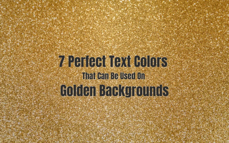
7 Perfect Text Colours That Can Be Used On Golden Backgrounds
This article will give you a detailed idea of the ideal font colour for a gold background, along with many other important features of this special background. Colour blending can take hours and hours to find the perfect match. Whether you work with interior design or text schemes, the right combination can highlight all of your project’s strengths and make it appear more appealing to the public.
However, some colours, such as gold, make the search quite challenging. The golden colour is typically associated with wealth and the decorations of ancient temples and palaces. It is still popular in both interior design and fashion. However, excessive use of this colour is considered a bad tone.
To avoid this issue, combining it with other colours is recommended. Which one complements it the best?
Table Of Contents
What Colour Font Looks Good on a Gold background?
One of the most critical conditions for using gold is moderation. It would help if you did not use it for everything in the interior, as its brightness depletes vision. So, looking for what exactly goes with a golden background might be challenging. It is also worth noting that the gold colour comes in a variety of shades.
However, for the interior to be harmonious, you should pick only one of them. When using gold, it is best to stick to a single interior style.
This colour is very demanding of all interior details: they must match its grace, be immaculate, and look expensive. Read ahead to know what text colour goes with a yellow background/gold background.
- Blue
- Green
- Black
- Red
- Burgundy
- Gray
- White
- Turquoise
- Purple
- Pink
- Brown
Warm gold tones look better with bright and light shades, while cold ones look better with dark and bright ones.
Importance of Contrast
When you work with interior design, try to create contrast when blending colours within a single space. Contrast is a basic design element. It adds visual interest and makes the space appear appealing and dynamic.
Contrast is also important in data presentation. No matter how good your material is, you will not get the results you want if you cannot present it properly.
For audiences, low-contrast text can be challenging to read or scan. Furthermore, it can cause eye strain, resulting in a loss of interest from them. As a result, it is critical to carefully select what you present and how you present it.
Also, check out Ideas To Use Preppy Backgrounds – Graphic Designer’s Guide
Best Font Colour For Gold Background
Golden is one of the most appealing colours. When used together with other colours, it subdues them.
As a result, to achieve harmony by enclosing the primary colour in a proper frame, one should pick muted tones. So, when it comes to Font Colours For Gold Background, consider the following:
1. Pink Font Colour For Gold Background
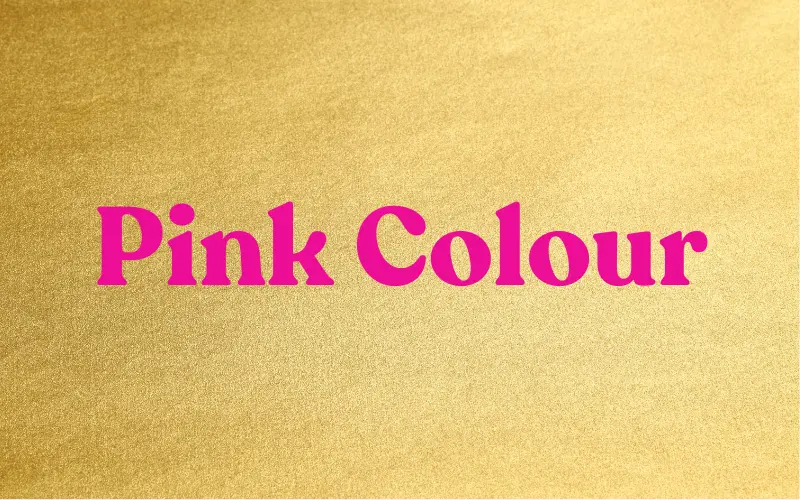
The combination of golden and pink looks delicate, airy, and light. Bright pink shades next to the gold will disrupt the delicate golden shine. So, light tones with a warm direction will be the ideal solution. Combine a golden background with the following font colours:
Royal pink
Peach pink
Orange pink
Sunset pink
Red-coral
Check Out Free Pink Glitter Background Images, Textures
2. Red Font Colour For Gold Background
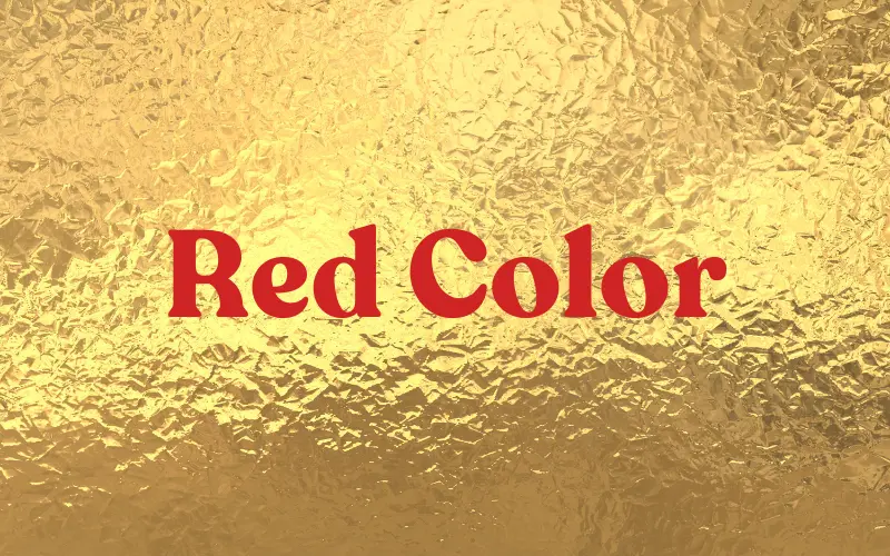
The combination of glittery gold backgrounds and red is a classic festive combination frequently used in New Year’s Eve designs. In this case, red may well be the dominant base colour. Combine the golden backgrounds with the following red fonts:
Light red
Chinese red
Dark red
Crimson red
Bright burgundy
Check Out Glittery Gold Backgrounds For Your Designs
3. Warm Green Font Colour For Gold Background
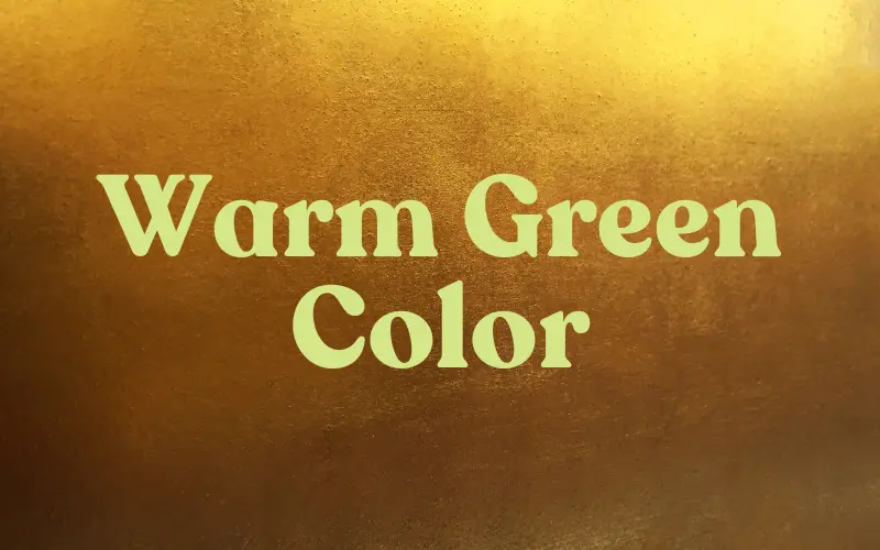
The colour combination of gold and warm green is very appealing. Shades of green must be muted to achieve harmony.
This will allow the gold to shine fully, even in the background. Consider combining gold with the following colours:
Pistachio green
Avocado green
Olive green
Swamp green
Brown green
4. Cold Green Font Colour For Gold Background
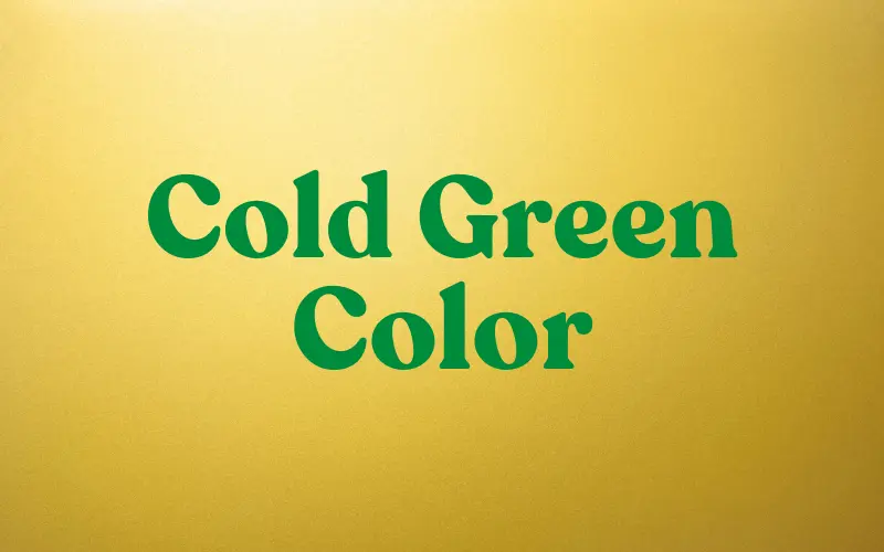
The combination of gold and cold green creates an equally bright pair. Dark tones are especially appealing.
They provide a catchy contrast in colour, lightness, and warmth. Take the following colours for the font text:
Green water
Mint
Emerald green
Malachite
Check out 300 Grand Script Fonts
5. Blue Font Colour For Gold Background
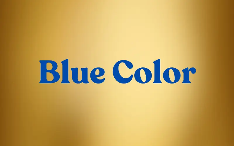
The colours gold and blue contrast in their warmth and lightness. This combo is attractive and rich. Pairs with dark blue and blue-green are particularly appealing. It is a win-win situation that can always be supplemented with white or black. Choose the following colours for the font in the combination:
Sky blue
Colour of the thrush egg
Blue-green
Black sea blue
Thunderstorm blue
6. Violet Font Colour For Gold Background
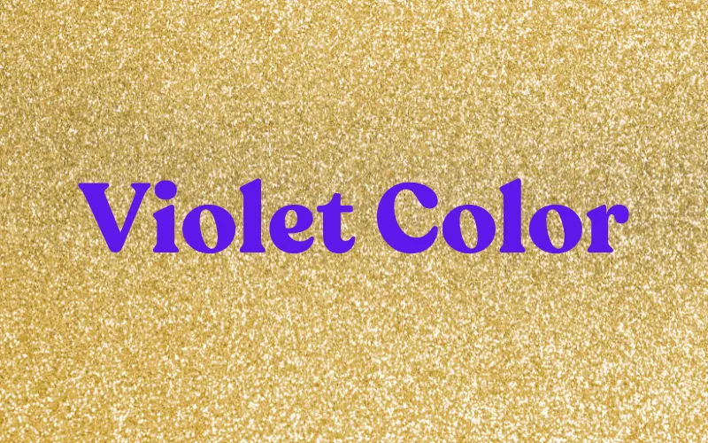
When combined with violet, golden colour forms one of the most appealing pairs (based on the contrast of additional colours). It is, however, used more frequently in interior design than in clothing. The choice of purple shades depends on the gold tone. Consider using the following ones:
Glycine violet
Thistle violet
Lilac-amethyst violet
Grape violet
Eggplant violet
7. Black Font Colour For Gold Background
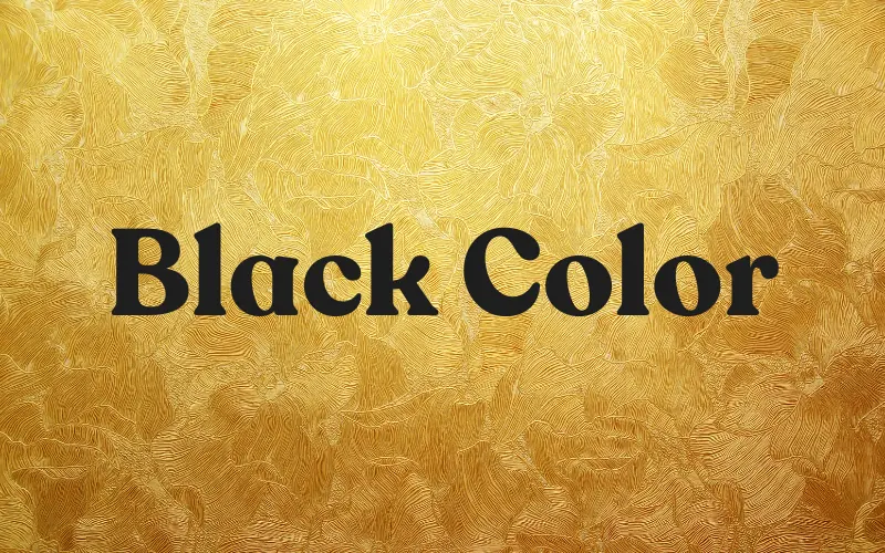
One of the most timeless combinations is black and gold. Black, the colour of nobility, and gold, the colour of kings, complement each other and achieve an absolute chic look. It is always a win-win choice. This is hands down the best font colour for a gold background.
Conclusion – Best Font Colour For Gold Background
The colour gold is associated with the sun’s non-flickering rays. It carries light, which is the crown of the entire spectrum, and thus, everything it adorns becomes visually noble. That is why it has become so popular in the field of design. The gold colour, best of all, appears in combination.
The most popular font colours for a gold background are classic black, blue, green, pink, red, and even purple. Choosing the appropriate tone will help make the project more appealing and engaging for readers and correctly emphasize and involve the audience in the dialogue.
Hope this in-depth article on what text colour goes with yellow background/gold background will help you enhance your designs even further.
Like this post? Check out more inspirational Graphic Design articles.
Sex Kontakt in Herrenberg is fine web place for your own sexy chat pleasure
Amazing Post, Thanks for sharing your knowledge with us it helps so many of us.
Thanks for sharing this great article. I found it really helpful for me. I appreciate all the effort you’ve put on this blog. Keep it up.
I can make out a great deal of essential information.
Informative and valuable content thanks for sharing!
What a wonderful article, thank you for sharing it. It was quite useful to me. Thank you for the hard work you’ve put into this site. Be consistent in your efforts.
Beautiful and fantastic blog.
Thank you. Its interesting.
Awesome blog post, really enjoyed reading through.
Okay
In design, gold symbolizes sunlight’s steadfast rays, enhancing visual nobility. Popular combinations for a gold background include classic black, blue, green, pink, red, and purple. To further engage your audience, try incorporating fun elements like the Monkey Mart game, where vibrant colors can complement your design efforts. Choosing the right tone captivates readers and deepens dialogue, making your project stand out.
To increase your battle effectiveness, concentrate on developing skills that complement your style of play.
It also ensures that employees understand their roles. Using a consistent structure across all rules familiarizes personnel.
This is a great resource for anyone designing with gold backgrounds! I especially appreciate the clear explanation of the importance of contrast and the list of 7 perfect text colors. The reminder to use gold backgrounds moderately is also helpful. Thanks for sharing!
By selecting the right font color based on these suggestions, you can create designs that highlight gold’s beauty without overwhelming the viewer, ensuring both readability and visual appeal.
Quem trabalha com produtividade sabe o quanto é importante ter o Office ativado e funcional. O ativador office 2016 kmspico download garante justamente isso: desempenho completo, sem restrições ou falhas. Recursos como salvamento automático, edição de planilhas, criação de apresentações e uso do Outlook são liberados sem limitações. Isso faz com que o ativador seja uma solução valiosa não apenas para usuários domésticos, mas também para pequenas empresas e freelancers que dependem do Office diariamente.
This is super helpful! I’m always struggling with choosing the right font colours, especially for something as tricky as a golden background. The idea of finding ‘7 perfect’ options to create a luxurious look sounds really valuable. Can’t wait to see the list!
Thanks for such a thoughtful write-up!
“I love how Geometry Dash teaches you patience, rhythm, and persistence without you even realizing it. Every level feels like a puzzle where you slowly learn the patterns until everything finally clicks, and that moment is just priceless.”
I completely agree about gold being tricky to work with! I learned this the hard way when designing my living room – too much gold made it look gaudy. Through trial and error, I found that deep navy and rich burgundy pair beautifully with gold accents. It’s like solving a puzzle, similar to matching colors in Suika Game where finding the right combinations creates something satisfying and visually appealing.
Play Volley Random online for free Enjoy this fun, physics-based volleyball game unblocked on all devices no download, instant play.