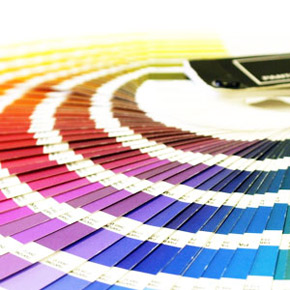
Basic Principles of Color Theory in Web Design
“It can be a fascinating game, noticing how any person with vitality and vigor will have a little splash of red in a costume, in a room, or in a garden…” – Edward Cayce
We’ve previously discussed how your color scheme influences the way your design is perceived and what each color means, as well as looked at some of the most important company websites on the net and their color schemes. Today we’re going to look at something else entirely.
First of all, we’re going to take a look at concepts like hue, chroma, saturation, lightness and tone, shade and tint. Once we’ve explained what these concepts mean, we’re going to look at the different effects different values of these attributes will have.
After that, we’re going to take a short look into how you can build your own color scheme that actually works and that gets your message across. So let’s move on to the definitions.
Hue
Hue refers to an object’s color. ‘Blue’, ‘yellow’ or ‘green’ are examples of hues. On the other hand, so is ‘bright red’ and ‘#C28B0A’.
Chroma & Saturation
When you talk about chroma, you’re referring to the purity of the color. That is to say, the purer the color, the less black, white or gray it contains. You can think of this as the brightness of the color in comparison to white. Saturation is very similar to chroma. It designates how strong the color is. It helps to think of saturation in terms of weak hues vs. strong ones.
Lightness
Lightness refers to, well, how light or dark a color is. The closer it is to black, the lower its lightness. The closer it is to white, the higher its lightness. For instance, yellow is lighter than navy blue.
Tones, Shades & Tints
Tones are what happens when you mix gray into a hue. They’re softer looking, even duller than the pure hue. Similarly, shades are what happens when you mix black into a hue and tints are what happens when you mix white into the hue.
We can now take a look at how to use these concepts. Like we previously mentioned, we’ve already discussed what each hue signifies and how you can use them in web design. So let’s move on straight to chroma and saturation, shall we?
How to Use: Chroma & Saturation
Typically, with both saturation and chroma you need to be careful to either choose colors that have the same level of chroma or saturation or that have significantly different levels of saturation or chroma. Don’t use things that are quite similar but not quite the same.
Like in typography and a lot of the branches of design, you either work with things that are the same or with things that are different enough to create a contrast. Otherwise, the viewer’s brain is going to be focused on what’s different instead of being focused on your content. You should be careful and use colors with high chroma and saturation with moderation. They can be quite painful to look at when used excessively.
How to Use: Lightness
When choosing your color, you should make sure to use colors that have different lightness levels, especially those with high chroma. Contrast is everything. Use it to your advantage. Pastel websites don’t really work unless they’re going for a particularly vintage look.
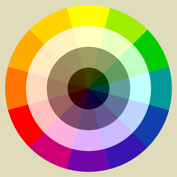
How to Use: Tones, Shades & Tints
As to the subject of tones, shades and tints, there’s not much to be said. Tones work well in web design. More so, the grayer your tones, the more vintage feel your website has. Pair it up with the proper hues, like blues, for instance, and you have yourself a nice, vintage, sophisticated look in your design.
Shades are also very hand when picking the color scheme. Typically, you won’t want to use a lot of black. Instead, you can opt for a very dark shade of your dominant color and use it as a neutral. You should be wary of using shades on their own, as they can make your website a bit too dark. Try throwing in a few tints in there.
Speaking of tints, when these are predominant, then the design is usually perceived as more feminine or lighter. Especially if you use pastel tints. Now, as we mentioned above, pastels are very useful when going for a vintage feel, so don’t hesitate to use pastel tints to complement your pastel tones.
Color Schemes
OK, that’s all fine and dandy, but how do you build your own color schemes? Well, let’s take a look at that. First of all, we’ll look at seven types of color scheme, in order of difficulty to build, from easiest to hardest. After that we’ll take a look at one of the simplest color schemes you can ever build.
So, on to our list of seven types of color scheme:
• Monochrome

A monochrome color scheme is exactly what it sounds like: you take one hue and you build upon it. You use tints, tones and shades all based on the same hue. It’s pretty hard to get wrong.
• Analogous
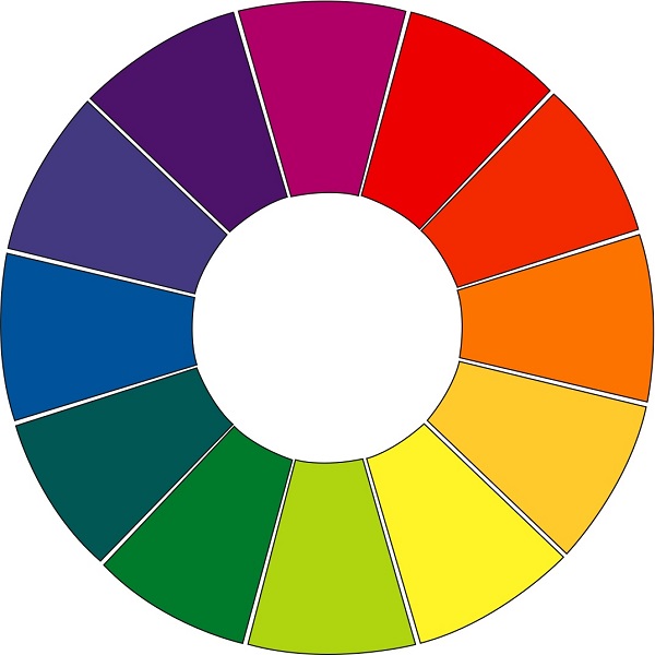
When creating an analogous color scheme, what you do is take two or three colors that are next to each other on the color wheel.
• Complementary
You can create complementary schemes by pairing colors from the opposite sides of the color wheel. Usually, these schemes use only two colors, but you can extend them infinitely via the use of tints, tones and shades.
• Split complementary

Split complementary schemes function on basically the same principle as complementary ones, but instead of picking the exact opposite color on the color wheel, you pick the two colors that are next to it.
• Triadic

When working with triadic color schemes, you pick colors that are evenly spaced on the color wheel. This produces some of the most diverse color schemes.
• Tetradic
Tetradic color schemes are some of the hardest to pull off. They usually require picking two primary colors and their complementary colors. Basically it’s a hybrid between the complementary and the triadic ones, as color selection goes. You can imagine why it’s hard to work with these.
• Custom
Custom color schemes are, obviously, the hardest ones of all to create. For one thing, there’s no more rules here, and while that does mean that you have a lot more freedom, it also means you don’t have any guidelines and that you have to rely on nothing but your own sense to pair colors together in a way that works.
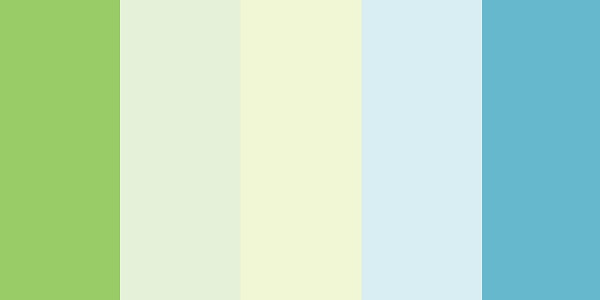
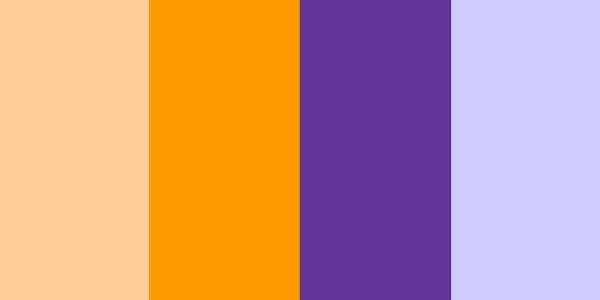
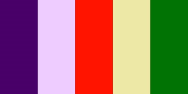
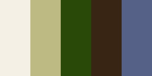
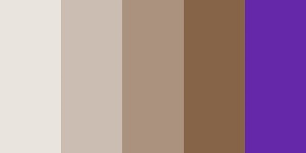
As we’ve promised, here’s a look at the easiest color scheme you can come up with. It’s all quite simple, you take a bunch of neutral colors, maybe greys, and then you contrast theme with one strong highlight color, like in the examples below:


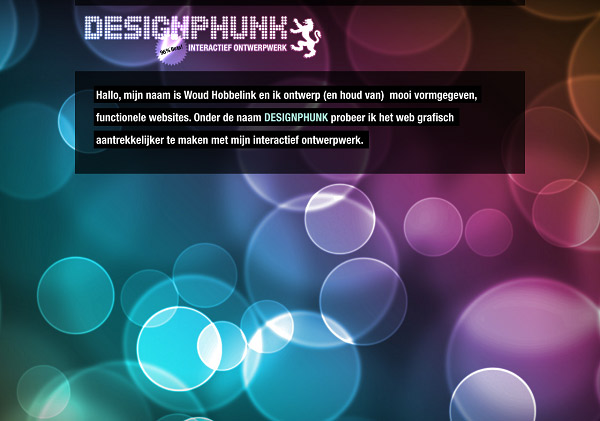
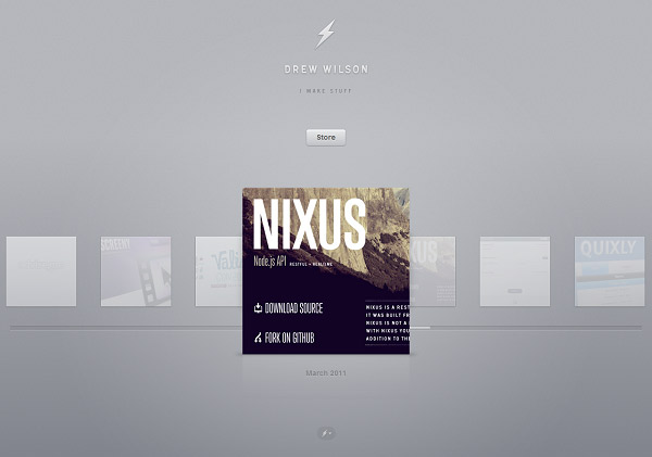
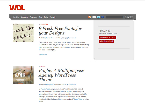
BONUS: 7 Websites That Have Great Color Schemes
1. Design Phunk
2. SugarSync

3. Drew Wilson
4. Web Designer Ledger (WDL)
5. 45 Royale

6. Cult foo

7. Envato

That’s about it for our crash course into color schemes, color theory and their applications in web design. Now go out there and experiment with your colors. Be bold, don’t be afraid to mix it all up. If it looks right to you, odds are it does look good. If you have doubts, then odds are it’s not that good of a color scheme. Keeping that in mind, you can’t fail!
If you have any thoughts on the subjects we just broached, don’t be afraid to post them in the comments section below!
Thanks for this useful post!
I have problem choosing good looking color for my website and this article really helping me .
Very good article. When you’ve chosen a color scheme, is there a guideline (or best practice) to follow to determine which colors are used for certain parts of the design (header, body, footer, text, etc.)?
Very useful tutorial about color theory web desain, I interested with A monochrome color scheme that is beautiful.. nice sharing
thanks for this tutorial.