A Beginner’s Guide to Psychology Principles in UX Design

Whether we like it or not, design trends are and have always been dictated by psychology. Even the simplest website or an application form functions thanks to successfully applied psychology principles. The same logic can now be applied in User Experience design (UX) as a new means of interacting with the audience.
UX goes far beyond mere design and visual appeal – it tries to answer the question of what the viewer likes and feels. As such, UX design principles can be difficult to grasp without properly segmenting them.
By the time you finish reading this, you will have a far better understanding as to why psychology is important in UX. You will also have a much clearer picture of how you can use psychology principles in your own work. Let’s take a look at a beginner’s guide to psychology principles that you can apply in your UX design projects starting today.
Importance of psychology in UX design
Before we get into the psychology principles, let’s discuss the importance of doing so in the first place. While your development team might produce results that make your clients happy, that still isn’t enough for proper UX design. Knowing how to code and understanding the audience’s needs are two distinctly different things.
UX designers specialize in guiding the readers’ eyes to buttons, calls to action and other interactive elements – this is what differentiates them from traditional designers. As such, they are required to be on a first-name basis with psychology and it’s most important postulates. As for the direct benefits of applying psychology in UX design, let’s take a look:
• Successful implementation of psychology in your UX can increase your conversion rates, word of mouth and overall traffic – people love sharing sites and apps that make them happy.
• Psychology in UX can increase your revenue and sales due to customer satisfaction.
• Retention rate and loyalty of your customers and clients will go up.
• You will have more freedom to explore experiment and innovate with your products without worrying about customer erosion – your UX design will simply keep them around.
These are only the surface-level benefits you will receive if you effectively apply psychology principles in your UX design practice. They are important to know because many big companies and design agencies already use them in their projects. Being left behind by new trends is something that no development team wants to experience. But what are these psychology principles we keep mentioning and how can you use them to your advantage?
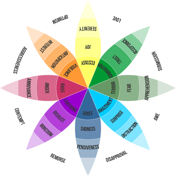
Color theory
Let’s start with the basics and work our way out from there. We all know that color plays a huge role in how our product is perceived. For example, the color red represents passion, but it also insinuates anger. The color blue is professional and trustworthy, but it is also melancholic and cold.
Each color has a certain set of pros and cons that make it stand out in the color wheel. According to research, up to 90% of purchase and interaction decisions on the web are done based on colors implemented. Knowing which colors are appropriate for each situation, button, menu or call to action can often make or break your product.
Make sure to take a close look at the ideas behind your design piece and choose the appropriate colors accordingly. Mismatching colors can cost you a lot of customers and revenue so don’t rush and explore the colors available to you.
Dark patterns
While it may sound ominous, a dark pattern is anything but. It represents a psychological principle that allows developers to place certain interactive elements in very specific UI places. Dark patterns represent perfectly positioned calls to action and hyperlinks that visitors simply can’t avoid.
Dark patterns can be found everywhere on the web, most predominantly on iOS and Android stores. Many popular smartphone applications make ample use of dark patterns which makes their team’s work a lot easier. Try implementing a dark pattern in your product by cleverly positioning calls to action next to purchase and order buttons for good effect.
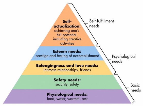
Maslow’s hierarchy
Have you ever heard of Maslow’s theory and the hierarchy of needs? It constitutes a pyramid-like structure of basic human needs, bottom to top. What makes Maslow’s theory interesting in regards to UX design is how we can use it to create a “need” with our audience. Look at Maslow’s table below and try to identify your product with the categories that the researcher created.
“Once you understand where your product lays you will be able to create calls to action appropriate to your priority on the food chain” – Emmie Kerr, UX Designer for Top Writers Review. “For example, companies that sell water will naturally have more priority for customers than jewelry salons – however, both of these products do have their audience.”
Make sure to understand your place in the grander scheme of things and use that to your advantage.
Von Restorff’s postulate
Von Restorff’s postulate talks about visual elements and positioning principles. This is one of the most important aspects of UX and UI design as it often dictates how a person will navigate the website or an app.
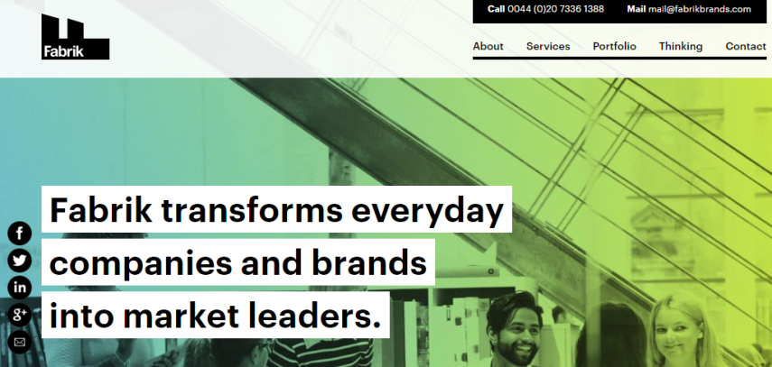
Von Restorff established a principle where similar objects (buttons, navigation, etc.) positioned next to each other will naturally arouse curiosity and interaction. For example, Fabrik Brands is a marketing agency that specializes in branding and image solutions. Their website uses a limited duo tone color palette that emphasizes important information.
Notice that their main messages share the same color as the interactive contact elements above. This creates a certain curiosity with the viewer, leading them to click on a now-familiar interactive element. Using Von Restorff’s postulate is highly recommended whether you develop UI for apps or websites – the principle remains equally important.
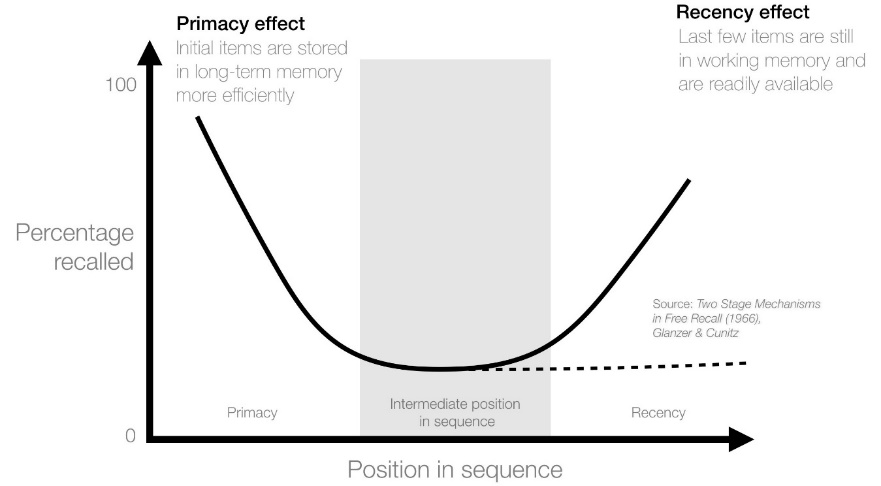
Primacy and repetition
Have you ever wondered why e-commerce stores such as Amazon have so much traffic daily? After all, there are many other web stores besides the most successful ones, so what separates them from the rest? It’s something called the primacy and repetition effect, a UX psychology principle based on landing page design.
In the example of Amazon, we can always find things to order and buy as soon as we visit the main page. On closer inspection and further search, we will always remember the things we saw initially on the landing page. This can create a sense of need and urgency in regards to the items listed on the landing page. Impulsive purchases are only a click away in case of well-designed primacy effect pages.
Long-form UX design (Conclusion)
Implementing UX psychology principles in your design is an ongoing process. Trends change and people’s perception of old design solutions erodes over time. Make sure to keep innovating with your design principles and never stagnate as a creative.
Chances are that a good idea will come to you naturally without referring to any guidelines. It’s a good idea to look for these patterns and principles in websites you visit often. Once you know how to identify them, you will start to come up with your variations of UX design. Do what is best for your business and audience and the results will follow suit.
https://www.userzoom.com/ux-design/a-brief-guide-to-psychology-principles-in-ux-design/
https://fabrikbrands.com/brand-consultancy-london/
https://ewebdesign.com/4-psychology-principles-web-designers-must-know/
Thanks for sharing such an informative article. Your guidance will definitely help people.