Top 7 Cool Responsive Website Designs to Inspire You
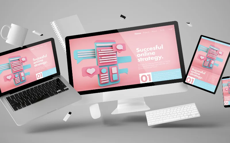
With the rise of mobile devices, building an appealing website that offers a great user experience has now become more complex. The art of creating responsive website designs has emerged to make your website look perfect on various devices, eliminating the need to code separate sites for each platform. With the growing number of users accessing the internet from their mobile devices, designers & developers are looking for ways to cater to online visitors on both desktop and mobile devices.
Responsive website designing is completely different from the traditional ways of developing the sites. So, designers and developers must know about its pros and cons. If you are in search of the coolest responsive website designs for your inspiration, then you have reached the right place. We have listed the top responsive yet fantastic web designs that will surely inspire you.
Check out these incredible examples of cool responsive website designs:
1. INDOCHINO

With wonderful product images, INDOCHINO is beautifully designed shopping website that offers premium quality clothing for men. This light-in-weight website adjusts itself perfectly on all devices maintaining its clarity.
Check Out: 12 Popular Trends In Web Design In 2024
2. CSSChopper

It can be the awesome red and white color combination with high-definition images that can make you love this site or it may be easy navigation due to its responsive nature that appeals to you more. The breakpoint works well with the layout needs and gives a sharp-looking website that does not degrade at any screen size. The site always looks good on all the devices.
Check Out: User Experience Design – Definition, Importance And Things To Know
3. HTMLPanda
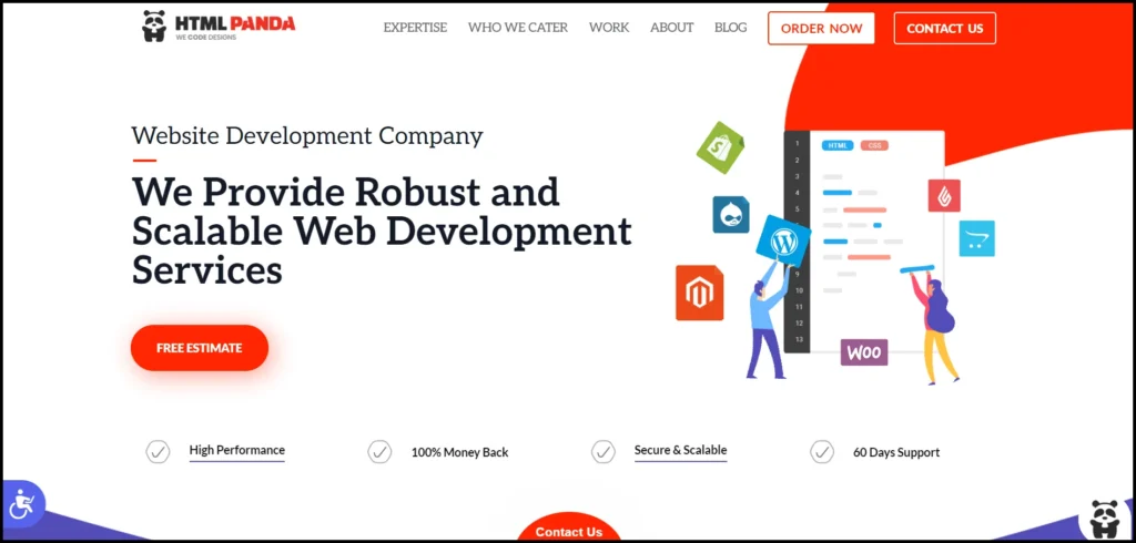
A neat layout, beautiful images, and clean text make this site a lot alluring to visit instantly at first sight. If you are looking for any kind of professional assistance in creating web applications, then HTMLPanda is a great destination.
Check Out: Color Schemes For Websites, Colors Combinations And Their Importance
4. BetterGraph

The consistent look of the website over various devices along with the forthright content structure is quite appreciable. Better Graph has done a great job of creating a site that responds well on different mobile devices while keeping the integrity of website design intact.
Check Out: Importance Of Typography In Web Design
5. Co Design
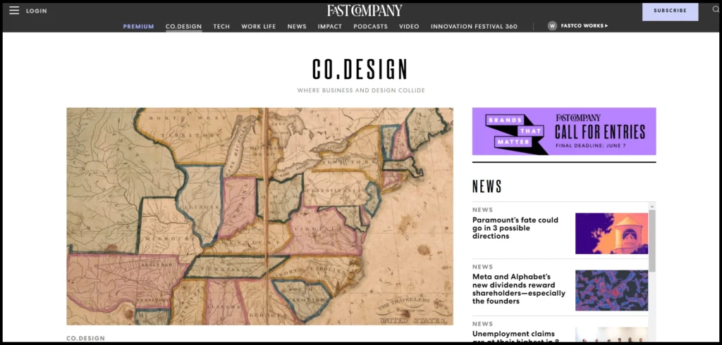
Co Design is one of the best examples of cool web design. You will surely love the topmost image showing the responsive behavior of the site. The picture quality makes no difference when viewed on a mobile phone. This fully responsive site with a faster loading speed is a pleasure to navigate.
Check Out: Parallax Effect In Web Design – The Rise And Fall Of This Trend
6. Design made in Germany Magazine 5
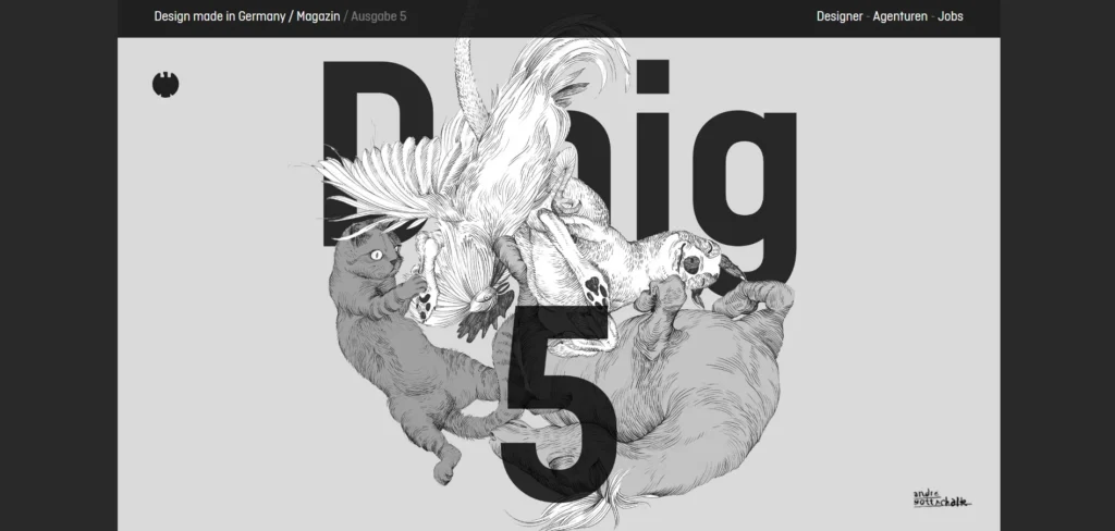
This magazine site has an ultra-modern design that compels visitors to not only stay longer but also return to the site. Magazine 5 has changed the definition of back & white as it looks much more interesting than even colored ones due to the perfect use of font size and type and awesome shades.
Check Out: UI Design Principles And Guidelines
7. PSDtoWordPressExpert
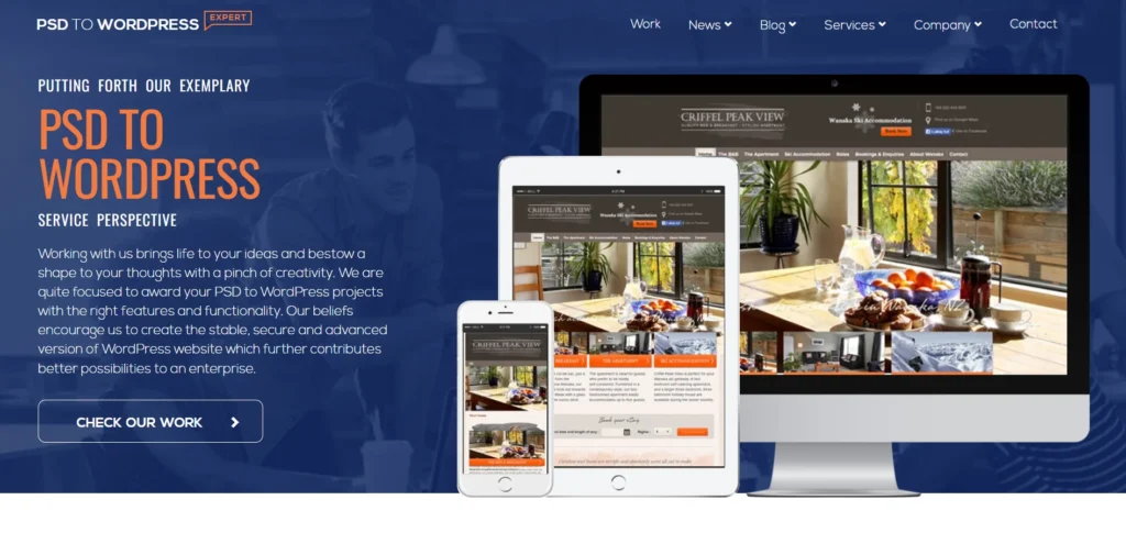
PSDtoWordPressExpert clearly shows that responsive designing does not limit our designs to adaptive images and text on solid backgrounds. A professional look, beautiful visual effects, refined typography, and intuitive navigation combine to build a site that is fully-functional yet attractive.
Check Out: Amazon Brand Colors – Color Codes For Major Amazon Logos
Top 7 Responsive Website Designs – Conclusion
If you are looking for inspiration from mobile friendly website design, then no need to look further than these 7 responsive web designs that fit perfectly to all internet-supporting devices and still manage to look wonderful.
Looking for more inspiration? Check out 10 Best Restaurant Websites For Your Design Inspiration
Like this post? Check out more amazing graphic and web design content on our blog.
Leave a Reply