Playful Typography by Allison Supron
Typography is similar to icon design in many ways, in that it is a small and discreet element that very few non-designers consciously notice. It can make or brake a design, and it really is worth it to take your time when choosing one.
It is easy to think of typography as a “byproduct” of Gutenberg’s printing press, but it has been used since even before the invention of paper. You can trace its origins to the first uses of punches and dies in ancient times to create seals and currency.
One of the most famous uses of typography is the Phaistos Disc, a disc that features 241 tokens, comprising of 45 unique signs. It is thought that the inscriptions were made by pressing pre-formed hieroglyphic seals into the clay while it was soft, and then baking it at high temperature.
Johannes Gutenberg did, however, revolutionize typography with his printing press. His type pieces were made from a lead-based alloy so suited for printing purposes that it is still used now, in the 21st century. That’s 600 years after the printing press was invented.
The next major breakthrough for typography came with the advent of computer technology, in the 20th century.
Personal computers began allowing designers to create type digitally with the help of graphic design programs (*cough* Adobe *cough*). This not only made creating typefaces easier, but it also allowed designers to make more experimental typefaces, to complement the more traditional ones.
Production costs were also drastically lowered, so typography finally became available to the masses, and that is why you can now spend a whole day navigating the Internet Ocean, looking for awesome fonts.
In today’s article, we will be taking a look at some gorgeous typography made by Allison Supron.
Allison is a New York City resident, and a graduate of Grand Valley State University, from which she received a Bachelor’s Degree of Fine Arts in Graphic Design with a minor in Advertising and Public Relations. She also spent the 2013 Spring/Summer semester in the United Kingdom, studying art and architecture at Kingston University.
She describes herself as being a creative problem solver, so she is not only unafraid of getting her hands dirty, she downright enjoys doing so in the search for “stellar design solutions” for anything from print, to graphic, to web.
As achievements, she lists taking first place at two competitions: one is The Yardisticks, which is an Advertising competition; the other is GRCC, where she won first in a 100th year anniversary logo competition.
She has worked for Grand Valley Lanthorn and Kmotion Design in the past, and is currently a design intern at Vimeo in New York City. She also does personal projects and some freelance work in her spare time.
Allison has several typography projects, but today we will be taking a look at one particular one she has called Play.
Play is an absolutely intriguing project, based on Allison’s own senior thesis project on creative purposeful play. Here she uses unlikely materials to create some truly awesome typography. The materials were chosen, as she says in her book, “during everyday situations, whether it was noticing how beautifully colored a grapefruit was during a routine breakfast, or while passing time in a less than lecture by folding and cutting colored paper into different strange shapes.”
She probably knows best how to talk about this project, so we will just quote what she herself said about it:
“Play is a project based on experimental typography and purposeful play in the creative process. What is purposeful play? Think back to the allotted time given in elementary school to finger painting, building with blocks, and storytelling. At the time these activities may have seemed simple and mindless, but they are all tasks that require the brain to think differently and promote creativity in the learning environment. Play is a colorful mixture of unconventional materials and techniques, hand-drawn typography, senior thesis paper tidbits, and photographs of each process from start to finish; a project geared to inspire hands to get off of the computer and get a little messy.”
Well, now it’s time to show you some of these fonts.
1. My Sister Loves Cheese
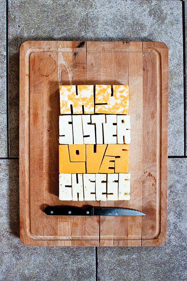
We can only assume that Allison’s sister does, indeed, love cheese, and seeing this image has reminded us of our own love for dairy products. Using what looks like four different types of cheese, Supron created a mouth watering type that showcases her passion for playful design.
2. a
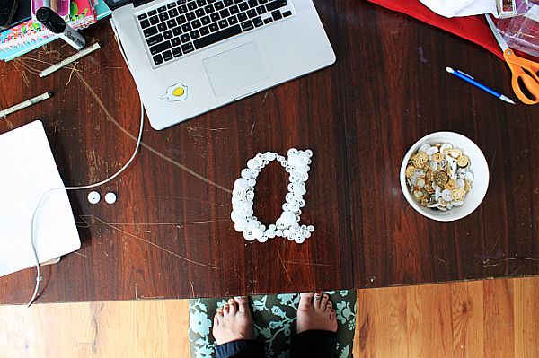
Using the ultimate symbol of whimsical “manic pixie dreamgirlness”, Allison created this lovely lower-case “a” from different sized buttons. It might not look like all that much of an effort at first glance, but once you take a real close look, and see how carefully each button is arranged, it is clear that this was not a piece done in a hurry.
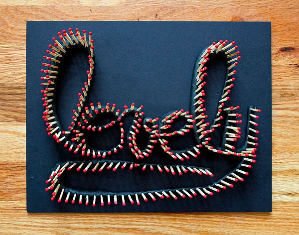
3. Lovely 1
Made using matchsticks, this type piece is definitely the kind of work you could have hanging on your wall. However, the real surprise is coming up in the next picture.
4. Lovely 2
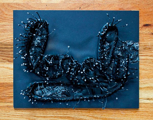
Setting fire to the matchsticks completely changed the work (as fire tends to do to art). It still clearly is a work of typography, only now it definitely seems more moody, especially since the fire affected the “canvas” as well.
5. Juicy Juicy Juicy Juicy
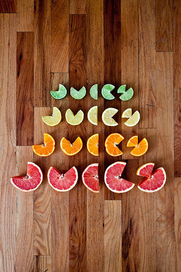
What we think is really interesting about this piece is the fact that the larger the font gets, the less intelligible it is. They are all readable, don’t get us wrong, and the reason that is is because of the material used in creating them. When seeing citric fruit, one of the first words that come to mind is, in fact, juicy. That almost makes this a cognitive sciences experiment.
6. “When you stop doing things for fun you might as well be dead”
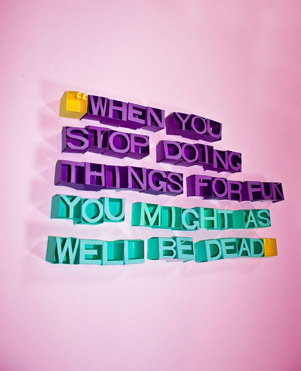
This quote from Ernest Hemingway is the very essence of Allison’s project. Play is out to promote playfulness and creativity, which all translates to one word: fun. The really interesting thing she did here was use a different color paper to split the text in two, much like the missing comma does.
7. MAKE
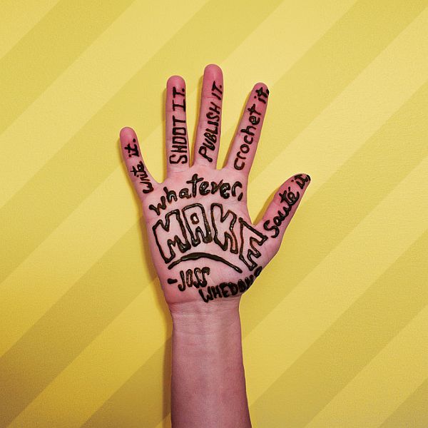
Another quote from someone we are guessing she admires, it reads “Write it. Shoot it. Publish it. Crochet it. Sauté it, whatever. MAKE”, and it is a quote by Joss Wheadon of Buffy, Firefly and, more recently, The Avengers fame.
8. Hot Cakes – The Show
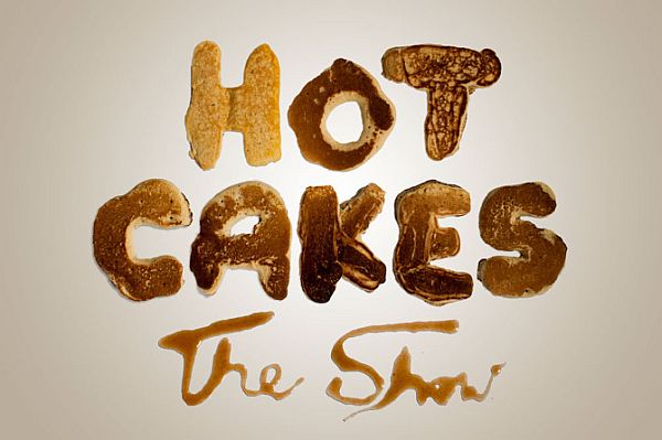
The final item on our list is a little something Allison cooked up for Hotcakes, Grand Valley University’s class of 2014 senior show.
That wraps up our article on playful typography by Allison Supron. If you want to see more of her works, check out her website here. We are looking forward to hearing what you think about her work (and our article, of course) in the comment section below, so feel free to scroll down leave us a couple of lines.

Leave a Reply