
What Is Maximalism – Understanding This Style With Examples
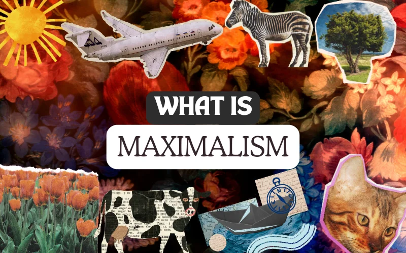
Welcome to the colorful, wild world of maximalism! Here, bold choices rule, and every detail has something to say. From eye-catching designs to over-the-top fashion, maximalism invites you to embrace the fun of mixing, matching, and breaking the rules.
In this article, we’ll dive into this exciting style and check out some fantastic examples that prove more is more.
Table of contents
What Is Maximalism?
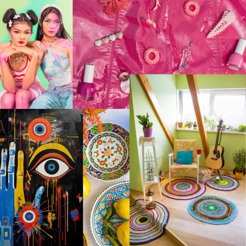
Maximalism is the opposite of minimalism. While minimalism strips away everything unnecessary, maximalism adds layers and combines elements.
It’s about creating rich, energetic, and unapologetically expressive designs. Maximalist designs often mix bold colors, dramatic typography, and intricate details to tell a story or evoke strong emotions.
Unlike minimalism’s “less is more,” maximalism believes “more is more,” it’s all about making your work stand out in a sea of clean, minimal designs.
Also, check out What Is Retro Futurism
The Key Elements – What Is Maximalism In Design
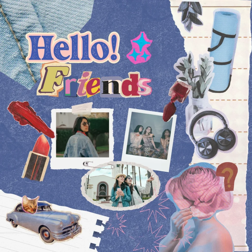
- Bold Colors: Think vibrant palettes and daring contrasts. Don’t be afraid to use colors that clash or grab attention. Neon pink next to royal blue? Yes, please.
- Layering: Pile on images, patterns, and textures. Overlapping visuals create depth and complexity, making your design a treat for the eyes.
- Eclectic Typography: Mix different styles of fonts like you’re creating a collage. Use playful scripts with sharp fonts or oversized letters. The more unexpected, the better.
- Ornate Details: Add intricate patterns or decorative frames. These details create a sense of luxury and craftsmanship.
- Clashing Aesthetics: Combine styles from different times or cultures. Blend modern shapes with vintage vibes or futuristic elements with classic motifs for a unique twist.
The Resurgence Of Maximalism In Modern Design Scenario
Maximalism is making a big comeback, and it’s easy to see why. With social media and digital platforms flooded with content, bold and vibrant designs grab attention faster than clean, minimal layouts.
Designers use maximalism to stand out, creating eye-popping visuals packed with colors, textures, and patterns that demand a second look. The rise of digital tools and technologies has made it easier to experiment with layered designs, 3D elements, and motion graphics, bringing maximalist ideas to life like never before.
In today’s crowded digital world, maximalism offers a fresh and exciting way to leave a lasting impression.
How To Use Maximalism In Your Designs
Start with a Bold Palette
Pick 3-5 strong colors that work together or clash in exciting ways. Test combinations until you find one that feels right.
Play with Layers
Experiment with overlapping images, textures, and text. Add and adjust until the design feels full but not chaotic.
Mix Fonts Carefully
Use contrasting fonts to create drama, but make sure they complement each other. A fancy script next to a blocky sans-serif often works well.
Use Patterns and Textures
Incorporate geometric shapes, floral patterns, or textured backgrounds to add richness.
Know When to Stop
Even maximalism has limits. Step back and check if your design still communicates its message. If it feels cluttered, simplify just enough to make it clear.
Famous Maximalist Art
The Garden of Earthly Delights by Hieronymus Bosch
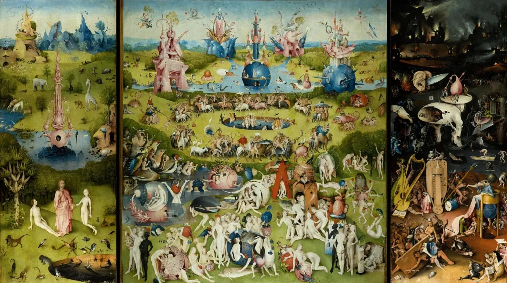
This 16th-century maximalist painting has surreal scenes, tiny details, and colorful storytelling. It’s a perfect example of mixing chaos with meaning.
The Persistence of Memory by Salvador Dalí
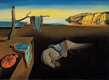
Dalí’s surrealist paintings, like this one with melting clocks, are full of rich textures, strange objects, and bold contrasts, making them feel maximalist.
Gustav Klimt’s Maximalist Painting – The Kiss
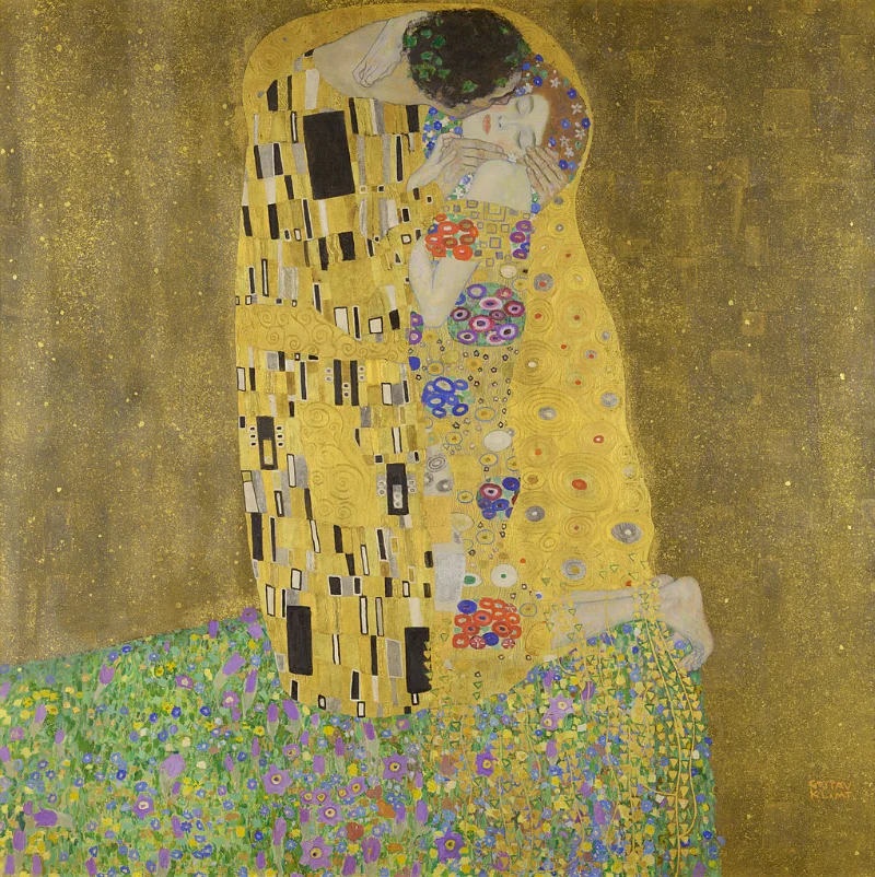
Klimt’s golden painting is famous for its glowing colors, detailed patterns, and luxurious textures, creating a romantic and visually stunning masterpiece.
Yayoi Kusama’s Infinity Mirror Rooms
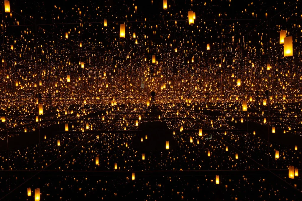
Kusama’s art installations surround you with endless dots, bright colors, and reflections, creating an overwhelming and mesmerizing experience.
Jean-Michel Basquiat’s Untitled Works
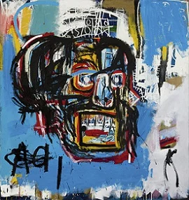
Basquiat’s graffiti-style art uses bright colors, layered images, and a mix of cultural symbols, making it a standout in modern maximalism.
Examples of Maximalism in Moden Graphic Design
Maximalism In Branding
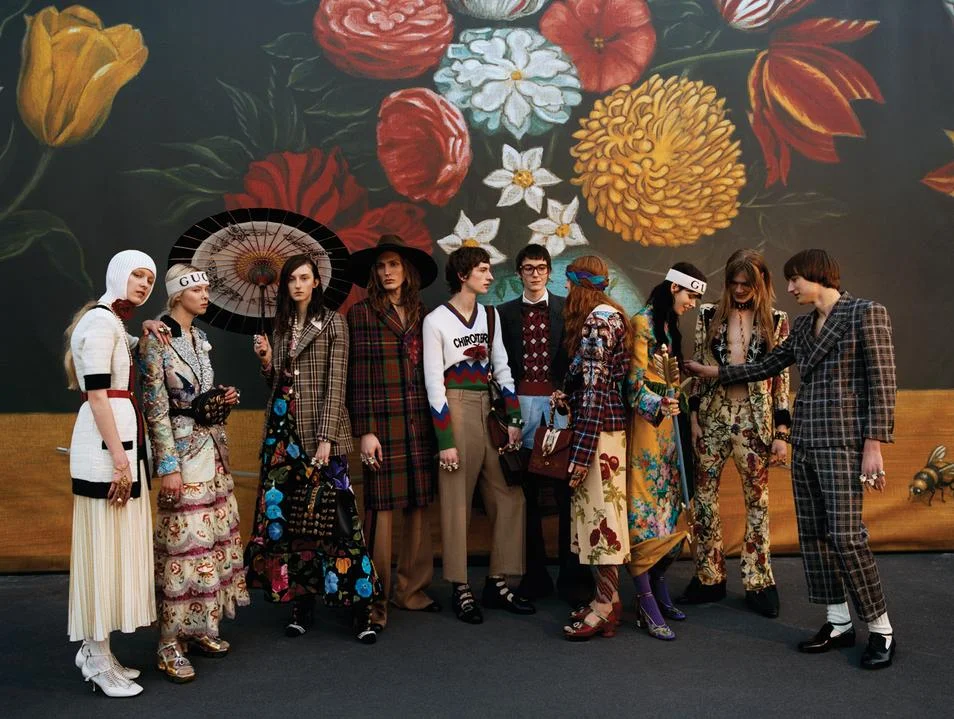
Brands like Gucci and Absolut Vodka use maximalism to create bold, high-energy campaigns. Their designs combine playful colors and intricate details to stand out.
Maximalism In Posters and Album Art
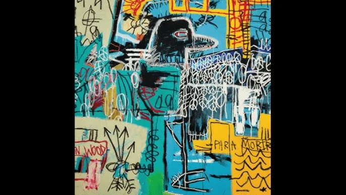
Think of music festival posters or album covers. These often embrace maximalism to reflect the energy and creativity of the artists they represent.
Maximalist Style In Social Media Graphics
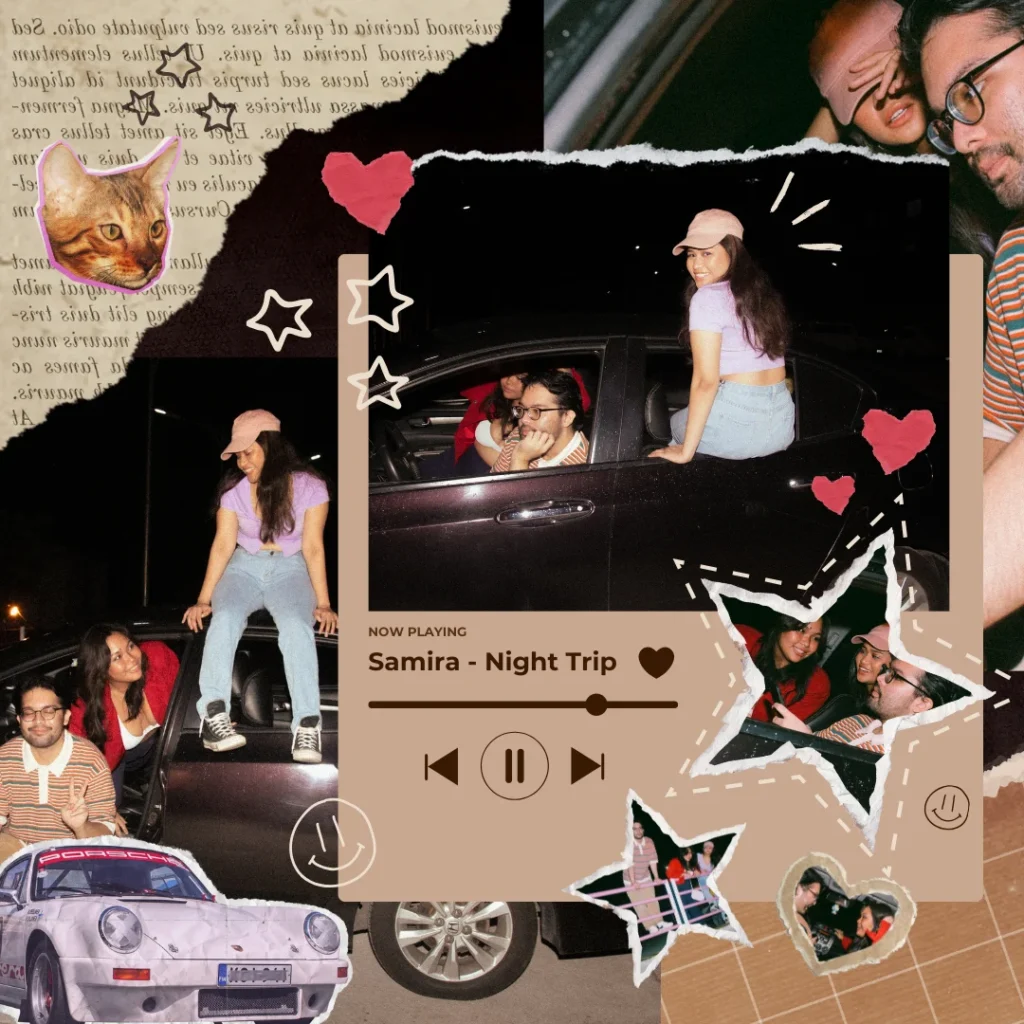
Platforms like Instagram thrive on eye-catching visuals. Maximalist designs stop users from scrolling and make them take notice.
What Is Moody Maximalism
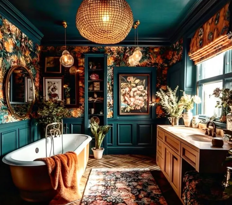
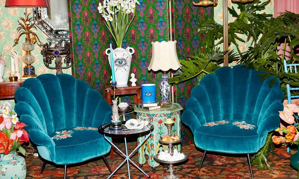
Moody maximalism mixes bold, rich designs with a darker, more dramatic feel. Instead of bright colors, it uses deep shades like emerald green, burgundy, and navy, paired with textures like velvet or metallics. The patterns are layered, but they feel more mysterious.
Think dark florals, vintage designs, or abstract shapes. This style is bold but also creates a moody, elegant atmosphere. It’s perfect for designs that want to stand out while still feeling stylish and full of character.
Challenges With The Maximalist Style

Maximalism isn’t always easy. Sometimes, it’s tricky to balance boldness with clarity. Too much layering or too many fonts can confuse your audience.
It’s essential to keep your design purposeful and ensure every element adds to the story. Clients might also have mixed feelings about maximalism.
Some may love it, while others might find it overwhelming. Always communicate and align your vision with theirs.
Conclusion
Maximalism is more than just a style. It’s a creative mindset. It challenges designers to be daring, experimental, and expressive. By embracing maximalism, you can create bold, exciting, and impossible work to ignore.
So layer those patterns, mix those colors, and let your creativity run wild. After all, more really is more!
Like this post? Check out more such informational graphic design content on our blog.
teşekkürler
Maximalism is more than just a style.
Good and quality article, thank you very much.
Thanks for sharing all the other info you do. Where can I find information like this that’s written so well? I’ll keep an eye on information like that.
Really enjoyed reading about maximalism! You perfectly captured its joyful and expressive nature. It’s such a refreshing aesthetic. Great post!
This article beautifully captures the spirit of maximalism! The bold use of color, layering, and eclectic typography is truly inspiring. Love the “more is more” attitude—it’s all about creativity and fearless expression.
The puzzle looked harmless enough—three short words and one long one. My brain immediately jumped to a few common idioms. I typed in “hit the road”.
This is a clear and inspiring overview of maximalism — the examples really show how layers, color, and pattern can create joyful complexity.
Maximalism is basically the opposite of minimalism. Instead of stripping things down, it layers things up. In web design, art, fashion, or interiors, maximalism says: if it sparks joy, add it.
I’ve always leaned towards minimalism, but this article makes a strong case for embracing more color and detail. I’m definitely going to experiment with bold patterns in my next project. It sounds like a fun way to break out of my comfort zone.
I want to try mixing bold colors and dramatic typography after seeing how maximalism embraces energy. It feels freeing to add layers instead of stripping them away.
I got excited seeing the bold colors and storytelling emphasis; I want to experiment with layered typography in my next poster. Mixing dramatic hues and textures might be just the shakeup my portfolio needs.
Wow, finding letters from 2002 is like discovering a time capsule! I love how Joe Blodgett showed up ‘out of the pouring rain’ – such a vivid scene, and those archives going back to 2000 make me wonder what artistic advice Sara Genn shared back then.
Honestly, the section on bold colors and layering caught my eye – neon pink next to royal blue? That’s bold! I was scrolling through this on my morning commute, and the examples like Klimt’s golden paintings made me pause and think about how chaos can actually communicate.
The section on moody maximalism caught my attention because I’ve been seeing more dark, rich designs in branding lately. Using deep shades like burgundy and navy with velvet textures sounds like a great way to keep that ‘more is more’ energy while still feeling sophisticated. It’s a smart twist for anyone who finds bright maximalism too loud.
Maximalist layouts are a useful stress test for motion tools because every frame has to carry more visual weight without turning into noise. When I storyboard campaign clips I borrow the same layering instinct: one hero motif, repeated accents, and a clear focal path so the eye survives the density. Still-first maximalism and short 1080p cuts can share a palette board so the social version feels like the poster, not a random re-render.
Love how you contrast maximalism with minimalism using concrete art examples — the layered patterns section makes the concept click. I use bold visual references when storyboarding AI video clips: still frames with rich texture first, then short motion passes to see if the energy still reads on screen. Helpful primer for designers crossing into motion.
Strong primer on maximalism — the historical examples and design contrasts make the concept much easier to grasp. Appreciate how you connected art history to practical visual choices.
Great breakdown of maximalism versus minimalism — the historical examples make the “more is more” philosophy much easier to explain to clients who only know Scandinavian clean lines. The section on layering pattern and color in digital UI is especially useful for mood boards.
I love how the piece highlights layering as a core move of maximalism—that idea of piling on images and textures to create depth really resonates with me. The mention of bold colors and dramatic typography makes me think of early 90s posters I hung in my room, all shouting with color.
The strongest point here is that maximalism is not just adding more elements, but making the layers work together through color, typography, pattern, and story. The examples from posters, branding, and social graphics make the style feel practical instead of just decorative, especially for projects that need energy and personality.
Really well-written breakdown of maximalism — the contrast between maximalist and minimalist aesthetics is something I think about a lot when working on visual projects. The point about layering textures and patterns resonated; I noticed that when generating reference imagery for mood boards, choosing bold, maximalist prompts produces compositions that feel very different from clean, flat designs. The cultural dimension you mentioned — how maximalism often carries regional identity — adds a layer I hadn’t fully considered before.
Maximalism really does reward layering — the more detail you stack, the richer the visual story. I find a similar principle applies to audio production: building up narration layers and voiceover tracks creates that same sense of depth. Been scripting maximalist video content lately and leaning on GPT Realtime 2 to turn dense scripts into expressive, publish-ready audio faster than I expected.
The exploration of maximalism here is really inspiring — especially the examples showing how bold pattern layering works in interior design contexts. Narrated design concept walkthroughs are gaining traction for creative teams who want to present mood boards in a more immersive storytelling format.
The breakdown of layering and the ‘more is more’ principle here really clarifies what separates maximalism from clutter — it’s curatorial intentionality. When building video content around bold visual styles, narration tone matters just as much as imagery; we used GPT Realtime 2 to handle the voiceover drafts and the expressive pacing actually matched the aesthetic energy well.
Really well-explained overview of maximalism — loved how you contrasted it with minimalism without dismissing either approach. I run a design blog and use Speech Text to transcribe my brainstorming voice notes into text before writing articles, which keeps the creative energy flowing.