The Importance of Website Carousels in the Age of Digitalisation

Over the years, website carousels have become popular despite the constant backlash. In fact, it’s a practice that designers are familiar with. It is, after all, the first thing your visitor notices on your site. Whether you refer to a carousel as a slider, gallery, or slideshow, you know their significance when you see them.
The design of the carousel holds the power to make or break your homepage slider. Besides, designers understand the vitality of the first impression. And that’s one of the reasons why the design of your homepage should feel good enough that everyone wants in on it.
What is a Web Page Carousel?
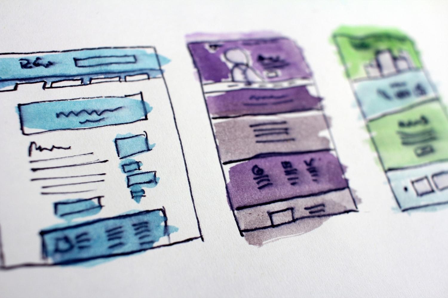
A carousel represents a list of cards that you can shuffle to show different types of content. Generally, every card includes a separate item that the user can browse from left to right. In simple terms, the carousel is a great way to showcase content cards or images on your website.
The underlying purpose is to cut down on the clutter. Furthermore, users get the freedom to scroll around on different images or videos. Website visitors can use left/right arrows on PC or swiping on smartphones. Great designers tend to inspire more effective and beautiful website carousel designs.

Should I Use a Carousel for Homepage?
If you were to Google right now, you would find some tarnishing carousel content. Most designers insist on the fact that website carousels are a vital aspect of the internet realm. It is the ultimate solution when it comes to the difficulty of fitting complex content on your home page.
How Many Slides in the Carousel?
Well, there’s bound to be a bad user experience if the content display is not right on a carousel. You should add fewer than five (5) slides in your carousel. And that’s because users don’t want to engage with dozen different slides at the same time. A limited number of slides in the carousel will increase the discoverability of your content.
How to Create Website Carousel Designs?
-
Select the Suitable Photo
You should select the photo that is self-explanatory. It must convey the nature of your product or service to the user. Furthermore, make sure there’s plenty of white space in your photo. Also, go for the picture that has the least noise.
-
Choose a High-resolution Image
Before you decide on the image, make sure the resolution of the photo is compatible with your theme. Websites often make the mistake of adding small resolution images. Such images get stretched throughout the screen. So, select a photo that has 1920x wide pixels.
If you have a dedicated budget, buy premium images on Shutterstock. You can use high-quality images on Unsplash.
-
Improve the Lighting of the Image
For the sake of more visibility, lighten or darken your slider text. You can do it in either Photoshop or other professional photo editing software. You can, for instance, use the Canva app for online designs that are affordable and easy-to-use.
-
Include Glow to the Image
If you want to make your carousel slider fascinating, integrate semi-transparent black glow exposure. So that your website will come across more professional than before.
What are the Best Practices for Designing Web Carousels?
Contrary to misguided perception, website carousels don’t reduce your conversions. So while using a carousel web design, ensure that you’ve compiled the current best practices:

Stick to a Limited Number
When it comes to your carousel, you shouldn’t add up to 5 slides. Users don’t want a non-ending slide show. More than 5 slides will discourage them from sticking around for any action.
Ensure the Visibility and Clarity of the Text
Impressive visual aesthetics might lure you into experimentation with the audacious fonts. Yet, if you fail to make your text clear and sizable, you may lose a lot of mobile device views.
Allow the User Some Semblance of Control
Your carousel shouldn’t look like a PowerPoint presentation. Instead, it should have interactive design elements for users to gain some level of control.
The trick is to make your slider navigation as straightforward as possible. You can, for instance, show the number of slides for users. As a result, users will have a better sense of their interaction which will improve the UX. Improving user experience will definitely help improve the conversion rate.
Avoid Auto-Forward
Here’s the thing, you don’t want to startle your users. Auto forward may not be a good idea. As we discussed earlier, you want to give them control over carousels.
It makes sense not to test the patience of restless users who might not sit through your slide show for a long time. Thus, get to the point as soon as possible and avoid auto-forward tactics.
How Does Carousel Design Work?
Carousel slides are useful to highlight things you don’t want users to ignore. You can use a static image to make a definitive layout choice for the home page. And it’ll be the “one” design you select that should have the aesthetic visual appeal. The design must also have contextual relevance to relay the message to the users.
The contemporary design of website carousels provides a scattershot method. It allows you to come up with top choices. And it’s completely normal to scrap some of those design ideas.
What are the 5 Mistakes to Avoid While Implementing Carousel Designs?
-
Faulty Product Representation
Misrepresentation or non-accurate representation of your website homepage can be a nightmare. Whether you sell shoes, jewelry, or clothing homepage is the most important page. All kinds of categories must be visible to users on your homepage.
If you choose to display new arrivals on a slider, it will take a ridiculous amount of time and clicks to get through. A user must be able to navigate to the product or item she came looking for.
-
Non-Effective Filtering
Non-filtered UX will limit the navigational efforts of users on your website homepage. Now, it doesn’t mean you have to oversimplify every item. Instead, choose filter methods that will help users go to more product pages.
That said, non-effective filtering means users will experience abandonment and frustration. Infinite sliding, manipulates users to check similar items on repeat.
-
Website Carousel Vs Ads
Carousels that resemble ads could wreak havoc on your homepage. From page takeovers, dialog boxes, promotions to pop-up boxes, it can annoy users. It may lead them to form a permanent negative impression of your website homepage.
-
Non-Compatible Theme
Yes, most of the themes revolve around a standard coding mechanism. Yet, you will often hear users complain about issues with page editing.
-
Autorotation Carousels
A variety of website homepages send users on misleading detours. Ironically, the autorotation of various products or services presents more problems to users.
Carousel Design for Desktop and Mobile
Carousel for desktop is the most famous approach to integrate a variety of content. It doesn’t take a lot of space. But, carousels for mobile, rose to popularity with the advent of the iPad. It’s incredible how the controlled layout can capture the smallest of details. Users can scroll through a dedicated web design carousel with comfort.
On a comparison, mobile devices do, in fact, have a slight upper hand when it comes to carousels. Apart from the small footprint, they’re much better for content prioritization. The idea is to enable everybody to make the most out of the main screen.
Using Heatmaps to Test Carousel Effects on Users
Heatmaps analysis can be quite insightful about users’ clicks on different mobile devices. The heatmaps analysis can showcase the most important links to your homepage. It can help you identify the un-clickable areas as well. It’s valuable information when you plan to test your promotional banners, menus, or CTAs.
A click and scroll on page heatmap, for instance, can display how long your users intend to go down on your homepage. A webpage heatmap can help you check the effectiveness of your homepage.
Heatmap can show you the most viewed parts of your homepage. The goal is to make sure your messages are visible from the users’ perspective.
How to Optimize Homepage for Better Conversion by Adding Carousels?
First, you can use engaging headlines and unique CTAs on every one of your slides. But, make sure your headlines relate to users’ main points. Instead of an authoritative approach, use a friendlier CTA button. Use engaging words such as “Start Your Free Trial Today.”
Second, don’t forget to display your most relevant slide first. Display benefits in bullet points to improve the value proposition of your website. Use the most captivating headlines to pursue users to click. And before you know it, you will increase the probability of your user conversion rate.
Third, it wouldn’t hurt to slow the speed down of your slides’ auto-rotation. The idea is to allow users to digest as much information as possible in a short time. You should set three (3) seconds for each slide.
FAQs Related to Website Carousels
- What is a web page carousel?
What are sliders? Well, the term slide carousel pinpoints towards a slideshow on a site. A typical slider gives visuals of a variety of products on that homepage. Today, web designers can integrate sliders into different types of websites.
The relevance of website carousels is outright undeniable. It allows business owners to highlight their professional portfolios. A slider narrows down the options when a designer adds layered options for the comfort of the users.
- Should I use a website carousel?
Currently, a handful of designers argue the usability of carousels. Yet, most of the designers and SEO professionals favor the functional approach of carousels for websites. Sliders only become confusing when there’s a limit to your imagination.
For the most part, designers profess the love for carousels with passion. Well, content sliders save space, merge images, and continue to engage users for more time. Besides, users can navigate through sliders at once.
- How do carousels affect website performance?
You can conduct your tests to identify the performance. Find out how a particular image carousel is affecting the performance of the site. Nonetheless, you should test current research to maintain the resourcefulness of your website. Continuous optimization can improve the performance of your website. It does, yet, need an informed approach.
Speaking of performance approach, it shouldn’t come as a surprise. The moment a user sees an ad; he or she would likely ignore the content. The auto-rotating image carousel often thwarts the attention span of users. This can affect the readability of your business website.
Click-through rate performance can help you understand user behavior and page interactions. Remember, there’s no such thing as “too fast” or “too slow”. Carousel experience that might affect user experience can change. Instead, the speed is subjective and has to do with the contextual relevance of the content.
Conclusion
If you want to use carousels with expectations that users will see your extensive range of content, you should take a reality check. Some individuals may just see the first frame or won’t slide at all. Therefore, make sure the placement of your content is not out of order or exaggerated on your website.
Your carousel website should be a place of entertainment, not horrors for users. Carousel slides are an excellent choice for your site. With enough expertise and optimized slider images, you will be able to develop enticing slides that would improve your user experience and conversions rate.
I don’t want to make any sweeping claims about the motivations or perspectives of the website or its users.
Carousels help highlight important messages, products, or services. When users visit a website, carousels can be the first thing they notice, especially if the design is eye-catching.
The way you presented complex information so simply is remarkable.
The Website Carousels is effectively matter in the new generation of web developement.
Rajssp pension services allow Rajasthan citizens to check pension eligibility, application status, and payment updates online under social security schemes.
Interesting ideas here, but some carousels feel overused and distracting on modern websites today still.