Lower Case g – History & Different Versions Of The Letter
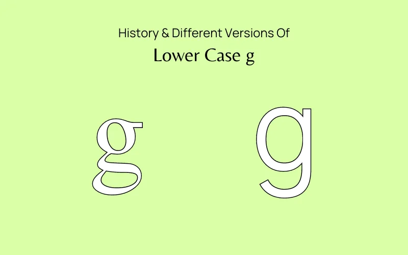
When we think about typography, we often overlook the details that make each letter unique. One letter that stands out is the lowercase g.
In this article, we’ll explore its history, design, and the mystery behind its two distinct forms and why no one seems to know which one is the correct form of the lowercase g.

Table Of Contents
- A Brief History Of The Two Versions Of Lower Case g
- The Difference Between Double & Single Storey g
- Which Version Should You Use?
- Google’s Logo Change
- How Do People Recognize The Lower Case g?
- How To Draw Lower Case Bubble Letter g
- How To Draw Lower Case Cursive g
- How To Draw Double-Storey Fancy Lower Case g
- Conclusion
A Brief History Of The Two Versions Of Lower Case g
Charlemagne, king of the Franks, sparked a renaissance in late 8th-century Europe. He used Bibles, classic literature, and poems to spread literacy and Christianity. Facing many scripts and languages, he established a standard Latin script to unify the continent.
To create this, Charlemagne asked Benedictine monks in France to merge regional writing styles into a single script. They developed Carolingian Minuscule, a clear, round handwriting based on Roman scripts.
The monks also added lowercase letters to make writing easier and faster, introducing the Single-Storey g, which is more straightforward than the Double-Storey version.
Also, check out Modern Baroque Art History and Influence
The Difference Between Double & Single Storey g
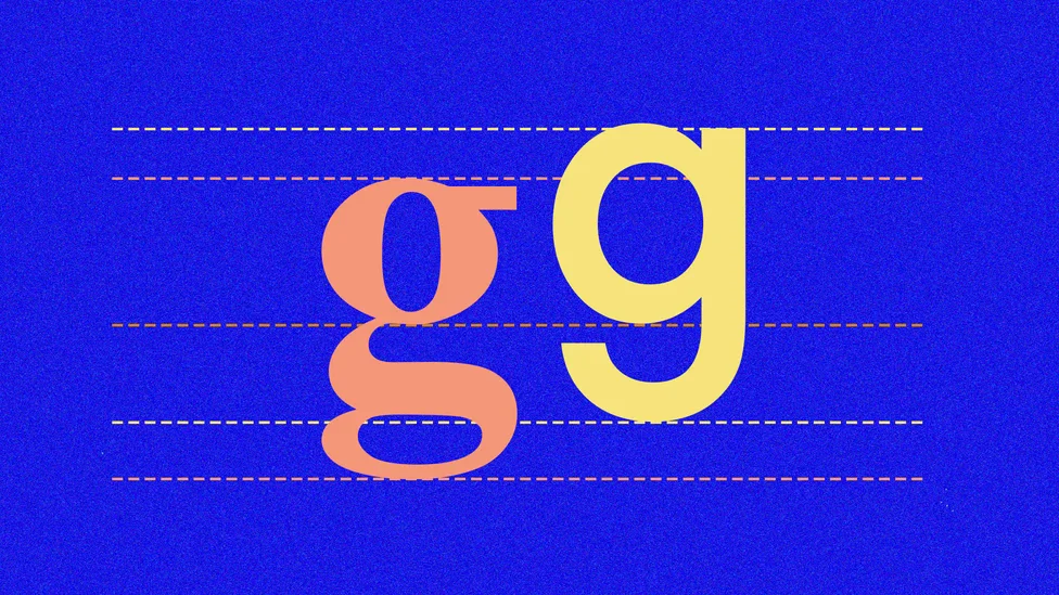
Single-Storey g
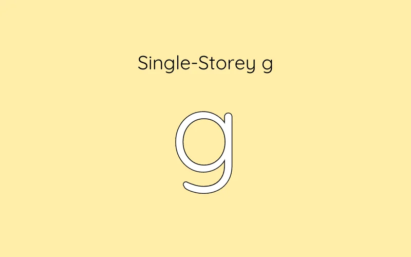
The Single-Storey g lowercase version looks like a simple loop. It comes from older writing styles. In the 20th century, this version became popular with modern fonts because it looks clean and straightforward. Designers like to use it in minimalist designs.
Double-Storey g
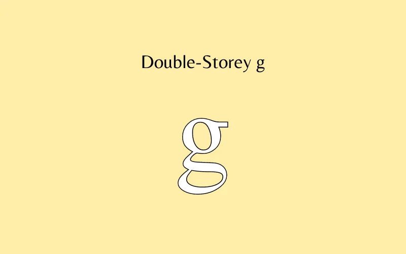
The Double-Storey lower-case g has a more complicated shape, with a round top and a loop below. This version comes from the Roman alphabet. It became common in fancy printed letters during the Renaissance when style was important.
The Double-Storey g is often used in books and printed text because it stands out and is easy to read, especially in longer passages.
Which Version Should You Use?
Why do we see the Double-Storey lowercase g so often? It often comes down to readability. The two parts make it easier for the eye to distinguish it from other letters.
In contrast, the Single-Storey g is less common in printed materials but has its place in modern design.
Typography is more than aesthetics; it also involves how letters communicate meaning. Designers must consider which form fits the message and mood they want to convey.
Google’s Logo Change
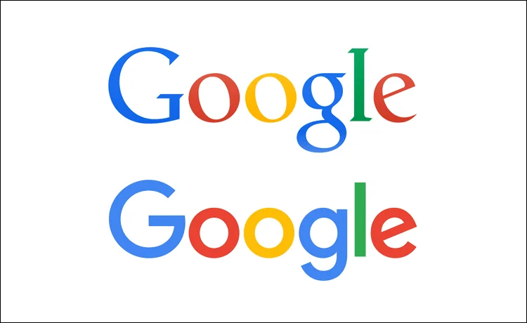
The shift from a Double-Storey lowercase g to a Single-Storey lowercase g in the Google logo shows a modern, minimalist design trend. This change makes the logo simpler and easier to recognize, matching Google’s focus on user-friendly experiences.
The Single-Storey “g” has a cleaner look, making it stand out and easier to write. This 2015 update moves away from traditional typography and embraces a fresh style that fits today’s digital world.
How Do People Recognize The Lower Case g?
Most people see the Double-Storey version of the lowercase g all the time, but they still struggle to recognize its correct shape. Psychology usually says that if you’re good at reading, you’re good at recognizing letters, which means you should know the details of every letter. But that’s not true for the Double-Storey g.
Many people don’t even realize there are two versions of the lowercase g. And even if they do, they often can’t remember precisely what the Doublt-Storey g looks like or how to draw it. Cognitive scientists at Johns Hopkins University studied this in a series of experiments.
In the first experiment, 38 college students were tested. Almost half had no clue about the loop-tail g, and only one person could write it correctly.
In the second experiment, 16 new participants were asked to write the lowercase g after reading a text. Half of them confused the Single-Storey g lowercase version with the Double-Storey one. Only one person got it right.
In the third experiment, 44 people had to pick the correct shape of the Double-Storey or loop-tail g. Most of them chose the wrong one.
How To Draw Lower Case Bubble Letter g
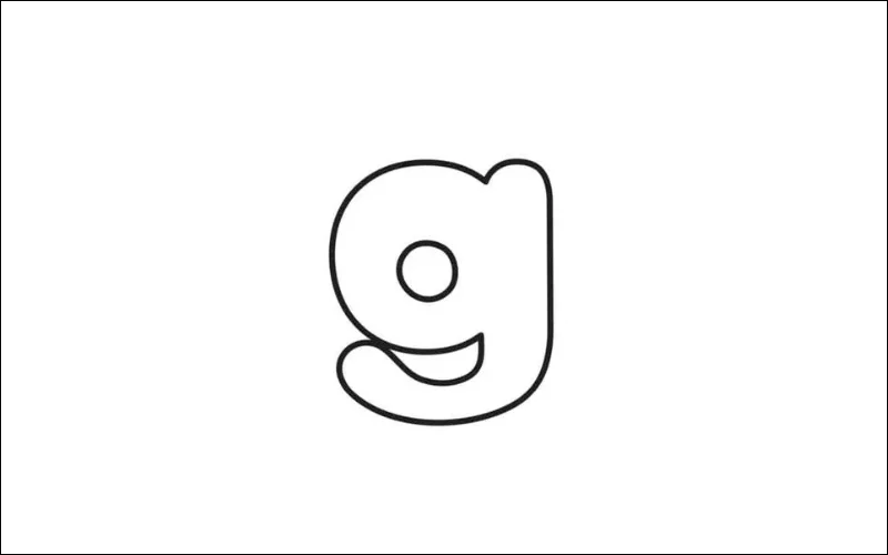
To draw a lowercase bubble letter “g,” start by sketching a large oval to form the loop at the top. From the bottom left of this oval, draw a curved line extending downward to create the descending tail, curving outward slightly and then back up to form a hook.
Once the basic shape is complete, thicken the lines by drawing parallel to your initial lines, giving the letter a soft, rounded look typical of bubble letters. Ensure the tail connects smoothly to the loop. Finally, outline the letter with a marker, erase any pencil marks, and optionally add shading or highlights for a 3D effect.
How To Draw Lower Case Cursive g
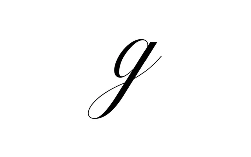
To draw a lowercase cursive “g,” start by making a small, rounded loop at the top, similar to the beginning of a cursive “o.” From the loop, smoothly curve the line downward to form the body of the letter, creating a soft, elongated oval shape.
As the line reaches the bottom, continue into a graceful upward curve to form the tail. The tail loops beneath the body of the “g,” creating a fluid, connected shape characteristic of cursive writing. Keep the strokes smooth and flowing to maintain the elegant cursive style.
How To Draw Double-Storey Fancy Lower Case g
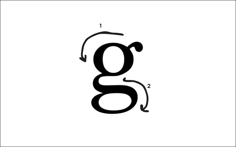
To draw a Double-Storey lowercase “g” with two strokes, first draw an oval for the upper part, like a lowercase “o,” and add a small hook at the top right.
For the second stroke, start from the bottom of the oval, curve the line down, and loop it to the left, forming a larger lower loop. Bring the line back up on the right and finish with a slight inward curl for the tail.
These two strokes create the Double-Storey fancy lowercase g with a closed top loop and a curved tail below. Check out the above photo for more clarity.
Conclusion
The lower case g plays an important role in typography. Whether you use the Single-Storey or Double-Storey form or upper and lower case g, each has its history and meaning. As designers, understanding these details can improve your work and communication.
Exploring the lowercase g and the history of its two versions will help you understand the broader world of typography. This information will help you make better design choices that connect with your audience or clients. So next time you create a design, remember the impact and the story behind that little “g”!
Like this post? Check out more amazing design ideas and resources on our blog.
helpful info! Imma follow you guys
Never realized this before, great knowledge, thanks for sharing
This was way more interesting than I expected! Never knew there were two versions of the lowercase ‘g’ and why. It’s kinda wild how we see one form everywhere but lots of people can’t even remember what it looks like. Makes you appreciate the little details in design, whether it’s fonts or using an AI photo extender to get the background just right. Cool stuff!
Found this super interesting! Never really thought about why there are two ways to write lowercase ‘g’. It’s wild that so many people don’t notice the difference or can’t even draw the double-storey one properly. Makes you wonder what else we overlook every day. It’s a cool detail, kind of like how AI image extenders work their magic without us knowing the technical details.
Wow, never really thought about the letter ‘g’ having two versions! That study showing people can’t recognize the double-storey one is wild. Makes you wonder what other common things we see daily but don’t really *see*. It’s kinda like how new tech like AI Image Extension pops up and suddenly changes how we look at things. Cool stuff!
Wow, never thought about the letter ‘g’ so much! The two versions thing is kinda mind-blowing, especially how many people mess up the fancy one. Makes you look at fonts differently now. Like, could an AI image extender even draw the double-storey one right?
Wow, never really thought about the letter ‘g’ having two forms! That Johns Hopkins study is wild, how can so many people not recognize the double-storey one? Makes you look at everyday text differently. On a totally unrelated note, heard good things about that AI Image Extender, might check it out later.
I really admire how you explain this to us.
Thanks for sharing!
Thank you for providing such useful information. This is a really helpful list of poster fonts.
Thanks for this cool post about the lowercase g! I never knew it had such a long history and different styles. Learning about how it changed over time was really interesting.
I really admire how your explain
I really admire how your
I really admire how your too
— Google-style Minesweeper, browser play
pilot a geometric icon through laser and sawblade mazes. Share custom levels for fun, music-driven jumps challenge finger speed. Hardcore players’ paradise!
Web-based Pokepath experience, play anytime on any device