Taking Calligraphy to a New Level: Hand Lettered Logos
Good logos are what makes a brand instantly recognizable. They are an integral part of the advertising process, as they become the company’s “avatar”, so to speak, and well-known logos become seals of approval for products.
Today we would like to discuss calligraphy in logos, and what better way to do it than by showing you a few awesome hand lettered logos, from a few really cool designers and artists.
First up, we have…
Sergey Shapiro’s Logos
Sergey is a graphic designer, based Russia’s capital city Moscow. He recently started focusing on calligraphy and lettering, applying his artistic skills in a wide variety graphic design fields, including, but not limited to logos, identity and t-shirt design.
He pays extra attention to freestyle and modern techniques, producing wonderfully minimalistic and clean lettering that does not feel limited and boring.
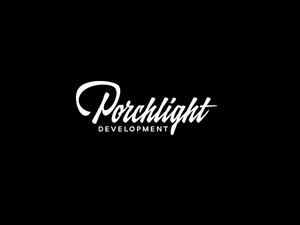
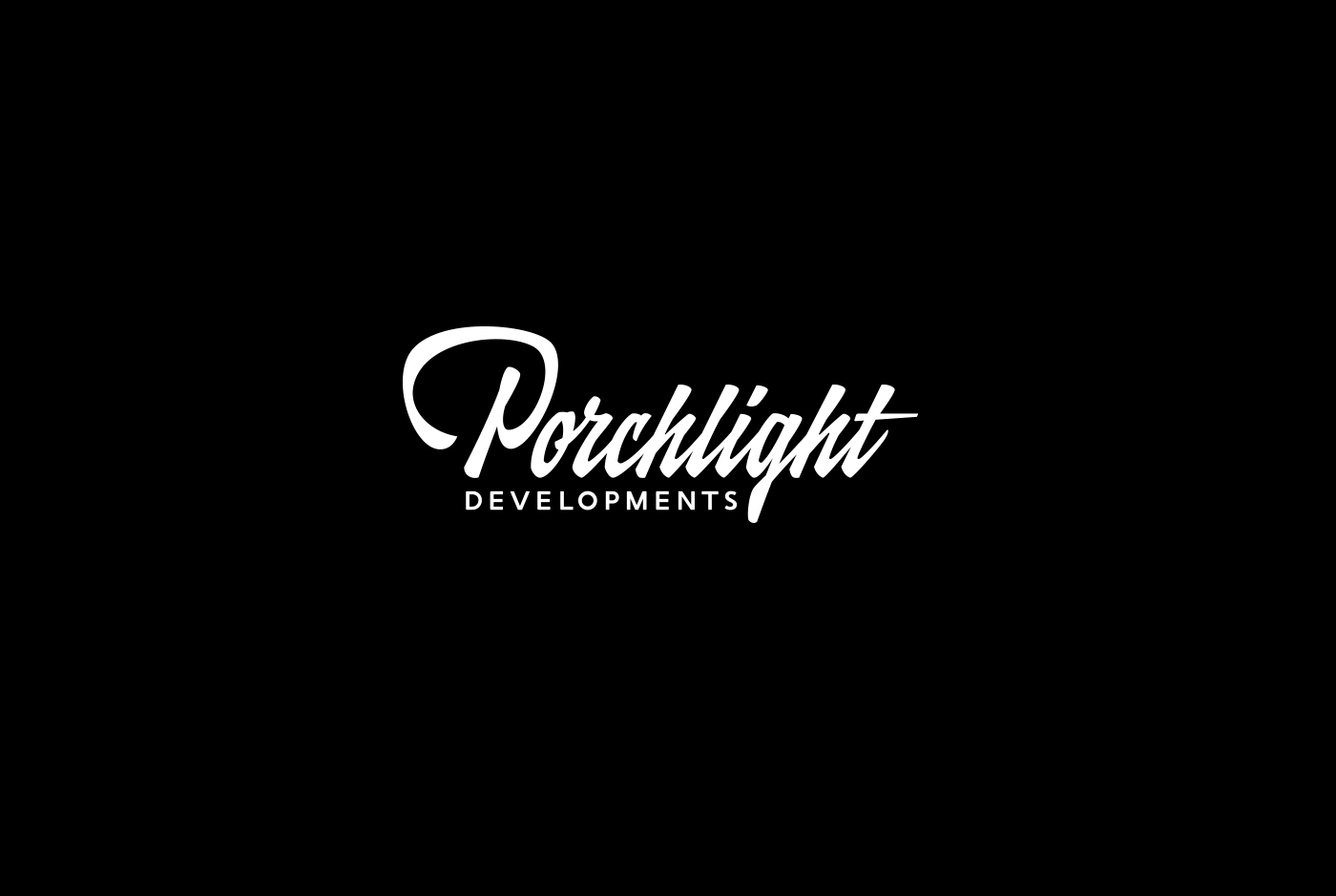
Done for a building company called Porchlight Development, this logo has fairly mundane hand lettering, aside from the capital P. This is what really gives the logo personality, as it is really easy to read and straight-forward, style-wise, letting the first letter handle the task of standing out.
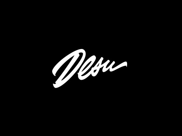
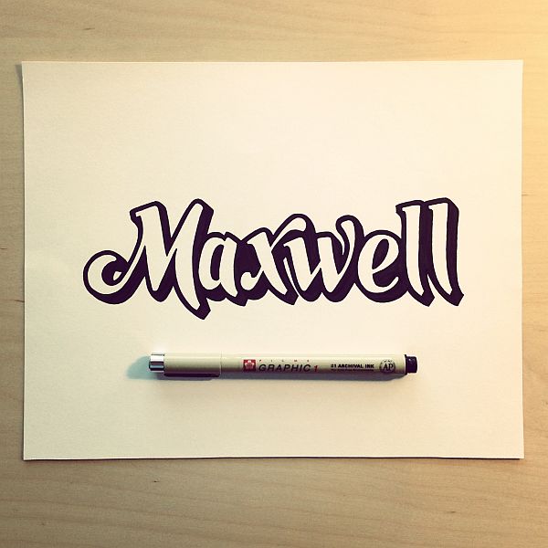
Desu is a clothing label based in the US, and as such, you can easily see how differently he approached making this logo, from the previous one. Whereas the logo for Porchlight is sober and contained, this one is a little more daring. Here, the lettering is not in horizontal line. They are at an angle, giving the logo a signature-like feel to it.
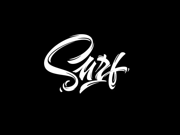
Moscow-based developers Surf create iOS and Android apps, but it is really the name itself that is used here to draw inspiration for the calligraphy. We all know what surfing is, and most of you probably also know that it also sparked a culture of its own. That includes fashion, music, design, and calligraphy. This logo has a “good vibrations” feel to it, the “S” especially, looking a bit like a wave.
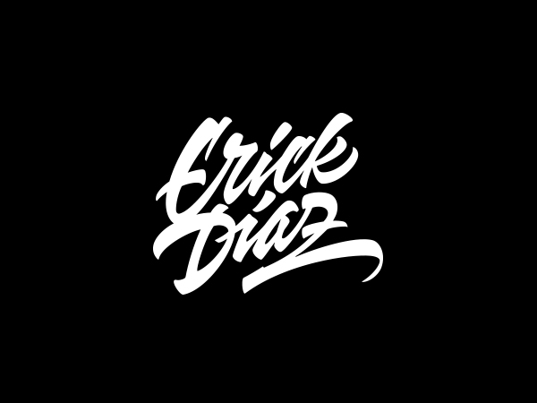
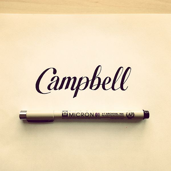
Developers, clothing labels, building company’s, and now a DJ, Sergey has a pretty eclectic client roster. Being a logo for a person, rather than a group, this logo looks a bit like an autograph, not as much as Desu’s logo, though. It is real easy to read, and manages to stay playful without being messy.
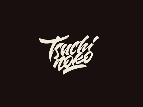
And now for another signature-like logo, this time for a graphic designer from Paris, who goes by the name Tsuchinoko. The really cool thing Sergey did here was split the name in two, making it Tsuchi Noko.
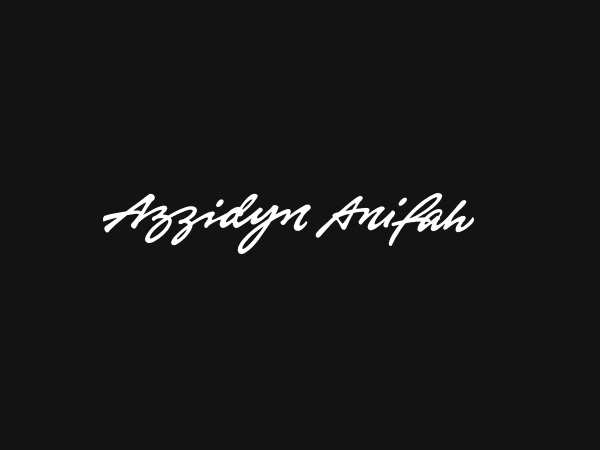
Made for a businessman based in Malaysia, this logo yells sophistication. The lettering is absolutely gorgeous, being just scribbly enough to be identified as handwriting, while also being completely readable.
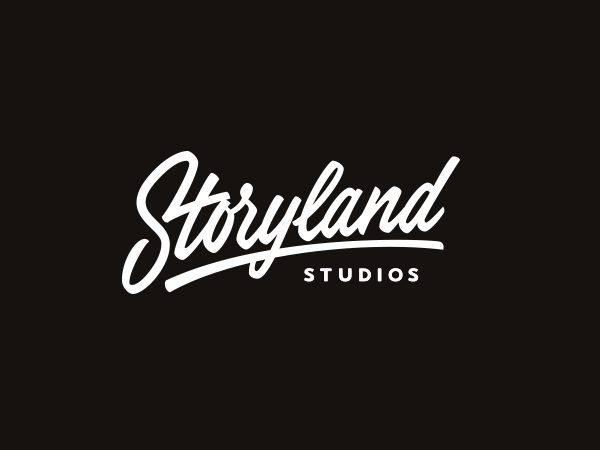
Storyland Studios, who are a leading fabricator and manufacturer of creative and design-intensive goods, got a real memorable logo from Sergey. We can not really put our finger on what makes this logo so good, all we know for sure is that we feel like we have seen it somewhere before.
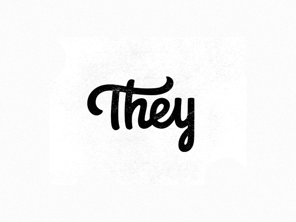
Digital and branding agency They really got their money’s worth, as far as we are concerned. The logo looks great, but it’s really once you see it used on their website that you really understand why this is such a good logo.
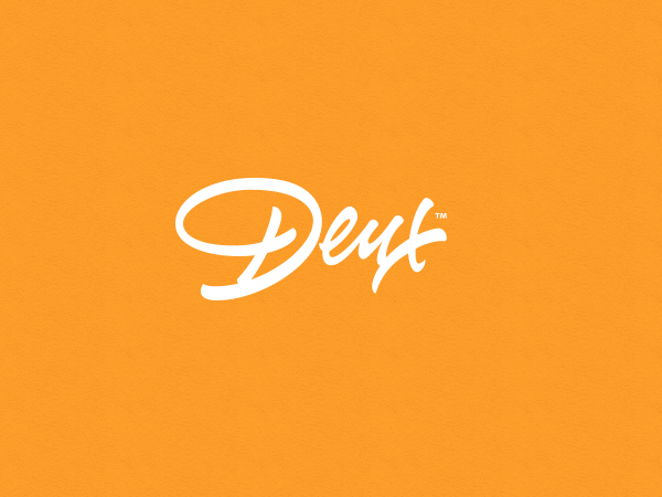
Yet another team of designers, Deux also wanted a great calligraphic logo, and that is exactly what they got. A great mixture of careless and careful, Deux’s logo is easy to read and has a certain stand-out quality that will get people thinking that they really are working with professional creatives.
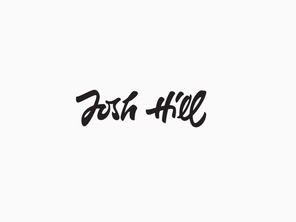
Josh Hill is an entrepreneur in the web and mobile technology industry. When we hear things like that, we can not help but think of American Psycho. We are, of course, not saying Josh would be a psycho, what we are saying, however, would be that Patrick would be really envious of his calling card.
Time for our next hand lettering expert. Everybody, say hello to…
Sean McCabe’s logos
Sean is from San Antonio, in the great state of Texas, USA. He is passionate about hand lettering and typography, which by his own admission, he uses as a form of voice.
“It simultaneously creates a platform from which you can speak a message.”, going on to say that “I use this opportunity to speak messages of positivity and encouragement.”
Being so passionate about what he does, Sean gives more insight into his creative process than we ever could, that is why here, we will just leave you with a quote:
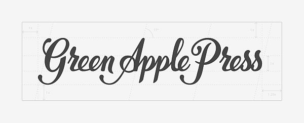
“In designing the Green Apple Press logo, I sought to employ a moderately contrasted script. I wanted to craft something unique and legible from this inspiration. The weight of the script I made has an elegant contrast that doesn’t get too thin in reduction to ensure that it continues to work well at small sizes.”
We are not poets, so we find talking about this logo kind of hard. It looks superb; the way the lines fluctuate from thick to thin, the beautifully designed letters, the proportions. Everything about this logo is absolutely gorgeous.
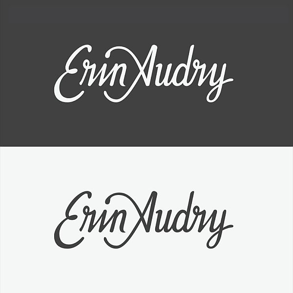
Now this is a real calligraphic tour de force. First of all, the hand letters look really authentic. You could actually believe that someone writes like that on a day-to-day basis. Secondly, the little details that you can easily miss if you aren’t really analyzing the logo are to die for. We love the way the “E” and the “A” wrap up the “rin” in “Erin”, and how a line from the “A” also serves as a dot on the “i”.
You can see a short vine, done by Sean, on how he created this logo, here. All we can really say about this one is that simplicity is the key. No special, snazzy lettering or anything like that here. Just a good, clean, vintage-looking logo.
That’s about it for our article on hand lettered logos. We hope you enjoyed them, and that they gave you a bit of design inspiration for creating your own awesome logos. Feel free to check out more great calligraphy from our featured artists, by clicking the source links. Also, don’t forget to leave us your thoughts, in the comment section below.
Editor’s Note: This article was originally published in July 2014, and has since been revamped and checked to ensure complete accuracy of information.
nice blog too informative. looking and reading your points its so impressive. doing more blog like this. i really appreciated doing like this.
Thank you for the kind words. What did you like in particular about the article?
Don’t
Wow…!
This is great reading.
I enjoyed this article very much.
Thanks for sharing with us great topics.
Really i appreciate it.
Great inspiration! Thanks