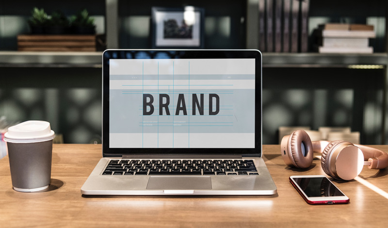
How to Establish Your Brand Image with Graphic Design
When you were just starting your business, you thought that it would be easy. Phase 1 collect ideas about what customers are looking for. Phase 2 come up with a solution to their problems. Phase three profits. In a perfect world, this would work flawlessly. However, a lot has changed in terms of customer dynamics. Now people buy products from a certain business because they trust their name. They want to be sure of the business’s credibility and more than anything else they look at the business’s brand image.
Think about any top brands you know. Google, Samsung, Amazon, McDonald’s and Coca Cola. All these are larger than life businesses that have a respectable reputation in their own respects. And not only that but you could in the very literal sense tell them apart from other brands even from a distance. And this is not just because they have been in business for years but because they have established a brand image that their customers identify with and trust.
I’ll tell you what though. There is no black and white to how these businesses did it. Some would say they had a lucky streak but it was really a whole phenomenon. From outworking everybody else to basically just establishing and building up their brand image.
Now, I’ll be the first to admit that establishing your brand image isn’t exactly a walk in the park. However, the good news is that there is help to be had. And in this article, I’ll walk you through how you can establish your brand image with graphic design.
Sound good?
Let’s dive in.
Design a Unique and Creative Logo
Now here’s the thing:
One of the best ways to leave a lasting imprint of your brand is to create a logo. Even though they are often just small images, logos carry a lot of meaning. Not to mention they are also the most recognizable representation of the business.
I mean think about it. Think of any top brand you know. Be it Coca Cola, McDonald’s or Apple you can right off the bat tell the company just from looking at the logo. And so even if it’s not written by its full name, you know exactly what company is being represented. So it is important to ensure that you create a unique and striking logo that best represents what your business is all about.
Principles of a Great Logo
Memorability
I don’t think I have to tell you how important it is to ensure that your logo is memorable and quickly recognizable. The customer should be able to right off the bat get what the logo is trying to represent within the shortest time possible.
Simplicity
How does the saying go again? Simplicity is the ultimate sophistication or something? Well, your logo also has to be simple and clean to make it more recognizable and understandable. You don’t want it to be too busy or too confusing because then no one will want anything to do with it.
Timelessness
Lastly, your logo has to be timeless. Although it’s fairly easy to come up with another logo with time, you’ll save yourself a lot of hustle if you create a logo that is in itself timeless. It needs to make sense not just now but 10, 20, 30, 50 down the line.
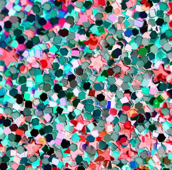
Experiment with Colors
Colors have a lot to do with establishing a successful brand image. With a few simple color tweaks, you can make your brand image a lot more persuasive and completely change people’s perspective about your brand. In fact according to Kissmetrics, color augments brand recognition by 80%.
However, deciding on the right colors can be a monumental task. Especially because there are dozens of colors to choose from. Each of which evokes different emotions. That being said, for you to determine which colors work best, you need to understand the psychology of color.
Think about the last time you bought an attire. How did you decide on the attire you ended up buying? My guess is as good as yours. The color pallets had a lot to do with your decision. In fact, according to Quicksprout, color is 85% of the reason why you purchased a specific product. Better yet, you choose a specific attire from a bunch of different colored attires depending on your color preferences.
However, I’ll be the first to admit that it’s easier said than done. The truth is color is a tricky thing. Think of it this way. Different colors evoke different feelings in different people. What this means is that while some people might like the colors you’ve used, others might not exactly be in love with them.
So, for instance, women will be more attracted to colors like gray, blue, green, orange and purple while men will prefer green, blue and black. Apart from gender preferences, different colors are associated with different things.
Allow me to explain. A lot of people like blue. And this is not just because it’s a chill color but also because it cultivates users trust. Yellow, on the other hand, is associated with warnings. Think wet floor signs and traffic signals. While green, on the other hand, is associated with the environment. And lastly, there’s black. The darker tone in the black color more than just adding a sense of luxury also exudes elegance and sophistication. However, black also depicts death so it’s imperative to do proper due diligence when choosing your colors.
Choose the Right Typography
Though often underestimated, typography is the bread and butter of graphic design and to extension establishing an effective brand image. It is after all the first thing that people see when they look at your brand – and you know what they say about first impressions. And just like color, it is crucial to choose the right typography for your brand image. People scan through the brand information and unconsciously judge the credibility of your brand by looking at how the text looks as well as the size of the letters. And all that in a matter of seconds. So you will want to ensure you have a typographically well-formatted design that is easy for the reader to comprehend.
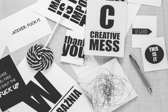
Incorporate Visual Elements
It’s the look and feel of the brand that either wheels customers towards your brand or drives them away. So it should come as no surprise that I included visual elements in this list. And I am not just talking about the logo design. On the contrary. I am talking about personalizing the brand image and representing it in a symbolic way to establish a connection between you and the customer. Even using vector patterns can elevate your designs.
So, for instance when you think of KFC the visual element that comes to mind is Kentucky chicken. Because they use it as a visual element to tell people that they sell Kentucky Fried Chicken. However, on the off chance that you don’t want to use a literal visual element, you can use typography to speak for your brand. Instead of using just the normal fonts you can create custom fonts that are unique to just you. That way, when people see the typography, they immediately think of your business.
Use Unique Shapes
Another important factor you want to consider when establishing your brand is the use of shapes. Shapes like colors are a huge part of forming our perspectives. Think of the cross sign. What comes to mind when you come across the sign? In most occasions, of course, you think of first aid. In the same vein, an octagonal shape on the road denotes stop. So obviously when you come across that shape you immediately stop.
You might not realize it but shapes just like colors leave a lasting imprint on us and can be just as influential in forming perspectives. In fact, you’d be surprised at just how impactful they really are. Therefore, adding a few tweaks to the brand’s shape can dramatically improve the recognition of your brand.
However, just as with colors, you will need to do your own due diligence to determine the kind of responses that different shapes evoke. All it takes is having an understanding of what different shapes mean to different people to help you tweak your shapes to communicate the right information.
Conclusion
And there you have it, folks! A comprehensive blog post on how to establish your brand image with graphic design. Of course, there’s a bazillion of other ways to establish your brand image and brand identity, but these are the most important yet. Be sure to leverage different colors and well formatted typographic elements to establish a more successful brand identity. Also, ensure that you incorporate visual elements that connect with the customers for better chances of success.
As always I hope that this information has been helpful. And always, always, always do your own due diligence so as to find out what works best for you.
Good information for banding a startup business.Thanks for your info.
Your product is your brand. So by taking proper product photo editing service from graphic designer give your product that chance. There is no hidden tricks and no secret handshakes that can bring you that. The article is very useful. Thanks for the article hemant
Nowadays typography is really important. For example in this site used serif font, its good for users are able to read quick and scanable.
Very informative post. Lot of information you provide here.
Your innovative guide line helps me in my professional life. Thanks for sharing this informative post.
thank you for the informative article..
That was a great and comprehensive article…all the tips enumerated and explained will be helpful for those who are wise enough to tap from it. Any business nowadays without social media signals and presence may not make it to the outermost, and investment too is part of the key to success in business. Keep up the good work