Mastering Negative Space Logos: Stunning Examples & Pro Design Tips
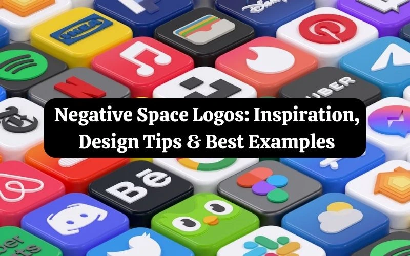
In the crowded world of branding, standing out is everything, and that’s where negative space logos work their magic. These clever, memorable, and eye-catching designs utilize a logo’s “empty” space to reveal hidden shapes, symbols, or messages.
From FedEx’s hidden arrow to the salsa bowl in Tostitos’ logo, many top brands use negative space as an innovative design technique. The beauty of a logo with negative space lies in its ability to surprise, delight, and stick in people’s minds long after they’ve seen it.
In this article, we’ll explain what negative space means in design. You’ll learn why negative space logos are so effective at grabbing attention. We’ll also share inspiring examples and highlight common mistakes to avoid when creating one for your brand.
Table of contents
1. What is negative space in a logo?
Let’s first clarify what negative space in design entails before exploring why it works so effectively. The empty space around and between the main objects of a design is called negative space. In negative space logos, the empty space is intentionally shaped to add meaning, balance, and creativity to the design. The negative space in the logo design doesn’t just sit in the background; it becomes part of the visual message, which makes the logo stand out and be remembered.
You may also like: Negative Space Art: A Powerful Tool for Depth and Design
2. Why do negative space logos capture attention?
- Visual Cleverness: The brain enjoys solving visual puzzles, and negative space logos offer a satisfying “aha!” moment. Compared to a simple graphic, this element of discovery makes the design more captivating.
- Memorable Branding: The effective use of negative space in a logo helps a company stand out from the competition. Long after they’ve seen the logo, people can still recall the “hidden” element due to this mental association.
- Clean and Minimal: A well-designed logo that utilizes negative space effectively communicates multiple levels of meaning without being cluttered. Open space offers the design a timeless, contemporary vibe that complements today’s minimalist branding trends.
- Emotional Connection: A tiny spark of delight or curiosity sparks when a spectator recognizes the hidden image or message. The audience feels closer to the brand as a result of this emotional reaction, which raises the likelihood that they will remember it.
You may also like: 5 Most Common Mistakes in Designing Logos
3. Negative Space Logos for Inspiration:
1. Pittsburgh Zoo & PPG Aquarium
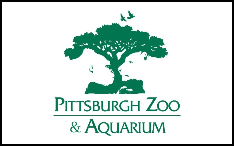
The Pittsburgh Zoo & Aquarium logo highlights negative space by showing a lion and a gorilla facing each other. Their outlines form a white area within a large tree. This clever design fuses nature and wildlife into one striking, memorable image.
2. Johnnie Walker
The Johnnie Walker logo leverages negative space design to create the “Striding Man” with only a few bold shapes: his boots, cane, tailcoat, bow tie, and bowler hat. His outline is defined by the background, leaving the remainder of his shape exposed. The figure stands out thanks to the use of empty space, which also keeps the design simple and contemporary.
3. FedEx Logo
One of the most well-known instances of negative space design is the FedEx logo. The white space creates a precisely formed arrow between the characters “E” and “x.” This concealed arrow represents forward motion, accuracy, and speed, values that are entirely consistent with the brand‘s delivery offerings.
You may also like: 5 Minute Guide: Why White Space Is Your Friend in Web Design
4. OSCARS, Academy of Motion Picture Arts and Sciences logo
Negative space is also utilized in the Academy of Motion Picture Arts and Sciences logo. The Oscar silhouette is positioned within a golden triangle, which also serves as the letter “A” for “Academy.” The statuette is easily recognizable due to the open area surrounding it. The triangle reflects the Oscars’ prestige while adding elegance and balance.
5. NBC
Six bold feathers, one elegant bird: NBC’s logo frames its peacock entirely in negative space, making it impossible to miss. The design is immediately identifiable because the empty space not only shapes the peacock but also highlights it.
6. Goodwill
The Goodwill logo appears to be a warm, smiling face at first glance, representing the satisfaction that comes from giving back, reusing, and donating. Upon closer inspection, however, you will see that the “face” is an enlarged lowercase “g” from the phrase “Goodwill” underneath it. This small design choice adds individuality and simplicity, making the logo distinctive yet approachable.
7. WWF
An excellent illustration of negative space in action is the WWF logo. The design is straightforward yet instantly recognizable, as it utilizes a few strong black outlines that allow the white space to form the panda’s face and body. Its understated style makes it classic, unforgettable, and ideal for a worldwide conservation logo.
8. Tostitos
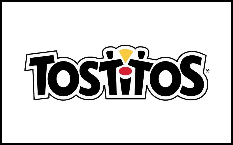
Two friends sharing chips over salsa, right in the middle of the word ‘Tostitos’, once you see it, you can’t unsee it. The dot over the “i” in Tostitos appears to be only a splash of color, but with closer inspection, you can see that it’s a bowl of salsa. The yellow triangle in between the two “Ts” is a chip, and the two “Ts” become persons. A minor, witty touch transforms the logo into a food-sharing moment, making it more meaningful and memorable.
9. Just Eat
The Just Eat logo is a simple design that conveys a great deal of meaning. The first thing you see is an orange house, which immediately makes you feel at home. However, upon closer inspection, the white area inside the house transforms into a knife and fork. The whole story is conveyed by this ingenious detail: delicious, freshly prepared meals delivered straight to your home. At a glance, it is clear, intelligent, and simple to understand.
10. Hartford Whalers
The Hartford Whalers logo combines three components into a single design, making excellent use of negative space. The negative space between them discreetly creates an “H” for Hartford, the blue whale tail above it reinforces the team name, and the green “W” stands for Whalers. It is a clever, simple logo that says a lot with little
4. Mistakes to avoid while designing negative space logos
- Overcomplicating the Design: Attempting to incorporate too many features or hidden shapes into the logo may confuse. Keep your negative space logo design minimal and clear so the hidden feature is easy to notice.
- Weak Contrast: The hidden design won’t be noticeable if there is insufficient color or tonal contrast between the positive and negative parts. To make sure your logo is clear, always test it in black and white with negative space.
- Forcing the Idea: Not all brands require a secret symbol. If a logo doesn’t naturally match the narrative or message of your business, don’t force it.
- Ignoring Scalability: A negative logo ought to be compatible with all screen widths. Simplify the design if the concealed part vanishes when the logo is small.
- Poor Alignment: Balance and position the shapes in negative space logos carefully; otherwise, they look haphazard or unclear.
You may also like: Why Does a Professional Logo Design Cost So Much?
5. FAQs based on negative space designs
- Is negative space bad in design?
Ans: In both art and design, negative space is essential. Negative space is the absence of visual clutter to highlight the main point or points in any kind of visual art.
- Which logo style is best?
Ans: Wordmark logos are most effective when a business has a clear and concise name. One excellent illustration of this is the Google logo.
- What is another word for negative space in design?
Ans: In art and design, people often call negative space “white space,” and they may also call it empty space, blank space, or even the void.
Conclusion
Negative space logos are like a designer’s inside joke, a clever secret tucked in plain sight. They don’t just decorate a brand; they invite the audience to pause, notice, and connect. Whether it’s a hidden arrow, an animal silhouette, or a nod to what the brand does, these designs turn curiosity into loyalty. Done right, they’re not just seen, they’re remembered, shared, and loved.
You may also like: 11 Creative Photography Logo Ideas To Try In 2025
Negative space logos are a brilliant way to convey complex ideas in a simple yet impactful manner, showcasing the designer’s creativity and ability to engage viewers with clever visual storytelling that lingers in their minds long after they’ve seen it.
This article brilliantly shows how negative space in logos does more than look sleek—it turns design into discovery. Brands like FedEx, WWF, and Pittsburgh Zoo use clever visual ‘puzzles’ that reveal hidden shapes, boosting memorability and emotional impact in a minimal style.
Done right, they’re not just seen, they’re remembered, shared, and loved.
This game is the perfect blend of puzzle-solving and action.
Negative space logos are truly a game changer in branding! They not only captivate attention but also convey deeper meanings in a clever way.
Schrotthändler is the German term for a scrap dealer—an individual or business that buys, collects, and sells scrap metal and other recyclable materials. Schrotthändler play a key role in the recycling industry by helping reduce waste, recover valuable resources, and support sustainable material reuse.
Fantastic overview — the way negative space can tell a story is so well demonstrated here.
Step into the arena of Scrandle , where linguistic mastery becomes your ultimate weapon in a battle of wits that demands vocabulary dominance.
Witness a symphony of strategic genius and balletic athleticism unfold in Football Bros play online, where every calculated play becomes a testament to the beautiful game’s intellect.
The real-world examples make the concepts easy to understand and offer great inspiration for designers looking to create memorable, clean, and clever visual identities.
Thank you. In a saturated market, a logo that can make a strong impression and make customers stop and think is key to success. Wishing you continued breakthroughs in your design projects!
In Grow Garden, players experience the joy of planting seeds, nurturing sprouts, and harvesting fresh produce in a colorful world.
Really love how negative space logos can convey so much with just a few simple elements. Great insights on what makes them effective!
Strong negative-space logos work because they add meaning without adding visual clutter, but the technique only succeeds when the hidden element supports the brand rather than becoming a gimmick.