Typography, type and typefaces
This article tries to explain, define and make you understand some notions of typography. We tried to compile the essentials and give you an objective look of these elements. Now let’s get started!
Typography
Is the art and techniques of arranging type , type design, and modifying type glyphs.
Arranging type involves: changing point size, leading, width, letter-spacing and kerning; type design is the art of designing typefaces.
Typefaces are a created set of characters of a single size and style. Here’s  a few examples of typefaces: Helvetica, Bodoni, Futura, Verdana, Myriad, Arial etc. Fonts, on the other hand, are specific style and sizes of a typeface. That would be:
Myriad Pro – a typeface
Myriad Pro Semibold Italic 24 pts – a font, because it specifies the size and styling of that particular typeface
The anatomy of type
Is a must-know. Learning the language of letter forms, you will easily distinguish typefaces and know where or what to look for when selecting a typeface.
Key terms
David Debner says there are over 25 terms applicable to a letterform. It’s not necessary to know all of them but certain ones are essential in order to make visual judgments about type. The principal terms that determine how letterforms differ are: x-height, serif, counter, descender, ascender and the stress of a letter. Other terms such as loop, spur, tail and link are interesting but not as influential as the ones above.

Each disting part of a letter has its own name.
Knowing the structure of letterforms is essential to understanding how typefaces differ and allows the designer to make decisions about selecting and using the multitude of typefaces.

The x-height is the height of a lower-case x and determines the visual size of type. The x-height size varies from typeface to typeface. Type with large x-heights tend to have small ascenders and descenders, whereas type with small x-height have large ones.
For a more detailed explanation and a better understanding of type anatomy, check out David Debner’s “Graphic Design School”.
Now that we have cleared that out, let’s move on to the difference between serif and sans serif typefaces.
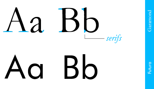
Serif and sans serif typefaces
Serif typefaces have serifs, while sans serifs don’t (sans comes from french, which means ‘without’). Well, serifs are semi-structural details on the ends of some of the strokes that make up letters and symbols.

Primarily, text types are meant to be read in a continuous form or at least with few interruptions. Certain serif typefaces, such as Garamond and Caslon, are ideal for the purpose of continuous reading. We know call them classics, and for a good reason, because they have stood the test of time.
There are general groups of serifs: bracketed, hairline, slab or slab bracket. When trying to identify a typeface, a good starting point is to identify the type of serif.

For an introduction, this is all you have to know about serif and sans serif typefaces. Now, if you remember, at the beginning of the article, we said what arranging type involves. This here is an explanation of the terms mentioned:
Point size – is actually the  height of a letter (1pt = 1/72 of an inch);
Width – obviously refers to the width of a letter;
Letter – spacing -defines the amount of space between the characters in a word
Kerning – kerning increases the space based on character pairs.

While letter-spacing increases the space between characters evenly, regardless of the characters, kerning increases the space based on character pairs. There is strong kerning between the V and the A, and no kerning between the S and the T.
Kerning is very important and improves readability a lot. To see how important kerning is, pay Max Kerning a visit.
Letter-spacing and kerning lead us to another important discussion in type: spacing. That we will cover up in the next typography related article.
Other typography-related articles and sites that might interest you:
4. TypeNeu
5. Fontlover
And, as the final touch, we hereby present you the periodic table of typefaces, brought to you by Cam.

Nice article on the basics. Very well explained.
Thank you
Stick around, there’s more type related articles to come:)
o pagina de meseriasi si sunt mandru de noi romanii putem da clase altora care multa vreme ne-au sictirit in nas.
Va felicit
m.s.bozan
germania
:)
:)
I’m wondering if you define what “bracketed” refers to when describing a font.