3 Essential Steps toward Successful Rebranding
There are two main reasons for which a company contacts a designer or design firm for a brand identity project: they are either a new company looking to establish a powerful and expressive identity, either they have an already established business and resort to a ‘facelift’, usually in order to increase sales and brand awareness and adopt a new position in the view of stockholders and competitors.

The latter of course entails a more complicated job for the designer, because they have to take in account the client’s wishes regarding all small alterations to the previous design; although the ultimate purpose is to create an entirely new logo or package, companies usually have a hard time giving up on the distinctive features of the previous one. We’re going to take a look today at three examples of redesign, including packaging and logo design: a success, a failure and an intriguing case which combines the two.

As a designer, it’s essential to initially understand why your client is looking for a redesign. It’s not uncommon that they’ve resorted to it for all the wrong reasons, such as a short term increase in sales or to follow the latest trends in logo or packaging design. It’s advisable that you start by discussing what are the expected outcomes of this facelift and the true reasons behind it. Offer advice on which course of action would be more trenchant, in order to avert the company’s risk of casting off a large budget and their reputation.


PepsiCo’s Failed Packaging Redesign
A relevant example of a redesign gone bad was the 2009 collaboration between PepsiCo and the Arnell Group. The project was regarding the packaging of PepsiCo’s premium fruit juice brand, Tropicana. Peter Arnell, founder and CEO of the Arnell Group said that it should be “more relevant to the times”. “We had always depicted the outside of an orange. What was fascinating was that we had never actually shown the product – the juice itself”.
They decided to replace the original “straw stuck in an orange” with a simple glass of orange juice, which resulted in a more diluted identity. Loyal customers were in fact so used to the packaging of the juice, that it became the way in which they identified it on store shelves. The result was that Tropicana sales went down 20% in the first two months, costing PepsiCo overall $33 million.

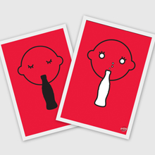
Coca-Cola Redesign: Advantages and Disadvantages
An interesting example of a failed redesign that actually generated a positive outcome is the one adopted by Coca-Cola back in 1985. They opted to change both the design of the can and the taste of the juice in order to increase sales and draw in new customers. The result was that over 400,000 customers complained about the change and started a full-blown movement to force the company to revert to the original formula. Although this definitely classifies as a redesign failure, it actually generated a lot of hype around the beverage and ended up generating interest in the brand.

Cigna’s Rebranding Success Story
Finally, an example of a successful yet sinuous rebranding is the one of the American based health insurance company, Cigna. They collaborated with the Leader Creative design firm because the company felt that the Cigna logo didn’t represent the wide array of services that they offered. Leader Creative resorted to an effective tool in redesign projects – focus groups, that confirmed Cigna’s concerns. Moreover, people referred to Cigna’s logo as being “bureaucratic” and “unresponsive”.

Still, Cigna feared that a significant change would result in losing the brand equity that they had built around their previous identity. So they first tried to keep the signature black box in the logo, but it didn’t give the acronym any apparent meaning. A health care company should express care, security and stability and create an emotional response from the clients. They ended up including a tree in the logo, because it encompassed all these qualities. Alongside the new slogan “A Business of Caring”, it made this particular redesign a success.

So don’t forget that the reasons behind a rebranding are just as important as the new brand identity. Make use of all the marketing research tools at your disposition, such as focus groups, surveys, pricing research, competitor analysis and more. Also, the meaning and emotional response generated by the redesign are key.
Great and effective marketing strategies will always be economical,
reach in the market to a greater audience, boost brand image and foster commercial relations
Just amazing post you have published . I appreciate your blog . Well-done for shared .