10 Tips & Tricks to Optimize Your Website for Mobile Users
“I do everything on my phone, as a lot of people do.” Mark Zuckerberg
The internet has changed a lot ever since smart phones came into play. Of course, very soon after that moment tablets were a reality. There was such a concept as a mobile site before that, but mostly it wasn’t that important to have a mobile version to your site. Mobile users were few and they weren’t too picky. They were used to the idea that websites are designed with a computer in mind and that they probably won’t display or load properly on their mobile devices.
Things have changed these days. Most computing is already done on the go. Emails have gained the functionality of text messages and most smart phones come with data plans that allow the users to surf the internet at will. Thus, one thing has happened that always happens when you give a large group of people the ability to do something. They’ll do it a lot and they’ll demand improvements.

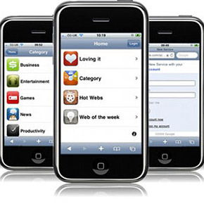
And the improvements are coming, make no mistake about it. These days, most major websites have mobile versions of their sites or apps for the iPhone and in the Android store in order to tap into this huge market of mobile internet users.
It’s gotten so that now, if your site is poorly optimized for mobile, you’re instantly considered sub-par and non-important. And that does have a grain of truth in there. This is a huge market of people that could be visiting your site and interacting with your content that you’re just not tapping into.
If you do want to tap into that market, then you need to optimize your website for these mobile users. That’s why we’ve compiled a list of 10 tips and tricks to help you get your website more mobile-friendly.

Now, before we get started, it’s important to mention who the mobile user is and what he expects. Your mobile user is, well, mobile. That may look like a tautology but it’s really not. It means that the typical mobile user is looking for a few key pieces of information – address or a click-to-call phone number. It’s less likely that they’ll care about your corporate philosophy or your latest press releases. Design the mobile version of your site accordingly.
So, here we go with the list of tweaks for your mobile website:
1. Keep it simple
What information will you include? Your space is limited. Mobile bandwidths aren’t quite as good as the ones you get on your desktop or laptop, so you can’t really cram as much in there.
Plan accordingly. Put in your contact details, use your store locator, maybe drop the huge PDF about your corporate philosophy.
If you’re selling a product or a service online via your website and you want to be able to sell to mobile users as well, then you need to keep the steps from entry to purchase as simple and limited in number as possible. Eliminate all non-essential content from this path.
2. TouchSwipe
TouchSwipe is a jQuery plugin that enables your mobile users to use touch gestures like pinch, swipe, zoom and scroll on your website.
Since more and more websites are leaving the physical keyboard somewhere in their past in favor of the touch screen, maybe you should consider using this plugin.
3. Plan your site layout
Like we mentioned above, mobile site versions will load slower than regular oens. That’s why it’s important to drop all non-essential content from your mobile version. It’s just to keep it as fast as possible.
That’s also why you should keep the number of pages on your site to a minimum and to streamline the layout of the website as streamlined as possible (as users won’t have the patience to click through several pages in order to get the information they’re looking for).
Ideally, your website should be uncluttered, it should provide limited navigation and improve the overall experience your user has when visiting your site.
4. Splash Screen
Splash screens are the first images that show up when booting up a program on your computer or an app on your smart phone. It’s purpose is to let the user know that the app / program is loading.
You can now use splash screens for the mobile versions of your website. A bit of HTML code:
<link rel=“apple-touch-startup-image” href=“splash-screen.png” />
And you’re good to go. After using this bit of code, when users open your website via the home screen, the image you assigned in the link element will show up for a bit before your site does. It’ll make your website look a bit cooler and it’ll improve the user experience by letting your users know that the website is loading.
5. Use white space
When you’re designing a mobile website, your natural tendency is to cram as much as possible in there. Resist that urge. White space has multiple advantages. First of all, it makes your site look good. Second, it means that the button the user clicks is the one he meant to and not the one next to the one he wanted. Let your site breathe.
6. Don’t use Flash & Java
It’s simple – a lot of devices don’t support Flash or Java. Apple products, for one, will never support Flash. Most mobile devices don’t support Java. And those that do can’t quite handle it anyway – it adds up a lot of loading time and makes the whole website lag terribly. Stay away from these and your mobile users will thank you.
7. Stay clear of pop-up windows
Navigating between various tabs is hard on a mobile phone or on a tablet. Things take longer to load and overall the experience is pretty bad. That’s why it’s important for your site to stay clear of pop-up windows that force the user to do this. And, hey, while you’re at it, stay clear of pop-up windows on your desktop site as well, the internet has kind of moved past them these days.
8. Use mobile redirects
So you’ve got a mobile site. That’s great. Still, what’s the point if you can’t detect which users are mobile and redirect them directly to the mobile version of your site? You need to use mobile redirects. These will detect mobile users and send them to the mobile version of your site.
9. Keep text input at a minimum
People don’t like to write too much on their mobile phones. That’s understandable. It’s much easier to make typos when typing on the narrow keyboard most such devices have to offer. That’s why, instead of text-based input, you should use drop-down menus, checklists and other types of information-gathering means that allow you to avoid forcing your user to type too much.
10. Let people visit your full site
Like we kept saying, your mobile site has reduced functionality, compared to your full site. There will be people who want information that’s not featured on your mobile site, but just on the full one. That’s OK. It’s not a failing on your part. You just have to give your users the option to use the full site instead of the mobile one. Just make sure each mobile page has several links that allow the user to return to the full website.
That concludes our list of tips & tricks for mobile website optimization. Can you think of any that we haven’t mentioned? Feel free to point it out in the comments section below!
0 Comments on “10 Tips & Tricks to Optimize Your Website for Mobile Users”