YouTube Changes Its Logo and App Design
Just like bunch of other apps YouTube changed its logo and app design to avoid common logo mistakes. The changes include new logo, typeface, color scheme and some other stuffs on the look. After the last 12 years using the same logo, YouTube finally makes an evolution out of it.
YouTube kicked out the word Tube out of the iconic red tube. The change not just happened on the Tube’s tube but also brought the familiar play button as the icon. The play button pretty much signifies the whole image of the brand. Besides for its familiarity, the play button icon simply represents the whole family services YouTube has now.
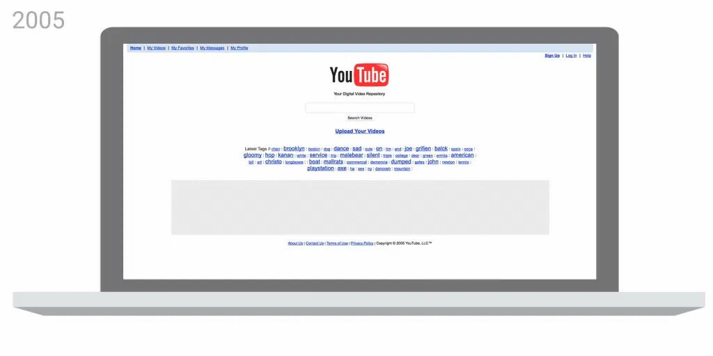
YouTube’s desktop website evolution
However all of the changes don’t change YouTube’s mission. YouTube wants to give people a voice and show them the world – no matter what device they use. Of course this mission seems like what everyone wants to believe and so we hope the best for YouTube.
Incredibox Colorbox Mustard has quickly become one of my favorite games! The atmosphere is vibrant and inviting, and I love how easy it is to get started. The sounds are enjoyable, and creating music feels effortless. It’s perfect for anyone looking to explore their musical side!
Incredibox Colorbox Mustard is quickly becoming one of my favorite games! The ambiance is lively and friendly, and I enjoy how simple it is to get started. The sounds are pleasant, and making music feels effortless. It’s ideal for anyone wanting to discover their musical side!
Every second counts; run and escape from the police chase in escape road 2.
I highly recommend you to experience the game Friday Night Funkin’ a colorful and fun rhythm game, bringing many interesting musical challenges!
If you love brain-teasing challenges, Brain Lines will keep your mind sharp and engaged!
Thank you for sharing this valuable information! Really helpful content.
Thanks for sharing the update on YouTube’s logo change. I found it interesting that they removed the word Tube and made the play button the main icon. It’s cool how it represents all their services now after 12 years.
Thanks for sharing the update on YouTube’s logo change
Interesting to see YouTube’s logo change after so long! I like how they kept the play button as the icon, since it really represents their brand well. The new design sounds like a smart update.
Thanks for sharing this update on YouTube’s new look! I found it interesting that they kept the same logo for 12 years before changing. The new play button-only icon is smart since it represents all their services now. It’s cool how brands evolve over time!