What Font Does Apple Use? – A Look At Their Typography Over The Years
If you’ve ever wondered what font Apple uses, you’ve landed on the right page. In this article, we’ll explore the evolution of Apple’s typography, exploring the iconic fonts that have defined its brand and user interfaces throughout the years.
Read ahead to gain insights into this iconic brand’s typography.
Table Of Contents – Apple Brand Typography
Motter Tektura Font (1977 – 1984)
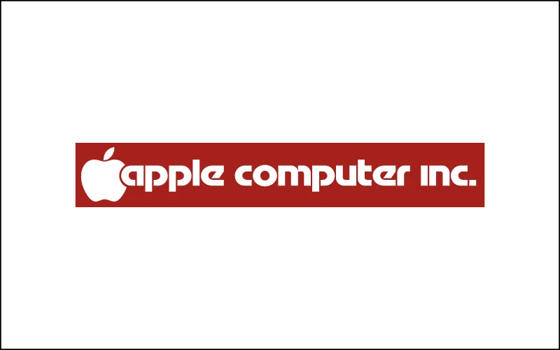
In 1977, Apple launched a logo with the font Motter Tektura, a bold, futuristic sans-serif font designed by Othmar Motter. Apple used it in its original logo and marketing materials.
This unique font immediately gave Apple a modern and innovative feel, which was essential as it entered the rapidly growing tech industry.
Apple Garamond (1984 – 2001)

With the release of the Macintosh in 1984, Apple changed to the Apple Garamond font, a custom version of the classic serif typeface. This new font dominated Apple’s brand identity for nearly two decades, appearing in everything from product packaging to its famous “Think Different” ads.
The iOS default font, Apple Garamond, perfectly represented Apple’s sleek, minimalist vibe during this period.
Chicago Font (1984 – 1997)
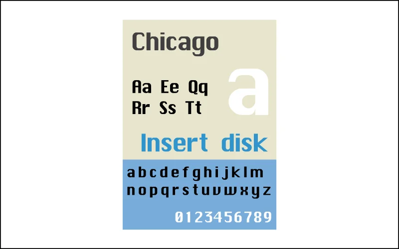
While Apple Garamond ruled marketing, Chicago, designed by Susan Kare, became the default font for the Macintosh interface. Designed to work on low-resolution screens, Chicago’s bold, pixelated look defined the user experience of early Macs.
Its unique style even found its way into the first iPod interface, cementing its legacy.
Geneva and Charcoal Font (1984 – 2000)
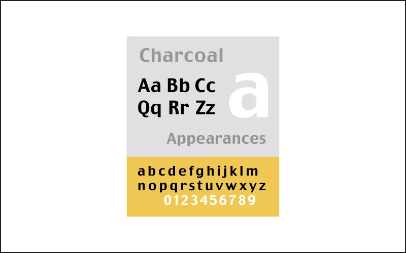
Alongside Chicago, they introduced Geneva, a cleaner sans-serif font for system menus. Later, in 1997, Charcoal replaced Chicago as the system font in Mac OS 8 and 9.
With its smooth design, Charcoal aligned with Apple’s direction towards a more modern, user-friendly interface.
The Lucida Grande (2001 – 2014)
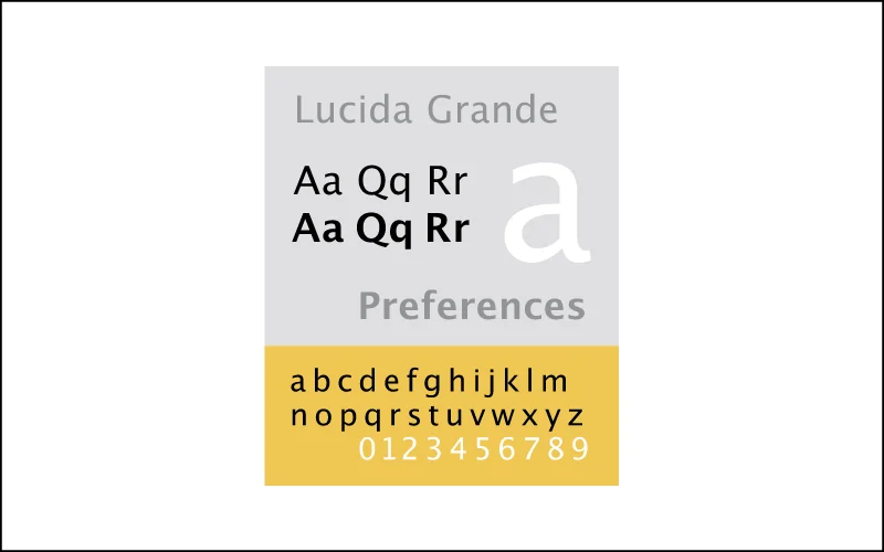
In 2001, Apple introduced Mac OS X and Lucida Grande, a humanist sans-serif font that balanced clarity and sophistication. The Lucida Grande font was perfect for the Aqua interface, which featured soft, translucent elements.
It remained a central part of Mac OS X’s visual identity for over a decade.
Helvetica Neue Font (2013 – 2015)
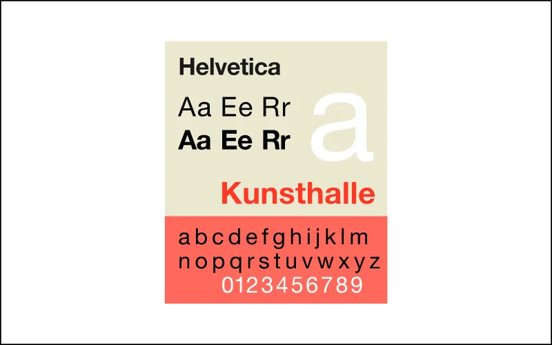
In 2013, Helvetica Neue was introduced as the Apple brand font with iOS 7, shifting toward a flatter, more minimalist design. Known for its clean and timeless design, Helvetica Neue complemented iOS 7’s sleek, modern aesthetic.
However, not everyone liked it. Many users found the Apple brand typography less readable, especially on smaller screens.
San Francisco – Current iOS Default Font ( 2015 – Present)
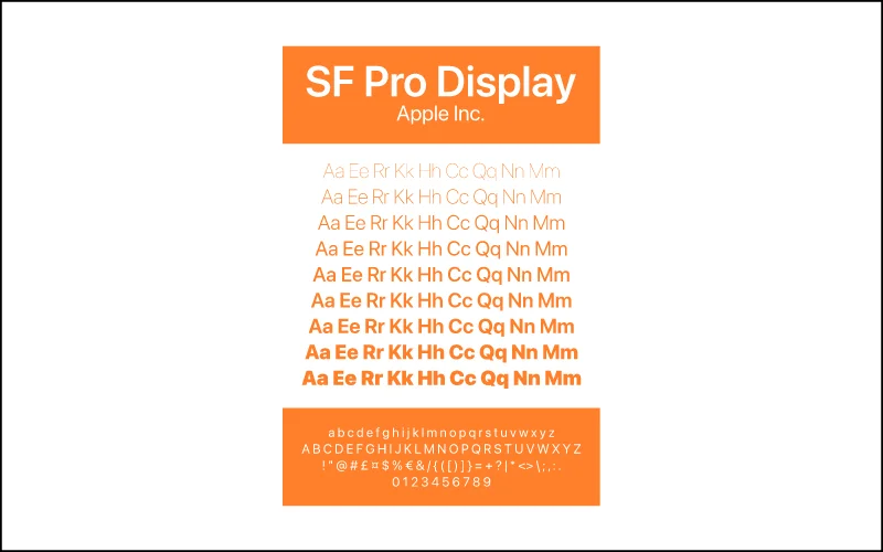
In response to the concerns about Helvetica Neue, Apple introduced San Francisco in 2015. This custom font, designed in-house, improved readability across all Apple devices, from the tiny Apple Watch to high-resolution Mac displays.
San Francisco quickly became the default font for iOS, macOS, watchOS, and tvOS, offering a consistent and user-friendly experience across the board.
Conclusion – What Font Does Apple Use?
Each of these fonts has played a crucial role in shaping Apple’s visual identity, adapting to the company’s changing needs in the ever-evolving tech industry. Today, the Apple brand font San Francisco shows their commitment to sleek design, usability, and innovation.
Over the years, the font used by Apple shows the power of typography in creating a smooth user experience. Apple’s iconic presence in the tech industry is definitely due to its attention to detail in all aspects of its products and its user-focused approach.
Like this post? Check out more fantastic design and typography content on our blog.
Look forward to more interesting and detailed information about Apple’s icon fonts in this article!
I am a huge fan of Apple. Apple’s product design and user experience are the best among all its products. Its products are also the best examples for me to learn design.
Loved learning about Apple’s font journey! So many iconic looks over the years. Makes you appreciate the design. Wonder how AI tools like an AI Image Extender will change design next?
I like the way Apple chooses fonts, minimalistic yet sophisticated. After reading it, I realized that fonts are also important in creating brand class.
I like the way Apple chooses fonts, minimalistic yet sophisticated. After reading it, I realized that fonts are also important in creating brand class.
Loved this deep dive into Apple’s typography! It’s fascinating to see how their font choices reflect their brand evolution. I had no idea about the shift from Lucida Grande to Helvetica Neue. Can’t wait to see what they choose next!
This was a fascinating read! I never realized how much thought goes into Apple’s typography choices. It’s interesting to see how their design has evolved over the years, and I love the clean and modern look they’ve maintained. Thanks for sharing these insights!
Great read! I love how Apple’s typography has evolved while still maintaining a clean and modern aesthetic. It’s fascinating to see how they’ve used type to strengthen their brand identity over the years. Thanks for sharing these insights!
Really enjoyed this deep dive into Apple’s typography! It’s fascinating to see how their font choices have evolved alongside their brand identity. The shift from Helvetica to San Francisco is particularly interesting—definitely reflects their modern approach. Thanks for the insights!