Learn About Dark Mode For Email Design In 9 Minutes Or Less
Dark Mode has a bright future, and email marketers should definitely leverage this design trend. It is aesthetically appealing, easy on the eyes, and there’s more than just visual appeal. It can help you with deliverability! Yes, it can boost your click-through rate and even conversions. No wonder, it has sneaked into almost every app and operating system.
Today, I will share details on what dark mode is and its application in email design. We will also see the benefits of using it in your email templates, tips for email designers, and a few useful hacks- all in 9 minutes or less. Buckle up to take a deep dive into dark mode email template design.
How Did The Dark Mode Trend Start And Why You Should Design Emails Using It
The modern history of dark mode dates back to 2019 when Apple introduced it for iOS 13. However, Google displayed it under the name ‘Dark Theme’ earlier that year at 2019 Google I/O. Yet, the light-on-dark theme, aka the dark mode dates back to the initial days of coding. Coders and cybersecurity experts used it as it caused less strain on their eyes.
With normal users slogging for 8+ hours in front of screens, its adoption became evident. Here are some statistics regarding bright screens that make dark mode relevant for all:
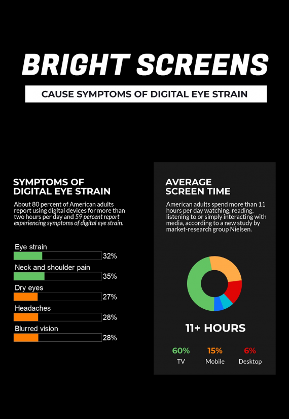
Okay, that’s enough of its background. Now, let’s talk business. The reason you should adopt this color scheme lies in mass adoption. No matter which device or OS your subscribers use, they are most likely to be aware of dark mode. Many might also be using it even in the day time just for the aesthetics.
Facebook, Twitter, WhatsApp, Instagram, Skype, YouTube, Slack, Spotify- all support it. Major mailbox providers like Gmail, Apple, and Outlook also support it both on the web and mobile apps. They apply color inversion to render emails in dark mode. If you haven’t designed yours for the dark UI, your email is going to look pretty bad.
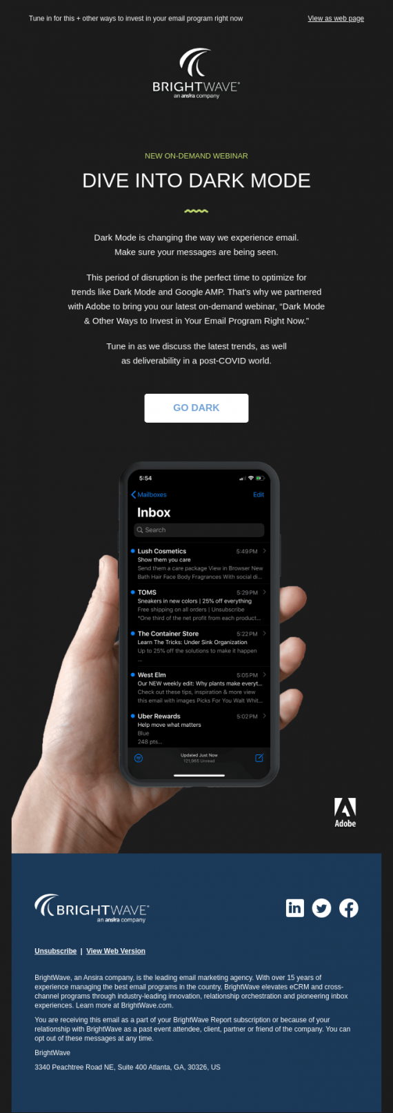
But here’s the good thing. If you’re designing your emails for a dark theme, users will find it easy to consume your messages. Since a lot of brands lack this approach, you are more likely to get better engagement and conversions. Also, your messages will look consistent with all other apps. Have a look at this example:
Thus, there are manifold benefits for you. For readers who are facing trouble reading other messages, you will automatically perform better. Adopting this trend early as an email marketer will help address the needs of your subscribers who have been spending more time on their smartphones. Thus, in a way, dark mode friendly email templates are becoming a part of mobile optimization.
How To Design An Email For Dark Mode
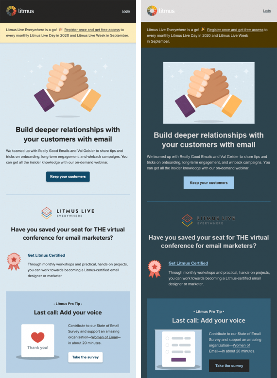
In this section, I will share design tips for dark mode friendly HTML email template design. But before we move ahead, have a look at these renderings:
Partial Inversion:
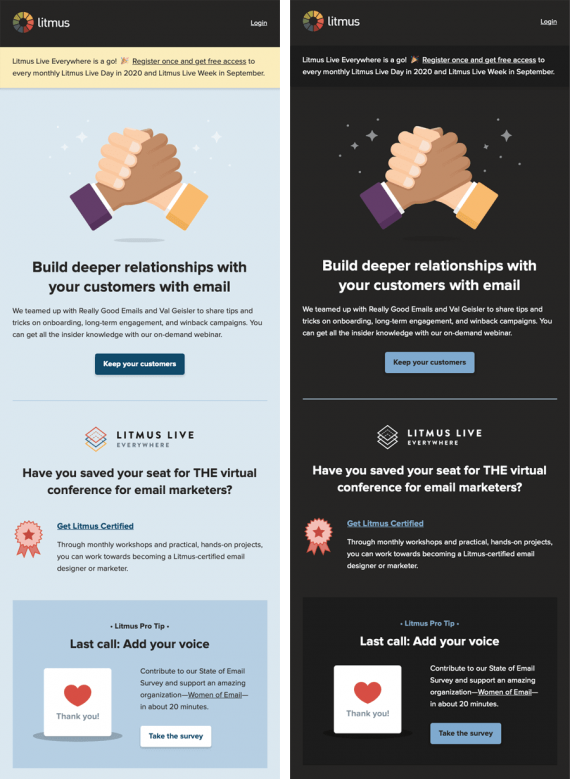
If your messages aren’t optimized for the light-on-dark theme, the ESPs will use color inversion to render your messages. This will impact your email’s design adversely and, in many cases, make them almost unreadable.
Properly rendered dark mode friendly HTML Email template:
Optimizing your messages for the dark UIs isn’t rocket science, but you will still need to invest efforts. Here’s how you can design your emails for dark mode:
Insert ‘“(prefers-color-scheme: dark)” in @media query. This is one of the basic steps as it allows the email client to understand which version to display. The dark theme coding is done separately, and it should be displayed only when the user has dark mode turned on.
Like always, Outlook will require you to make special changes exclusive to it. You will have to use (data-ogsc) inside CSS styling for duplication purposes.
Use HTML and CSS as dividers with the help of elements like <hr> and <td> along with height and width specifications. For instance, a single-column email template will make it tough to differentiate between various elements. Using a dividing line will ensure that your email doesn’t look skewed and lose accessibility.
Go for transparent PNG images as they adapt well to any background. Also, very bright images are not suitable for dark mode. So make it a point to apply a filter for keeping them visually consistent with the dark theme. This will keep your message look consistent without any lighting related distortion.

Ensure that your fonts have a stroke that contrasts with the background. Failing to do so will make your text disappear or at least look strange. This applies equally to your branding elements. For typefaces in logos, you can either add a contrasting stroke or change the font color for making necessary changes.


Add a background color for social media icons to maintain their visibility. In case you are using black color for icons, consider adding a white/contrasting background. It will save you from this type of mishaps:
Test your emails. You can use tools like Litmus or Email On Acid. But even simple tricks like using (bgcolor=”#000000”) in table and body tags does the job. CSS filters will help you optimize your images for the dark mode.
Mastering this theme will require experience, as you need to understand how your brand colors fit into it. Also, adjusting your color palettes and overall design language. Thus, pre-deployment testing should be on your priority list. In case you find these design tweaks overwhelming, you can hire an email development agency like Uplers to take care of the process for you.
Summing Up
The dark color scheme is becoming increasingly popular. It is helping improve the user experience when it comes to email marketing along with increasing their utility. The points I covered over here will surely improve your understanding of dark mode friendly email template design as we covered but theory and actionable tips.
Normally it would take 4-5 minutes to read a post of this length, but even with images and technicalities included, I bet you will be doubt-free before the tenth minute. You can find more of such solid insights on dark mode friendly email templates in this infographic. I hope you find this post insightful.
Source: What is Dark Mode in Email & How to Enable in Email Clients
About The Author:
Kevin George is Head of Marketing at Email Uplers, one of the fastest growing custom email design and coding companies, and specializes in crafting professional email templates, PSD to HTML email conversion and free responsive HTML email templates in addition to providing email automation, campaign management, and data integration & migration services. He loves gadgets, bikes, jazz and eats and breathes email marketing. He enjoys sharing his insights and thoughts on email marketing best practices on his blog.
Nice article
Your article is very informative for me. Nice article
Tips for email design thanks!
Awesome blog post, really enjoyed reading through.
Awesome blog post, really enjoyed reading through.
Beautiful and fantastic blog.
Great and Informative blog