Back to basics- Understanding Color (part II)
So last week we offered you an introduction to the science of color. Now that you are experts in that field we can move on to some new aspects. Today we will continue with some more color terms and go through the psychology of color and give you a better understanding  of why a certain color is more suited in one context than another.
Other color terms
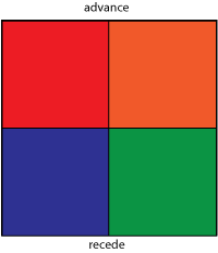
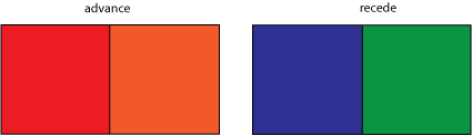
Advancing and receding
Color containing red create the illusion of advancing towards the viewer while colors that contain blue (like green or violet) seem to recede.
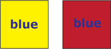
Simultaneous contrast
When seeing to neighboring colors, the human eye tends to emphasize the differences between them rather than the similarities. The perception of one color will always be influenced by the presence of another color ,as you can see in this example. The word blue is the same color  on both backgrounds but it’s perceived to look brighter on yellow and darker on red.
Vibration
Complementary colors of high saturation and equal luminosity tend to appear more brilliant.
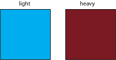
Weight
Colors differ in weight also. For example colors from the blue-green range appear to be much easier than the ones who contain red which appear to be heavier.
Choosing the right color for your text
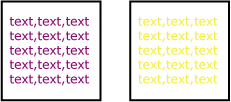
Poor legibility of the text is a common error which affects directly the way you message is transmitted to the reader. So  a good legibility is a always a must and you can achieve it by taking in consideration  some  basic elements like the font you are using(that we will be discussing in the near future) and also…yes u have guessed color. Good color legibility is assured by always using colors that create a strong contrast. For example a white background and a violet text (violet- the color closest to black) is a good choice but putting on the same white background a yellow text (color closest to white) will result in a lower legibility.
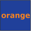
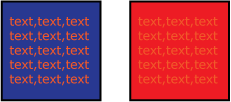
Also you can use the color wheel to make your choice of color. Colors that are opposite (like blue and orange) create a strong contrast and good readability while the contrary effect is obtained when using a red/orange text on a red ground.
The psychology of color
Colors have particular associations that most likely have became deeply rooted in the human psychology. So we don’t just perceive color with our eyes, but we also have an emotional response to it. Of course the meaning of color may vary in different cultures but despite the local differences certain colors do seem to have universal significance.
RED is a bright, warm color that evokes strong emotions. It stimulates a faster heartbeat and breathing. Red is associated with love, warmth, passion, strength, energy, fire, sex, excitement, speed, heat, arrogance, ambition, leadership, masculinity, power, danger, Â blood, war, anger, revolution, radicalism, socialism, communism, aggression, summer, autumn, stop, Mars (planet), respect, Aries (star sign), December.
BLUE is the color associated with the ocean, men, productive (interior) skies, peace, unity, harmony, tranquility, calmness, trust, coolness, confidence, conservatism, water, ice, loyalty, dependability, cleanliness, technology, winter, depression, coldness, idealism, obscenity, tackiness, air, wisdom, royalty, nobility, Earth (planet), Virgo (light blue), Pisces (pale blue) and Aquarius (dark blue) (star sign), strength, steadfastness, light, friendliness, July (sky blue), February (deep blue), peace . It’s the most common color used for men products being most preferred by men. It causes the opposite reaction as red. Peaceful, tranquil blue causes the body to produce calming chemicals and calls to mind feelings of calmness or serenity.
YELLOW is cheerful sunny and an attention getter. Yellow stands for sunlight, joy, happiness, earth, optimism, intelligence, idealism, wealth (gold), summer, hope, air, liberalism, cowardice, illness (quarantine), hazards, dishonesty, avarice, weakness, greed, femininity, gladness, sociability, summer and friendship. It is  also the most difficult color for the eye to take in due to the high amount of light that is reflected, so it can be overpowering if overused.
GREEN is a calming, refreshing color, currently the most popular decorating color.Green symbolizes nature and the natural world also great intelligence, nature, spring, fertility, youth, environment, wealth, money (US), good luck, vigor, generosity, go, grass, aggression, coldness, jealousy . It is the easiest color on the eye and can improve vision.
VIOLET is the color of royalty, purple connotes luxury, wealth, Â sophistication,sensuality, bisexuality, spirituality, creativity, wealth, royalty, ceremony, mystery, wisdom, enlightenment, arrogance, flamboyance, gaudiness, mourning, profanity, exaggeration, confusion, pride, romanticism (light purple), delicacy (light purple). However, because it is rare in nature, purple can appear artificial.
ORANGE is a combination of yellow and red and is considered an energetic color. Orange calls to mind feelings of excitement, enthusiasm, and warmth and  flamboyance, playfulness along with aggression, arrogance, gaudiness, over emotion and is associated with Hinduism, Buddhism,  energy, balance, heat, fire, warning, danger, autumn, desire.This color is often used to draw attention, such as in traffic signs and advertising.
If you want to find out even more about color you can check out these links :
2. Design & art
5. Color picker

0 Comments on “Back to basics- Understanding Color (part II)”