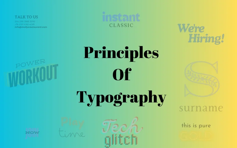
5 Basic Principles of Typography Theory
The word ‘typography’ comes from the Greek words ‘typos’ (form) and ‘graphe’ (writing). It’s the art and technique of arranging type to make language more visible. What does a typographer do? He makes sure the text is easy to read. Being a designer, knowing typography theory can be a game changer as your time will be saved, and you’ll end up with perfect-looking designs.
Understanding and applying typography principles requires many choices and also involves a good understanding of elements such as typeface, font and characteristics, alignment, line length, leading (line spacing), and tracking (adjusting space between groups of letters).
Here are the 5 basic typography principles you should stick by.
Table Of Contents
- Typography Principle No. 1: Don’t Use Too Many Typefaces
- Typography Principles No. 2: Contrast Is Good, But Not With Wrong Colors
- Typography Theory Principle No. 3: Limited Use Of Display Faces
- Typography Principle No. 4: Scannable Text Is a Must
- Typography Principle No. 5: Don’t Distort Typography In Graphic Design
Typography Principle No. 1: Don’t Use Too Many Typefaces
Do you know the difference between typeface and font? You may have heard about modern fonts or great vintage fonts. Adobe InDesign’s glossary states, ‘A font is a complete set of characters that share a common weight, width, and style.’
A typeface is a collection of fonts that share an overall appearance and are designed to be used together. For example, Verdana is a typeface, and Verdana 12-pt italic is a font.
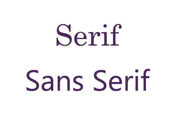
Typefaces usually are broken down into the following categories:
- Serif
- Sans-Serif
A serif is a small line attached to the end of a stroke in a letter or a symbol. If the letters and symbols of a typeface have serifs, then we call it a serif typeface.
The word “sans” is French for “without,” and a Sans-Serif typeface is, as you might have guessed already, a typeface without serifs.
The strokes of the serif typeface help guide the eye across a line of text. Serifs are almost a standard in most newspapers. The sans-serif font family is said to be easier on the eye when reading online.
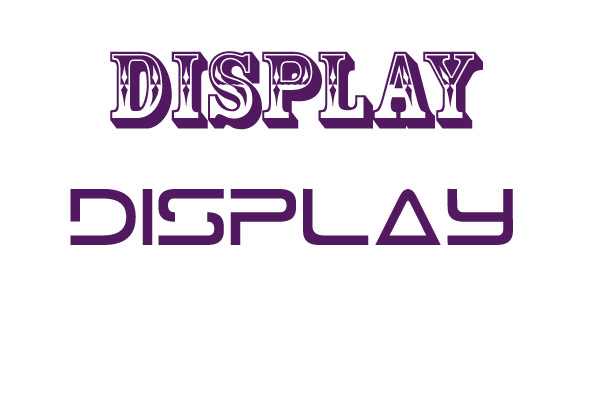
- Display
Display is usually a typeface used with large sizes, usually 20 or above. They are generally not used for body, but they are perfect for demonstrating a visual theme when used for titles and headings.
Check out: Awesome Fonts Bundle
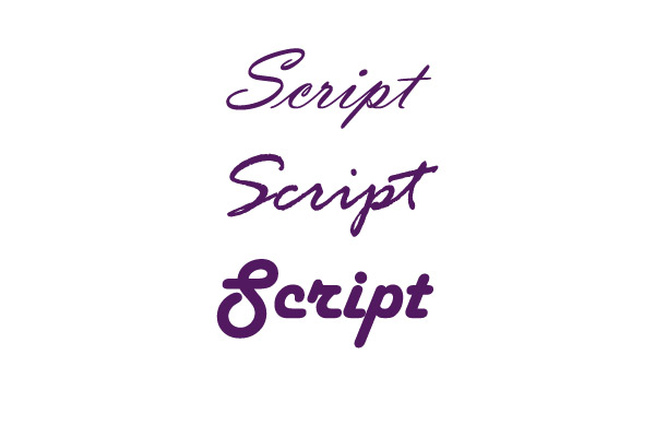
- Script
Script is a typeface based on the appearance of handwritten letters and symbols.
- Dingbat
Dingbat is a special typeface used for scientific/mathematical formulas or graphic icons. Don’t use a typeface just because you like it, think of the impact it will have and make sure that it carries the references and associations your design needs.
Check out: 20 Free Aesthetic Patterns
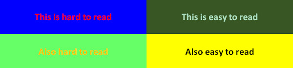
Typography Principles No. 2: Contrast Is Good, But Not With Wrong Colors
The most common form of text we encounter is black text over a white background. Even though people love colors, sometimes color makes text harder to read, less enjoyable, and can even cause pain when looked at for a longer time.
It is almost always a bad idea to choose a text color and a background color that contrast with one another in a discordant manner.
Check out: All In One Fonts Collection
You need to have enough contrast between the background and the text for the text to be legible, but you also need to make sure the colors don’t clash.
Keeping the background of the text simple (fewer colors) is often the best choice as it allows you to use a small set of colors and get optimal results.
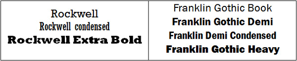
Typography Theory Principle No. 3: Limited Use Of Display Faces
Display typefaces are fun, and they look very interesting. No matter how much you like them, don’t use them excessively. Remember that ornamental and display typefaces were not designed for bodies of text as they generally require a larger font to be readable.
It’s important to remember that these faces tend to be more complex, which can easily tire the viewer’s eyes.
Check Out: Inspirational Text Overlays Bundle
Typography Principle No. 4: Scannable Text Is a Must
This typography theory principle states: When writing for the web, readability is not the only thing you must worry about. The user can surf away at any moment and with just one click.
Your purpose is to ensure the text is in such good shape that the reader will keep his interest long enough to read through the whole thing. That won’t happen unless he can easily scan it for focus points that pique his interest.
Focus points, such as a header, a button, a graphical element, or emphasized text, will draw the user’s attention.
Focus points, header size and position, text size, line height, alignment, and contrast are the main factors impacting how scannable your text is. Good use of these elements will ensure your reader is aware of the content of your copy before choosing to read it wholly or abandon it.
Check Out The Modern Script Fonts Bundle
Typography Principle No. 5: Don’t Distort Typography In Graphic Design
Sometimes, you feel the need to stretch or pull text to fit in a certain space or make it look different. Don’t do it!
Their creators have put a lot of work into making them; they are very carefully designed. Squishing or pulling a typeface not only reduces its legibility but also eliminates the reasoning behind its crafting.
Each typeface contains styles and weights that are already adequately expanded and condensed. Type designers know that people want “thinner” or “thicker” fonts, so sometimes these styles are included in typeface families.
Check Out: All Style Fonts Bundle By Blankids Studios
If the font you are using doesn’t have the variant you want, try pairing it with another font that fits your needs.
Do not use the bold and italic buttons in character palettes of the software as they are called “false bold/italic”. Instead, use the menu to find the real bold and italic, created by the type designer. Hope these principles of typography will help you in your projects.
We’re hoping you have enjoyed our short journey through the world of typography theory and have found it at least entertaining, if nothing else.
Now, let’s take a moment to see how many of these typography principles we have broken while writing this article, shall we? Feel free to comment and let us know below.
Like this post? Check out more amazing graphic design content here.
All the theories on technography you have shared is valuable. Thanks for sharing such kind of article.
This article is really impressive. The author explains everything in a way that makes it easy to understand, even if you’re new to the topic. The examples are clear and support each point well. I love how the information is organised. It’s a great resource for anyone looking to learn more. and if you are looking
Great Post! I am Really Enjoy to Visit In the Post. I have too been generated Clipping Path/Cutout image Service to a long time. Keep Writing.
I always love to use Sans Serif. It is standard typography to use anywhere. Thanks for this nice post.
It nice and easy to comprehend thanks for sharing
What a wonderful article it is. I really enjoy your post. Thanks
You knocked me off my feet!
Hy! What a fantastic post! I really impressed by this article. This step-to-step guide is very beneficial for all beginners. I like these rules and try to use them in upcoming and ongoing projects.
Thanks.
Serifs is the most usable and popular font in web. Glad to know about the history of typography. Thanks
Accessibility testing
Accessibility testing is essential because it guarantees that digital materials, websites, or applications are usable by all users, irrespective of their potential limitations or impairments. It confirms if the layout, user interface, and features are sturdy, comprehensible, observable, and operative for every user. Organizations may reach a wider audience and improve user satisfaction by carrying out accessibility testing, which shows their dedication to diversity and social responsibility. It also aids in maintaining legal standards and regulations, averting possible discrimination problems, and building a favorable brand image. In the end, prioritizing accessibility testing creates a more fair and user-friendly digital environment by helping those with disabilities as well as enhancing general usability for everyone.
fnf mods is a fascinating website devoted to Friday Night Funkin’ game series. In this series of games, players are challenged with loads of wonderful music, rhythms and sounds that keep players engaged without getting bored.
Your site was very useful for me, thank you.
This is such a helpful guide to typography! The concept of ‘contrast’ really stood out to me—it’s something I never paid much attention to before, but now I can see how it can totally transform a design. I’m excited to experiment with these principles in my next design project!
Great insights on typography! I particularly loved the emphasis on hierarchy and readability. It’s fascinating how much of an impact proper typography can have on conveying a message effectively. Looking forward to more posts like this!
It is nice and easy thank for sharing
Great breakdown of typography principles! I especially appreciated your insights on the importance of hierarchy and readability. These tips are super helpful for anyone looking to improve their design skills. Thanks for sharing!
You have to consider more than just readability while writing for the web. With a single click and at any time, the user can surf away. Thanks.
Nice typography! Keep it up.
Great insights on typography! I particularly loved the point about the importance of hierarchy in design. It really makes a difference in guiding the reader’s eye. Thanks for sharing these foundational principles!
Great insights on typography! I especially appreciated the point about how spacing can dramatically affect readability. It’s amazing how such small adjustments can create a big impact on overall design. Looking forward to applying these principles in my next project!
I’ve found that mastering the balance between kerning and line spacing is essential.
It also aids in maintaining legal standards and regulations, averting possible discrimination problems, and building a favorable brand image.