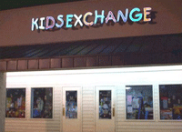
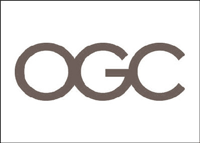
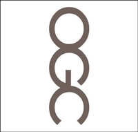
Good Intentions, Baaad Logos
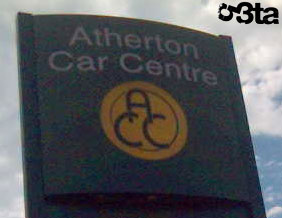
Well yes, the intentions were honorable : Â designing a logo that better represents the company.The result… turned out be a little more … complex than that. Let’s just say each of these logos leave a lot of space to the imagination. But hey, we’re not here to judge…we’re only in for the laughing out loud part.
![]()
![]()

![]()
![]()
![]()
![]()
![]()

![]()
![]()
Wow, these are pretty funny. How do these designers not notice how they look? I got a good laugh, that’s a major mistake. Check out my logo contest on logo blog. Hopefully no one redesigns anything to look like one of these.
http://penisland.net/ always makes me laugh
They really need to put a bit more effort into the planning!
Hilarious. I almost did an oops myself, typed “hilaroius”, but I somehow caught it…
Brilliant collection of ‘not completely thought out’ logo designs. As crazy as it may sound I’m sure the ‘penisland.net’ site that ela mentioned probably gets alot more business than expected due to the strange name…
And here we have a collection of work from:
http://www.yourlogomakesmebarf.com
lol are these real images?
Ha, I can’t believe they are real… but they really are.
I have been to KIDSEXCHANGE before. Its actually a kids consignment store chain with a horrendous name.
Its really as if they never read their sign.
These are just unbelievable! I couldn't stop laughing at “we toss the small ones”. Who comes up with these slogans? I also recently came across a hilarious article about why people shouldn't get logos through logo contests. http://www.logocontests.net/bad-logos.html Funny….
that is the funniest post I’ve seen in ages!
Hah, thats gorgeous, specially the OGC logo design