5 Most Common Mistakes in Designing Logos
In order to be easily recognized, it is required for a company to have a logo. Good logo should be unique, original and able to communicate the company’s message briefly and clearly. Below, we have 5 most common mistakes in designing logos you should avoid while creating not just good but great logo.
Horrible Font Choices
In designing a logo, font is one crucial aspect that has power to convey message. Whether you use words in the logo or in the tagline, finding the right font has never been easy. Every font has its own unique characteristic that delivers different visions. So, if you want to make professional logo, you have to correctly match the font and the icon.
Other than choosing font rightly, there is a limitation on the choices. You can put maximum of two fonts in one logo to avoid customer’s confusion.

New YouTube logo is the perfect example for this. The font is minimal and yet delivers a powerful message.
Another one can be the new Pinterest logo which is bright red in color but the font used in the name is pretty decent and mellow.
Too Complex
One of the keys to a great logo design is to keep it simple. Some of logo designers rely on colors, effects and put too much details in the icon which is not good. Highly detailed logos are not usually memorable. Likewise, it will lose the detail when viewed or printed in smaller sizes.
Same thing goes with color choices and additional effects, keep the icon as simple as you can. A logo must represent the business target, therefore it is important to avoid unnecessary color and effects.

Apple’s new App Store logo is the perfect example for it. It is really very simple and decent. Uses a subtle blue color and still catches the eye instantly
Monogramic Logo
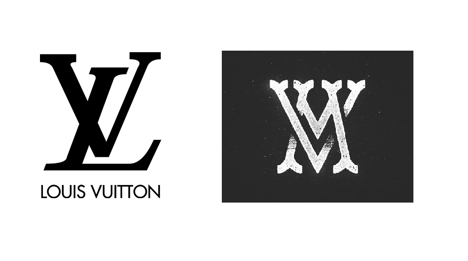
Using acronyms as logo design is probably a smart idea. However, it will be difficult for your client to deliver their brand message thoroughly. Besides, KFC, IBM and HP took their time before using initials.

New IBM iX logo is the perfect example for the monogramic logo design with the iX as its logo.
Using Raster Images
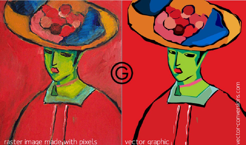
It is no secret that raster graphic (bitmap) is considered bad for designing logos. Raster images consist of pixels which means when you enlarge the logo, it will lose its consistency. On the other hand, vector graphic made of mathematical calculations forms shapes, which means a logo can be scaled to any size without losing consistency. Other than managing to keep your logo’s quality perfect in any size, editing vector graphic is much easier as well.

Using Stock Art
Using stock art for designing a logo is becoming more common from time to time. It is not really a smart idea however. Not only will it make your logo design questionable for its originality but it will also look like other logos made using same stock art. Recreating a logo using stock art by changing the color is quite similar to stealing which is illegal and not cool.
Imagine if a company found out that you “copied” their logo design and they sue you for that. No thanks.

Now that you know the mistakes you should avoid when designing logos, you should also know about Gestalt principles of visual perception and how you can effectively apply it to logo designing.
For perfect logo ideas try out our very own free logo design templates.
Once you master perfect logo making you can try animating your logo with the help of animated logo examples.
Take this fun logo quiz on identifying famous logos and find out how well can you identify different logos.
Like!! I blog frequently and I really thank you for your content. The article has truly peaked my interest.